Samsonite
Master Architecture for Samsonite & all Sub-Brands.
iA / UX
Information Architecture / Wireframes / Prototype
DISCOVERY
The team at Samsonite approached LYONSCG with the opportunity of designing multiple sites that were owned by their singular holding company. This would include Samsonite, Hartmann, American Tourister, High Sierra and one of the new additions of J.S. Trunk & Co. The goal was to develop a custom master architecture that could be utilized by each of the sub-brands with their own unique styles, but all following a similar pre-defined architecture. This would be an enormous benefit to the client as there would be consistency in how content on each site gets managed as well as the flexibility to allow each sub-brand their own space for marketing and specific customer targeting. Hartmann was just beginning to launch a brick and mortar store along with expansion of J.S. Trunk & Co. stores in the U.S. We had to establish a flexible design solution at a rapid pace in order to meet the needs of our client.

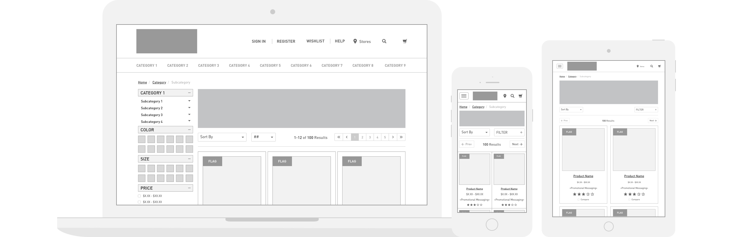
INFORMATION ARCHITECTURE
In order to succeed in creating a unified yet broad master architecture we had to absolutely understand the qualities and business logic behind each of the applicable sub-brands. This meant that our initial discovery consisted of significant amounts of requirements gathering and gaining stakeholder consensus on how we were going to both stick to the timeline as well as deliver the proper solution that the client had asked of us.

E-COMMERCE EXPERIENCE
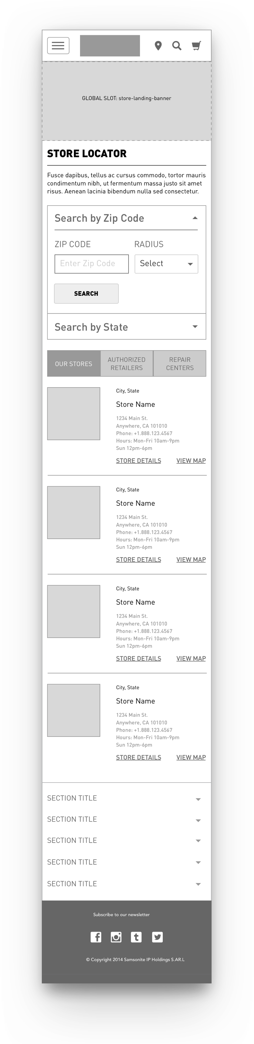
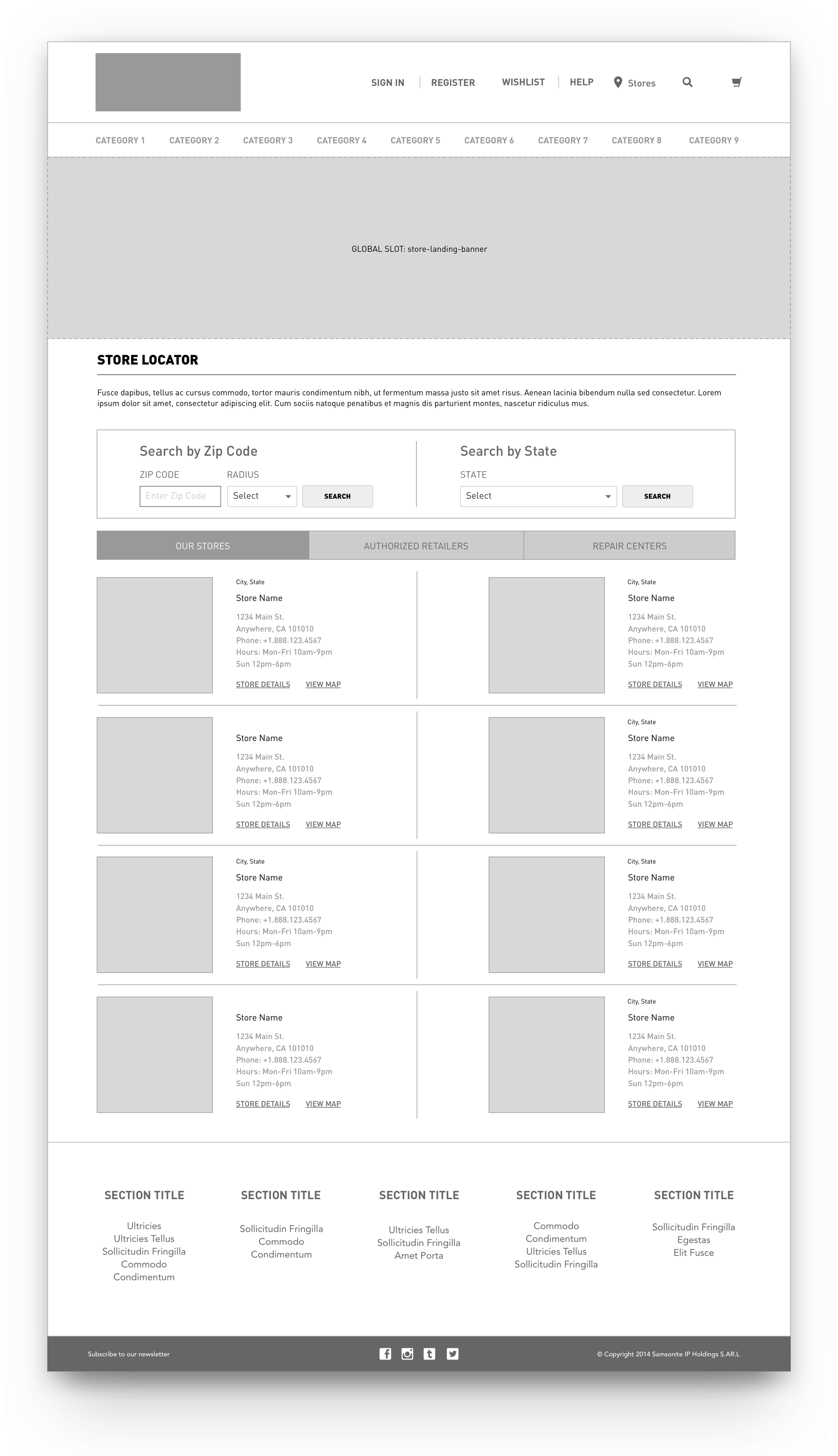
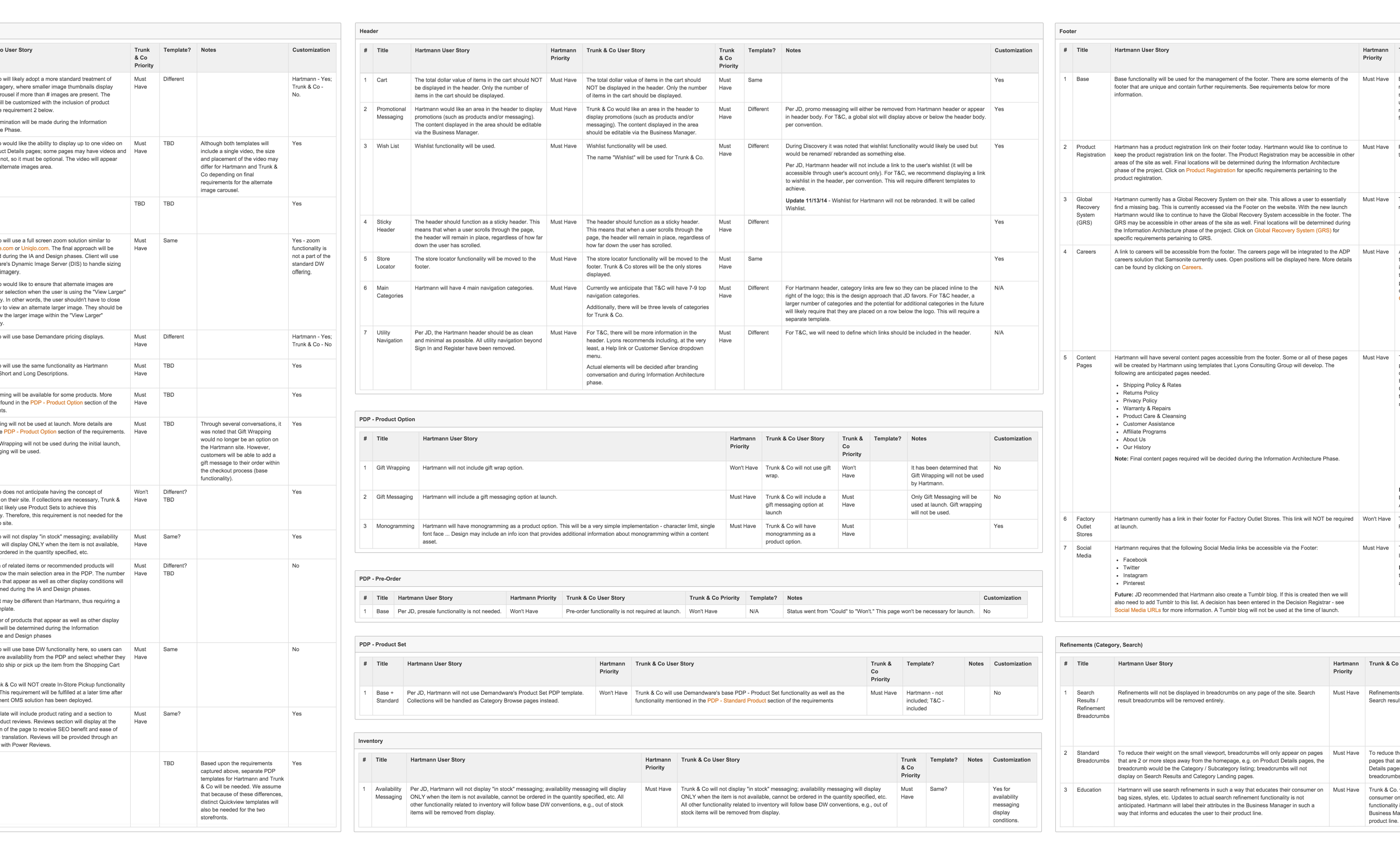
The main goal for this project was being agile and flexible while applying e-commerce best practices to the master architecture. Each site consisted of similar content and functionality though some pages were customized in order to fit the needs or all sites. For example, the store locator on Hartmann required third party sellers to be identified within the store listings while others didn’t require this functionality. Additionally, full-screen zoom on the product page and fluid responsive CMS page layouts were customized to be added to the master architecture so that all sites could benefit from this functionality.
Establishing Standards
Working with the design team we were able to apply brand specific styling using only one set of wireframes. This required a greater level of visual design focus in order to differentiate the designs for each site, while not implying additional scope or development efforts. In the end, we had an extensible master architecture that allowed for the flexibility that the client needed, each with their own brand specific styling.