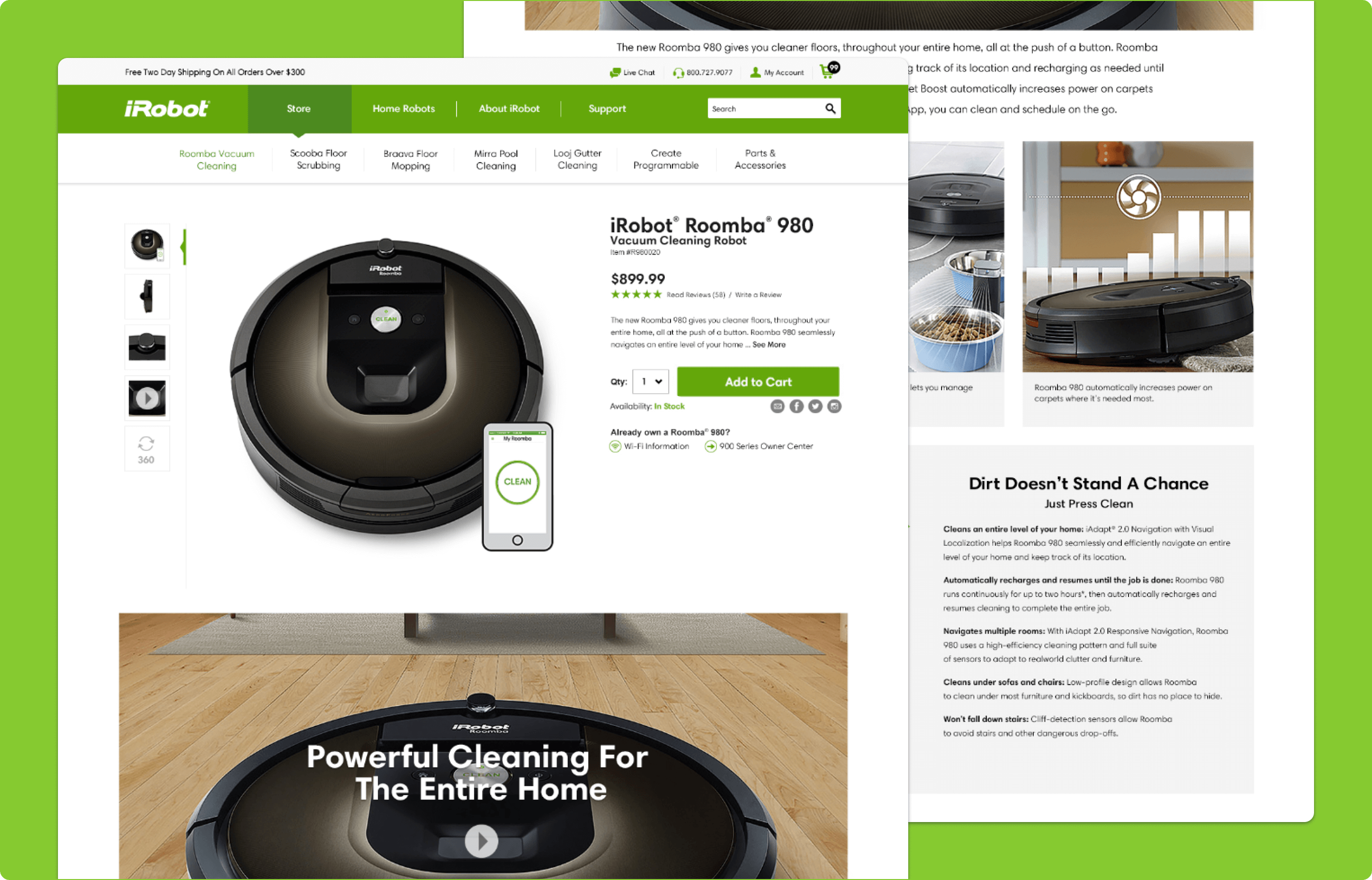


Reinventing the way you clean
A content and commerce experience that helps users find the best robot vacuum for their needs
Platforms
Salesforce Commerce Cloud
Deliverables
Wireframes, Prototypes
Expertise
iA, UI / UX Design
Year
2015
Discovery


iRobot designs and builds robots that make a difference. The award-winning iRobot Roomba is the flagship product that has set the standard for vacuum cleaning robots. iRobot approached LYONSCG with the task of redesigning their storefront to better align with their brand, incorporate ecommerce best practices, and make the transition from content to commerce seamless for their users.
Information Architecture


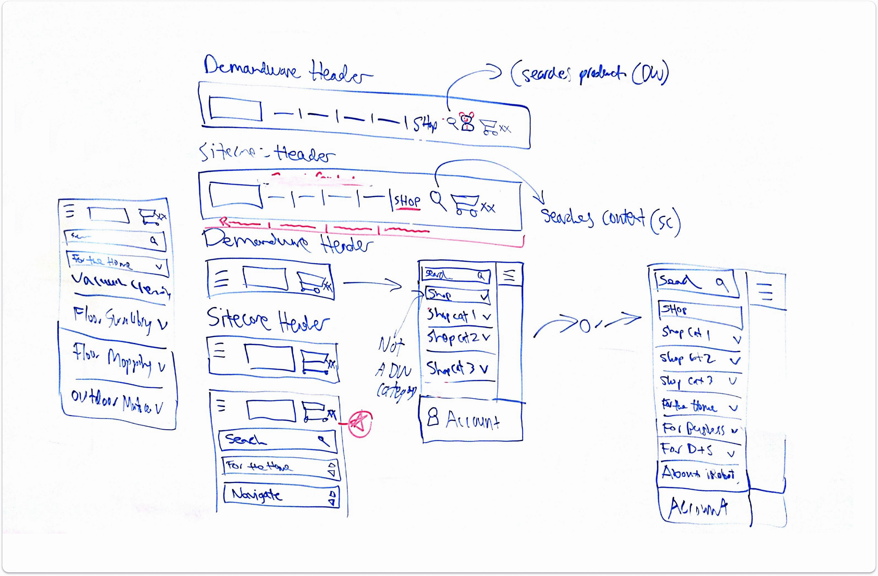
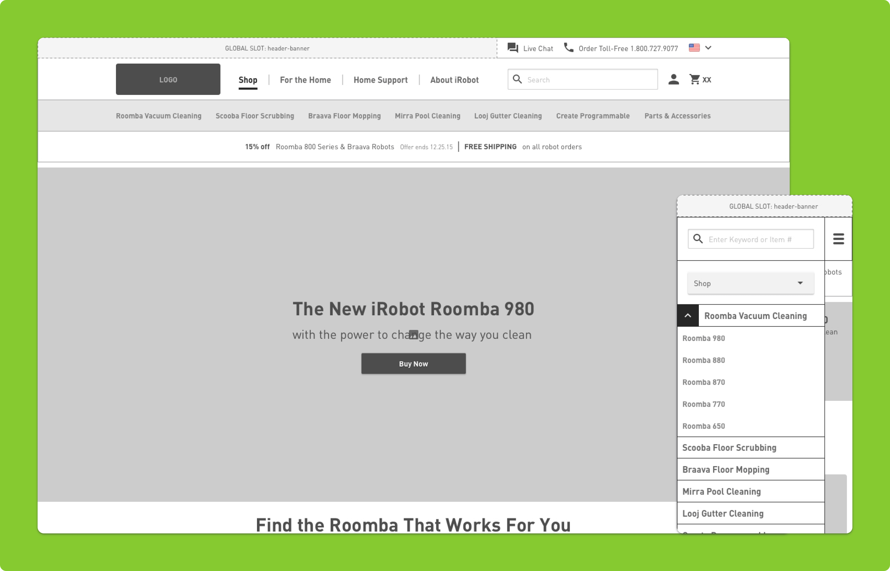
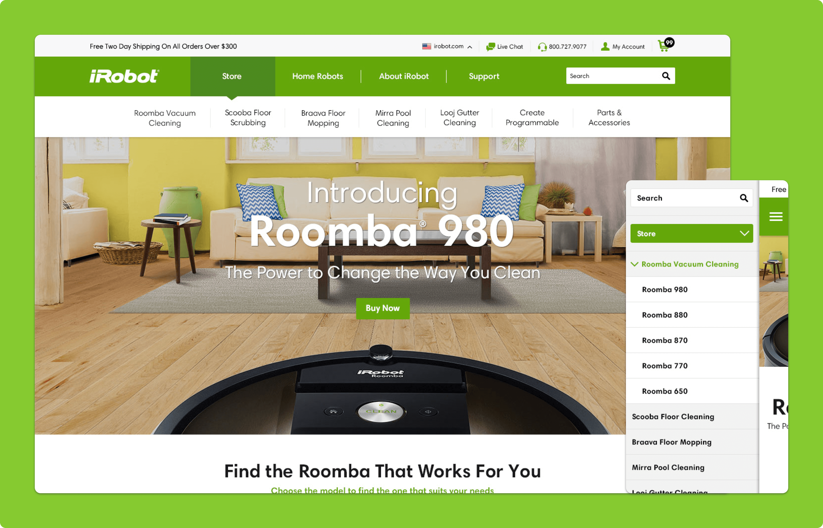
With this redesign, we aimed to create a seamless transition from content pages to products, despite the technical limitation of using two separate platforms for primary and subdomains. The key was to have consistent visual design across domains, but also to make clear distinctions between each domain's navigation schema.
To do this, we examined user analytics and found that most of the traffic coming from the store subdomain was from the content side, but users were often getting lost, backtracking, or leaving pages. It was clear that there was a disconnect between the content and the storefront where users would make purchases.
The first step was to address the navigation. Currently, the content sub-navigation was displayed on all pages, including those of the storefront, leading to confusion for users trying to navigate back to the product page. We proposed eliminating content sub-navigation on irrelevant pages and only showing sub-navigation for applicable parent categories. This would allow for consistency in user navigation, regardless of which site they were on.
Implementing this change would help users progress smoothly from content to purchase, making for a more cohesive customer journey.
E-Commerce Experience


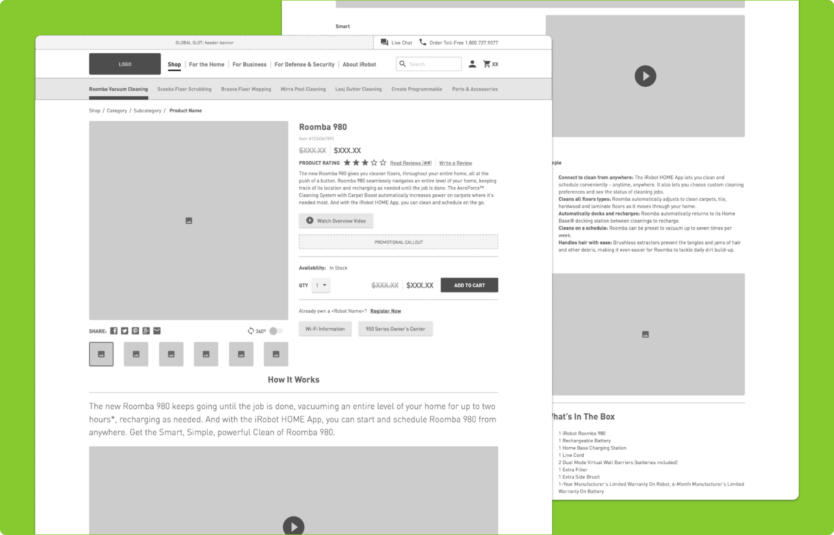
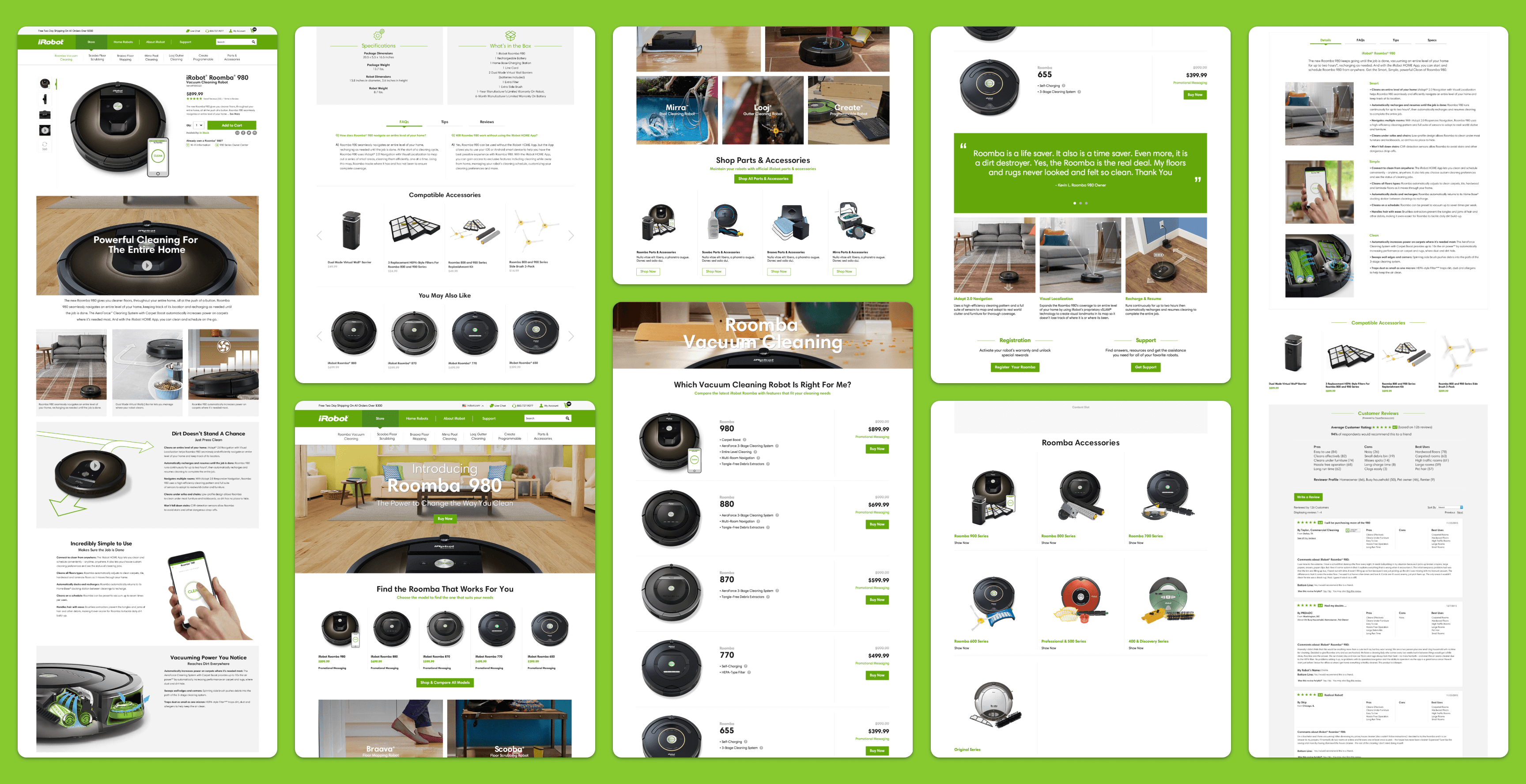
To improve the iRobot storefront, we needed to address both navigation and content issues. Previously, the content site provided information about the product, while the storefront only showcased products and a few promotions. To prevent users from losing interest or getting confused, we brought informational content over to the storefront, making the user experience seamless.
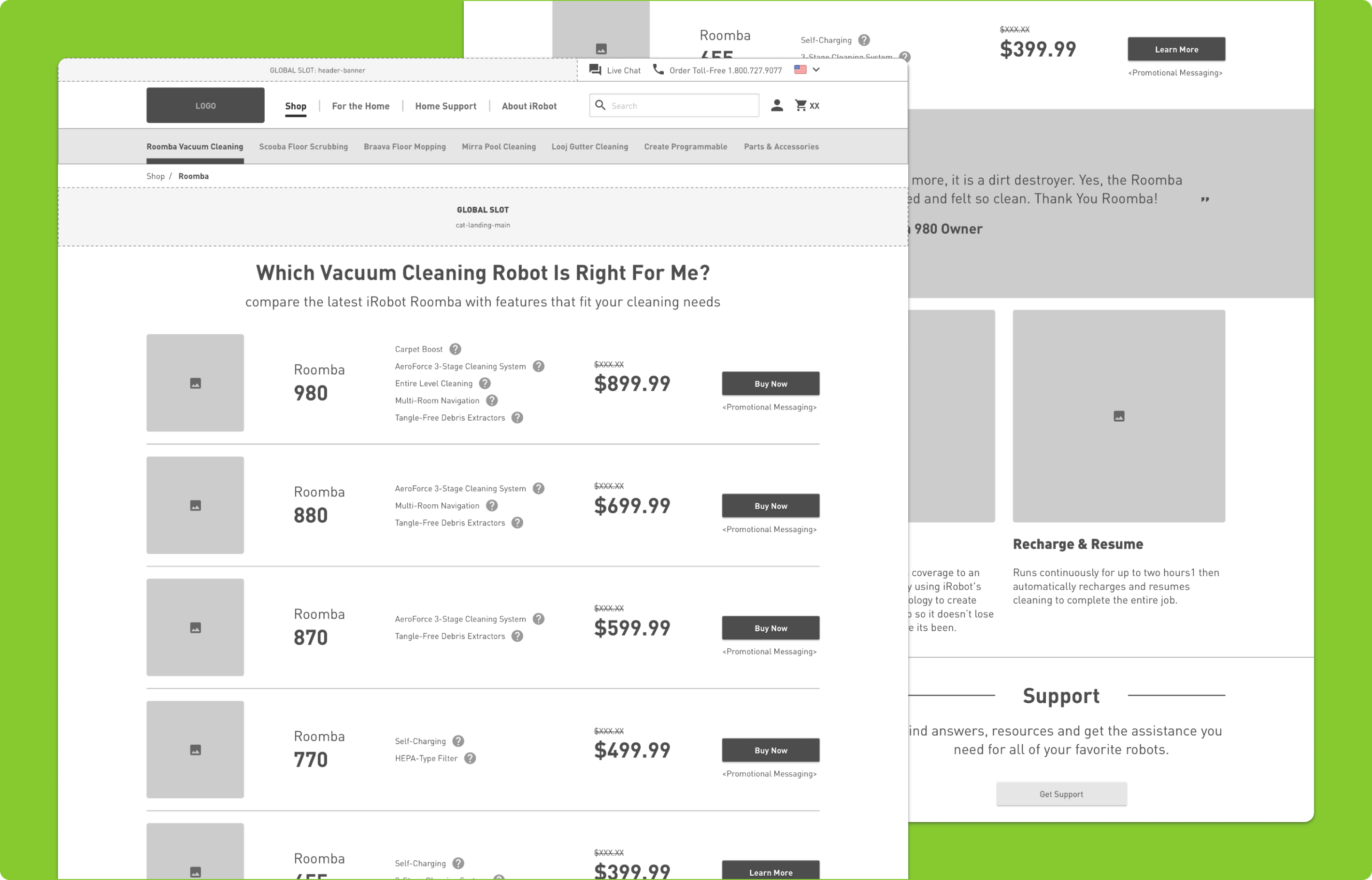
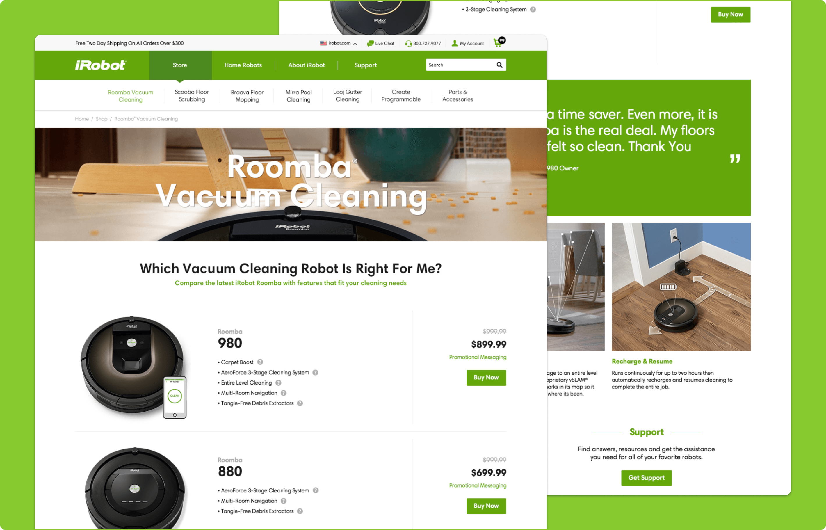
Robot Comparison
The Robot Comparison table was a successful content piece in iRobot's usability testing. It used to only be available on the content site, accessible only as a link that took users away from the storefront. This was due to technical limitations of the old platform, creating a disjointed user experience. I worked with the design team to build a category page on the storefront that summarized the major comparative features of each vacuum cleaner model, catering to both users from the content site and new users looking for reassurance in their purchasing decision.
