

Make home a welcoming oasis
Unique storefront experience for bespoke design-driven luxury home and lifestyle brand
Platforms
Salesforce Commerce Cloud
Deliverables
Wireframes, Prototypes
Expertise
iA, UI / UX Design
Year
2015
Discovery


Serena & Lily designs and sells furniture, including dining room furniture, custom upholstered sofas, and bedding. The company's goal is to help you bring your personal style into your home with a variety of colors, patterns, and materials. S&L partnered with LYONSCG to create a new design with unique features that distinguish them from competitors. Working with Sweden Unlimited, we developed a branded experience that includes features for greater brand engagement, product discovery, and customization.
Information Architecture


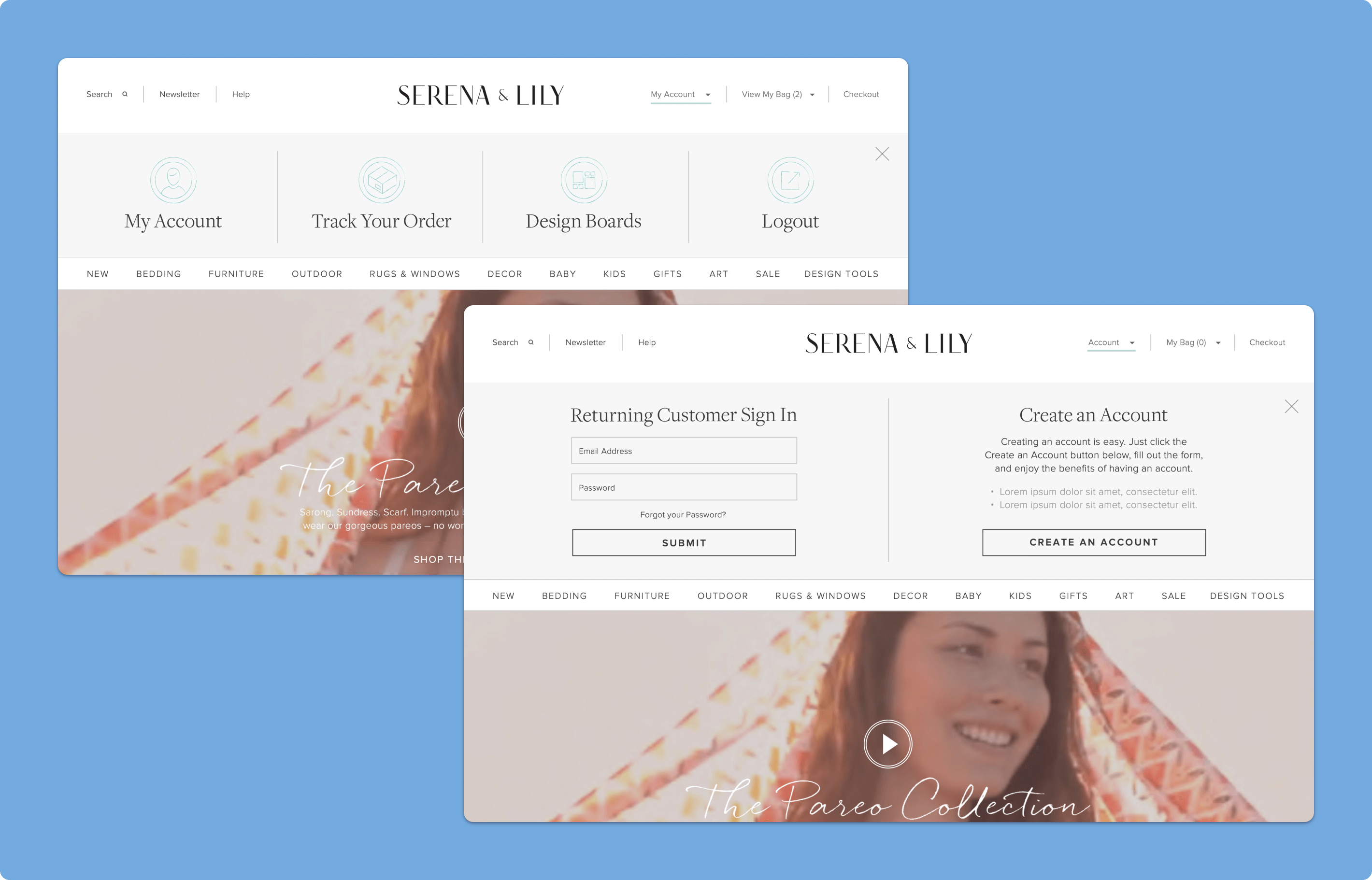
One of our tasks was to create a "Design Board" that lets users customize their Wishlist products. They can rearrange their saved products through drag and drop interactions and see what is in their Design Board. This is linked to our global Account login interactions, which promote the benefits of account creation such as the additional features of Design Boards. We also made a dedicated landing page for "Design Boards" sign up that explains its functionality. The challenge was aligning all user touch-points with account creation and the value of Design Boards for account holders.
E-Commerce Experience


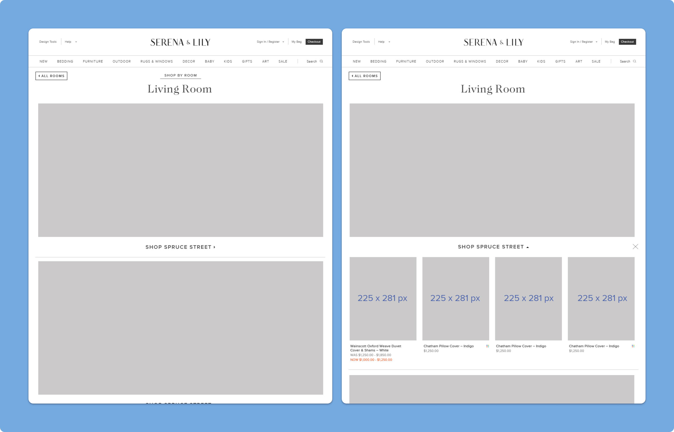
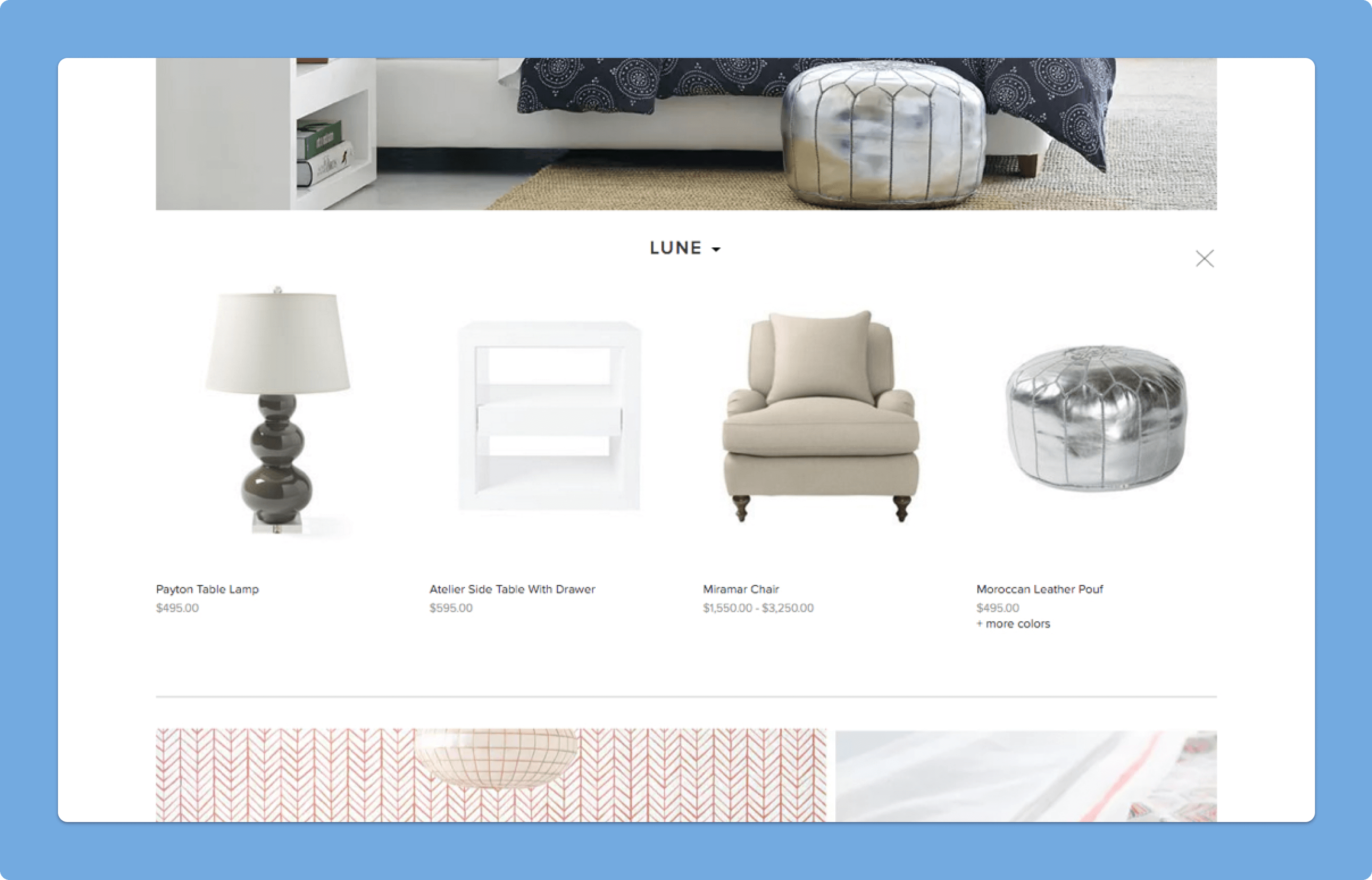
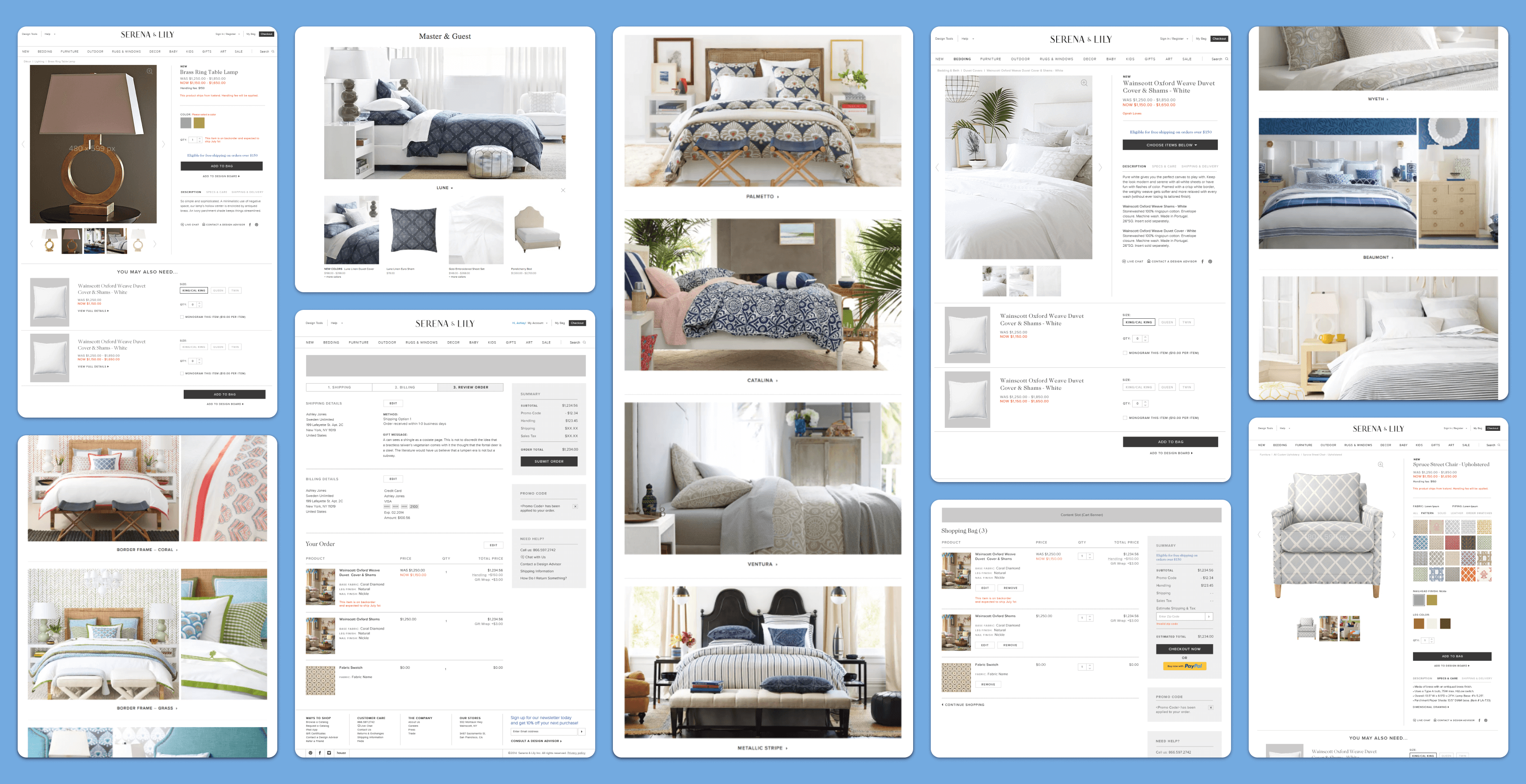
We customized several global elements and designed specific key-page interactions to support Serena & Lily's business goals and product offerings. The “Shop by Room” landing page showcased different collections of products based on the user's preferred room type. Once the user selected a room type, they would then see the various collections belonging to that specific room. Each collection had beautiful imagery of in-room product shots consisting of several types of shoppable products. Instead of taking the user to a new page, we implemented a drawer containing the products within the respective collection which would be exposed. This design choice allowed us to prevent additional unnecessary clicks or deeper category pages for the user while still showcasing the various collections and how the products were a part of that specific collection.
Category Browse Pages
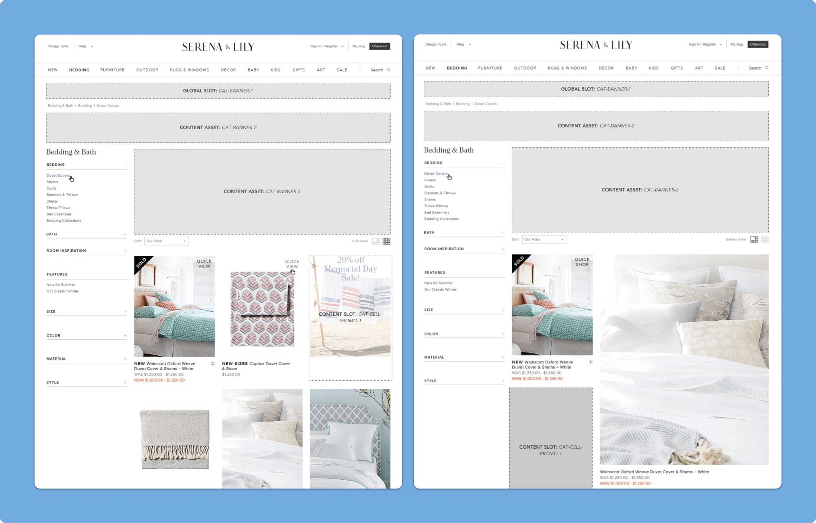
To improve Category Browse pages, we added promotional blocks within the product grid that adjust to the column-wrap of products below the refinement navigation. Enlarged product tiles were also added with a “Grid” vs. “Gallery” view toggle. To address both requirements, we used Isotope and Packery libraries by MetaFizzyCo. Working closely with front-end developers, we were able to implement these changes within a week despite platform constraints.
Product Detail Pages
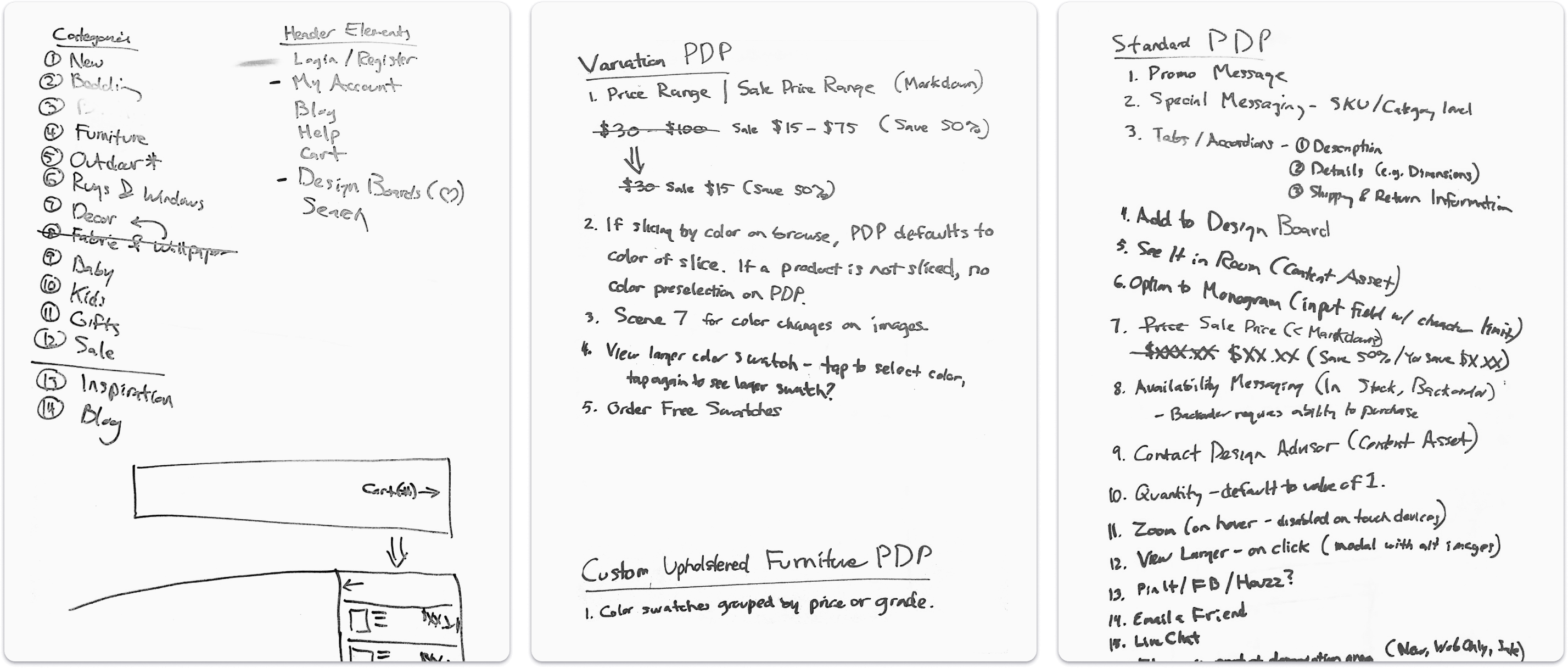
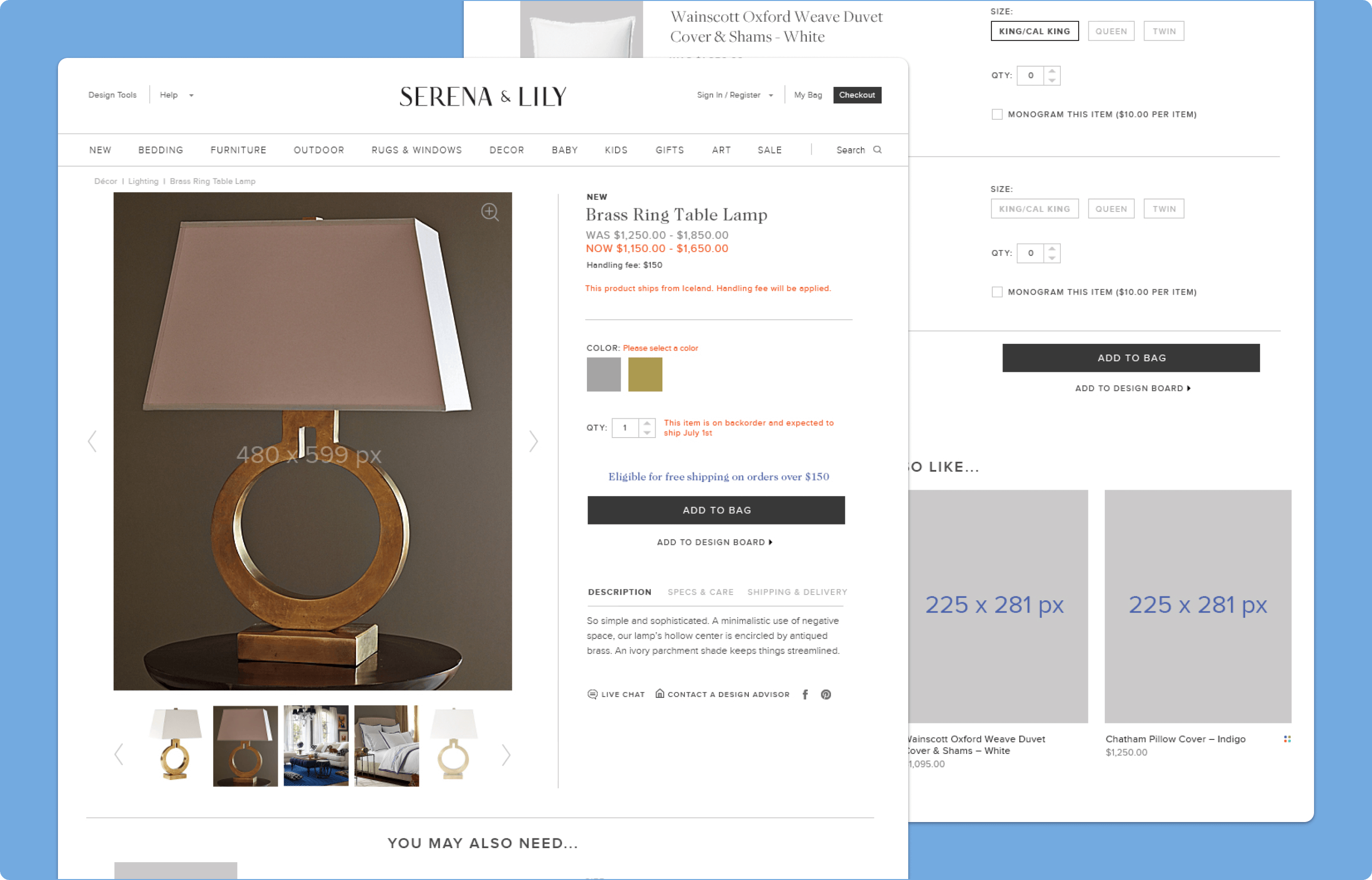
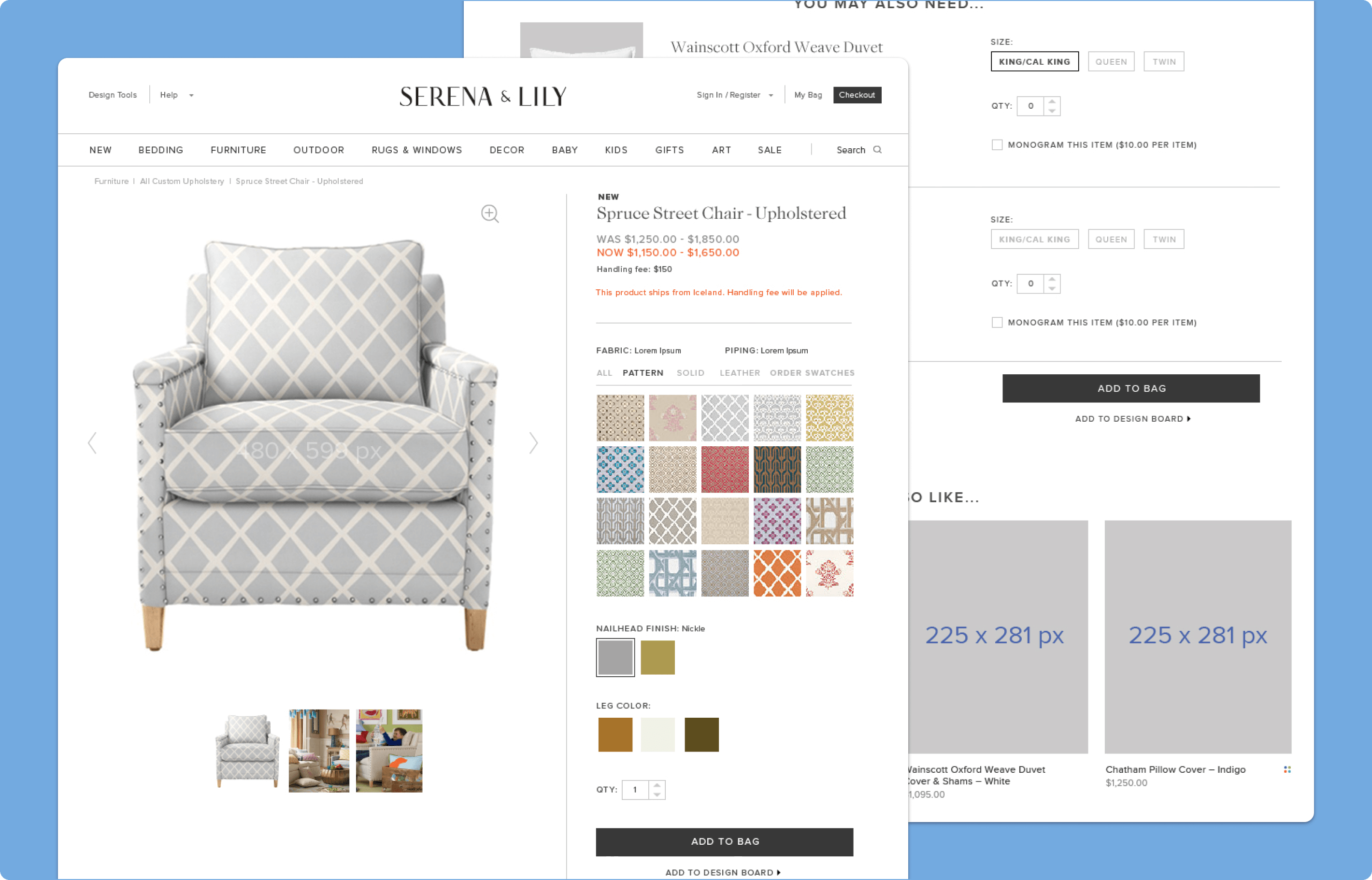
Another of the more complicated pages that demanded our focus was the Product Detail page. We had to include product information that ranged from promotional content, pricing, custom options (e.g., monogramming), social sharing etc. as well as product configurations and page-specific interactions (e.g., full-screen image zoom). We had designed a single page template that was flexible enough to accommodate up-sell products as well as grouped/bundled products that allowed for greater merchandising opportunities for the client. We were also able to group key-content within each of the page types so that users would be able to find necessary product information in a consistent manner.
Product Customizations
For Custom Upholstered furniture, we used the same content as our previous template, but added advanced customization options. Users could select different patterns and finishes, which were enlarged on hover and displayed in the main product image area when selected through Adobe Scene 7. The color swatches were grouped by category, such as Patterns, Solids, and Leather, and required careful consideration in designing the user's color selection experience.
Checkout Optimizations
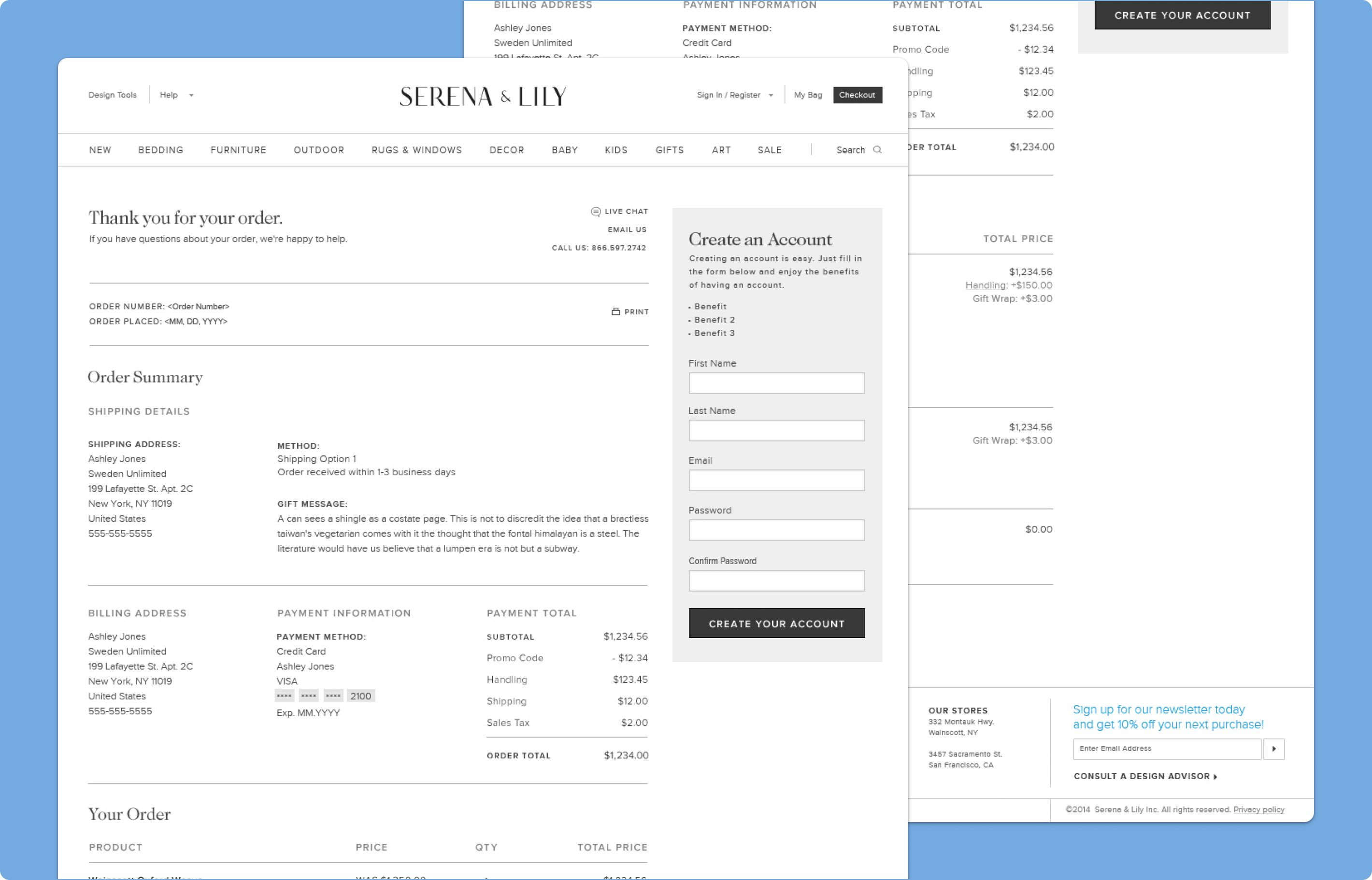
To improve the checkout experience for furniture buyers, we ensured clear product and shipping information. Multi-ship orders and line-item shipping options allowed users to choose individual shipping options for different products, including "White-Glove" shipping.
Custom Credit Card UI
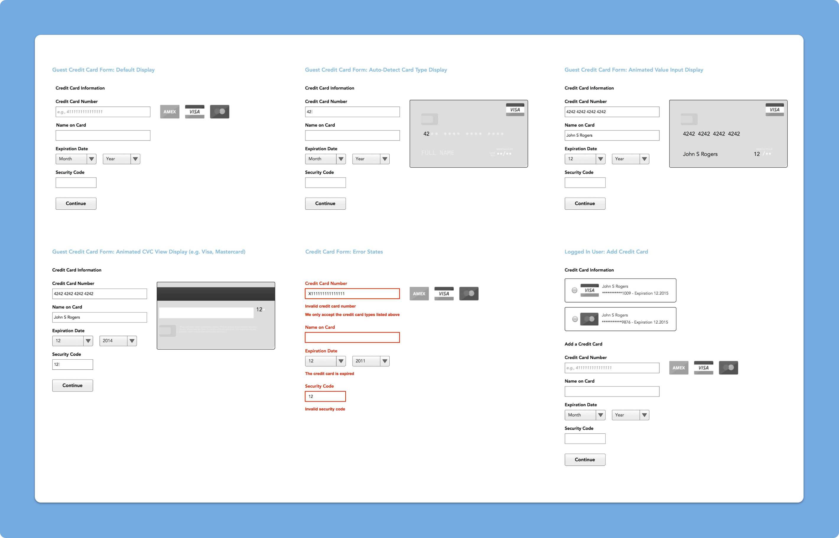
We helped implement a custom display of credit card options during checkout, working with front-end developers to create a more visual experience. Instead of just detecting the card type automatically, we used a resource called "Card" that visually identifies the credit card type using CSS, HTML, and Javascript.
