SERENA & LILY
Unique e-commerce experience for home & lifestyle brand.
iA / UX
Information Architecture / Wireframes / Prototype
DISCOVERY
Serena & Lily designs and sells furniture, with offerings spanning dining room furniture, custom upholstered sofas and even sheets or candles. Serena & Lily’s goal is to bring your style into your home through beautiful color options and a long list of available patterns and material. S&L approached the team at LYONSCG to implement a new design with additional functionalities that set them apart from the competition. Working with Sweden Unlimited, we began our process of designing a uniquely branded experience that comprised of a number of features and functionality that would allow for greater brand engagement, heightened product discovery as well as in-depth product customizations.

INFORMATION ARCHITECTURE
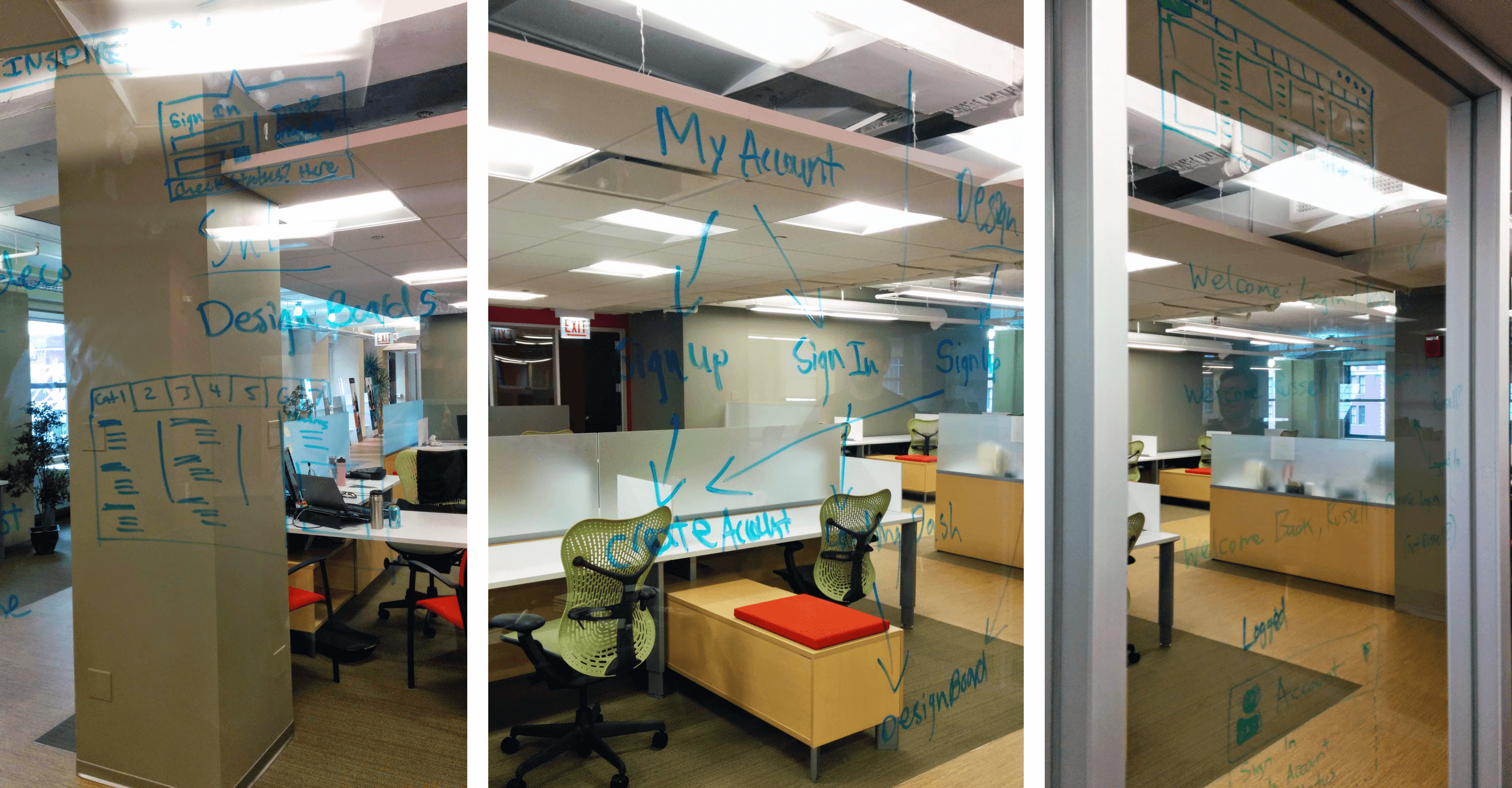
One of the key features we were tasked with implementing was a “Design Board” that made use of default Wishlist functionality within Demandware with customizations to allow for greater user-control. Essentially, when users would save products to their boards they were able to rearrange the saved products visually through drag and drop interactions while also allowing for a better understanding of what products were contained within the user’s Design Board. This tied into how we were designing the global Account login interactions, with boards being promoted as a benefit of account creation along with the additional features of the Design Boards. We had also designed a dedicated landing page for “Design Boards” sign up that consisted of a more detailed presentation of the Design Boards’ functionality for the user. One of the more challenging aspects of this task was aligning all of the user’s touch-points with account information/creation and the value of “Design Boards” for account holders.
E-COMMERCE EXPERIENCE
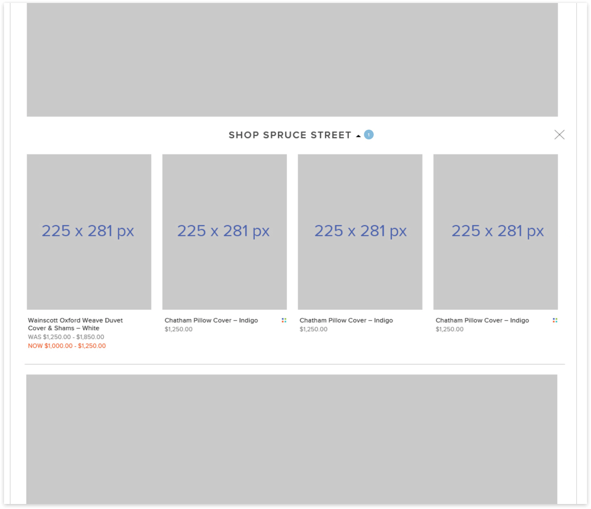
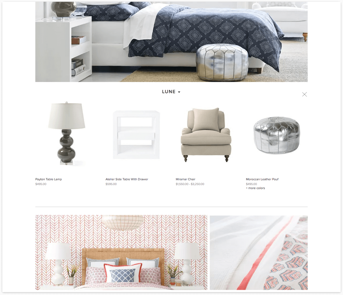
In addition to the more general customizations introduced to some of the global elements, we had to also design specific key-page interactions that supported Serena & Lily’s various business goals and product offering. We began with a landing page design that showcased different collections of products that belonged to a specific type of room that the user would be looking to shop for. After the user selected the room type of their choice (e.g., Bedroom) they would then be shown the collections belonging to that specific room. Serena & Lily provided beautiful imagery of in-room product shots that consisted of numerous types of shoppable products within the collections. When a user clicked on the name of a collection, instead of taking the user to a new page (adding to the number of clicks to product), we chose to implement a drawer containing the products within the respective collection that would be exposed, pushing the content below down the page. The client’s goal was to showcase the various collections and how the products were a part of that specific collection, which we worked closely with the client and Sweden Unlimited on the design in order to prevent additional unnecessary clicks or deeper category pages for the user.
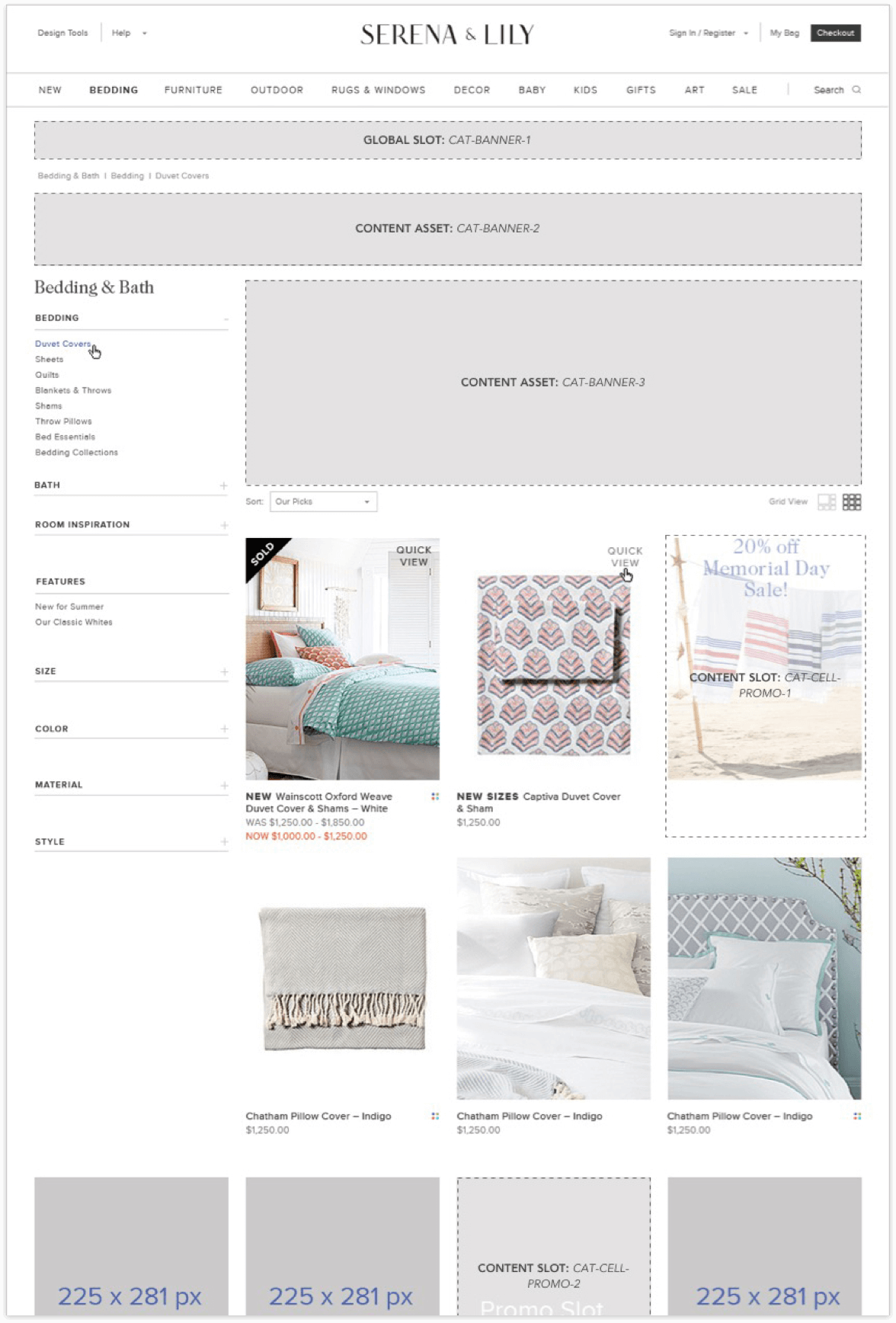
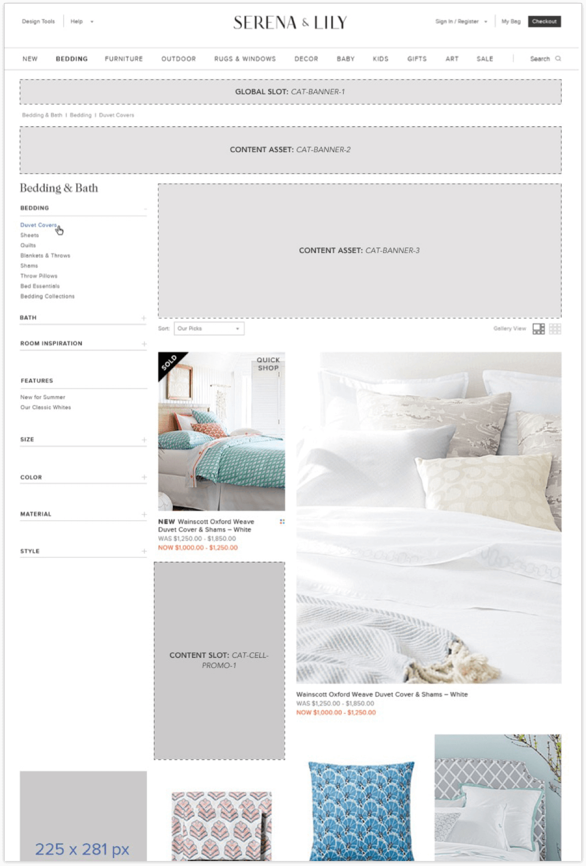
For Category Browse pages we incorporated our requirements of in-line promotional blocks within the product grid that contained a fluid layout to adjust the column-wrap of products below the refinement navigation. This was a complicated task from a development stand-point that needed the appropriate design solution in order to implement this functionality into the platform. This was done in combination with the client request of enlarged product tiles within the product grid that were controlled by the user through a “Grid” vs. “Gallery” view toggle on the Browse page. With these seemingly separate requirements in mind, I worked to bridge the gap between business requirements, design and development by seeking out a proper front-end solution that addressed all of our needs. After some quick research, I had found the Isotope and Packery libraries by MetaFizzyCo. After closely working with our front-end developers on addressing these requirements and the potential solutions I had found, we were able to implement the exact functionality the client had requested in little over a week. This was no small feat when working within rigid platform constraints.
Advanced Product Configuration
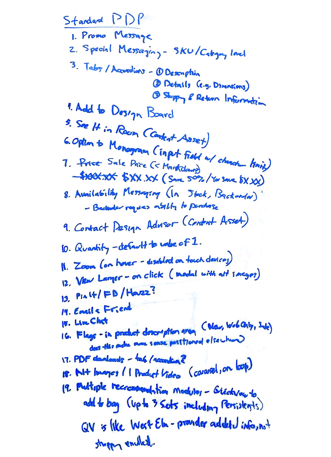
Another of the more complicated pages that demanded our focus was the Product Detail page. For Serena & Lily we had to incorporate a vast number of product information that ranged from promotional content, pricing, custom options (e.g., monogramming), social sharing etc. as well as product configurations and page-specific interactions (e.g., full-screen image zoom). We worked internally to list out all of the required content we needed to represent on the Product Detail page that allowed us to prioritize content for the user. Serena & Lily offer sophisticated product bundles that we also needed to prioritize in how each of the page templates translated consistently in how content was presented to the user. We had designed a single page template that was flexible enough to accommodate up-sell products as well as grouped/bundled products that allowed for greater merchandising opportunities for the client. We were also able to group key-content within each of the page types so that users would be able to find necessary product information in a consistent manner.
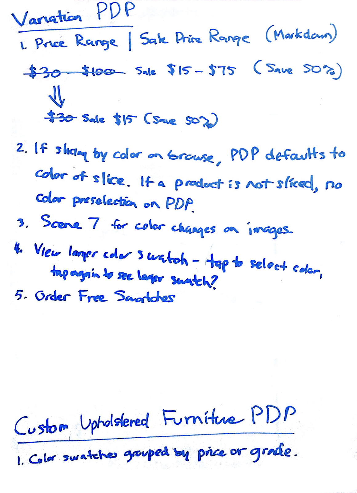
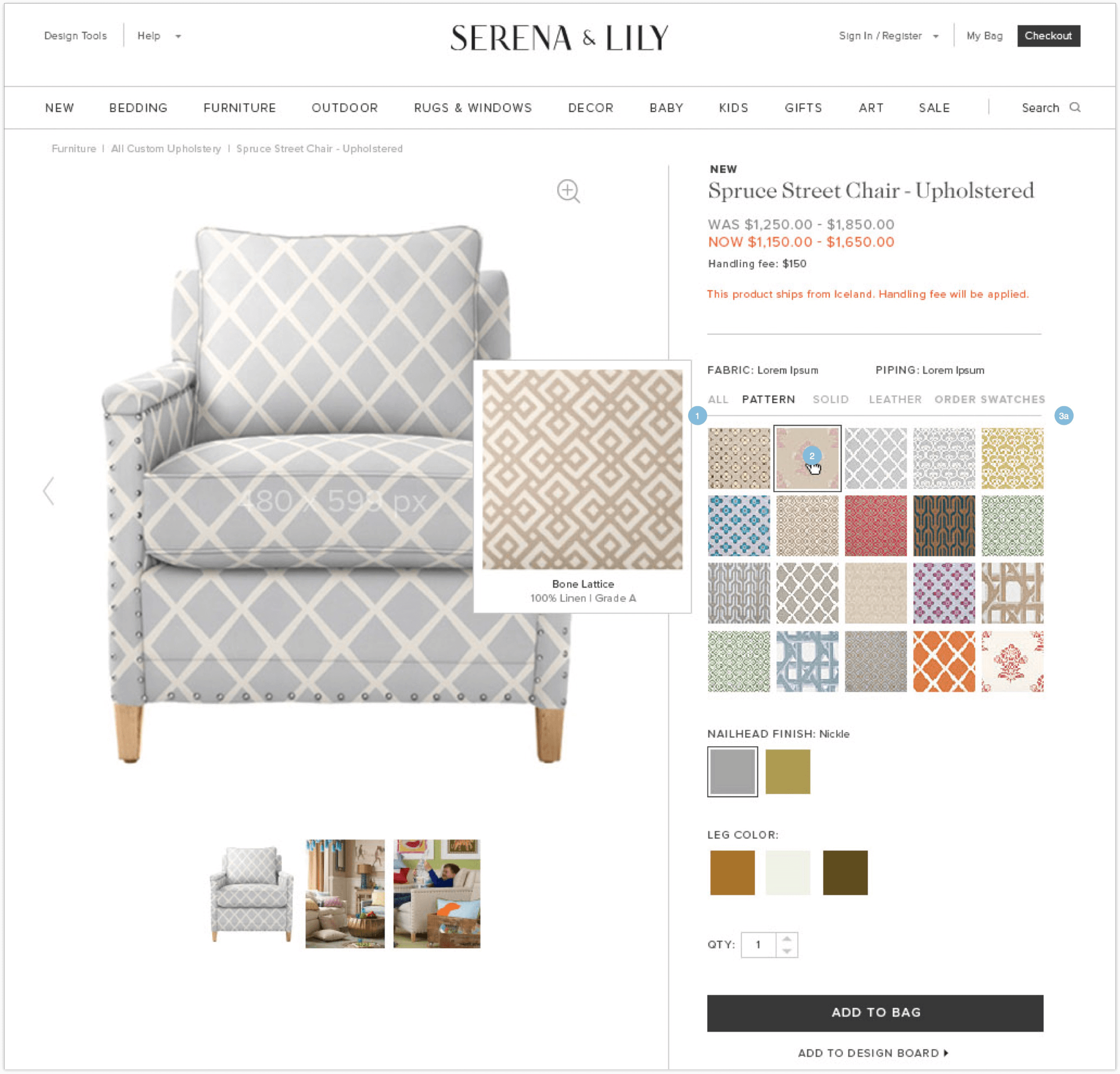
For Custom Upholstered furniture we leveraged much of the same content aggregation from our previous page template, but with the additional required functionality that comes with the advanced product customization that was offered. Unlike other products on the site, Custom Upholstered furniture allowed the user to select various patterns and finishes that were enlarged on hover as well as displayed in the main product image area when selected through an Adobe Scene 7 integration. One of the more complicated interactions was how the available color swatches were grouped by Patterns, Solids, Leather etc. It took a greater understanding of this specific integration’s functionality in order to design interactions for how the user was expected to select from the available colors.
Checkout Optimizations
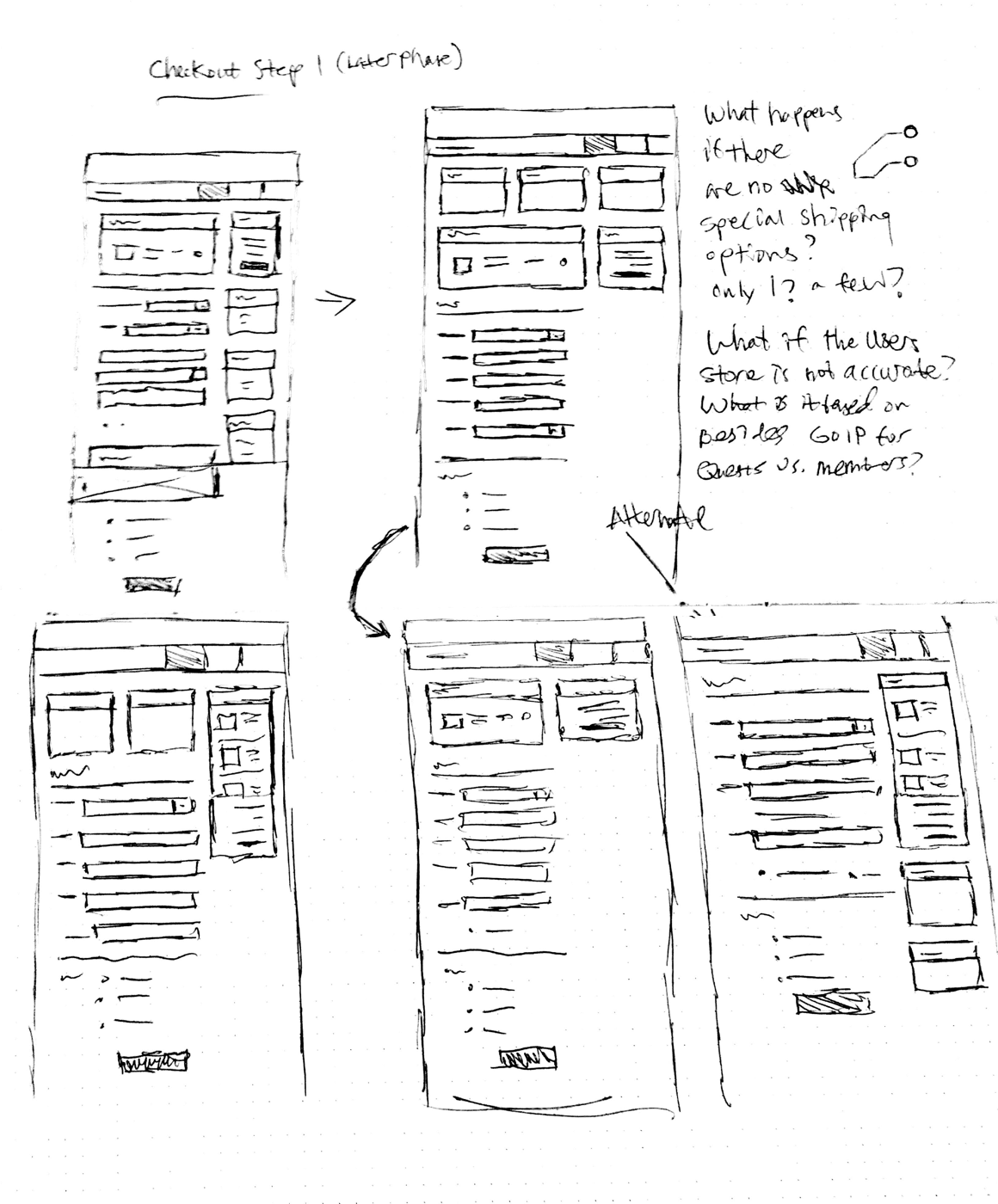
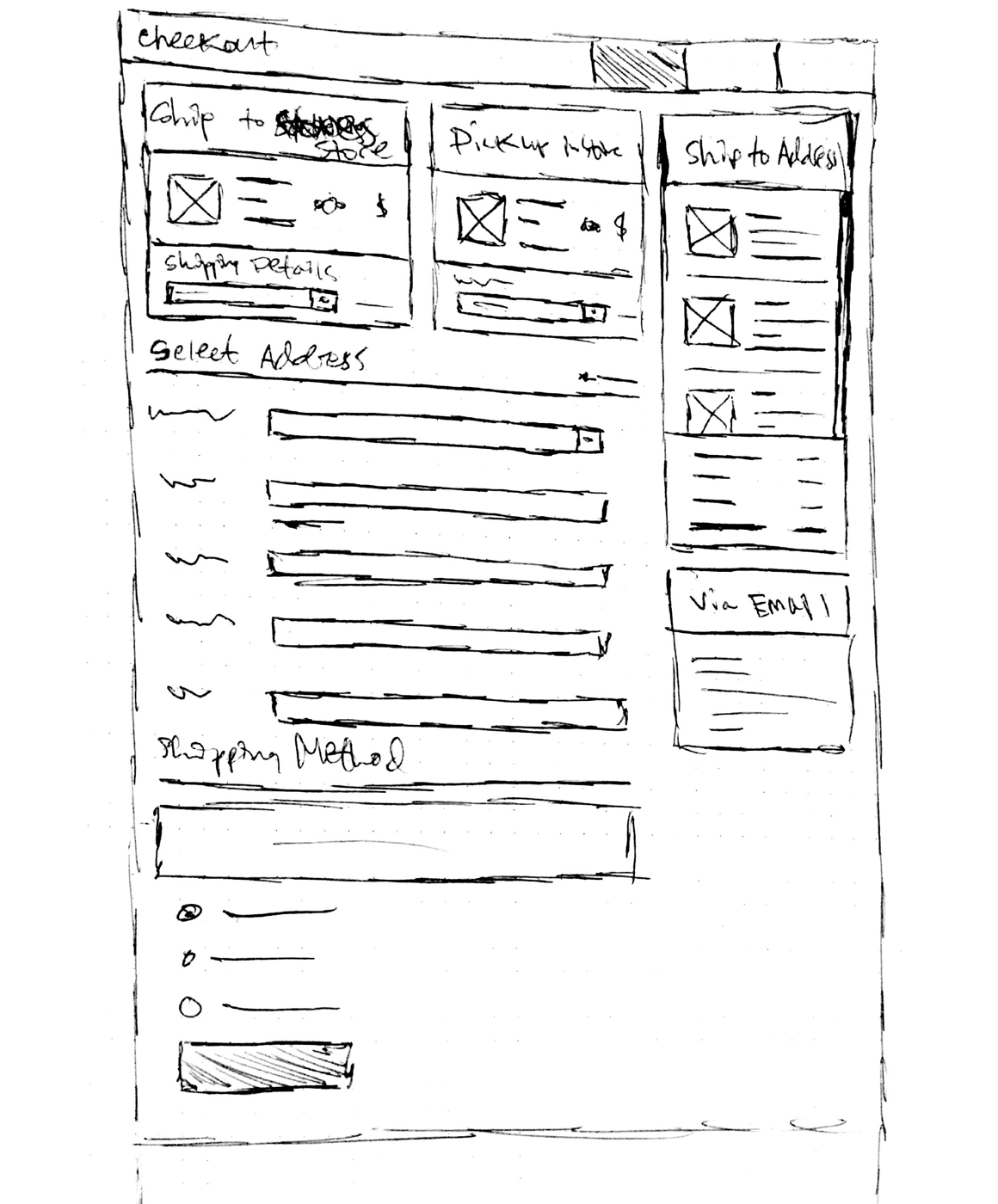
Due to the nature of selling Chairs, Sofas and other Furniture we needed to alleviate many of the potential flaws that the user would encounter in the checkout flow. Based on our initial business requirements, product information and shipping information needed to clearly explain what products the user was purchasing as well as when they could expect to receive their products. Additional Shipping options such as “White-Glove” shipping was dependent on the products within the order, which meant we needed a solution for multi-ship orders and line-item shipping options. This way, users could choose an individual shipping option for one product and another option for the other products.
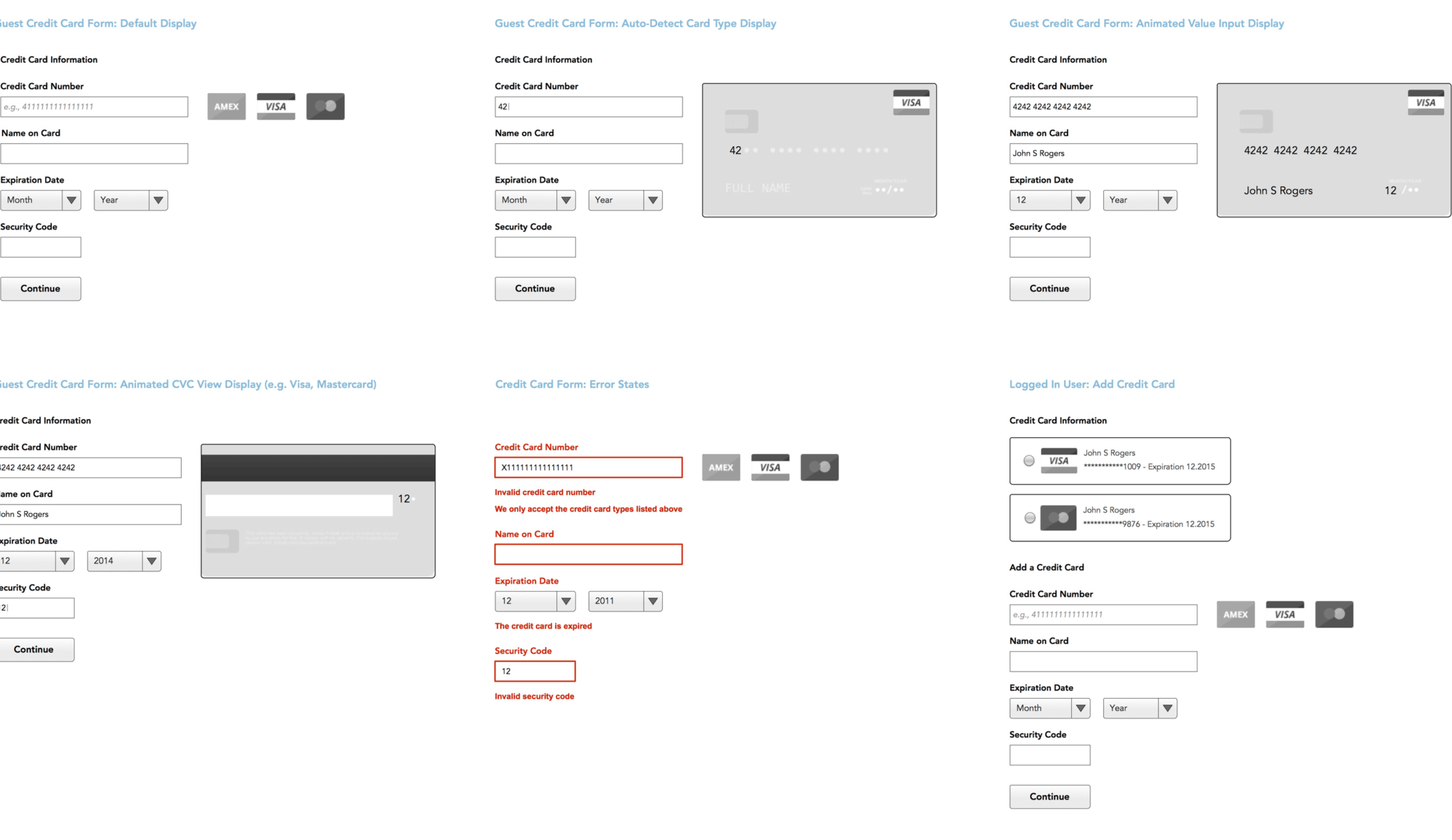
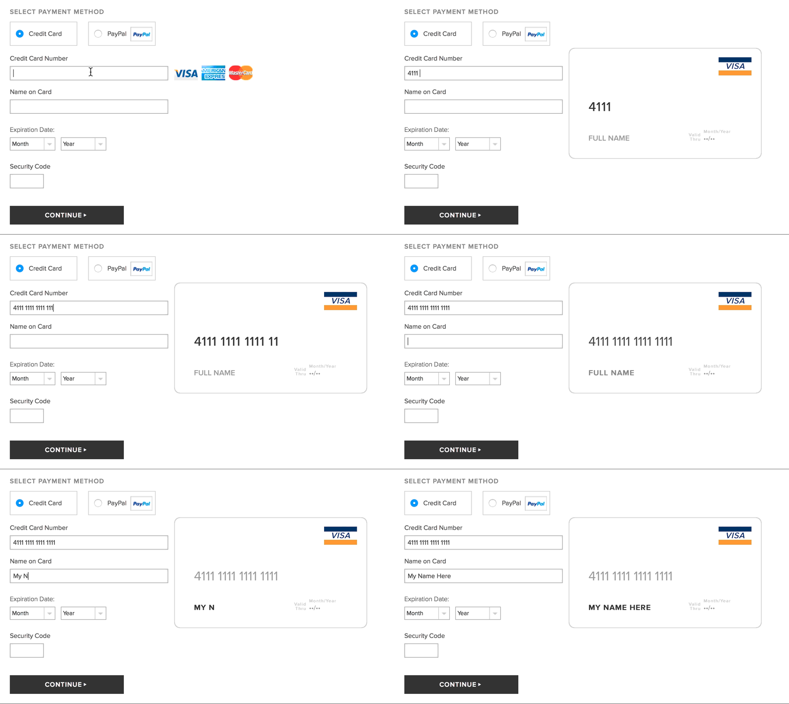
We were also responsible for implementing a customized display of credit card options within the billing step of checkout. Initially, the client had only requested that the user select the type of payment method by selecting a “button” or “card”. I worked closely with our front-end developers to incorporate additional functionality that not only met the client’s requirement but also added a more visual experience for the user. Rather than simply auto-detecting the card type in the Credit Card fields, I had found a resource called “Card” that visually identifies the credit card type through simple CSS, HTML and Javascript.
