Reinventing The Way You Clean
A content and commerce experience that helps users find the best robot vacuum for their needs
Platforms
Salesforce Commerce Cloud
Deliverables
Wireframes, Prototypes
Expertise
iA, UI / UX Design
Year
2015
Project Overview

A More Connected iRobot Shopping Experience
iRobot partnered with LYONSCG to rethink how its digital experience supported users moving from learning about products to purchasing them. The challenge was not simply to refresh the storefront, but to create a more cohesive relationship between the informational content experience and the commerce experience across separate domains and platforms. The work focused on reducing that disconnect so users could move more naturally through the purchase journey, with content, navigation, and page structure better supporting confidence before purchase.

Research Approach

A More Connected iRobot Shopping Experience
iRobot partnered with LYONSCG to rethink how its digital experience supported users moving from learning about products to purchasing them. The challenge was not simply to refresh the storefront, but to create a more cohesive relationship between the informational content experience and the commerce experience across separate domains and platforms. The work focused on reducing that disconnect so users could move more naturally through the purchase journey, with content, navigation, and page structure better supporting confidence before purchase.
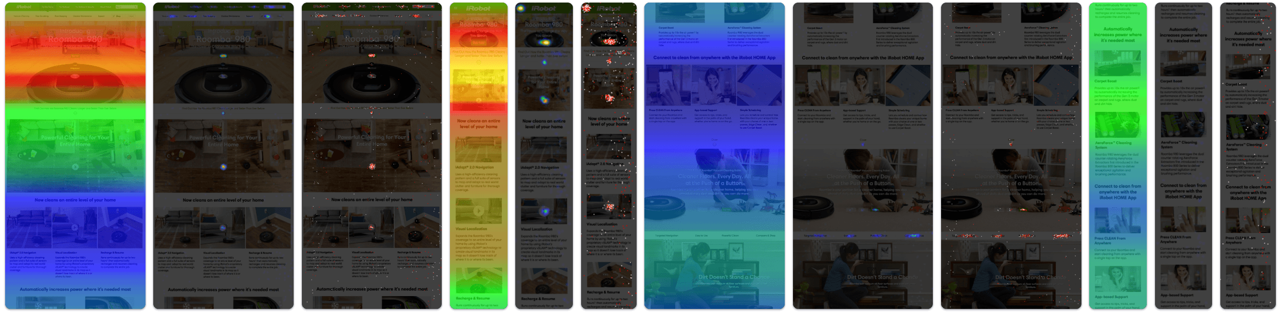
Key Research Themes
Content and Commerce Felt Disconnected
Users were moving between two environments that did not feel closely related, making the transition to purchase feel abrupt.
Users Needed More Confidence Before Buying
Many users appeared to enter the storefront before they had enough information, then moved backward to keep learning.
Navigation Was Contributing to Friction
The structure and persistence of navigation patterns across domains made it harder for users to understand where they were and how to move forward.
Storefront Needs More Informational Support
The commerce experience needed to do more than list products. It needed to help users compare options and continue learning without leaving the path to purchase.
Design Strategy

Making the Path to Purchase Feel More Seamless
The design strategy focused on closing the gap between product education and ecommerce by making the content site and storefront feel more coordinated through clearer navigation, greater visual continuity, and more useful product-supporting content within the shopping experience. This led to a stronger information architecture across domains and a storefront that better supported product understanding, resulting in an experience that felt more connected, more intuitive, and more supportive of the real customer journey.
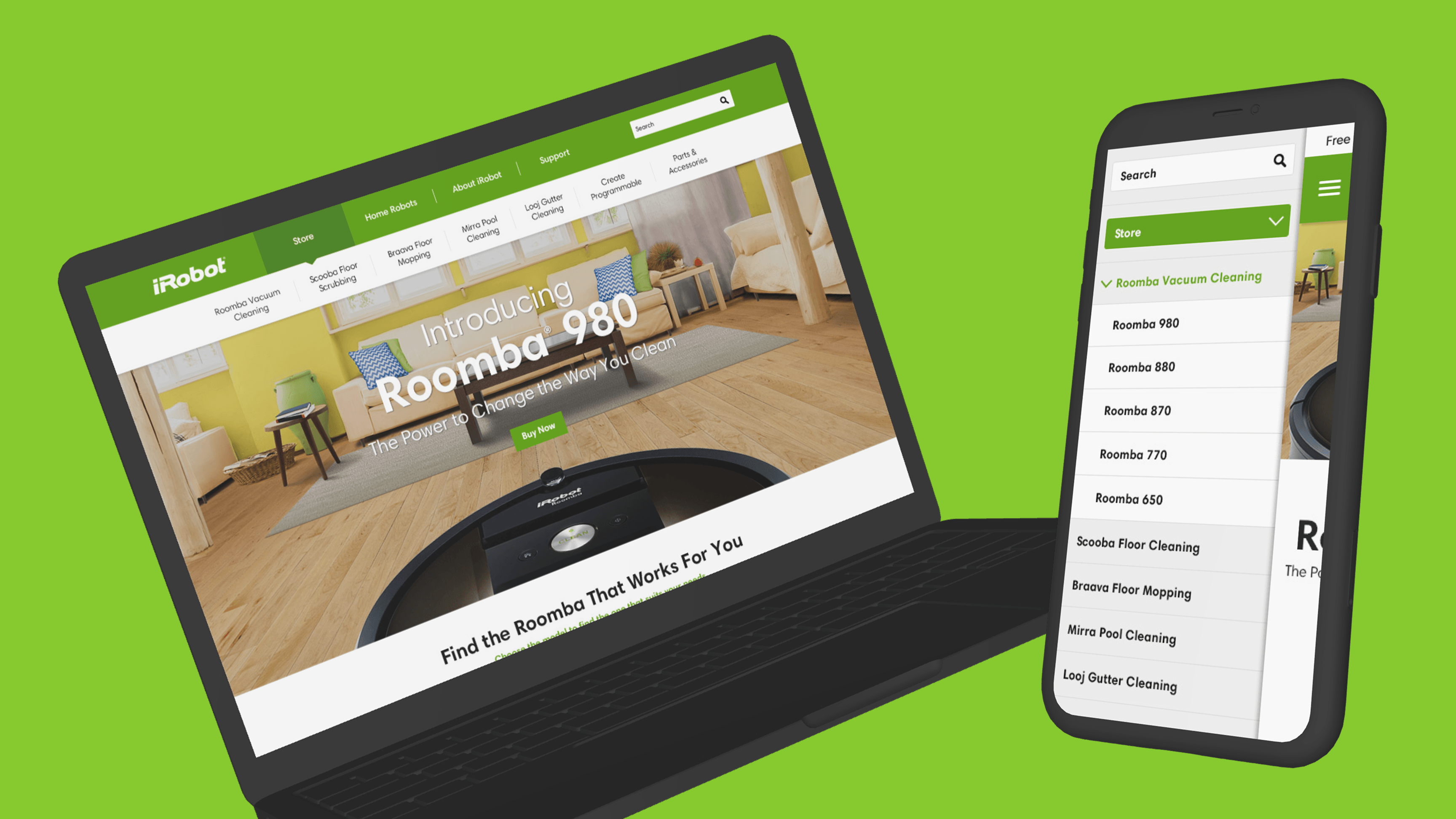
Navigation & Information Architecture
Creating Clearer Boundaries Between Content and Shopping
One of the core design challenges was that the content experience and storefront existed on separate platforms with different navigation behaviors and constraints. Rather than trying to make them identical, the strategy focused on making each environment clearer on its own while creating a more predictable transition between them. The navigation approach removed irrelevant content sub-navigation from pages where it did not belong and limited sub-navigation to the appropriate parent categories, helping ensure that content navigation stayed within the content domain while shoppable product navigation lived within the storefront. This made movement between learning and purchasing feel more intentional and less confusing.
Why it mattered:
- Reduced confusion caused by mismatched navigation patterns
- Helped users better understand where they were in the experience
- Created a clearer separation between browsing content and shopping products
- Made movement between domains feel more structured and predictable
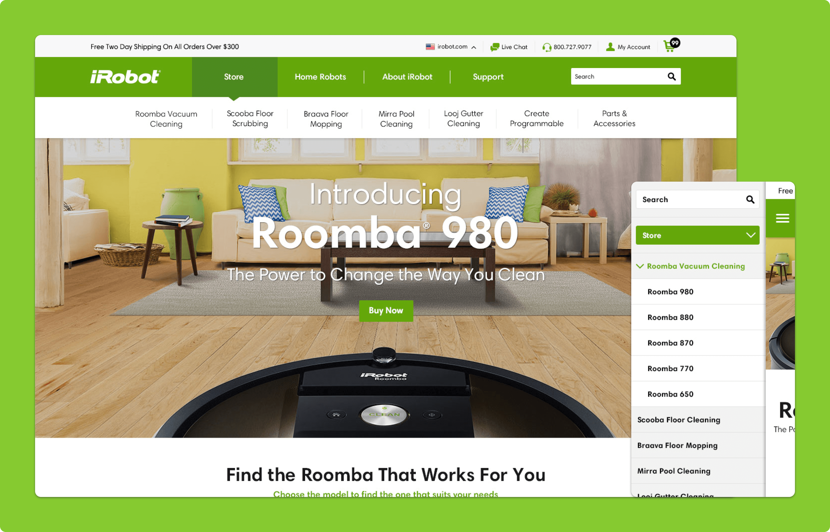
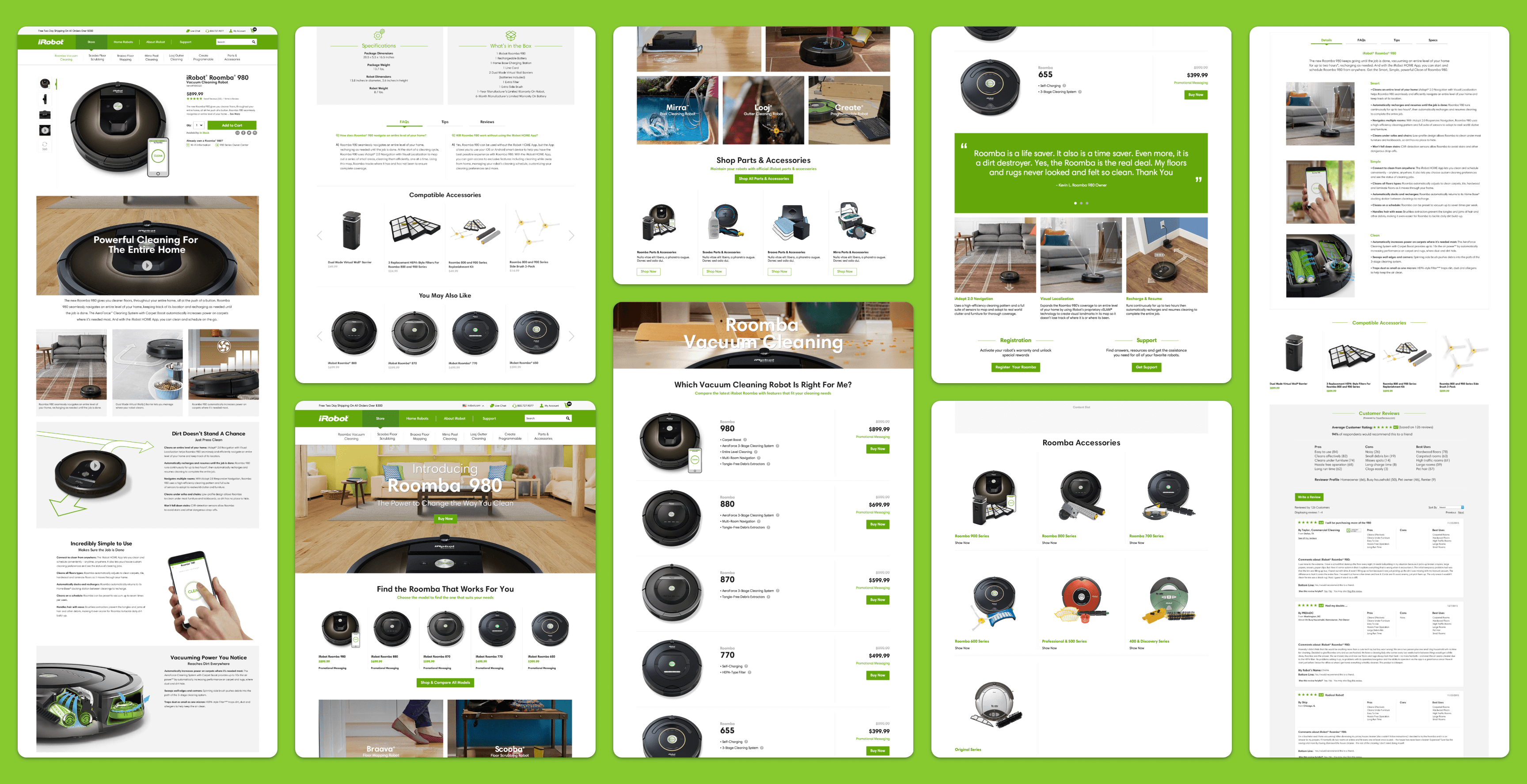
Storefront Homepage
Bringing More Continuity Into the Storefront Experience
The storefront homepage was redesigned to feel more connected to the broader iRobot brand and content ecosystem. Because many users were arriving from content pages or search, the homepage needed to do more than simply present products. It was designed to reinforce familiarity, carry over recognizable visual and messaging cues, and direct users toward more relevant interior shopping pages so the storefront felt less like a separate destination and more like a continuation of the same journey.
Why it mattered:
- Created stronger continuity between the content site and storefront
- Helped users feel more confident after crossing into the shopping experience
- Made the storefront homepage more useful as a navigation and orientation point
- Supported different entry paths, including content referrals and search traffic
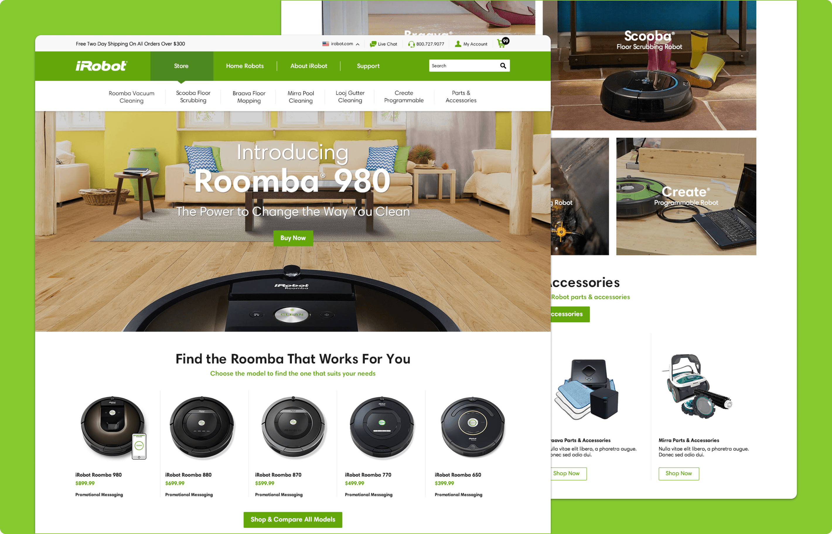
Product Comparison Experience
Making Product Differences Easier to Understand
One of the strongest existing pieces of content was iRobot’s robot comparison table, but it previously lived on the content site and pulled users away from the storefront. The redesign addressed that disconnect by bringing comparison-focused content into the commerce experience itself, allowing users to evaluate key differences across robot models in a more storefront-friendly format without leaving the path to purchase. This helped support both users who had already done research on the content side and those who still needed reassurance while actively shopping.
Why it mattered:
- Helped users compare models without leaving the storefront
- Reduced friction between product research and purchase decision-making
- Brought more informative content into the shopping experience
- Supported both early-stage exploration and near-purchase validation
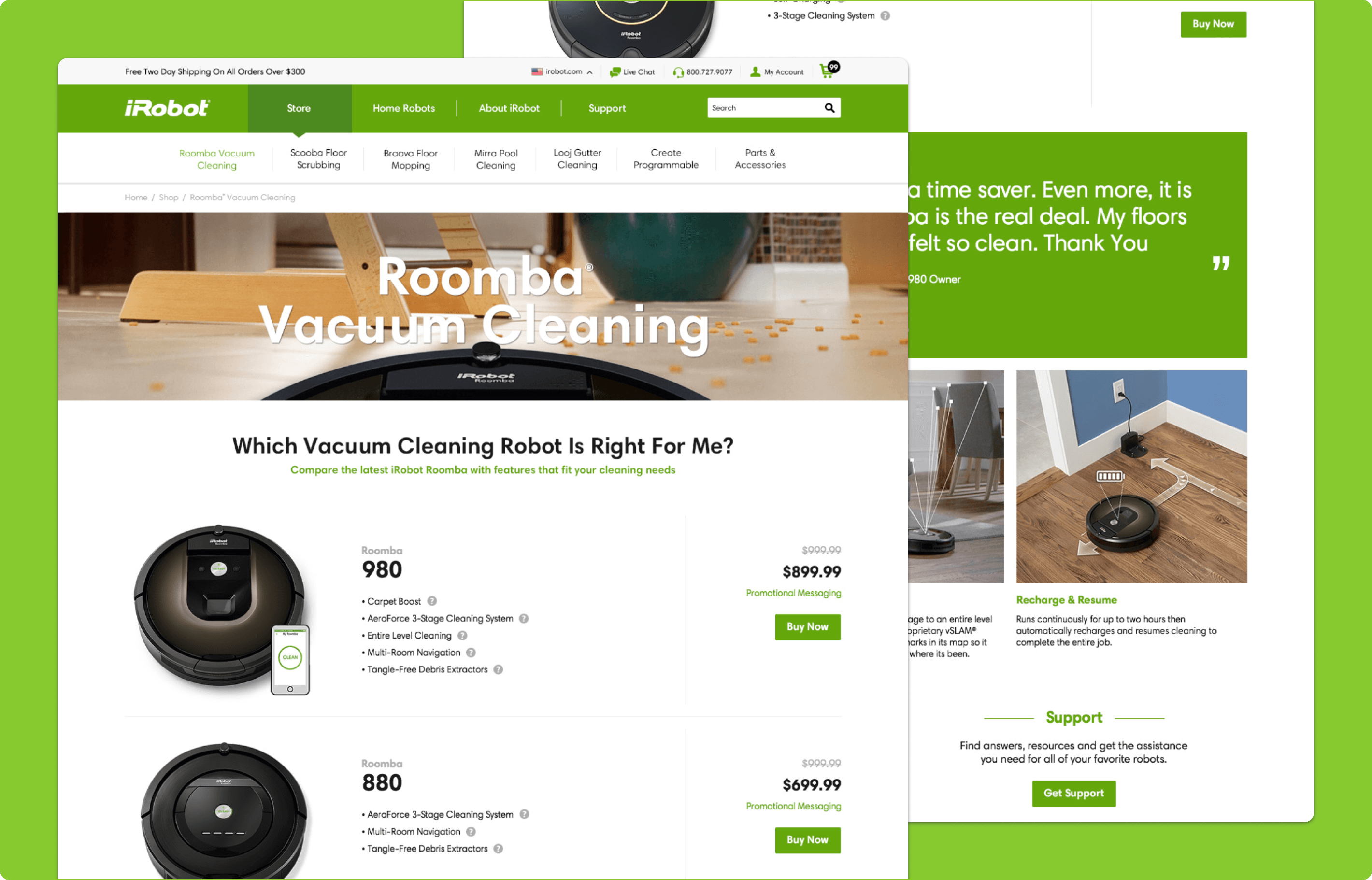
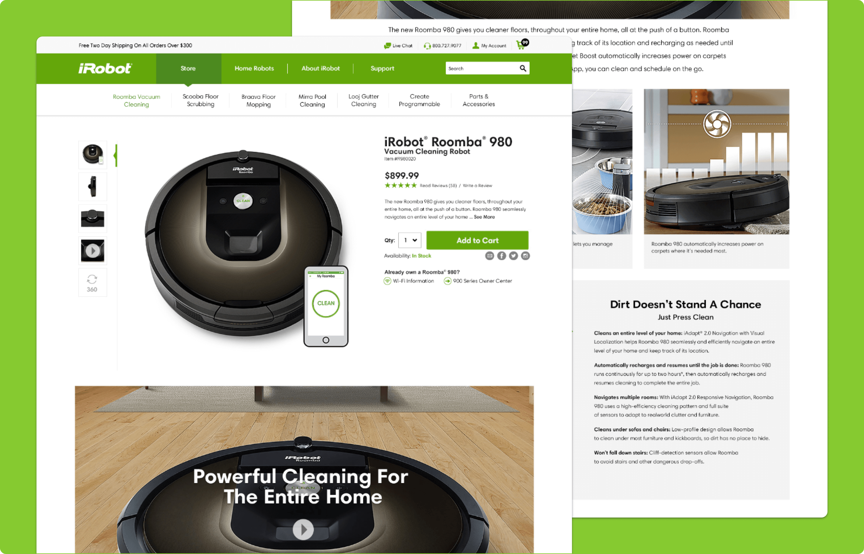
Product Detail Page
Bringing Product Education Into the Purchase Path
The product details page was designed to do more than support a transaction. It brought together large product imagery, pricing, promotional messaging, specifications, feature tabs, comparison-oriented content, compatible accessories, and customer reviews in one unified experience. Rather than forcing users to leave the page to keep learning, the design helped them understand what made the product valuable, explore key features in greater detail, evaluate add-ons, and build confidence through social proof, all while staying close to the point of purchase.
Why it mattered:
- Helped users continue learning without leaving the shopping flow
- Combined product education and purchase intent in one place
- Made the page more useful for comparison, validation, and decision-making
- Supported confidence through reviews, specs, and accessory recommendations