iRobot
Content & commerce together for revolutionary home robots.
iA / UX
Information Architecture / Wireframes / Prototype
DISCOVERY
iRobot designs and builds robots that make a difference. The award-winning iRobot Roomba is the flagship product that has set the standard for vacuum cleaning robots. iRobot approached LYONSCG with the task of redesigning their storefront to better align with their brand, incorporate e-commerce best practices and make the transition from content to commerce seamless for their users. iRobot is a multi-faceted company, with pursuits in defense & security, research & design and business development, all within the iRobot umbrella in parallel with consumer products found on their storefront. The first step in our process was to understand who our client was, so that we could take them to where they wanted to be.
INFORMATION ARCHITECTURE
One of our tasks with this redesign was to make the transition from content pages to products a seamless experience, due in part to technical limitations of primary and subdomains consisting of two separate platforms. This was certainly achievable by means of consistent visual design across domains etc., but the platform and technical constraints required more of a distinction between each domain’s navigation-schema and how the sites were capable of allowing the user to travel freely between the store and the informational content.
This wouldn’t be a new experience for their users, so taking a look at their analytics showed us where users were potentially getting lost, backtracking or just plain abandoning pages. From the store subdomain, most (if not all) of the traffic was coming from the content side but at different levels in the hierarchy. In almost all cases the user was taking their next step backwards in the hierarchy, potentially due to their arrival within the store site prematurely without having enough information of the product to make a purchase.
iRobot had previously done usability testing on their site before a recent rebrand, after looking at the user data and findings of those tests it was clear that there had been a disconnect between content and the storefront where the user would actually purchase the products. As it turns out, nothing had been done to remedy any of the problems that the usability study had exposed due to a recent redesign/rebranding effort. This was even more evidence that supported our hypothesis of the two domains functioning as a disjointed experience for their users.
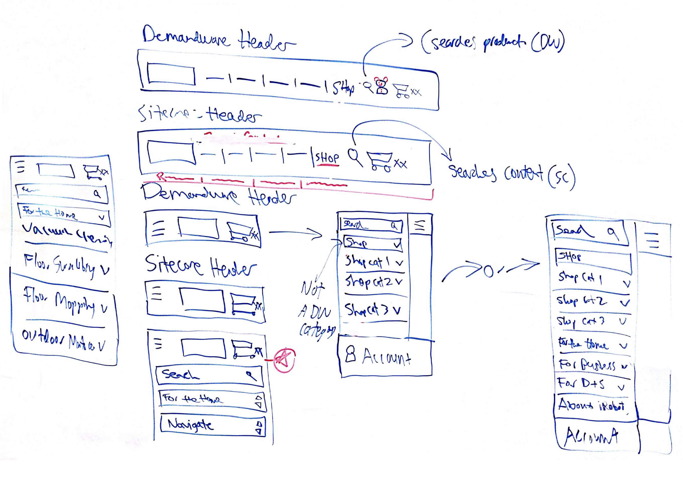
The first thing to address was the navigation, not only because of technical implications of two separate domains with two different platforms, but the sub-navigation from the content site was currently displayed on all other pages including those of the storefront. This was a potential flaw in the design that led to the users navigating to and from the storefront without having any idea how to get back to actually purchase a product.
We devised our strategy to eliminate content sub-navigation on all irrelevant pages and instead only show the sub-navigation for the applicable parent categories. This seems like a no-brainer, but the fact that the iRobot team had not previously been capable of achieving this meant it was the perfect time to make these changes. This meant that only sub-navigation of content pages would now be seen on the primary content domain, while allowing for shoppable product sub-navigation to live on the storefront domain. This gave us consistency in how the user navigates regardless of which site they were on, potentially easing the path of travel for their users that were progressing from content to purchase within their customer journey.
E-COMMERCE EXPERIENCE
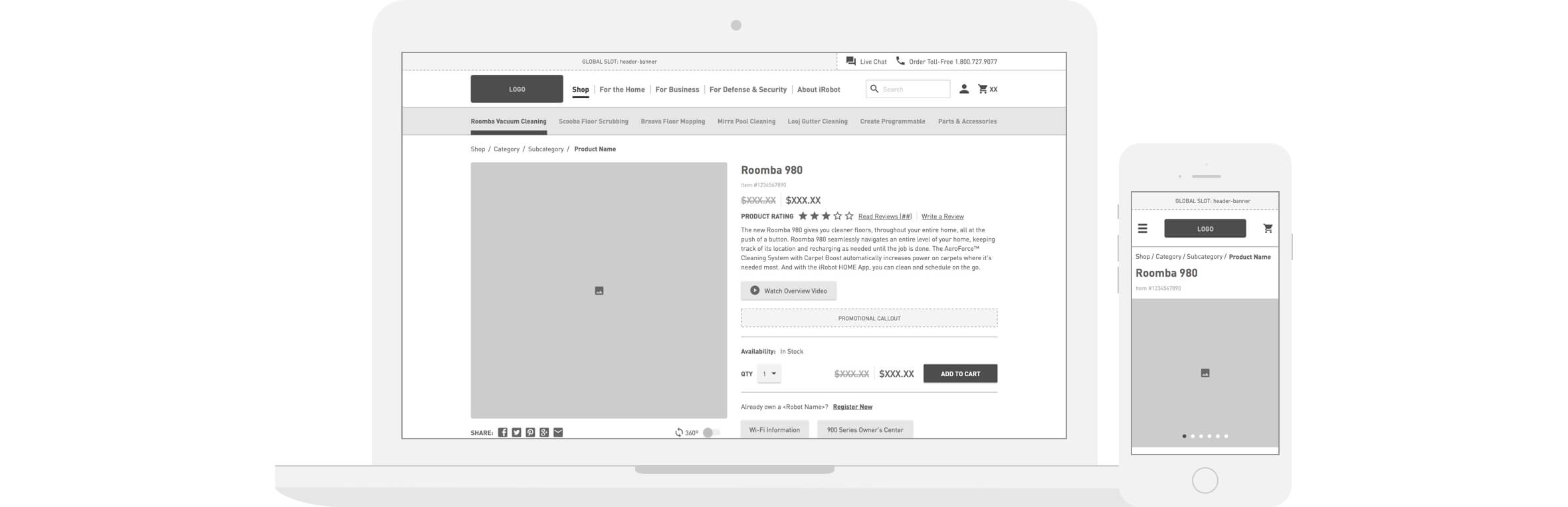
The existing problems with the storefront for iRobot were not only navigation focused, but also content specific. The content site had previously been the place for all information about the product that would convince users of why they wanted an iRobot Roomba Vacuum Cleaner, while the storefront was simply a shell that housed products and a few promotions on the side. In order to make the experience as seamless as possible, regardless of where the user was in their journey to purchase, we had to bring some of the more informational content over to the storefront to prevent users from losing interest or thinking they had made a misstep.
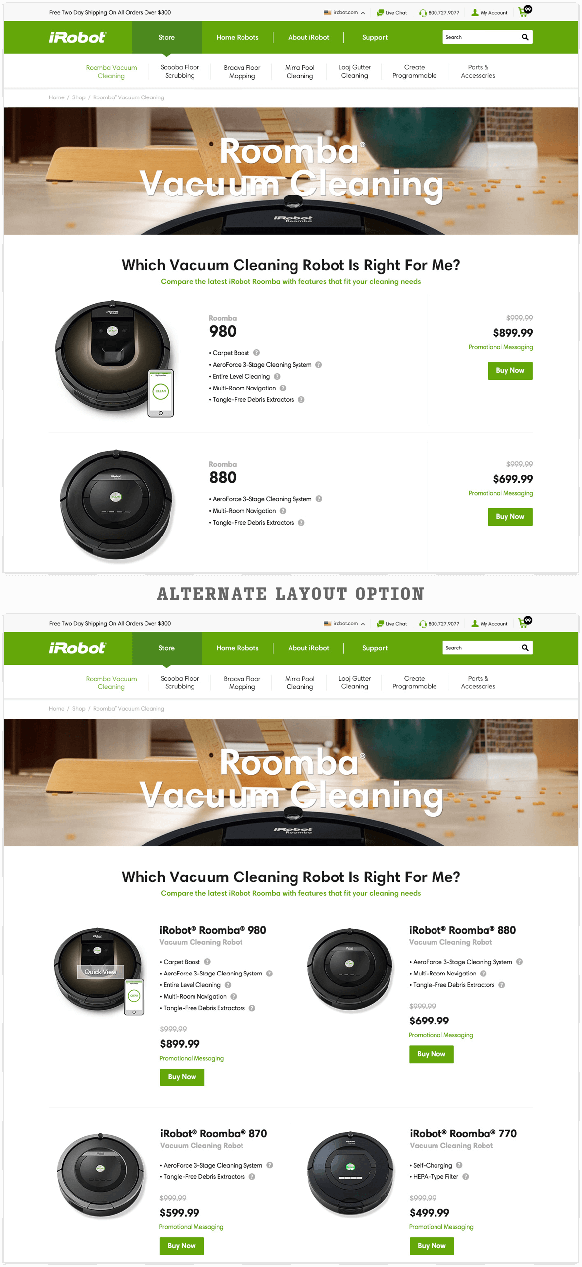
Consistency from Content to Storefront
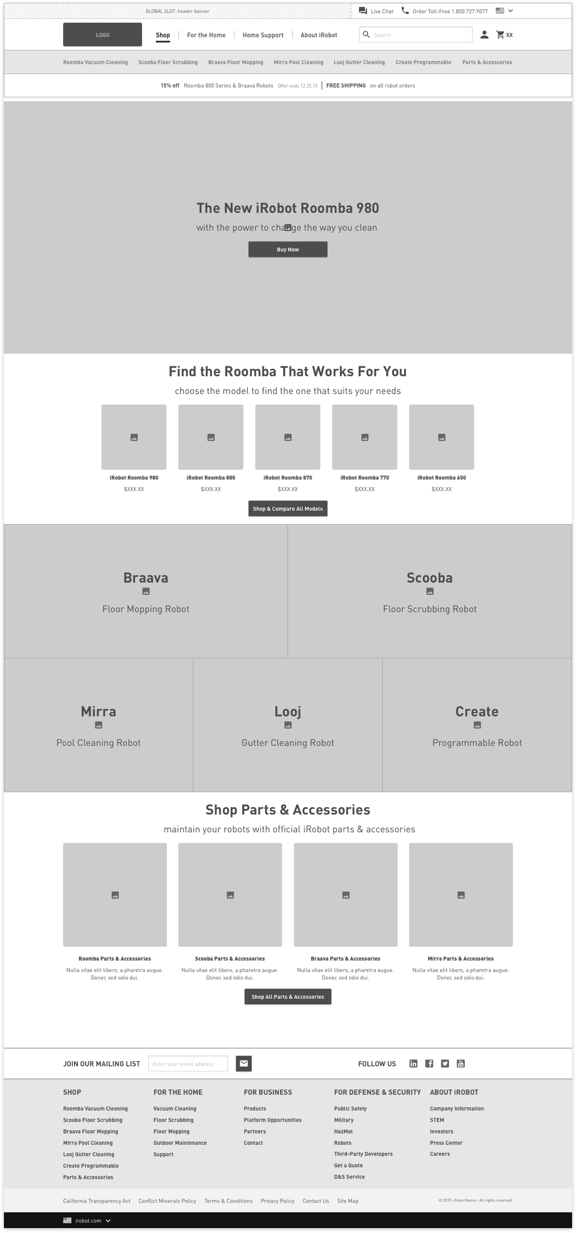
Previously on the storefront there was barely any recognizable carry-over from the content site. Users were traveling from the content site to the storefront and being thrown into an entirely different experience. Working with the design team, we had begun by utilizing many of the same assets from the homepage of the content site to be carried over to the homepage of the storefront. The storefront homepage was one of the least trafficked pages due in part to how the user was being directed from product pages on the content site to product pages on the storefront, essentially bypassing the storefront homepage a majority of the time. This gave us the chance to ensure consistency from the content site to the storefront while recognizing that most users who are on the storefront homepage are either coming from search or simply navigated to the storefront homepage intentionally from the content site navigation. We needed to direct users to interior pages while maintaining the similarities to the content site in order to accommodate users who were in varying points in their purchase journey.
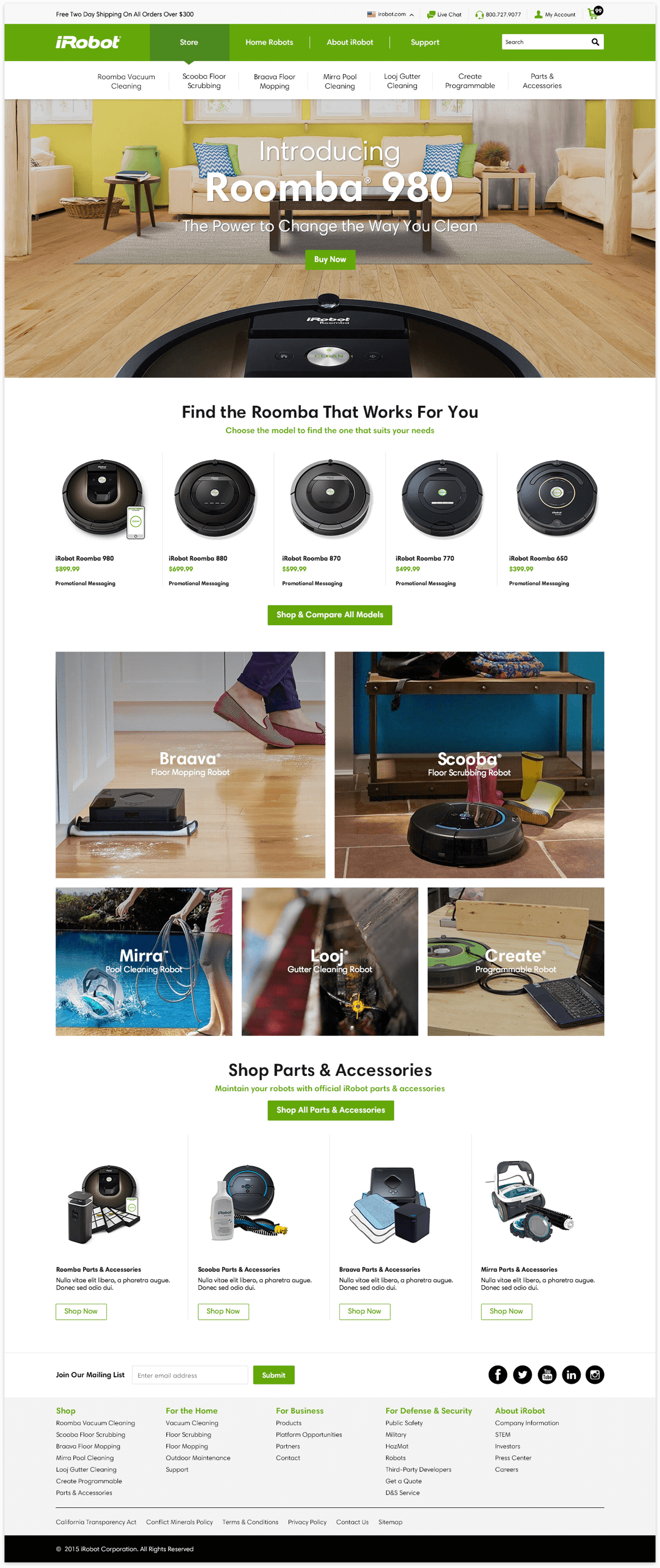
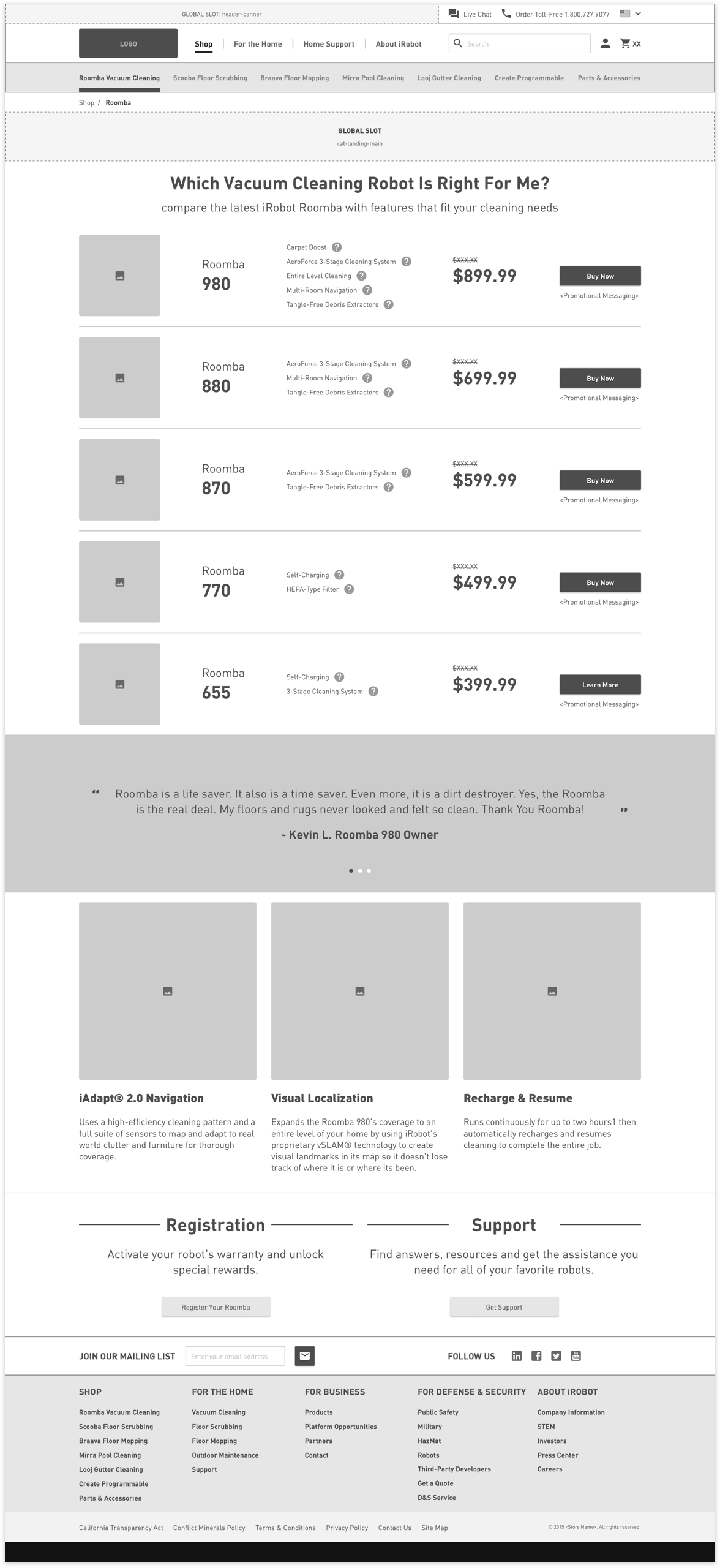
Optimized Robot Comparison
One of the most successful pieces of content that was revealed in iRobot’s previously done usability testing was the Robot Comparison table. Previously, this had only lived on the content site and was only referenced on the storefront as a link that would take the user away from the shoppable storefront and back to the content site where the comparison table lived. This was yet another case of the disjointed experience set up by the technical limitations of the old platform that didn’t allow for a cohesive experience for their users. I had worked with the design team to build a category page on the storefront that would summarize all of the major comparative features of each model of vacuum cleaner that would address both users who had traveled from the content site as well as new users looking for reassurance of their purchasing decision.