
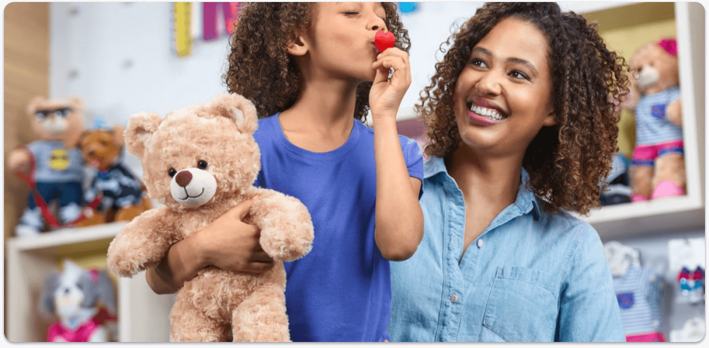
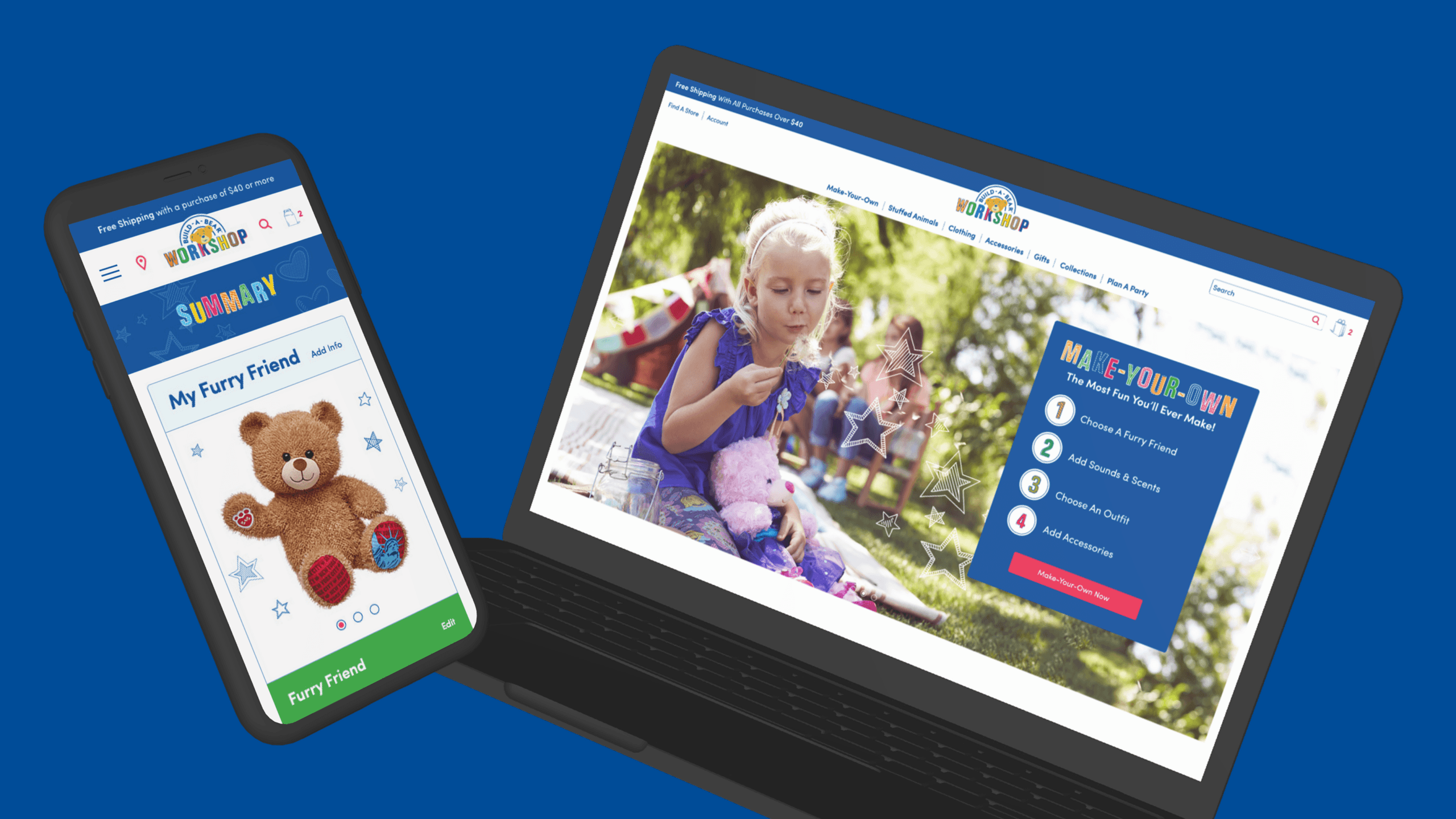
Experience Make-Your-Own Fun
Bringing life into the online experience with an iconic step-by-step stuffed animal creation
Platforms
Salesforce Commerce Cloud
Deliverables
Wireframes, Prototypes
Expertise
iA, UI / UX Design
Year
2015
Project Overview

Bringing the Build-A-Bear Experience Online
Build-A-Bear Workshop partnered with LYONSCG to redesign the online shopping experience with a focus on translating the fun, memorable nature of the physical store into digital form. The work centered on creating a more intuitive e-commerce journey, improving how customers browse and personalize products, and designing a step-by-step experience that captures the spirit of building a bear in person. The result was a more modern and engaging online experience designed to make customization, discovery, and purchase feel easier and more immersive.
Research Approach

Translating an Interactive Store Journey Into Digital
One of the core design challenges was figuring out how to bring an experience that is inherently physical, emotional, and hands-on into a digital environment without losing its charm. The team focused on how to organize the customization journey in a way that still felt playful and branded, while also making the site easier to navigate and more effective as an e-commerce experience. Early concepts explored step-by-step configuration patterns and new ways to structure the path from choosing a furry friend to completing a personalized purchase.
Key Research Themes
Online Needed To Feel More Like The Store
The redesign focused on capturing the playful, guided, and memorable qualities of the in-store Build-A-Bear experience rather than treating the website like a standard product catalog.
Customization Needed A Clearer Flow
Because personalization is central to the brand, the experience needed to help users move through product choices in a way that felt structured, intuitive, and fun.
Collections Needed To Be More Engaging
Featured and licensed collections had become an important part of the product offering, so landing pages needed to do more to showcase them and support browsing.
Shopping Flows Needed To Feel More Modern
The broader redesign aimed to improve usability across the site through cleaner interfaces, better navigation, and more engaging commerce touchpoints.
Design Strategy

Designing a More Playful Commerce Journey
The design strategy focused on making the Build-A-Bear website feel less like a traditional e-commerce site and more like a digital extension of the workshop experience. Rather than separating product discovery, customization, and purchase into disconnected steps, the work created a more connected journey across configuration, collection browsing, location finding, and product exploration. The experience emphasized guided personalization, stronger collection storytelling, and a more modern interface that made the brand feel both more usable and more emotionally engaging.
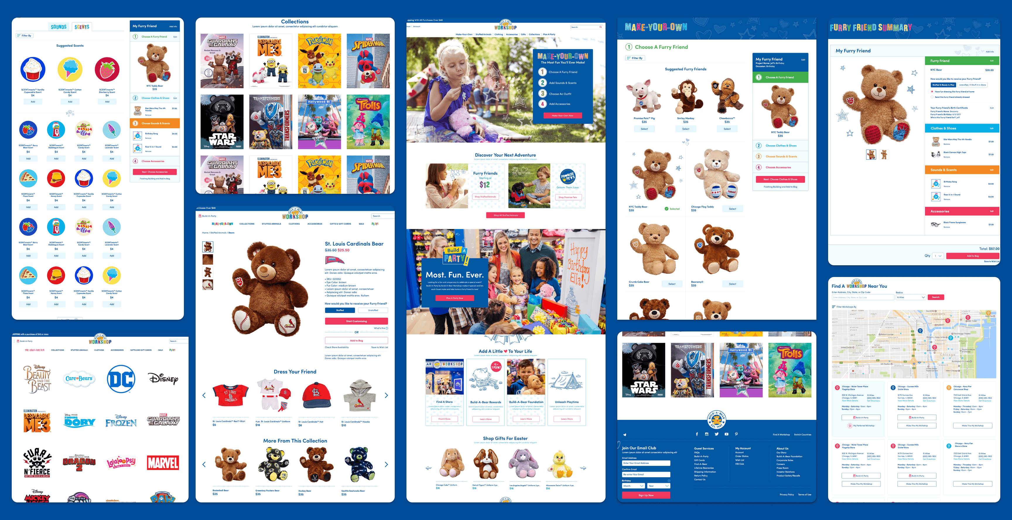
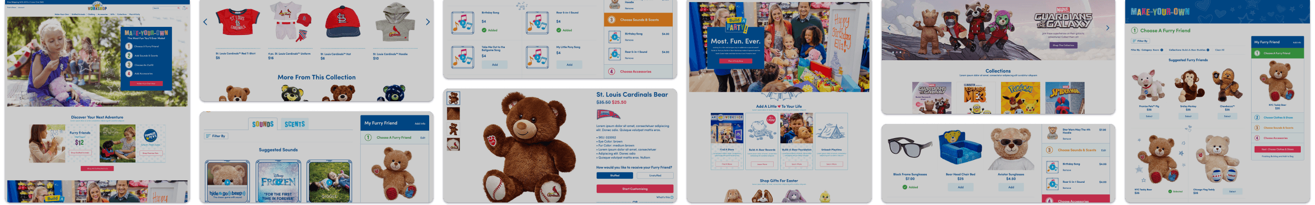
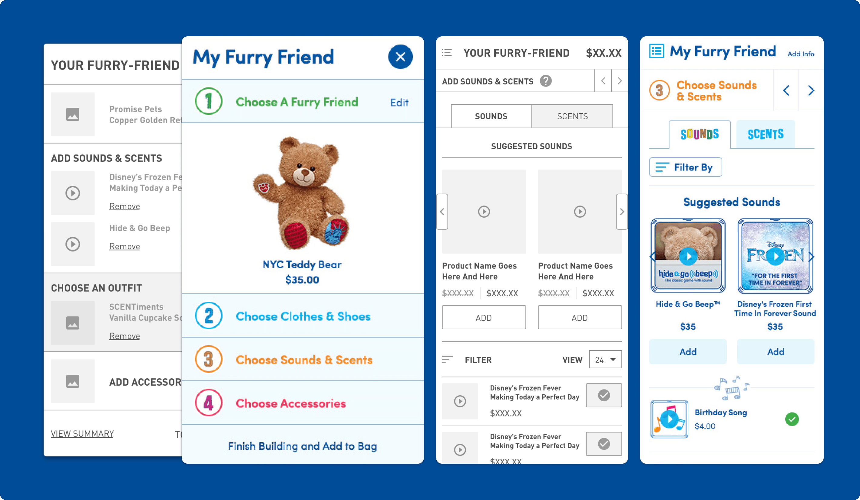
Product Configuration – Build-A-Builder
Recreating the In-Store Customization Journey
The Build-A-Builder experience was designed to mirror the step-by-step process customers go through in a physical Build-A-Bear Workshop. Instead of presenting customization as a flat list of options, the flow guides users through personalizing their furry friend in a more sequential and immersive way. This made the process easier to follow while helping preserve the sense of excitement and ownership that defines the in-store experience.
Why it mattered:
- Brought a signature brand experience into digital form
- Made customization feel more intuitive and engaging
- Helped users move through product decisions with less friction
- Reinforced the emotional value of creating something personal
Choosing Your Furry Friend
Creating A Better Starting Point For The Journey
The early steps of the configurator focused on helping customers choose their furry friend, which is the first defining moment in the Build-A-Bear experience. The design accounted for both original plush options and licensed character products, giving users a clearer way to browse a wider range of choices. This made the beginning of the customization journey feel more intentional and helped set up the rest of the experience more effectively.
Why it mattered:
- Clarified the first major decision in the customization flow
- Supported both core products and licensed collections
- Improved the structure of early product browsing
- Helped users begin the experience with confidence
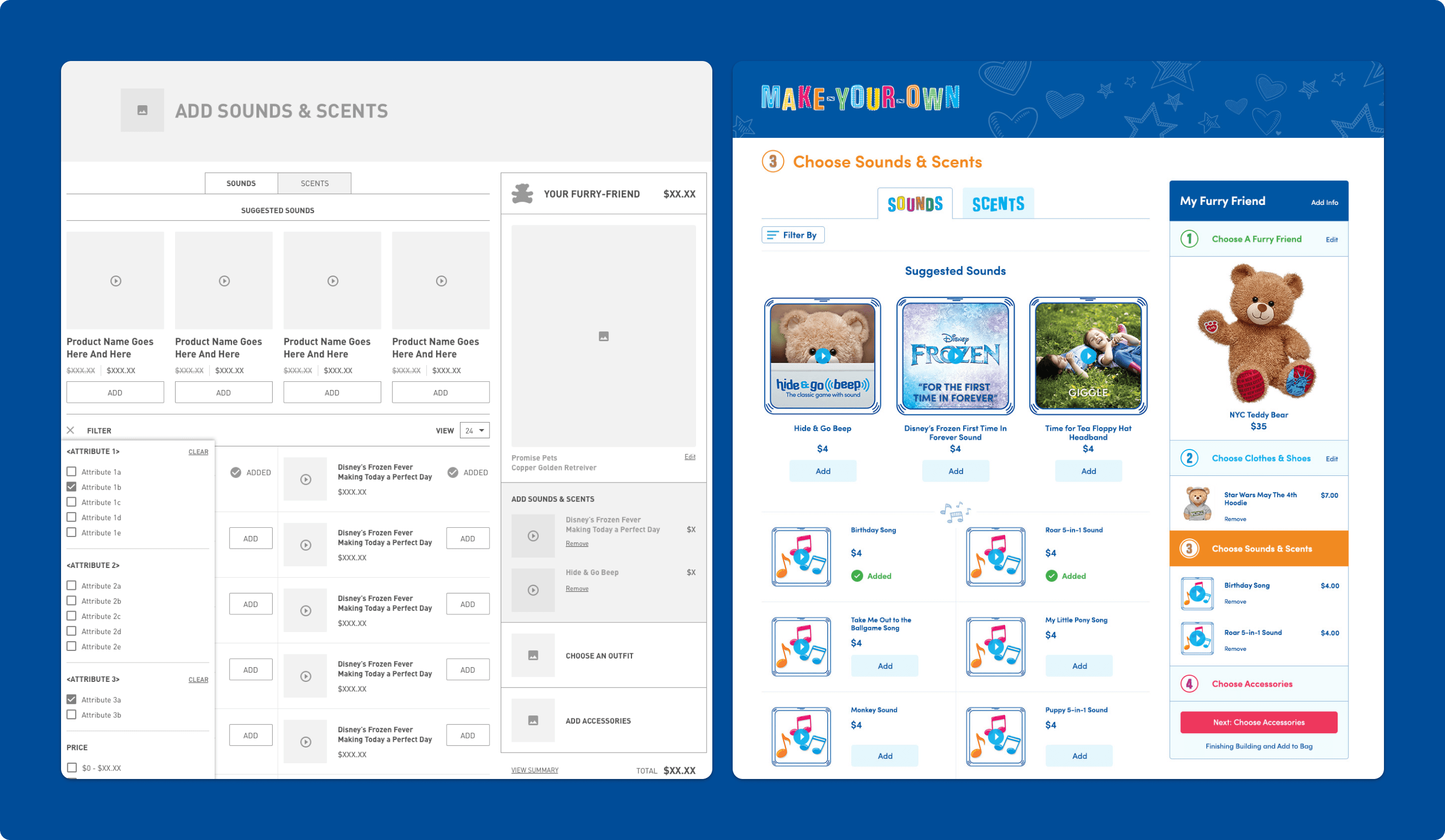
Make-Your-Own Product Configurator
Turning Personalization Into A More Interactive Experience
The Make-Your-Own configurator was designed to give customers a more personalized way to create their bear online before visiting a store or purchasing digitally. The experience let users choose from different furry friends, clothing, and accessories while moving through a more guided path that reflected how the workshop journey unfolds in real life. This helped the experience feel more interactive and gave customers more control over creating a product that felt uniquely theirs.
Why it mattered:
- Supported deeper personalization across products and accessories
- Made the customization flow feel more hands-on and branded
- Helped customers better understand the available choices
- Created a stronger bridge between online and in-store experiences
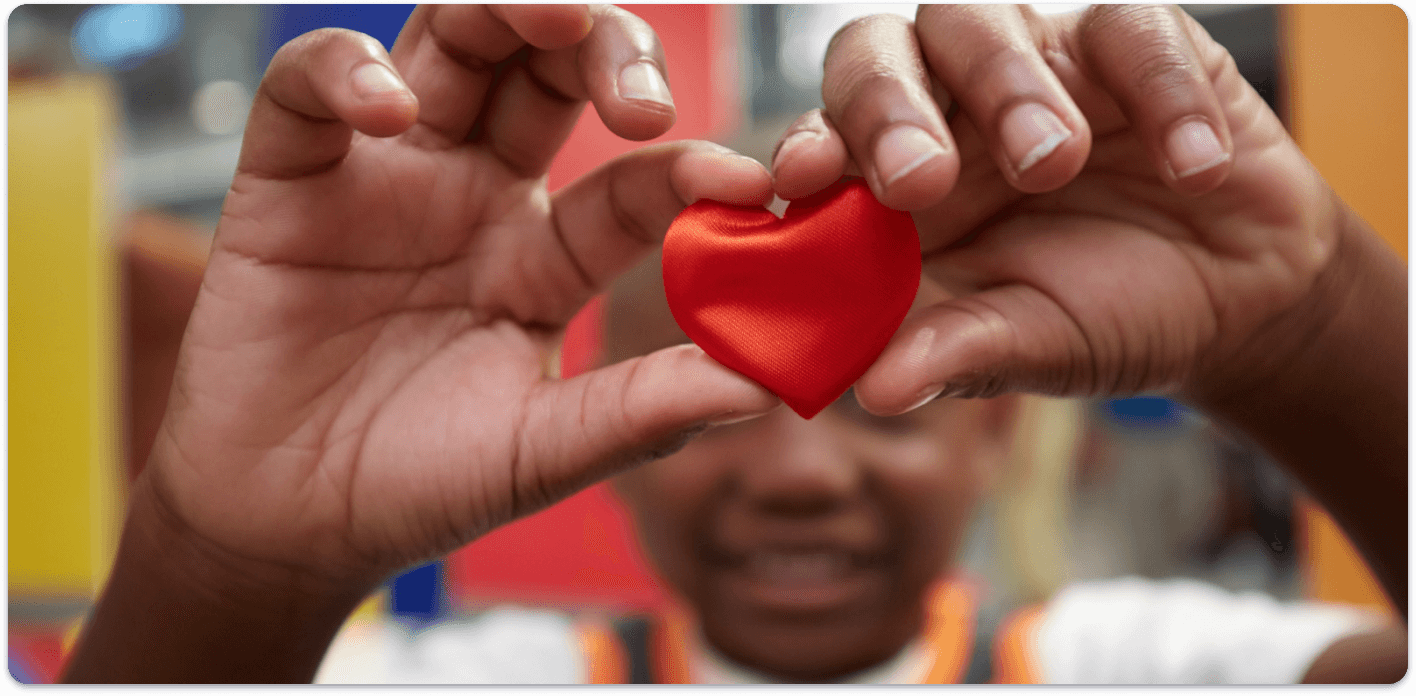
Made With Love
Bringing Signature Brand Moments Into The Digital Experience
Part of the redesign focused on carrying over the small, memorable moments that make Build-A-Bear feel special, including emotional touches like the heart ceremony. These elements helped the digital experience feel more than transactional by reinforcing the sense of fun, imagination, and personal connection tied to creating a bear. Bringing these moments into the interface helped the site feel more distinctly Build-A-Bear rather than simply functioning as an online store.
Why it mattered:
- Preserved the charm and personality of the brand online
- Added emotional value to the customization journey
- Helped differentiate the experience from standard e-commerce
- Reinforced the idea of creating a keepsake, not just buying a product
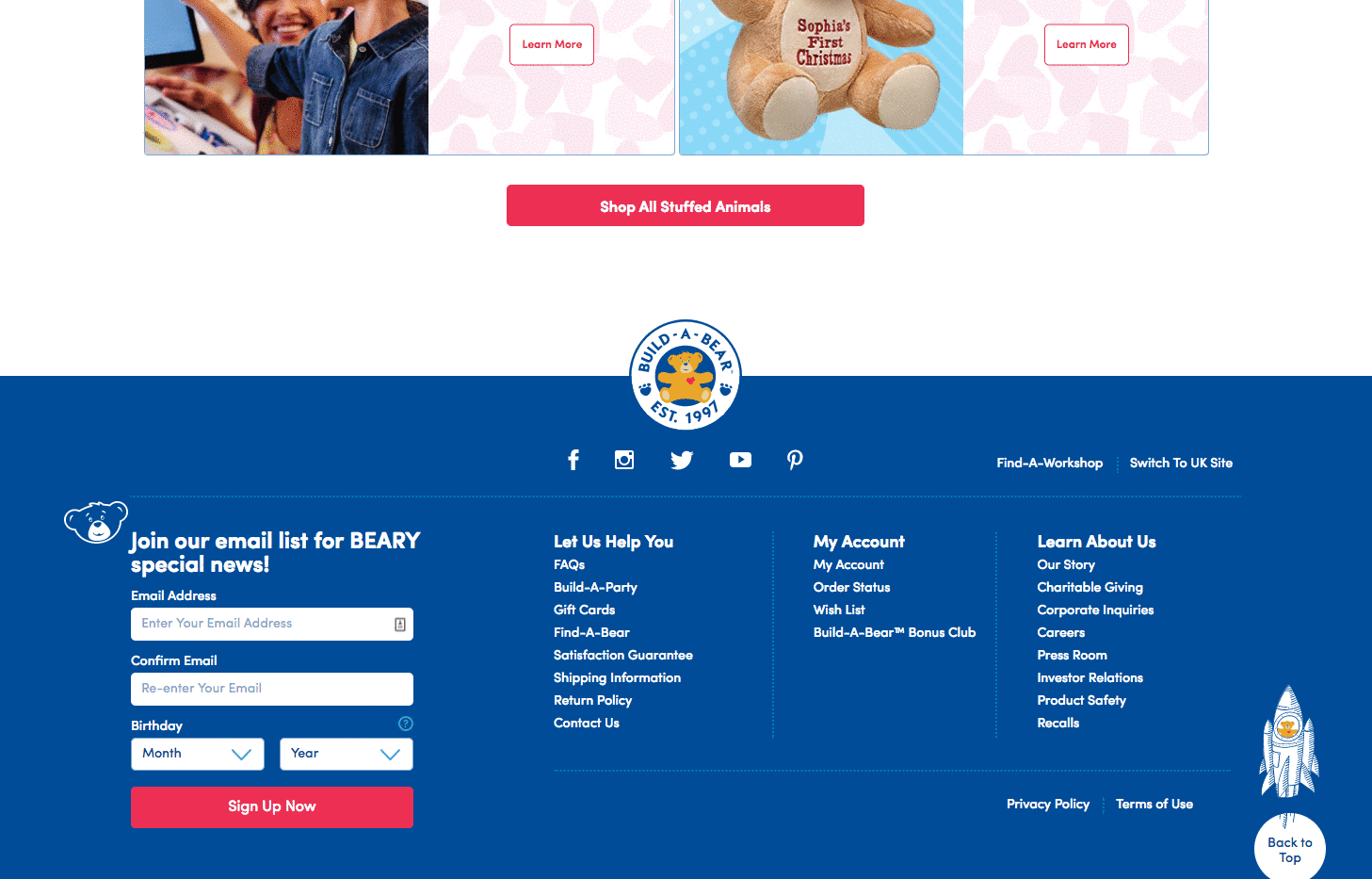
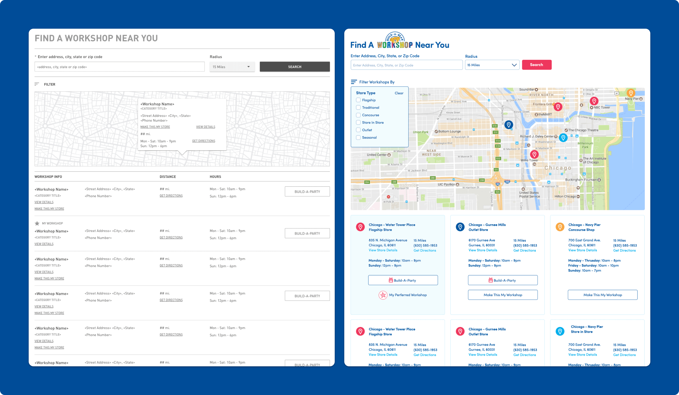
Find-A-Workshop
Making Location Discovery Easier And More Useful
The Find-A-Workshop feature was redesigned to make it easier for customers to locate the nearest Build-A-Bear Workshop and choose the location that best fit their needs. The experience introduced more search filters, clearer calls to action, and a more user-friendly interface to reduce friction in the process. This created a more supportive utility flow that better connected the digital experience back to the physical store network.
Why it mattered:
- Simplified a common task for store-oriented customers
- Improved the usability of an important utility feature
- Better connected online browsing with in-person visits
- Made location search feel more guided and actionable
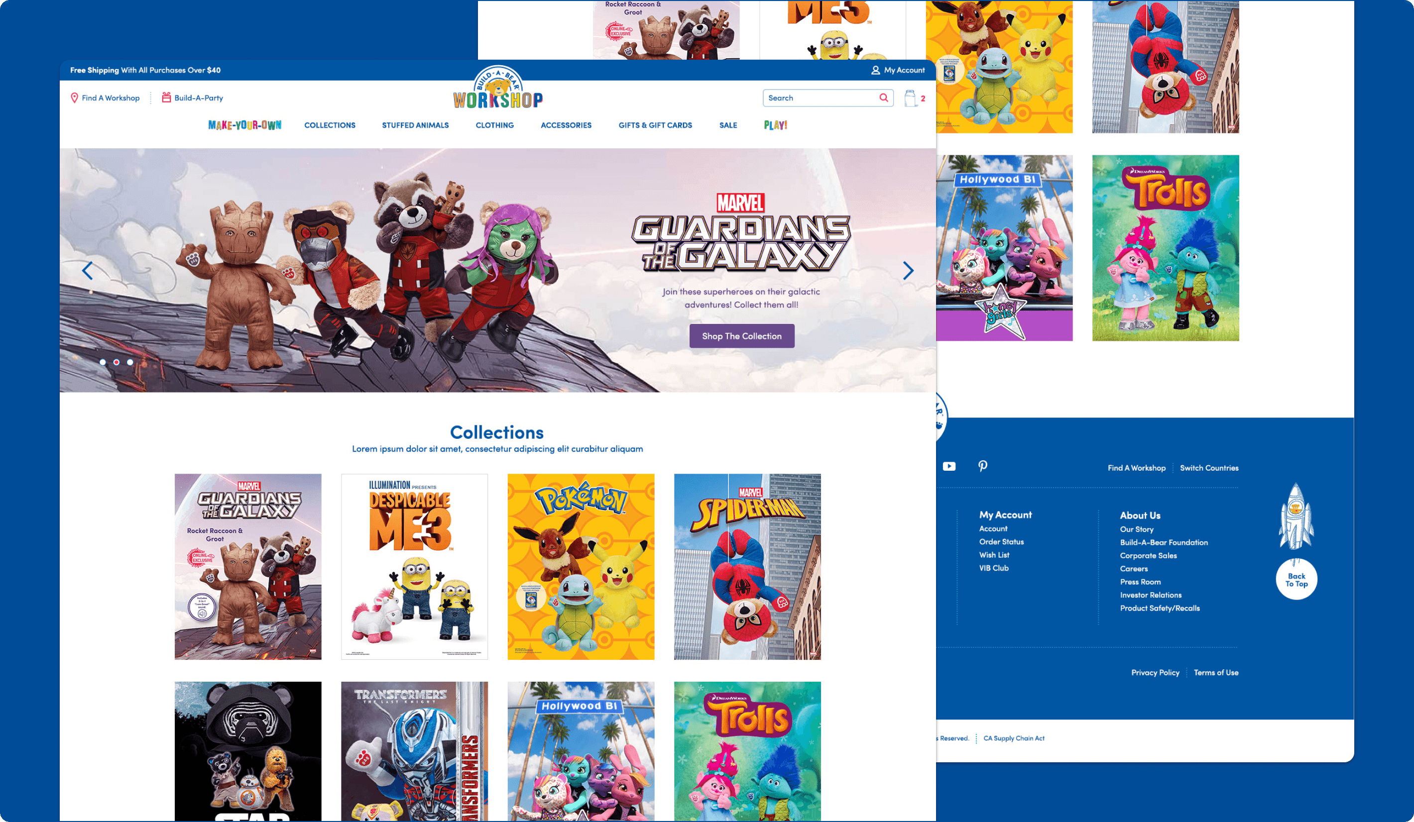
Collections Landing Page
Showcasing Collections In A More Compelling Way
The collections landing page was redesigned to better highlight Build-A-Bear’s featured and licensed collections, which had become increasingly important to the brand’s online merchandising strategy. The new concepts were intended to do more than list products by creating stronger visual entry points into specific themes, characters, and product groupings. This helped collection browsing feel more engaging and gave the site a better way to support interest-driven shopping.
Why it mattered:
- Made collection discovery more visually engaging
- Supported the growing importance of licensed products
- Created stronger entry points into themed shopping journeys
- Helped translate merchandising strategy into a better digital experience
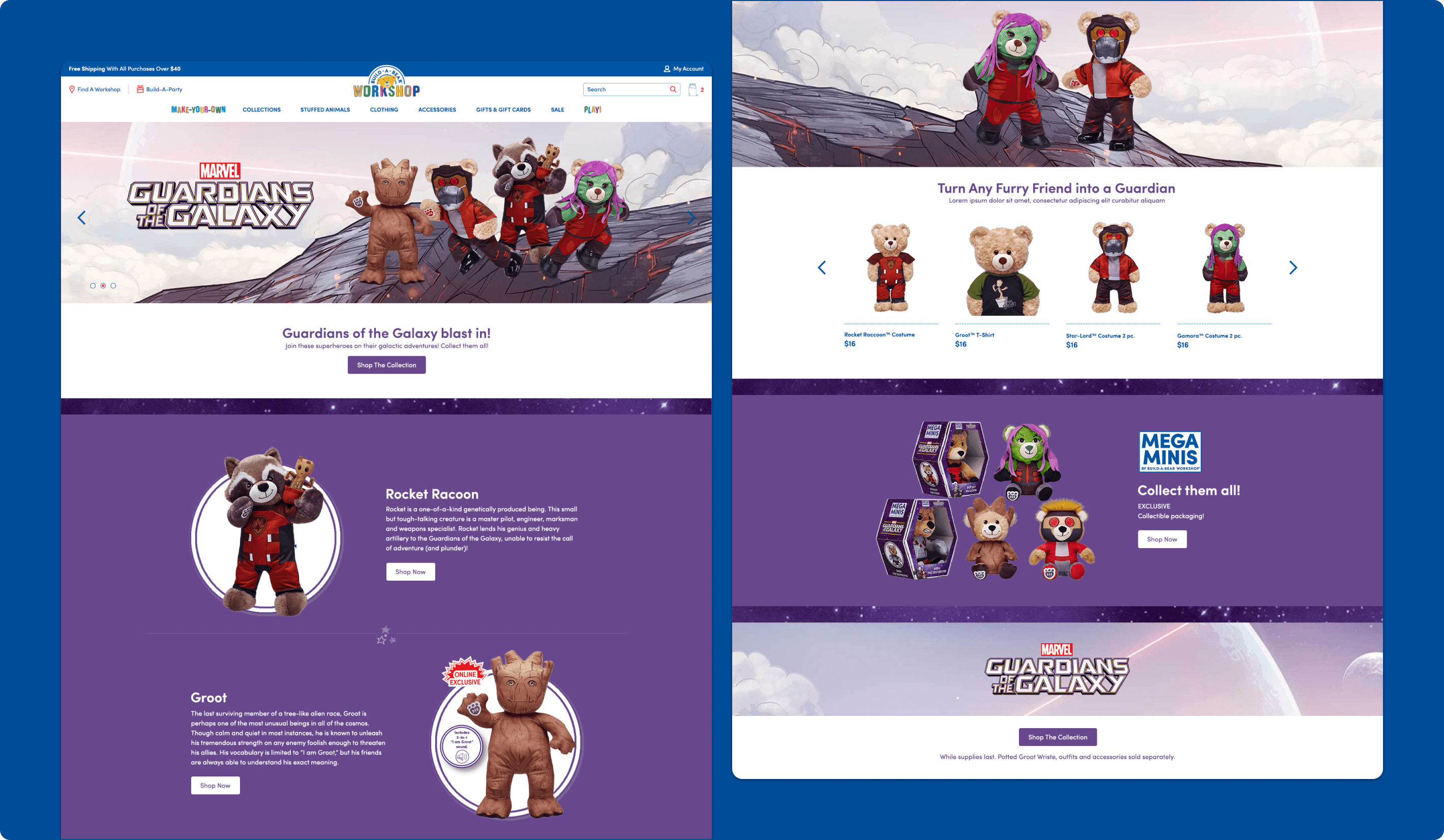
Collection Page
Organizing Featured Product Families More Clearly
In addition to redesigned landing concepts, the experience included a more detailed collection page that brought together the various collections available across the site. The page gave customers clearer information about what each collection included, along with details such as pricing and availability. This created a more structured browse experience that made it easier to understand and compare themed offerings.
Why it mattered:
- Improved how customers browse across multiple collections
- Made themed product offerings easier to understand
- Added more useful information to support purchase decisions
- Strengthened the merchandising experience beyond individual products
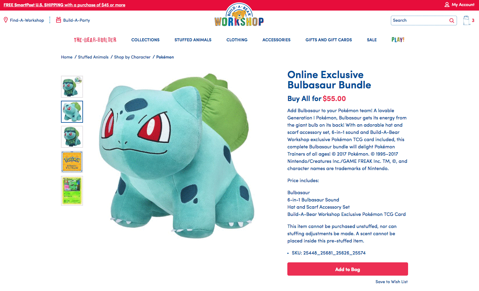
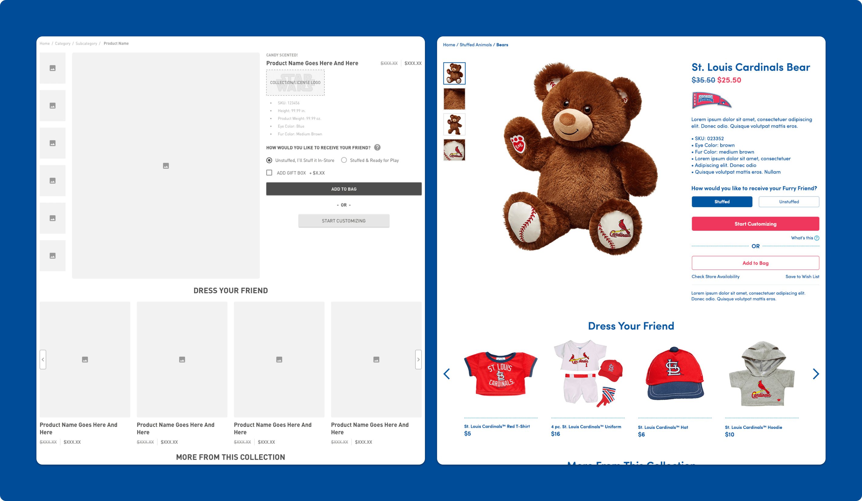
Product Details Page
Making Product Pages More Informative And Actionable
The product details page was redesigned to give customers easier access to the information they need when evaluating a product, including specifications, shipping details, and reviews. It also introduced a clearer entry point into customization through a “Start Customizing” action, helping connect the product page more directly to the brand’s signature build-your-own experience. This made the PDP more than an information page by turning it into a stronger launch point for personalization and purchase.
Why it mattered:
- Improved access to important product and purchase information
- Created a clearer bridge from browsing to customization
- Supported both product evaluation and action in one place
- Made the shopping journey feel more cohesive and conversion-friendly
A Fun-Filled E-Commerce Experience
Refreshing the Site With a More Modern and Playful Interface
The broader e-commerce redesign focused on creating a more visually appealing and user-friendly experience while taking advantage of the newer commerce platform. The work modernized key touchpoints across the site and improved how users navigate, discover products, and engage with the brand online. Taken together, these updates helped the Build-A-Bear website feel more polished, more playful, and better aligned with the expectations of a modern retail experience.
Why it mattered:
- Modernized the overall shopping experience
- Improved usability across key browsing and buying flows
- Better reflected the energy and personality of the brand
- Created a stronger foundation for engagement and conversion