Reach Your Fitness Goals Today
Creating an optimized shopping and financing flow with a new modern design refresh
Platforms
Salesforce Commerce Cloud
Deliverables
Wireframes, Prototypes
Expertise
iA, UI / UX Design
Year
2015


Project Overview

Modernizing the Bowflex Shopping Experience
Bowflex partnered with LYONSCG to redesign key parts of the digital shopping experience with a focus on usability, visual modernization, and conversion support. The work centered on improving landing pages, streamlining the financing application flow, and creating a more flexible e-commerce experience that better supported how customers browse, evaluate, and purchase fitness equipment online. The result was a cleaner, more modern experience designed to reduce friction and make purchase-related tasks feel more manageable.
Research Approach

Simplifying High-Consideration Purchase Workflows
A major focus of the redesign was improving complex areas of the customer journey that could create hesitation or drop-off, especially around financing and checkout. The work explored how to make these moments feel easier to understand, more seamless to complete, and better integrated into the Bowflex site experience rather than pushing users into disconnected third-party flows.
Key Research Themes
Financing Needed To Feel Easier To Complete
The financing application experience was redesigned to feel more streamlined and user-friendly by reducing unnecessary complexity and keeping users within the Bowflex site.
Checkout Needed More Flexibility
The experience introduced features such as split shipments and split payments to better support real customer purchasing scenarios and reduce purchase friction.
Shopping Pages Needed Stronger Storytelling
Landing pages and product pages were designed to better combine product information, visuals, and customer success stories so shoppers could build confidence more easily.
The Front-End Needed A More Modern Feel
The redesign aimed to create a cleaner, more contemporary interface that felt easier to navigate and more aligned with customer expectations for a modern commerce experience.
Design Strategy

Streamlining the Bowflex Buying Experience
The design strategy focused on making the Bowflex experience easier to shop, easier to understand, and easier to complete. Rather than treating financing, product comparison, and checkout as isolated steps, the work created a more connected journey across discovery, evaluation, and purchase. The experience emphasized four core ideas: streamlined financing, more flexible checkout, stronger product storytelling, and a cleaner front-end design that improved usability across the site.
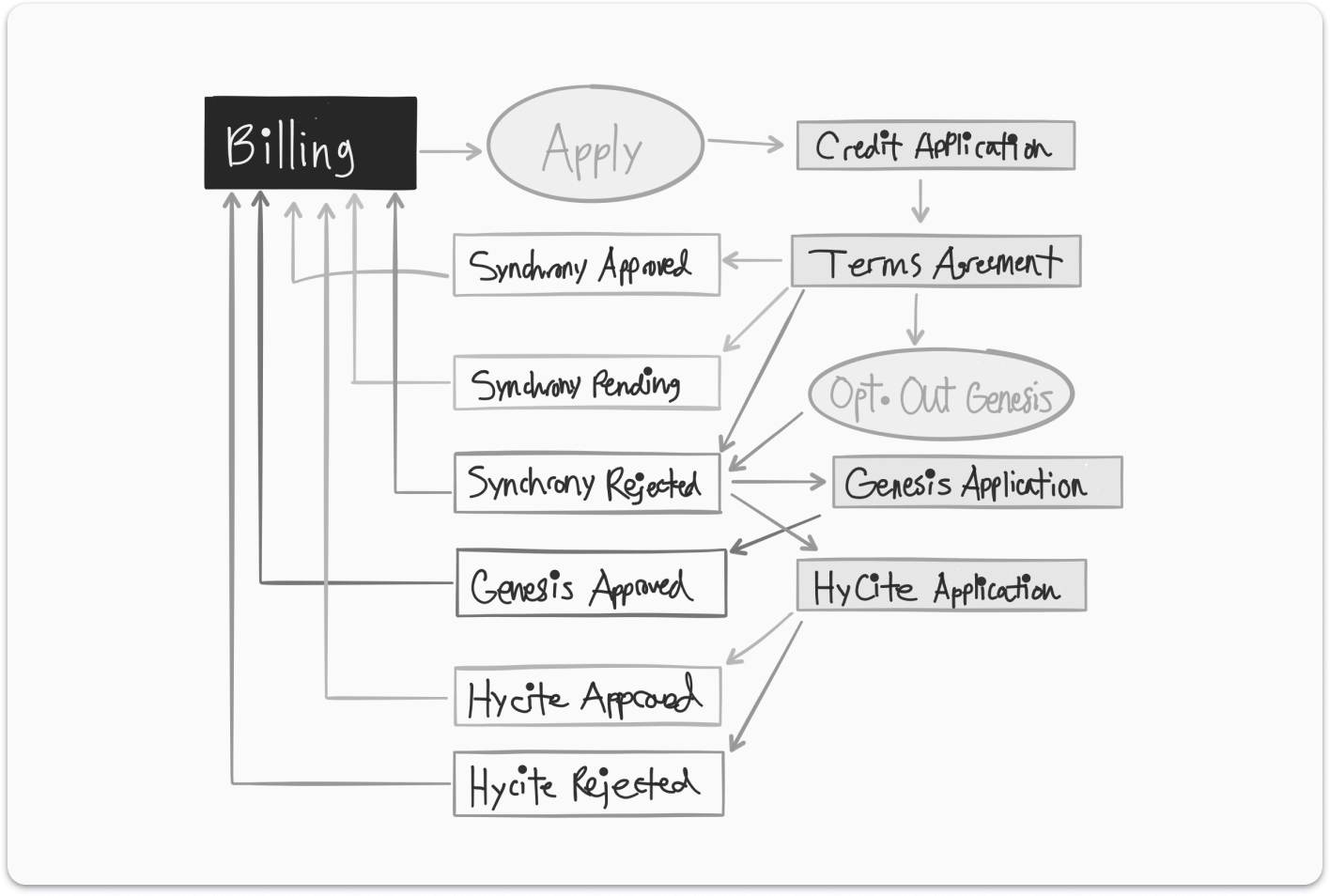
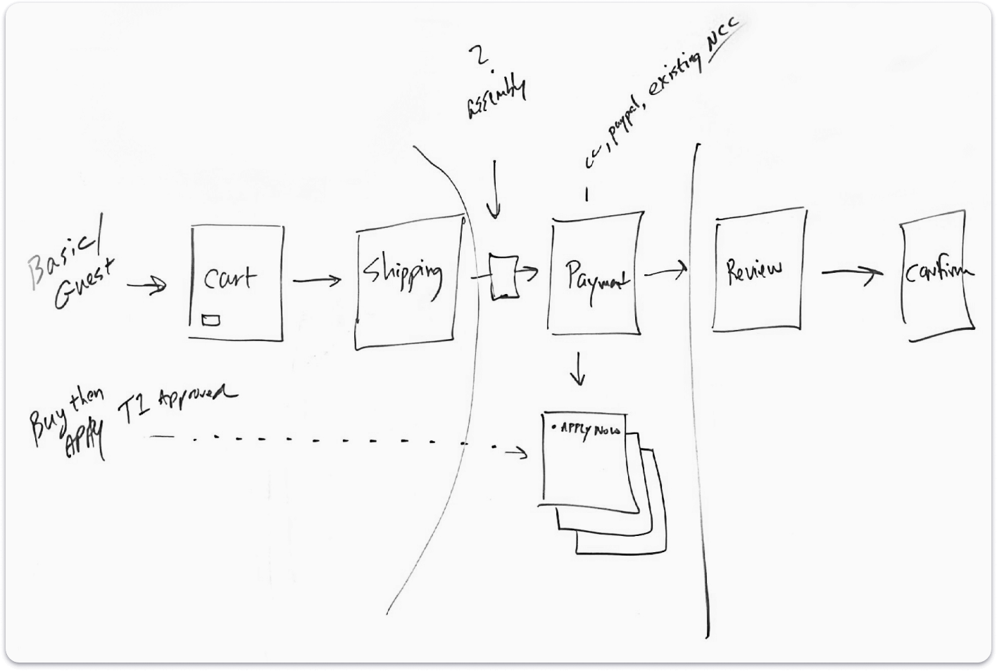
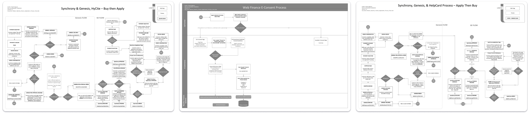
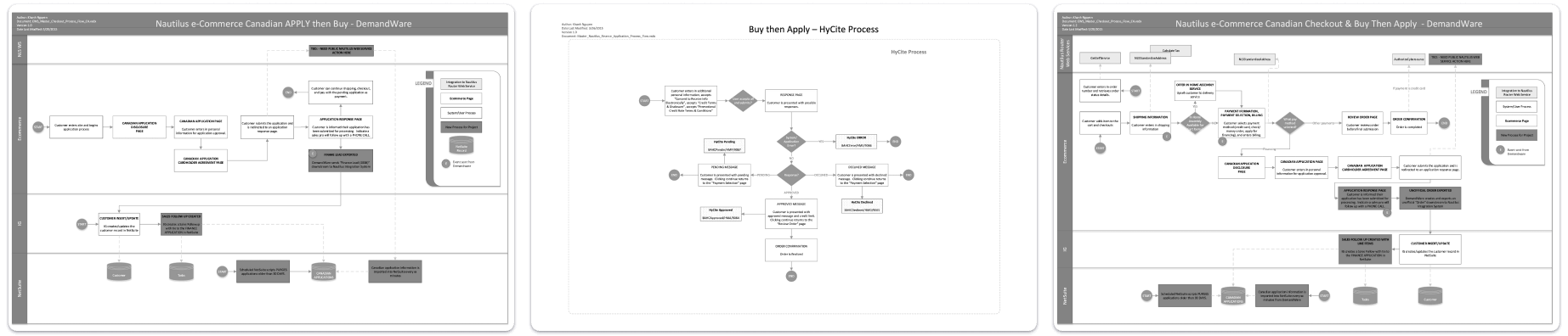
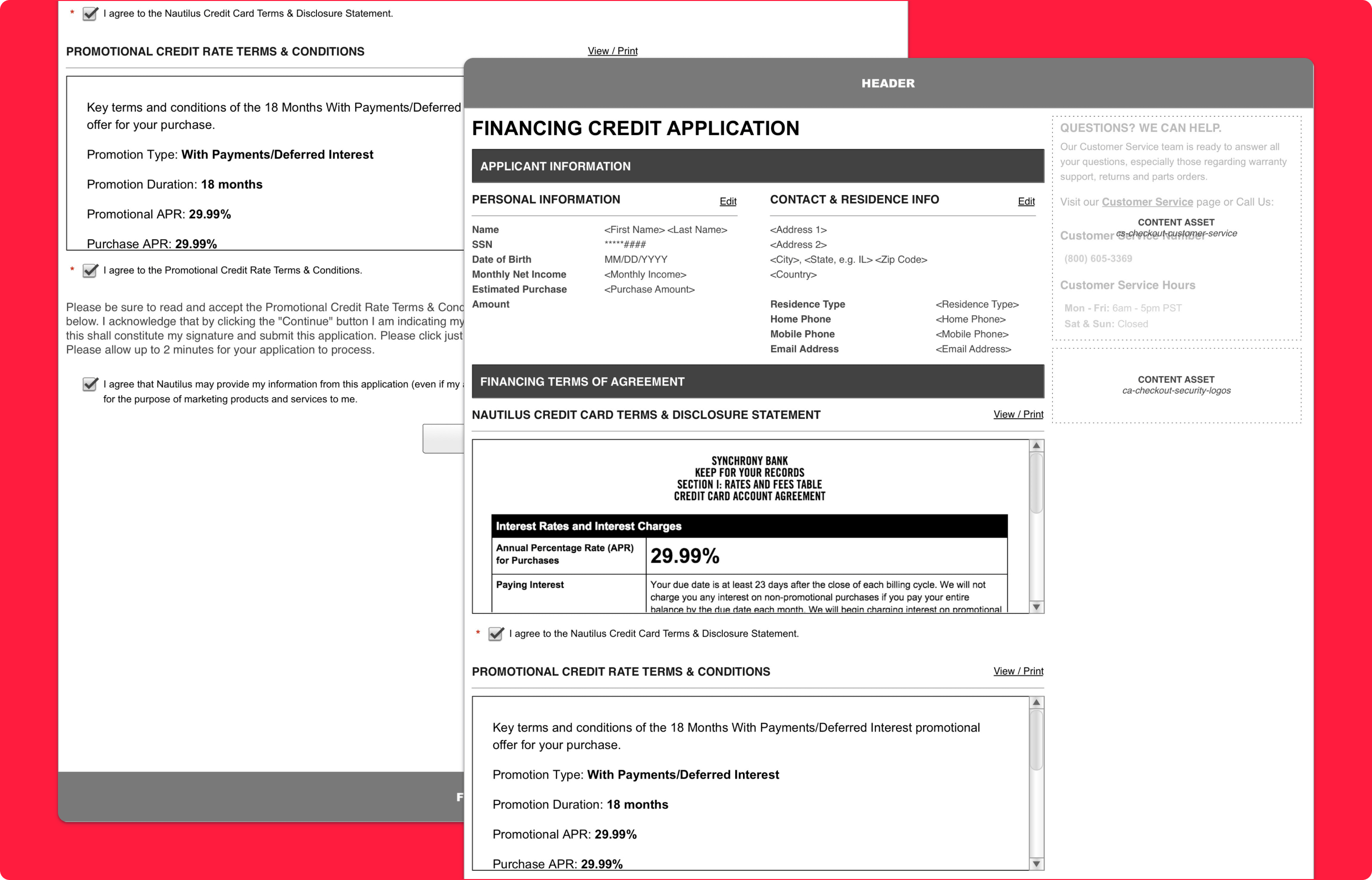
Financing Application Flow
Reducing Friction In A Complex Purchase Step
The financing application flow was redesigned to help customers complete an important but potentially high-friction step with less confusion and fewer interruptions. Instead of sending users to a separate third-party site, the new approach allowed them to apply for financing directly within the Bowflex website. The experience was structured as a clearer series of steps with less required input, making the process feel more seamless and easier to finish.
Why it mattered:
- Kept users within the Bowflex experience during a critical conversion step
- Reduced friction created by third-party handoffs
- Simplified a complex application process into a clearer sequence
- Helped make financing feel more approachable and convenient
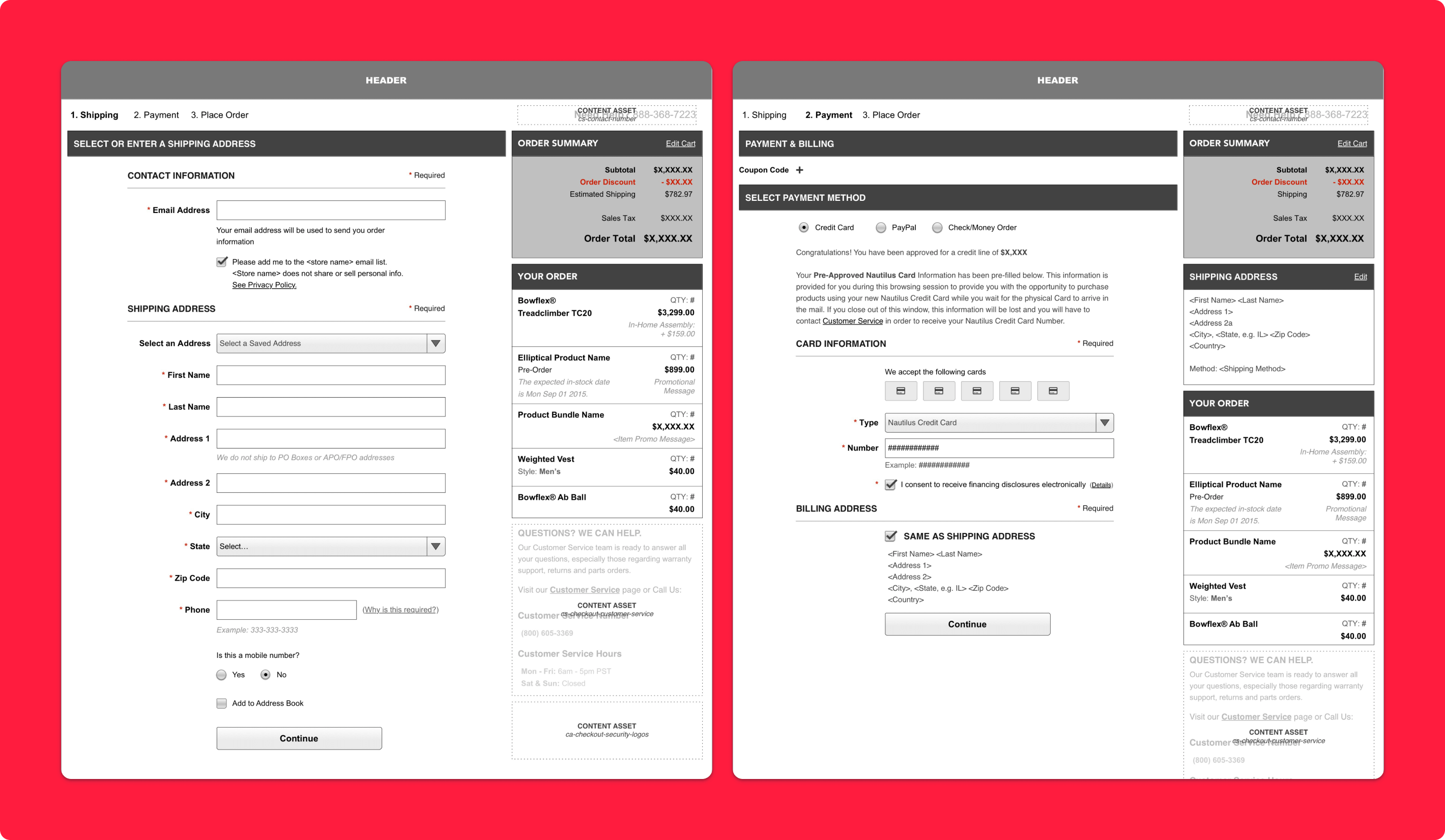
Checkout Experience
Creating More Flexibility At The Point Of Purchase
The checkout flow was updated to support more flexible purchasing behaviors through split shipments and split payments. These enhancements were designed to better reflect real customer needs, whether that meant sending products to different locations or dividing payment across multiple cards. By giving users more control during checkout, the experience became more accommodating and easier to complete.
Why it mattered:
- Supported more realistic multi-item and multi-destination purchase scenarios
- Gave customers greater control over how they pay and ship
- Reduced purchase barriers for high-cost products
- Made checkout feel more adaptable and customer-centered
Split Shipments
Supporting Multi-Location Ordering
The split shipment experience was designed to let customers send different products within the same order to different destinations. This created a more useful checkout flow for gift purchases, multi-person households, or orders where different items needed separate delivery handling. The feature extended checkout flexibility in a way that made the overall purchase process feel more practical and tailored.
Why it mattered:
- Made one order work for multiple delivery needs
- Reduced friction for more complex purchase scenarios
- Improved convenience without requiring multiple transactions
- Added flexibility to a traditionally rigid checkout flow
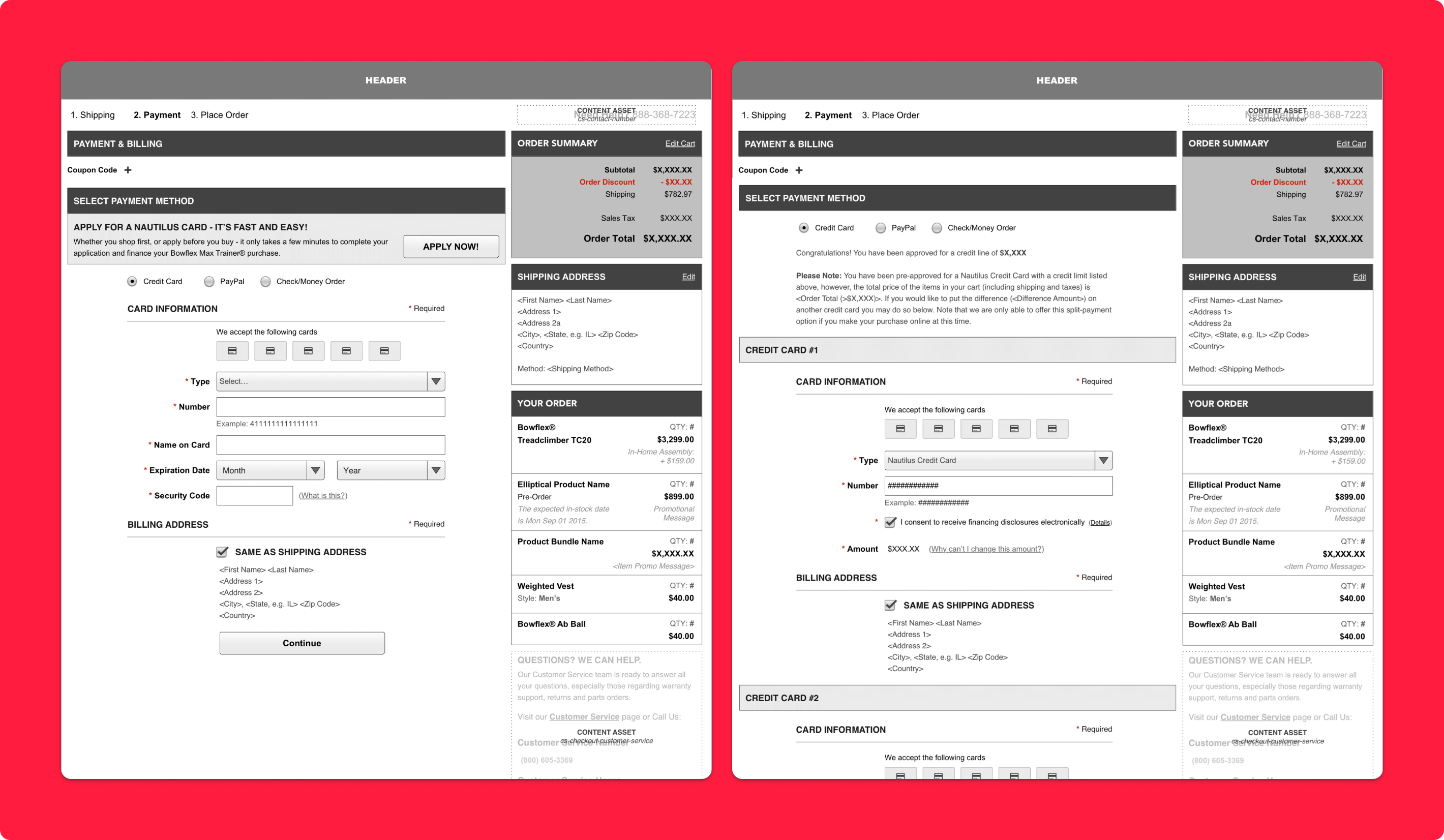
Split Payments
Giving Customers More Control Over Payment
The split payment flow introduced a dedicated billing step that allowed customers to divide the total purchase across multiple credit cards. This addressed a meaningful need for shoppers making large purchases, especially those managing card limits or wanting to distribute spending across accounts. The result was a payment experience that felt more flexible, supportive, and aligned with how customers actually manage larger transactions.
Why it mattered:
- Helped users complete purchases that might not fit on one card
- Supported higher-consideration and higher-cost transactions
- Increased flexibility at a critical conversion moment
- Created a more accommodating billing experience
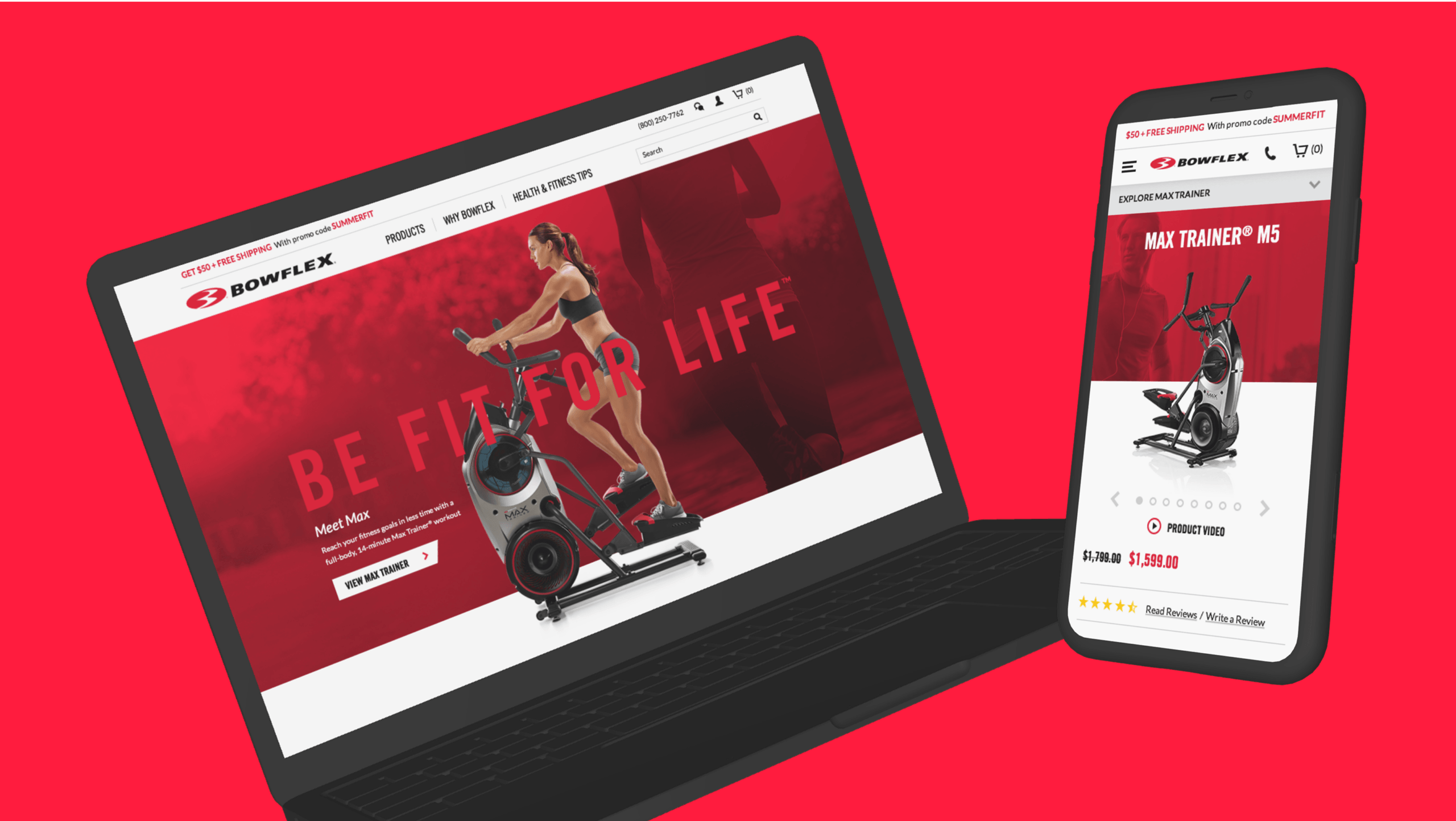
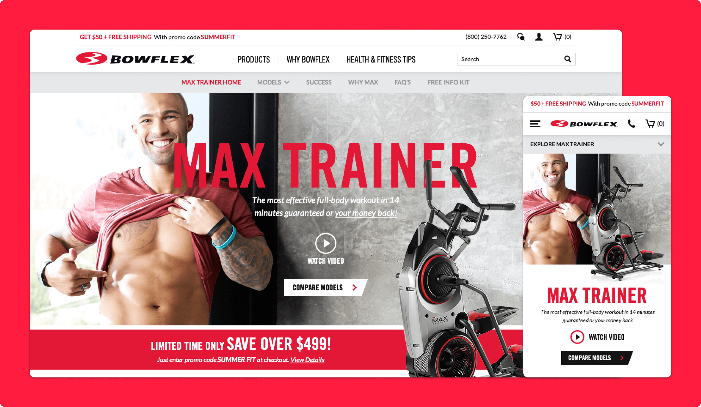
Front-End Redesign
Refreshing The Experience With A Cleaner, More Modern Interface
The broader front-end redesign focused on improving the overall usability and visual quality of the Bowflex website. Pages were reworked to feel cleaner, easier to navigate, and more contemporary, while also supporting faster interaction and stronger readability. The redesign elevated the site experience while making core shopping flows feel more straightforward and accessible.
Why it mattered:
- Modernized the overall brand and commerce experience
- Improved usability through cleaner layouts and easier navigation
- Made shopping flows feel more intuitive and less cluttered
- Created a stronger foundation for conversion-oriented interactions
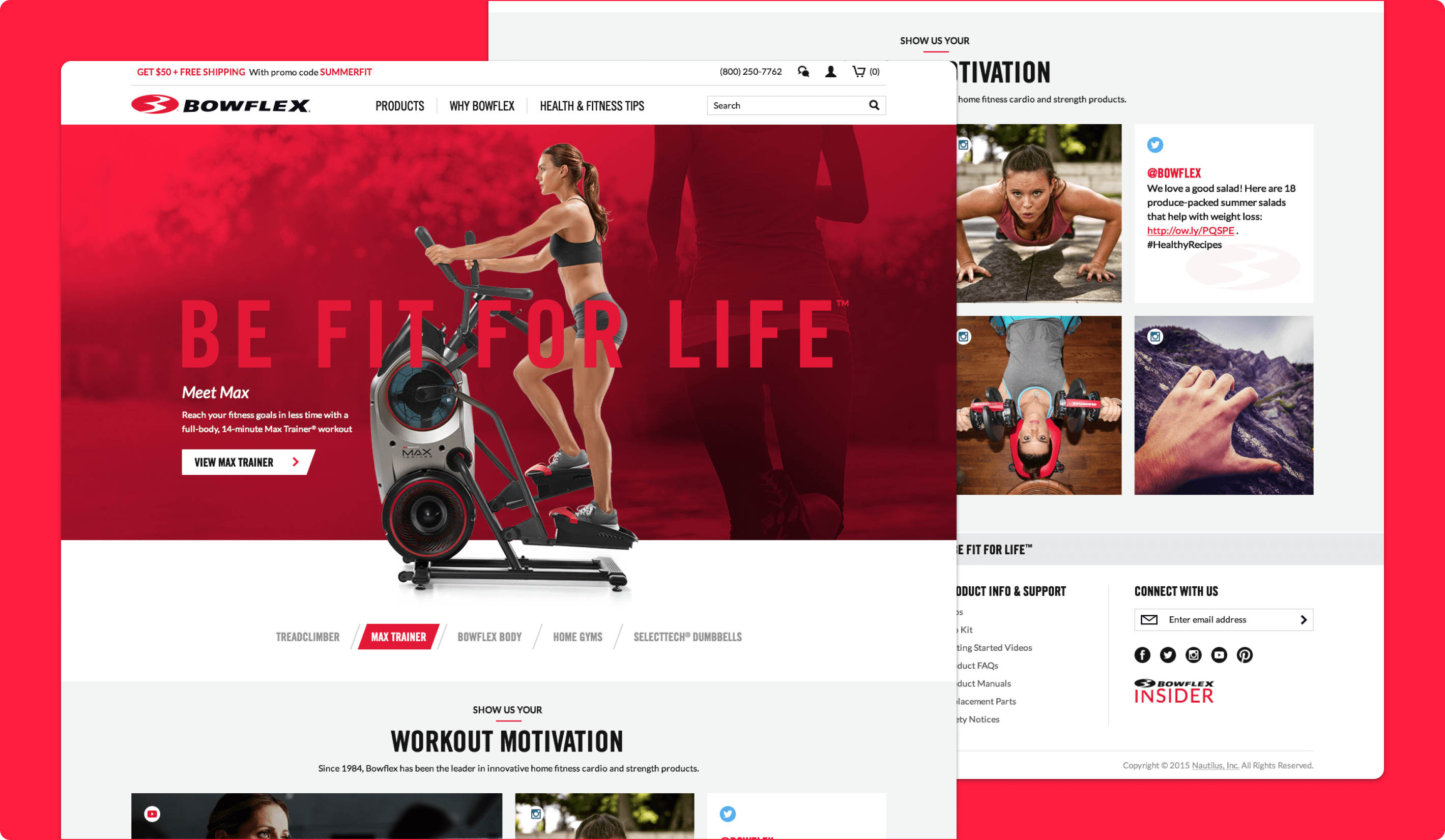
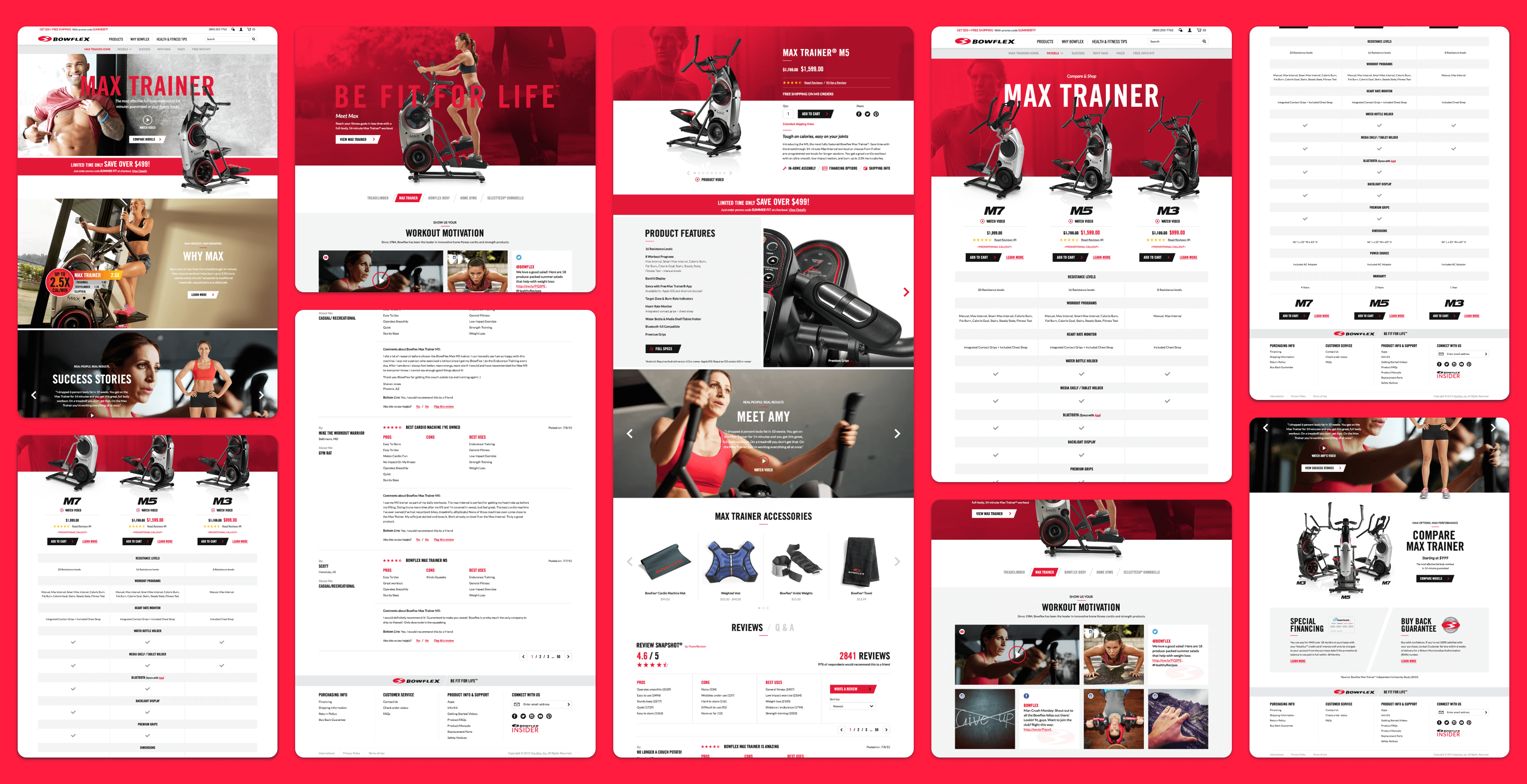
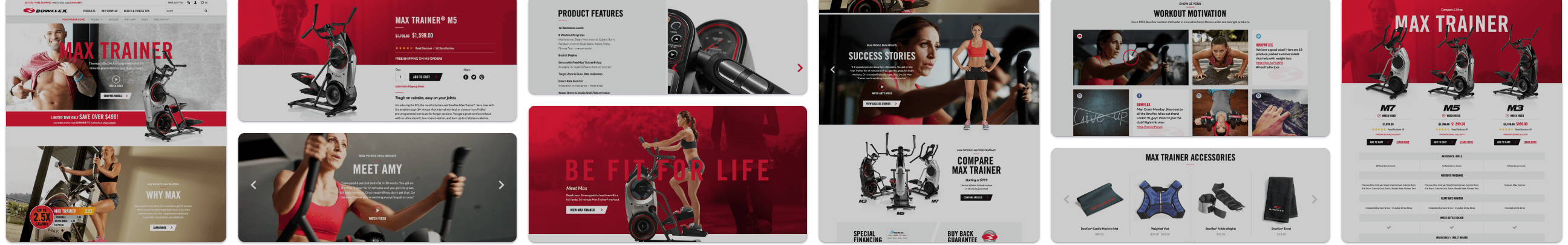
Landing Page Designs
Creating A Stronger Brand And Product Entry Point
The landing pages were redesigned to create a more compelling first impression while helping users connect product benefits to personal fitness goals. The pages paired robust product messaging with real-life success stories so visitors could better understand the value of Bowflex products and imagine their own outcomes. This helped the experience feel more motivating, more credible, and more action-oriented.
Why it mattered:
- Strengthened the emotional connection between brand and customer goals
- Used customer success stories to build trust and motivation
- Improved the clarity and presentation of product value
- Created a stronger starting point for deeper shopping exploration
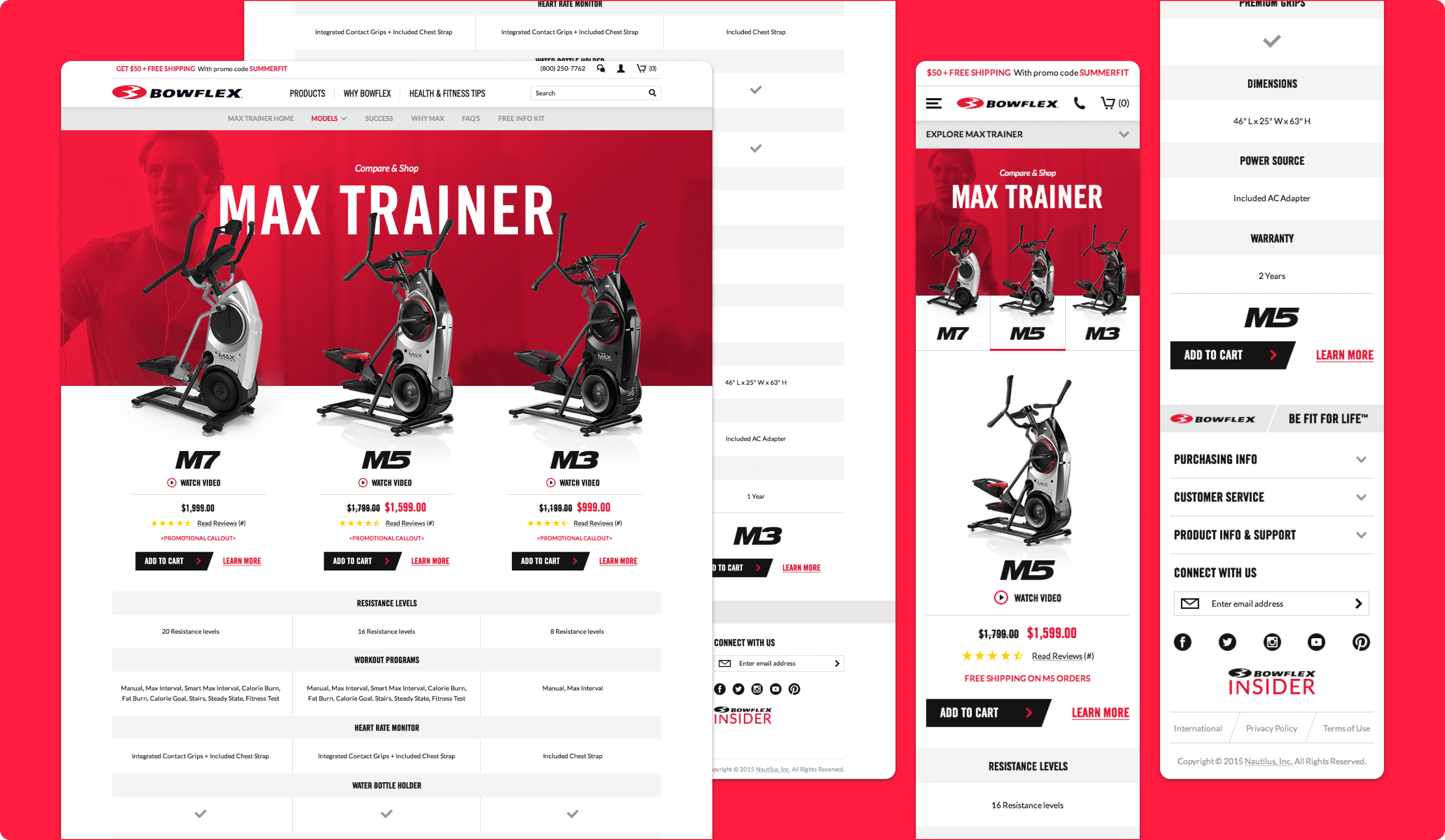
Comparison Table
Helping Shoppers Evaluate Products More Easily
The responsive comparison table was designed to help customers compare Bowflex machines in a clearer and more usable format. By bringing key model features into one scannable interface, the page supported side-by-side evaluation and made it easier for shoppers to determine which option best fit their needs. This reduced guesswork during product selection and supported more confident decision-making.
Why it mattered:
- Made feature comparison easier and faster
- Reduced cognitive load during product evaluation
- Helped customers identify the best-fit machine more confidently
- Supported decision-making without requiring users to jump between pages
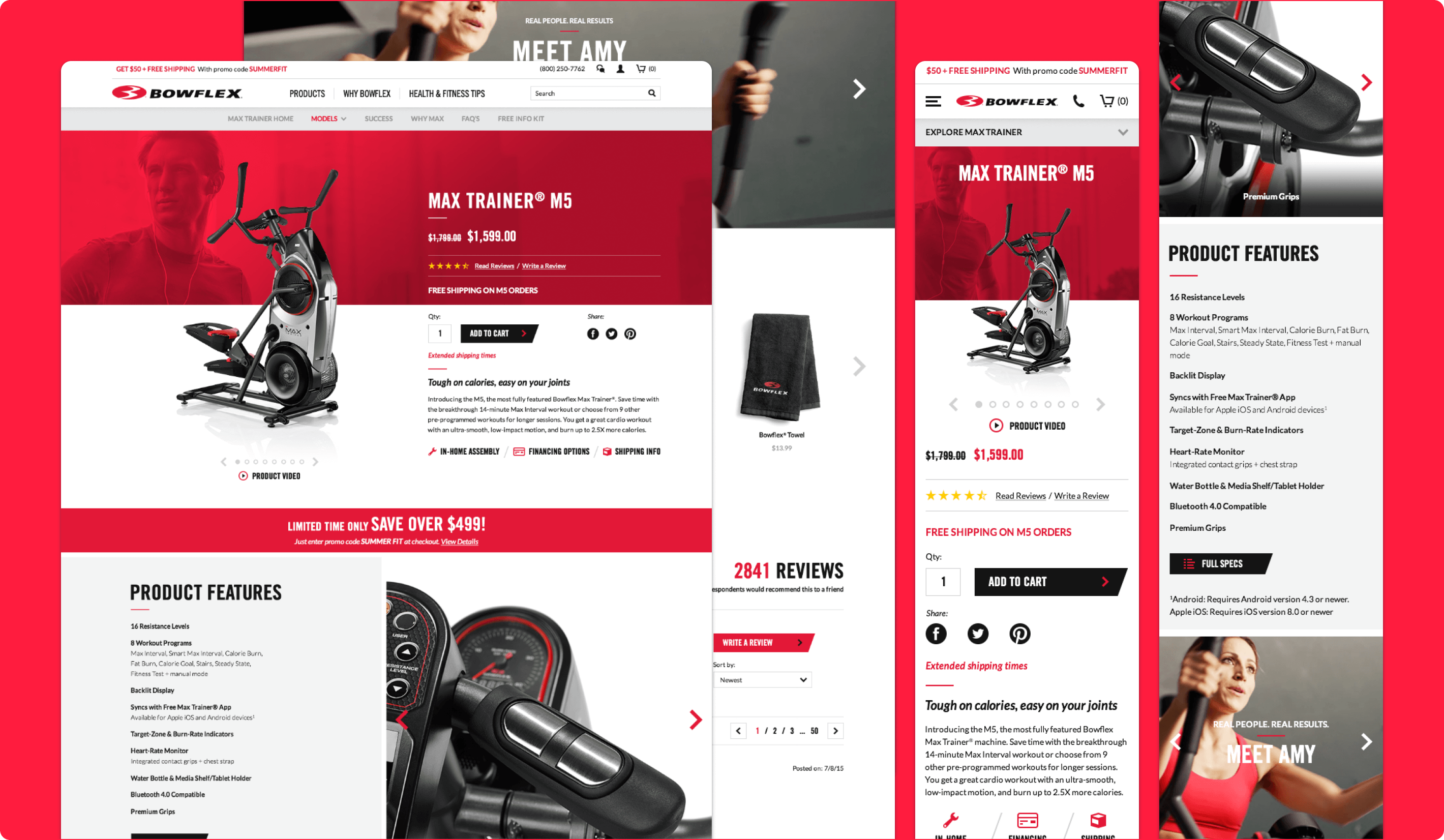
Product Detail Page
Making Product Information More Persuasive And Actionable
The product detail page was designed to bring together the core information customers need when evaluating a product: features, visuals, and proof points from other users. The page gave shoppers a clearer understanding of what made each product unique while using strong imagery and success stories to reinforce trust and purchase confidence. This helped the PDP function not just as a specification page, but as a more persuasive decision-making tool.
Why it mattered:
- Combined product education and persuasion in one place
- Helped customers understand what differentiated each product
- Used visuals and success stories to build credibility
- Supported stronger purchase confidence before checkout