Developer Docs Made Simple
A developer portal experience designed to make API discovery and documentation easier to use
Platforms
Usertesting.com
Deliverables
Research, Prototypes
Expertise
Research, iA, UI / UX Design
Year
2022

Project Overview

Shaping a Future-State Developer Experience
Eaton partnered with Capgemini to define a future-state vision for the Eaton Developer Portal. Our focus was on designing an experience for developers and technical users to discover APIs, navigate documentation, and engage with Eaton Software and Services. Through concept design and moderated usability testing, the work explored how Eaton could create a more structured, intuitive, and developer-centered experience that better supports real documentation workflows.
Research Approach

Grounding Concepts In Real Developer Workflows
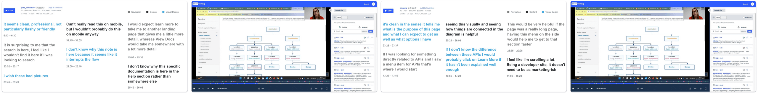
The design direction was informed by two rounds of moderated usability testing focused on newly designed key pages and features for the Eaton Developer Portal. In the first round, Capgemini conducted five 60-minute sessions across desktop and mobile to compare two concepts with identical tasks centered on navigation, wayfinding, and content recognition. The two concepts explored different navigation models, layouts, and documentation treatments to understand which patterns felt more intuitive and usable.
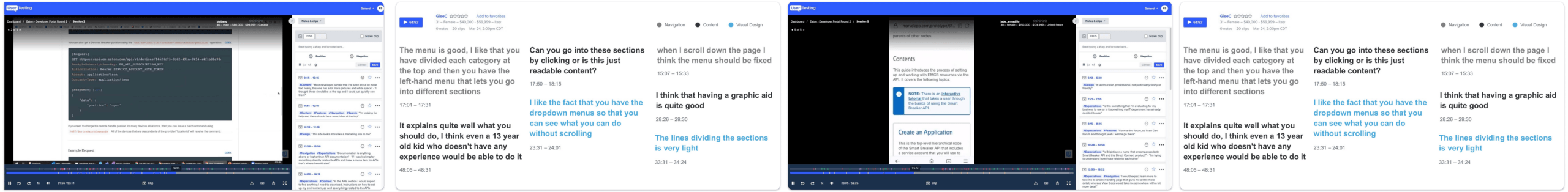
The second round of testing built on those findings and tested a more refined single-concept direction across fifteen tasks. This broader evaluation helped validate how the portal concept supported users across multiple layers of the documentation hierarchy.
Key Research Themes
Navigation Needed Stronger Wayfinding
Users responded best to structured navigation patterns such as left-hand navigation and API subnavigation because they made the portal feel easier to move through and less easy to get lost in.
Documentation Need to Feel More Technical
Participants expected the portal to prioritize technical content, code, and implementation guidance over content that felt too broad or promotional.
Users Wanted More Actionable Content
Developers valued step-by-step structure, examples, and clear next steps that helped them move from understanding to execution more quickly.
Support and Guidance Build Confidence
Participants wanted the portal to feel not only informative, but also supportive, with enough guidance and access to help to make technical tasks feel manageable.
Design Strategy

A More Structured and Developer-Centered Portal
The future-state design focused on making the Developer Portal easier to navigate, easier to understand, and more supportive of technical workflows. Rather than relying on users to piece together Eaton’s structure on their own, the concept introduced a clearer hierarchy across portal-level navigation, API-level navigation, and detailed documentation pages. It also explored multiple ways to help users find information, including structured navigation, contextual page layouts, linked related content, and AI-assisted answer retrieval.
The result was a portal concept that felt more like a practical documentation environment and less like a generic information site. The experience emphasized four core ideas: clearer navigation, more actionable documentation, stronger technical orientation, and assistive features that reduce friction for developers over time.
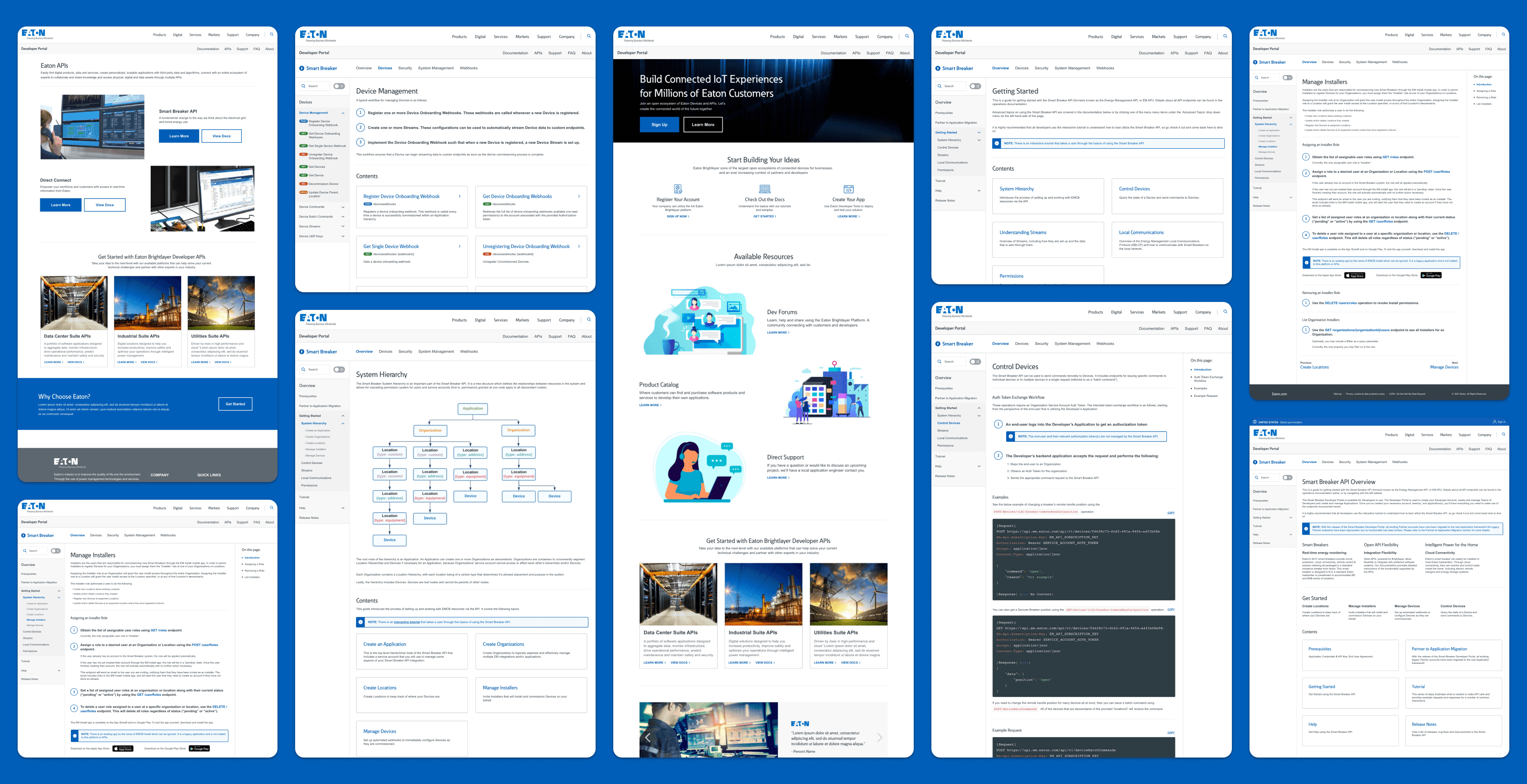
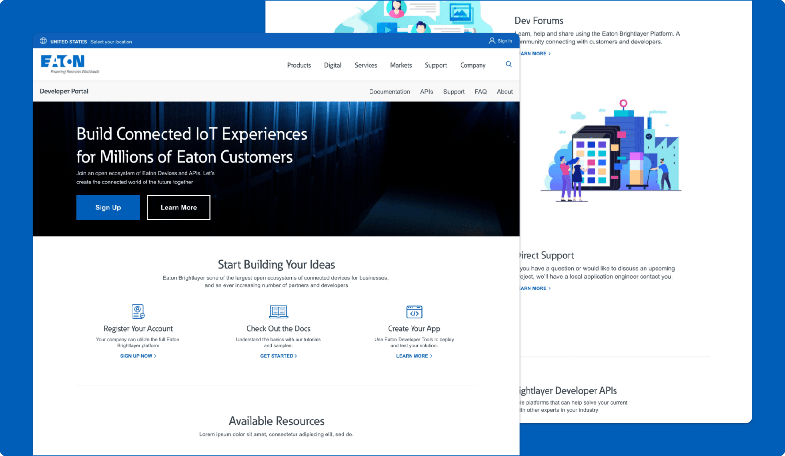
Developer Portal Landing Page
The Entry Point Into Eaton’s Developer Ecosystem
The Developer Portal landing page was designed to introduce Eaton’s developer ecosystem while guiding users toward the most important next steps. The page combined brand-level framing with direct pathways into APIs, documentation, account creation, and related developer resources. Instead of functioning only as a broad marketing-style homepage, it was intended to help users quickly understand what the portal offers and where to go next. That made the page an important bridge between first impression and technical exploration.
Why it mattered:
- Helped users understand the purpose of the portal faster
- Created clearer entry points into APIs and documentation
- Balanced brand introduction with technical direction
- Set expectations for the portal as a usable developer destination
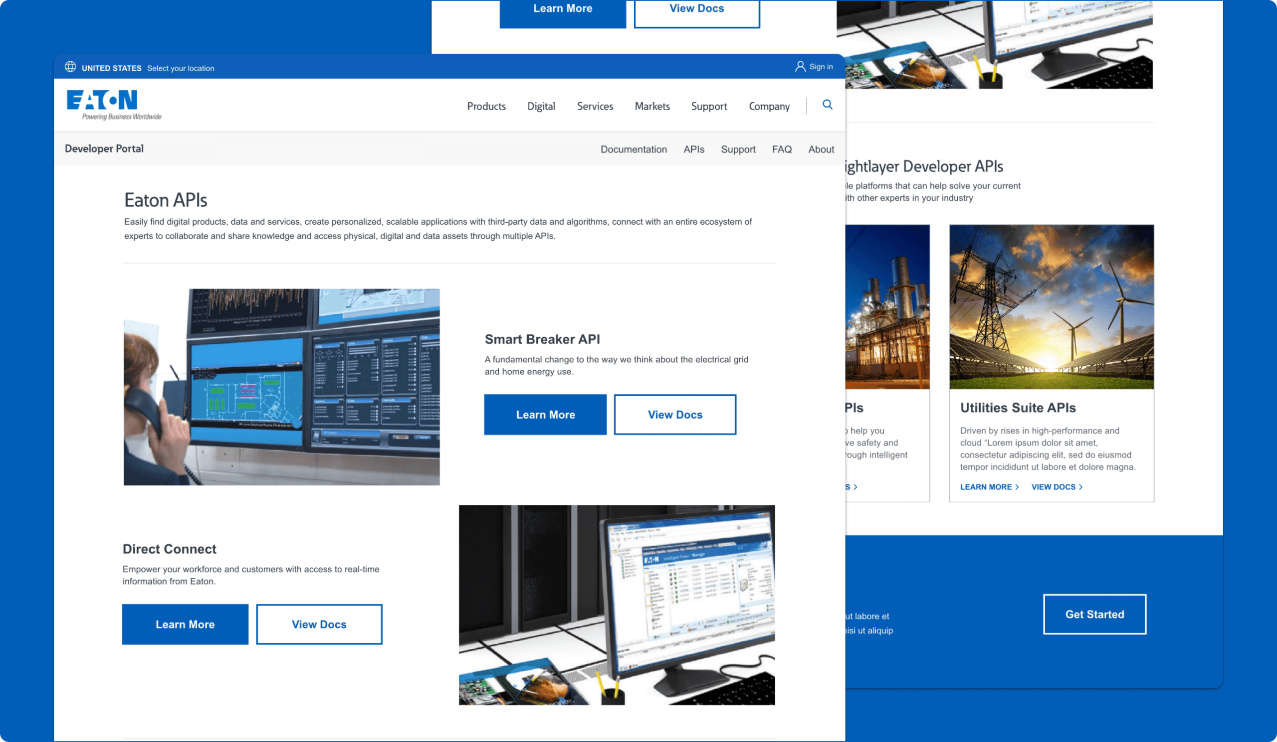
APIs Landing Page
Making Eaton's APIs Easier to Discover and Explore
The APIs landing page was designed to give developers a clearer starting point for exploring Eaton’s API ecosystem. The page introduces multiple API offerings, highlights featured APIs, and helps users understand the different solution areas available across the portal. The experience supports faster discovery by combining featured API callouts with broader API suite entry points, making it easier for users to browse what is available and decide where to go next.
Why it mattered:
- Created a stronger entry point into the developer portal
- Helped users quickly understand the breadth of Eaton’s API offerings
- Supported faster API discovery through clearer browse paths
- Reduced friction between exploration and documentation access
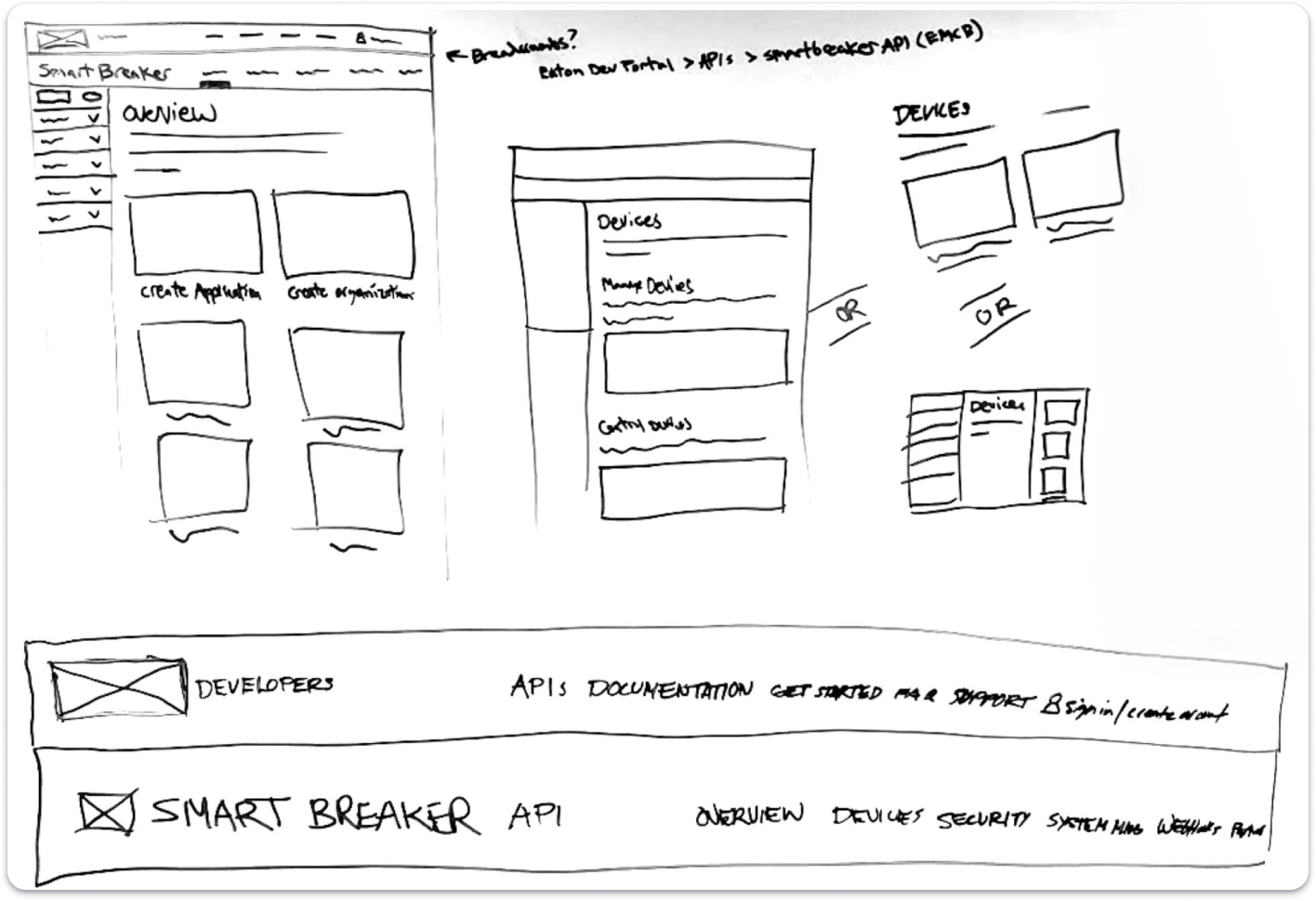
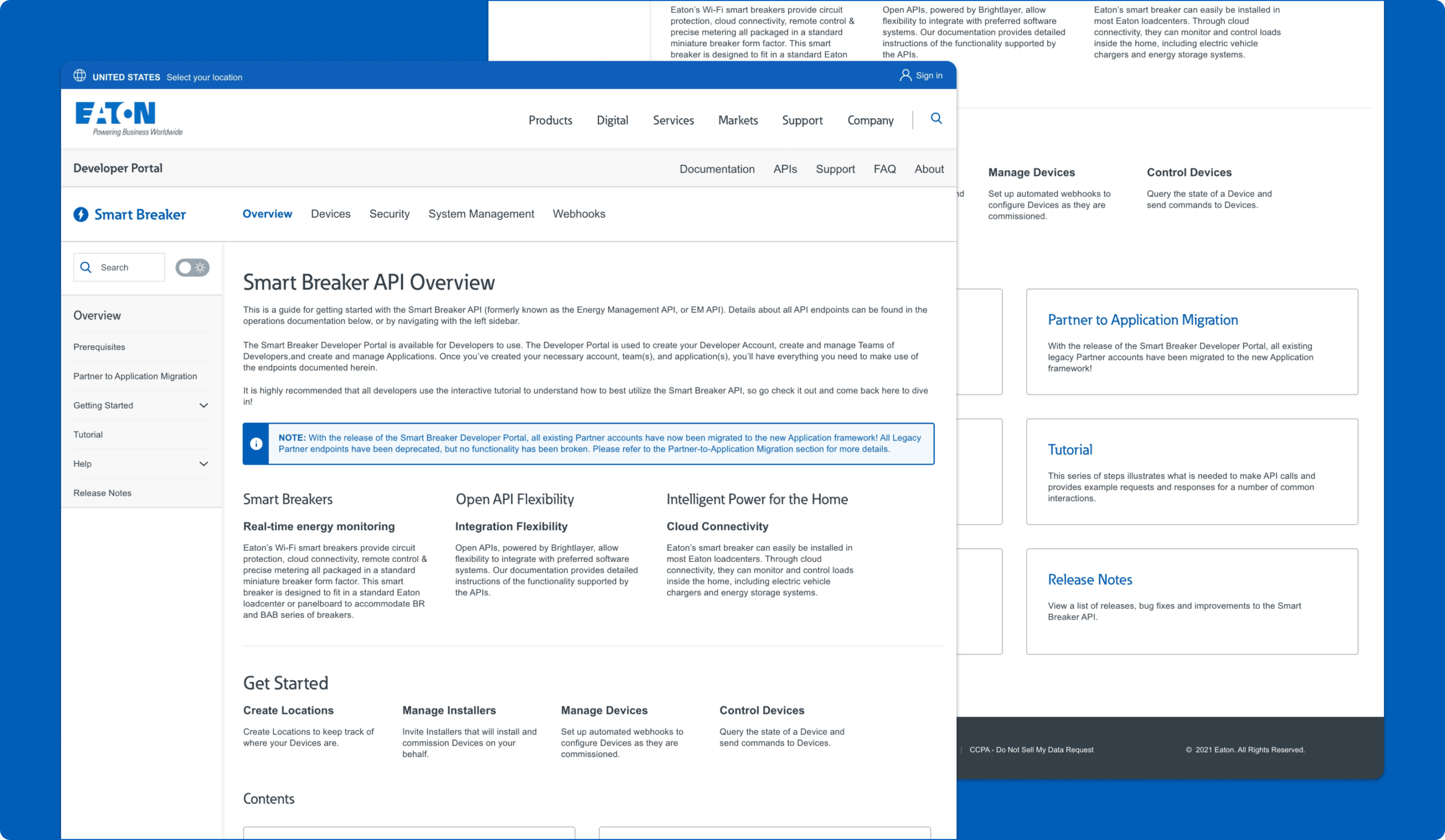
API Overview Page
Creating A Clearer Starting Point Within Each API Experience
The API Overview page was designed to provide a consistent starting point within an individual API experience, helping users understand the API at a higher level before moving into deeper documentation. It established the structure of the API section through overview content, linked topics, and navigation patterns that made it easier for users to understand what was available and how the documentation was organized.
Why it mattered:
- Created a consistent way to orient users within an API
- Helped users understand the scope and structure of documentation
- Supported movement from high-level understanding into deeper content
- Made the portal feel more organized and easier to learn
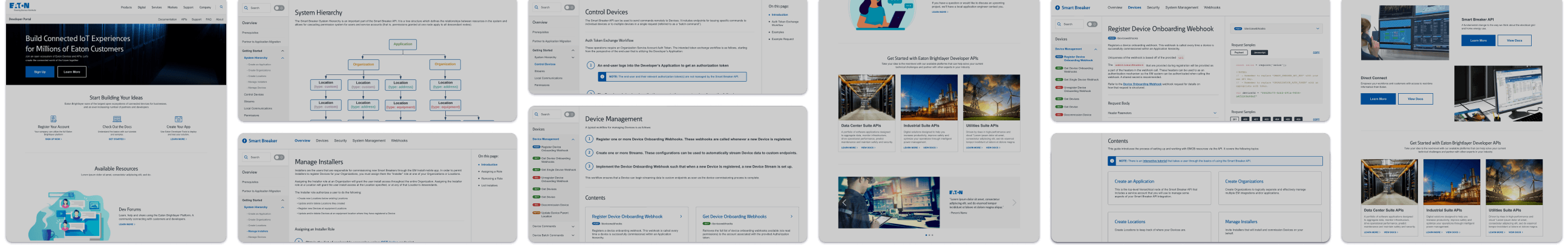
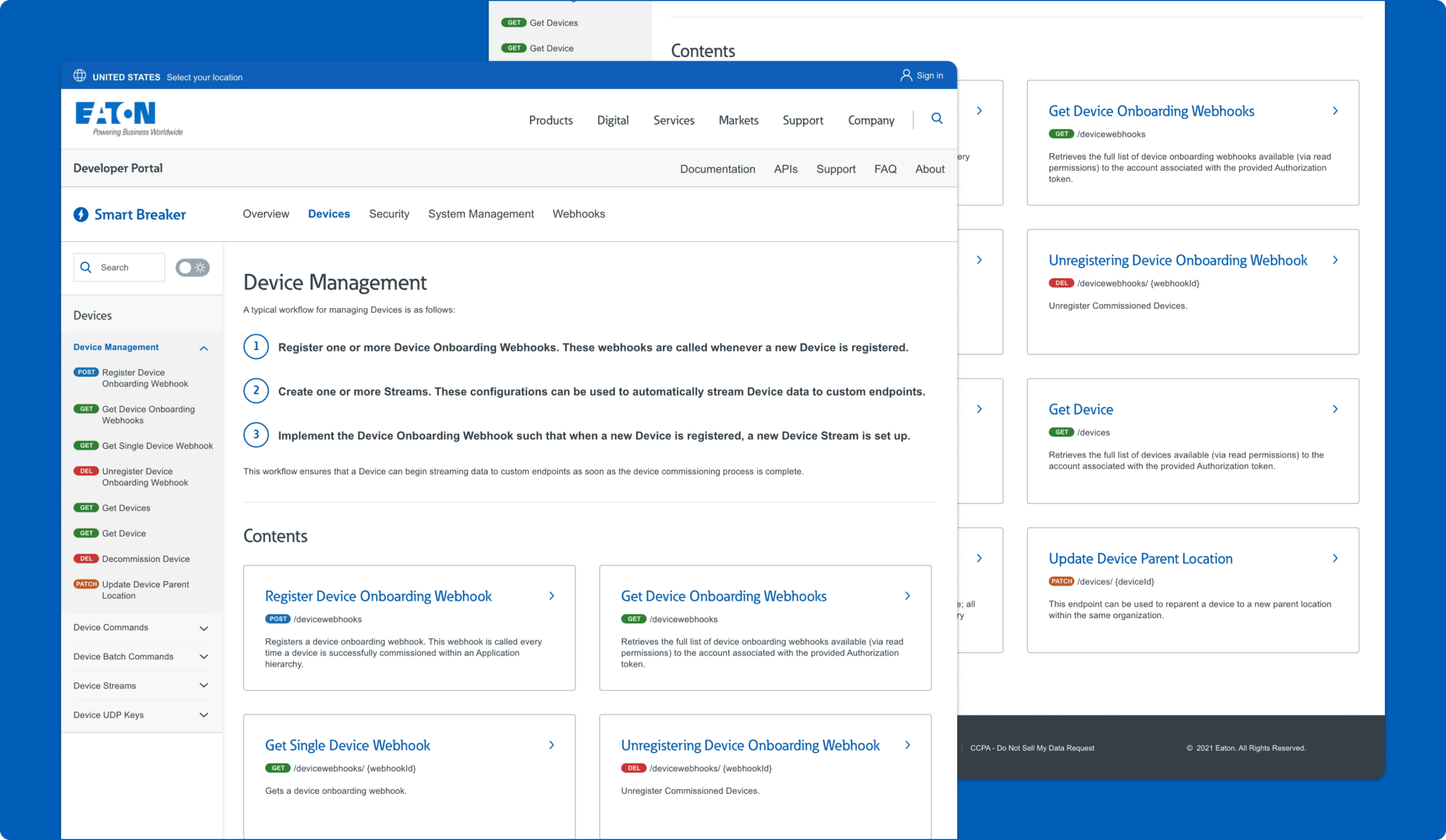
API Category Page
Organizing Related Documentation
The Category page was designed to organize related documentation topics into a clearer, more scannable section of the portal. Rather than forcing users directly into detailed reference content, it grouped related concepts, workflows, and documentation areas together so users could understand a broader subject area before going deeper.
Why it mattered:
- Grouped related content into clearer areas of focus
- Reduced cognitive load before users entered detailed documentation
- Helped users understand broader workflows and concepts
- Improved navigation across larger sections of content
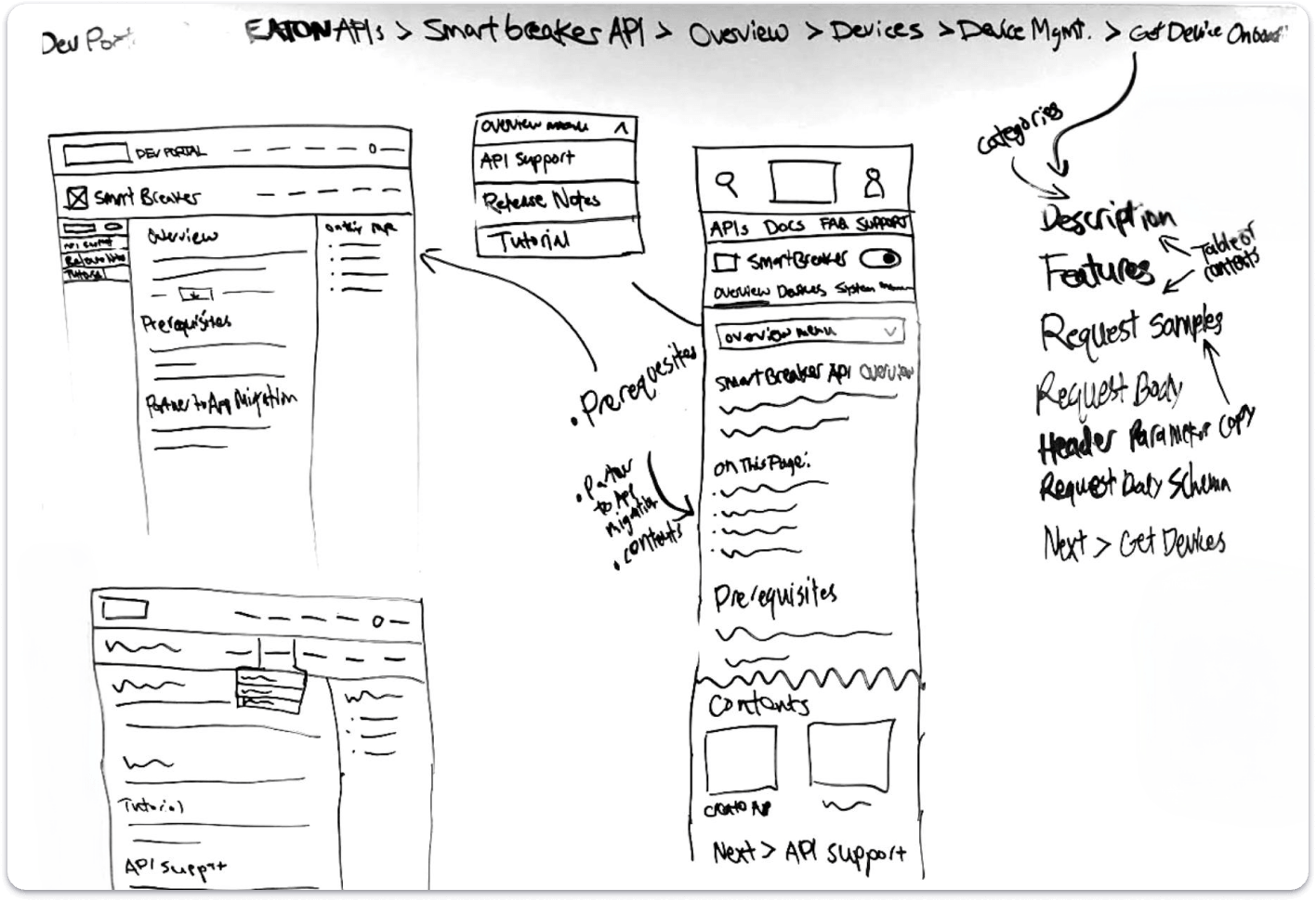
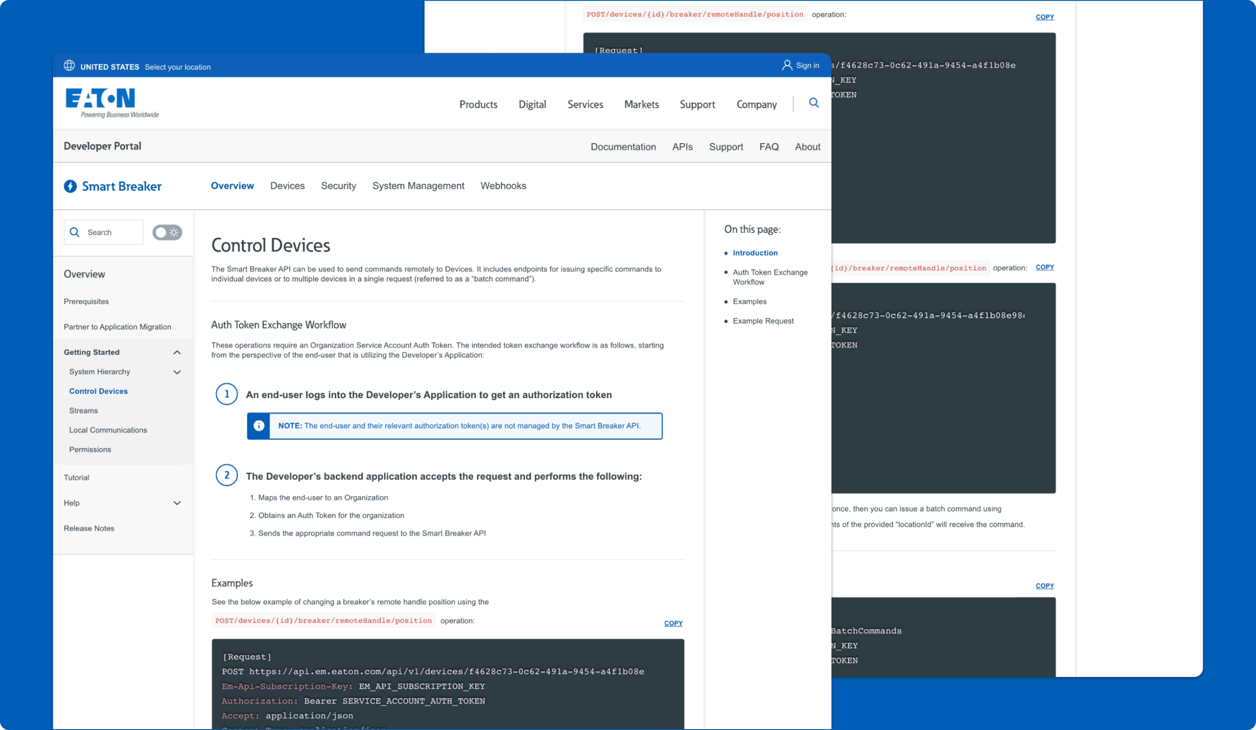
API Subcategory Page
Connecting Broader Categories to More Focused Technical Workflows
The Subcategory page was designed to help users move from a broader documentation area into a more specific workflow or task within that section. In this example, the page includes the selected subcategory within the left-hand navigation, a clear page title and introduction, step-by-step instructional content, highlighted notes, inline examples, code snippets with copy functionality, and a right-rail “On this page” table of contents for faster scanning and jump navigation.
Why it mattered:
- Helped users move from broad topics into specific tasks more naturally
- Made technical workflows easier to scan, follow, and act on
- Combined explanation, examples, and code in one focused experience
- Added stronger on-page navigation for longer documentation content
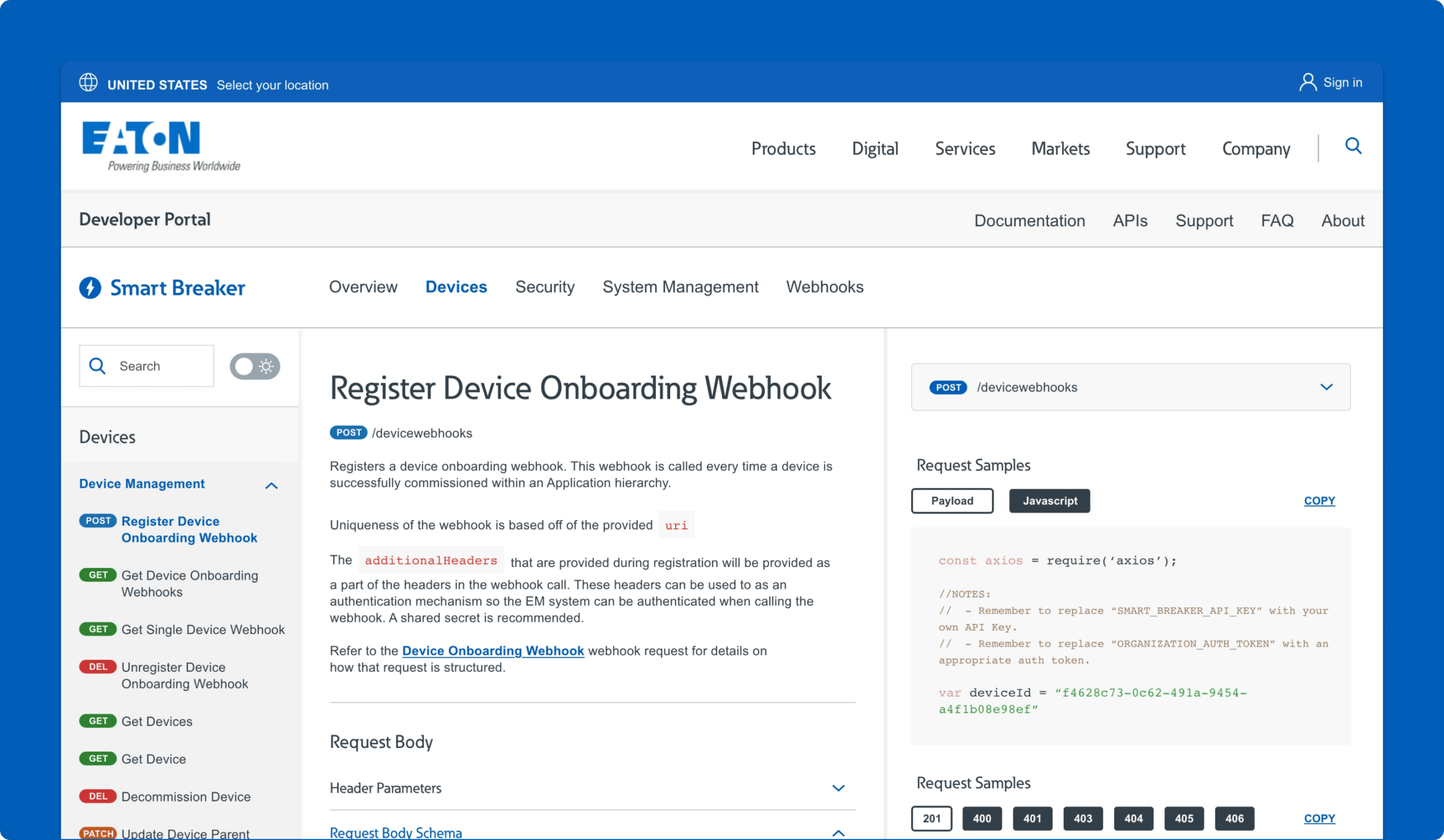
API Detail Page
Making Endpoint Documentation More Actionable
The API detail page was designed to support focused implementation work. These pages combined endpoint information, example code, error responses, and next-step guidance in a more structured developer documentation format. The goal was to make it easier for users to scan quickly for the technical details that matter most without losing the surrounding context of the broader workflow.
Why it mattered:
- Turned the portal into a more practical technical tool
- Helped users retrieve implementation details faster
- Supported scanning across examples, responses, and next steps
- Made endpoint documentation feel more usable and credible
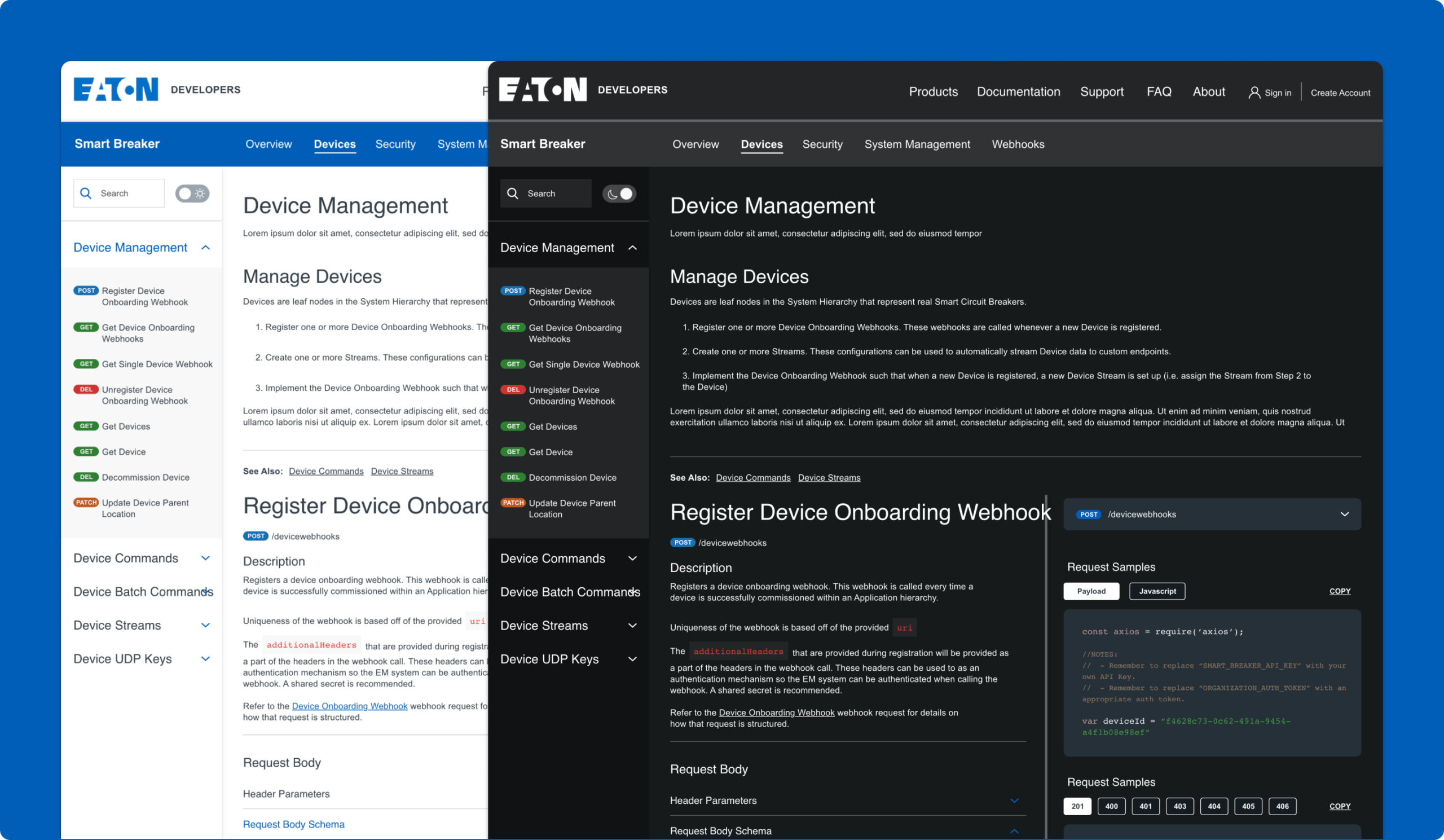
Light & Dark Mode
Supporting Developer Preferences
The portal concept also introduced both light mode and dark mode versions of the experience. In a documentation-heavy environment, this was more than a visual preference feature. It acknowledged that developers may spend extended time reading technical pages and often have strong preferences around viewing comfort and readability. This flexibility also contributed to the overall perception of the portal as a more polished and contemporary developer experience. Combined with a cleaner layout and stronger visual hierarchy, theme flexibility helped make the content feel easier to work with over time.
Why it mattered:
- Supported extended documentation use with greater visual comfort
- Matched familiar patterns from other technical products
- Made the portal feel more modern and developer-centered
- Improved the overall usability of a documentation-heavy experience
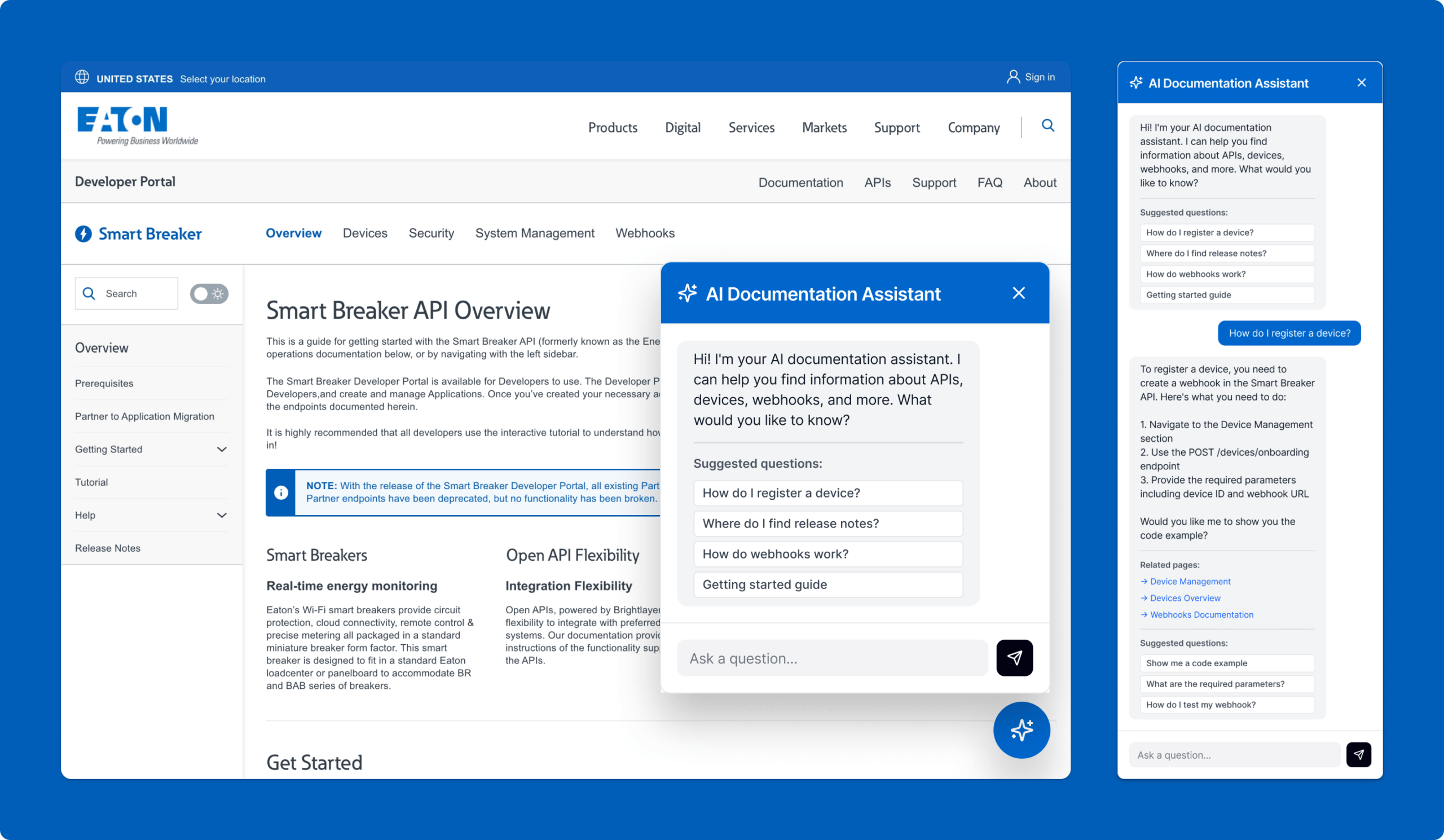
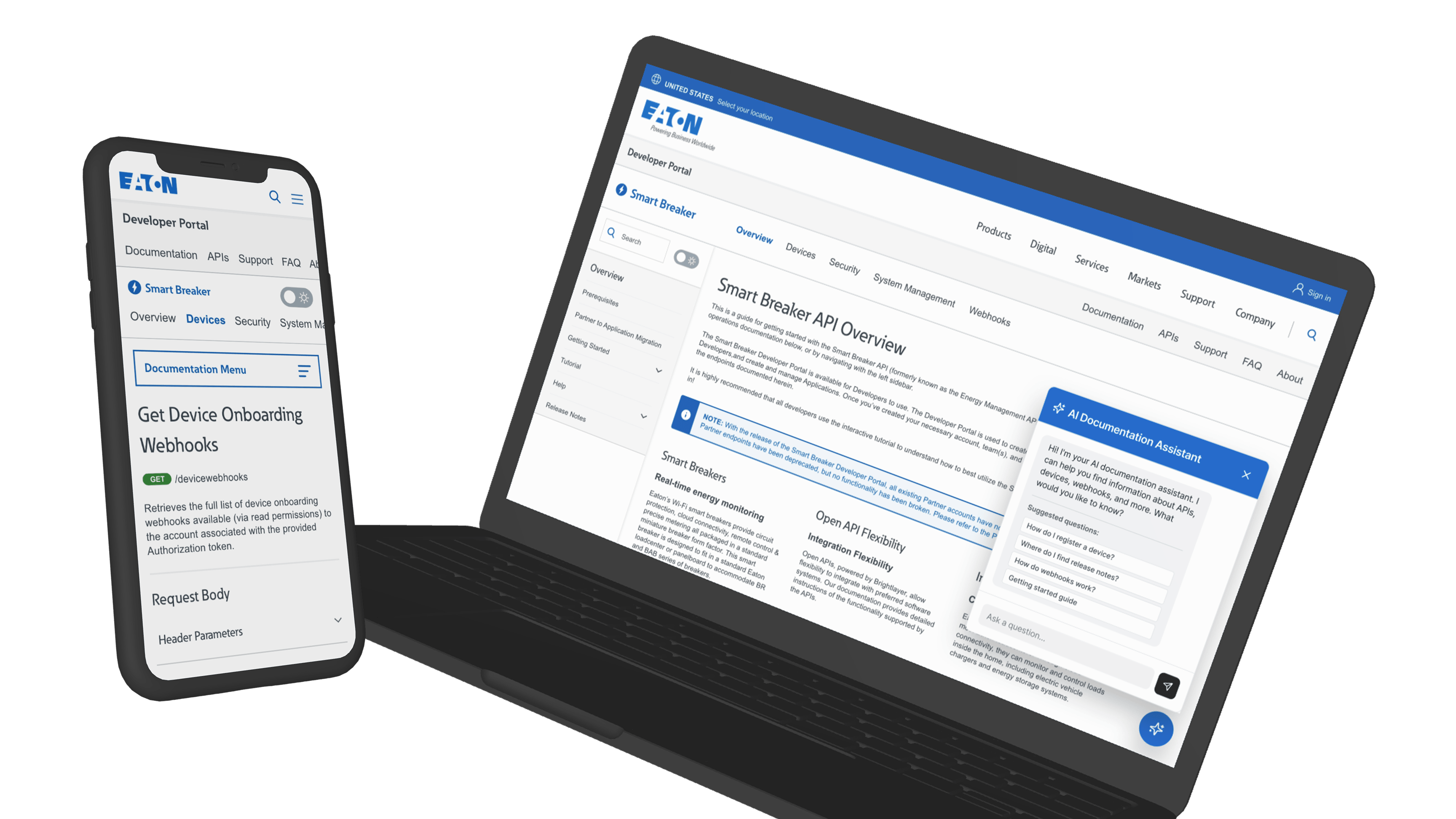
AI Documentation Assistant
Providing Direct Answers Inside The Documentation Experience
The AI Documentation Assistant was designed to make the portal more assistive by allowing users to ask natural-language questions such as how to register a device or where to find release notes. Instead of forcing users to navigate through multiple layers of content to find the right answer, the assistant returns a direct response along with linked pages, related sections, and relevant API endpoints. It also suggests related resources such as tutorials, FAQs, code examples, and support options, while preserving conversational context as users move across overview, category, and detail pages.
Why it mattered:
- Reduced the time needed to find answers in documentation
- Helped users retrieve technical guidance without navigation
- Connected direct answers to the underlying docs and endpoints
- Demonstrated a practical use of AI inside the developer workflow