A More Holistic Customer View
A customer support experience designed to help agents understand the full customer relationship
Platforms
Spectrum AgentOS
Deliverables
Research, Prototypes, Testing
Expertise
Research, iA, UI / UX Design
Year
2025


Project Overview

Designing a More Focused Customer Support Experience
Spectrum partnered with Capgemini to explore a future-state customer landing page for AgentOS that could help agents understand the customer more completely at the very start of an interaction. In the current experience, agents often had to move across separate tabs, tools, and account views to piece together basic context such as active services, billing details, outages, prior interactions, and which account was actually relevant to the call. This friction was especially pronounced for customers with multiple accounts across residential, business, disconnected, or legacy services. The concept work focused on creating a more centralized and actionable landing page that gives agents a clearer view of the customer, their accounts, and the context shaping the conversation before the call moves too far.
Research Approach

Grounding the Experience in Real Agent Workflows
The design direction was shaped through a broader research and concepting effort that included agent interviews, SME interviews, call observations, and heuristic evaluation, followed by concept validation and design testing with agents. Across the work, the team studied how agents identify the correct account, verify customers, understand account status, review prior interactions, and navigate across services during live support calls. More than twenty participants informed the project overall, and the landing page concepts were further validated through two rounds of testing to understand whether the new structure was intuitive, useful, and capable of reducing navigation overhead.
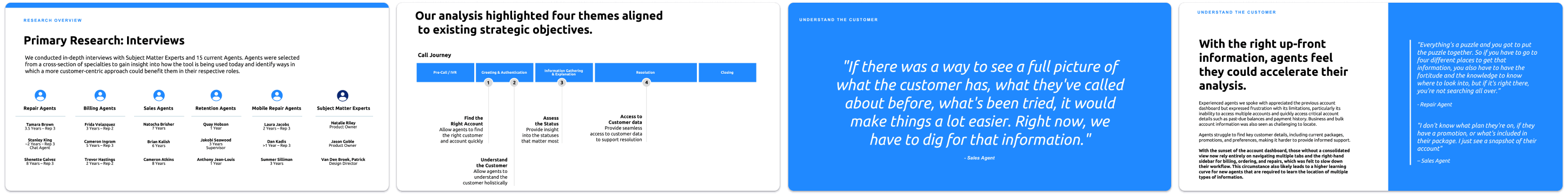
Key Research Themes
Finding the Right Account Was Too Difficult
Agents often had to manually search, open multiple tabs, and compare records just to confirm which account they should be working in when customers had multiple services or addresses.
Customer Context Was Fragmented
Important information such as billing status, outages, prior interactions, active services, and related accounts often lived across separate pages and tools, slowing agents down at the start of the call.
Getting Up to Speed Quickly Mattered
Agents needed a faster way to understand what was going on with the customer right now without having to ask repeated questions or retrace work done by a prior agent.
Multi-Account Support Needs to Feel Seamless
Agents wanted a better way to see related accounts together, authenticate additional accounts from the same screen, and avoid losing context when switching between them.
Design Strategy

A More Customer-Centered Agent Experience
The future-state concept focused on turning the landing page into a central hub for understanding the customer across accounts, services, and recent history. Rather than requiring agents to assemble the story themselves, the design introduced a unified customer overview, grouped account hierarchy, clearer selected-account treatment, and expandable service sections that let agents move from summary to detail without leaving the page.
The experience was designed around four core ideas: helping agents identify the right account faster, giving them a more holistic understanding of the customer, surfacing the statuses that matter most, and reducing navigation across AgentOS. It also explored practical AI features that could help agents prepare more quickly, including last-call summaries, customer sentiment signals, and AI-derived customer attributes from prior interactions.
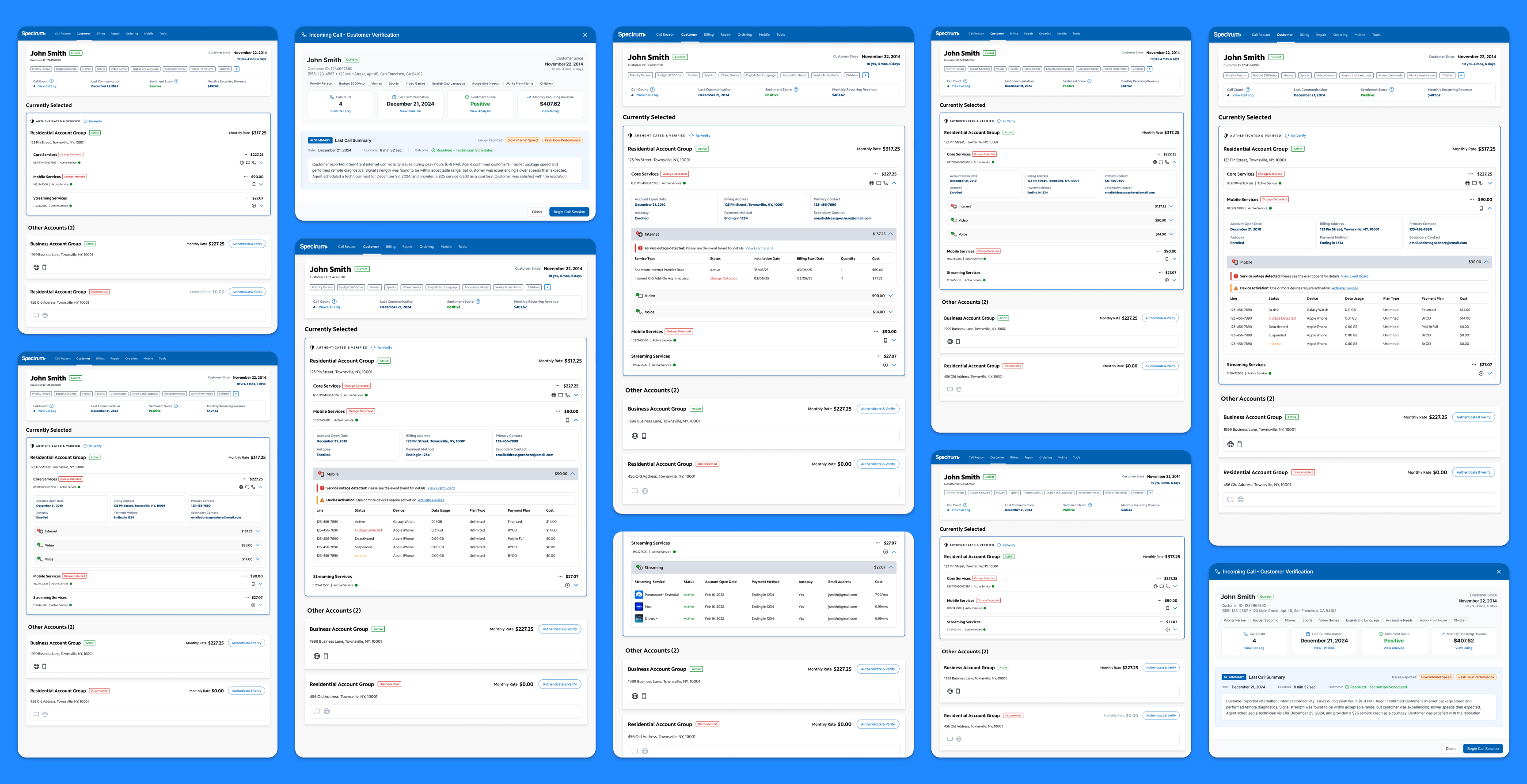
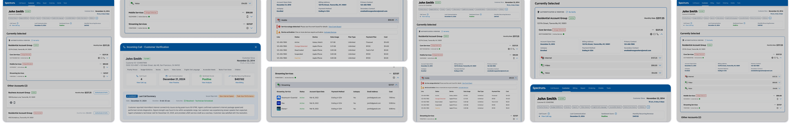
Incoming Call Modal
Bringing Better Context Into The Call Before It Begins
The incoming call modal was designed to give agents useful context before they even begin the session. The concept brings together customer identity, tenure, monthly recurring revenue, recent communication history, sentiment, and attribute tags in one pre-call view. At the center of the experience is an AI-generated summary of the last call, helping agents quickly understand what happened previously, what was resolved, and what may still be relevant to the current interaction. Instead of starting cold, the agent enters the call with a clearer sense of who the customer is and what context may matter most.
Why it mattered:
- Reduced the need for customers to repeat themselves
- Helped agents start the call with more continuity and empathy
- Surfaced useful context before navigation into the broader workflow
- Demonstrated a practical use of AI to improve support readiness
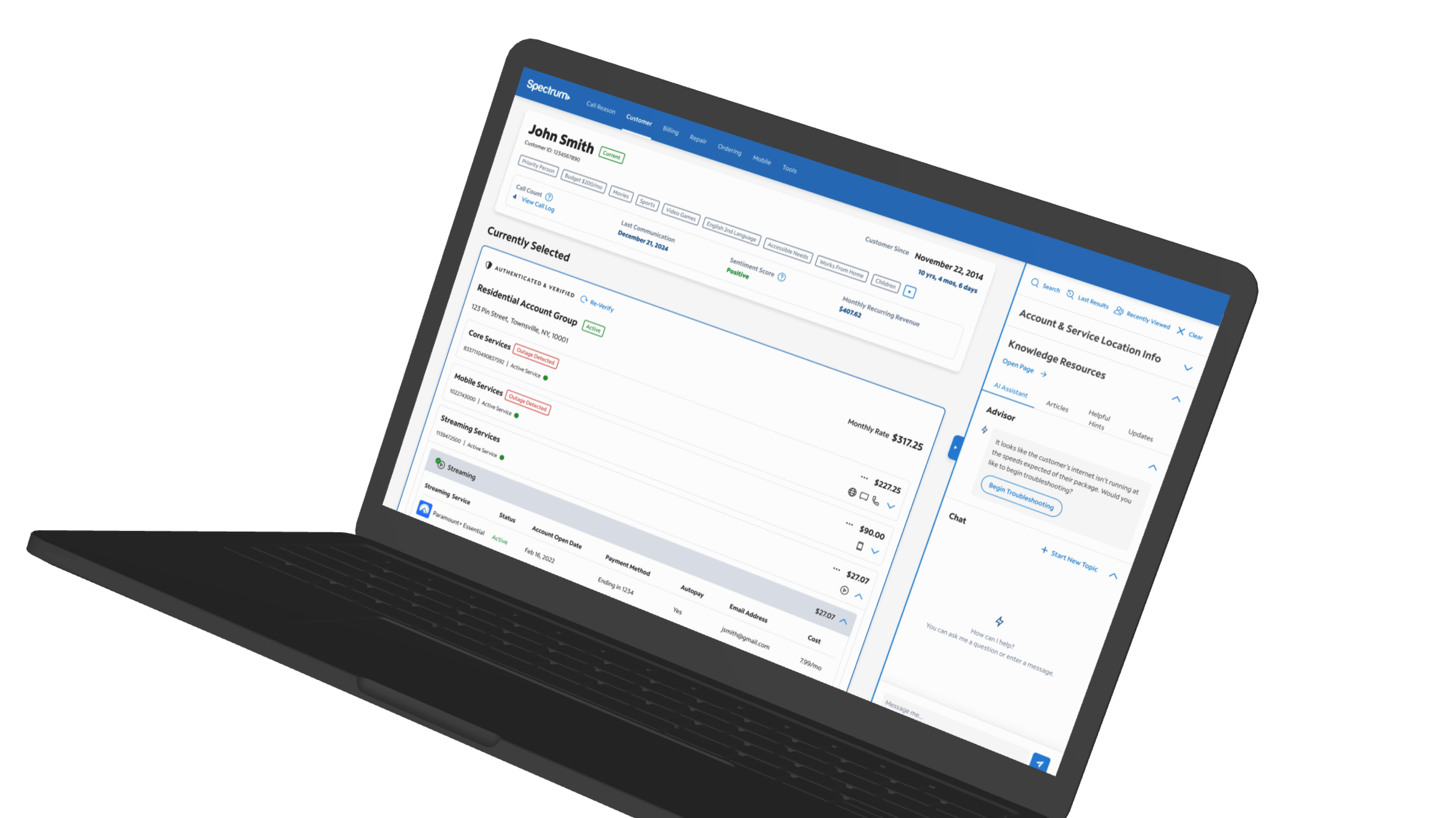
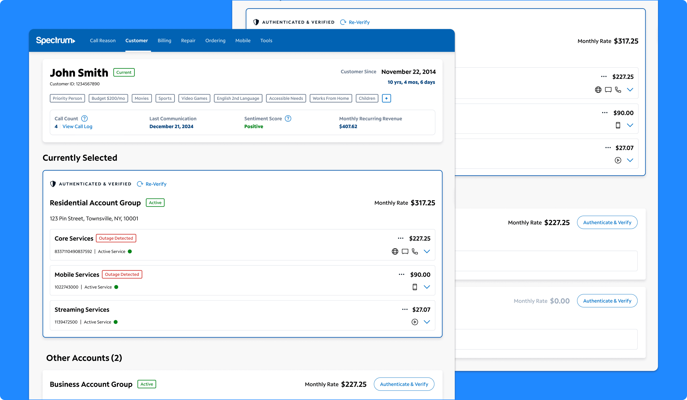
Customer Landing Page
Creating A Stronger Starting Point Inside AgentOS
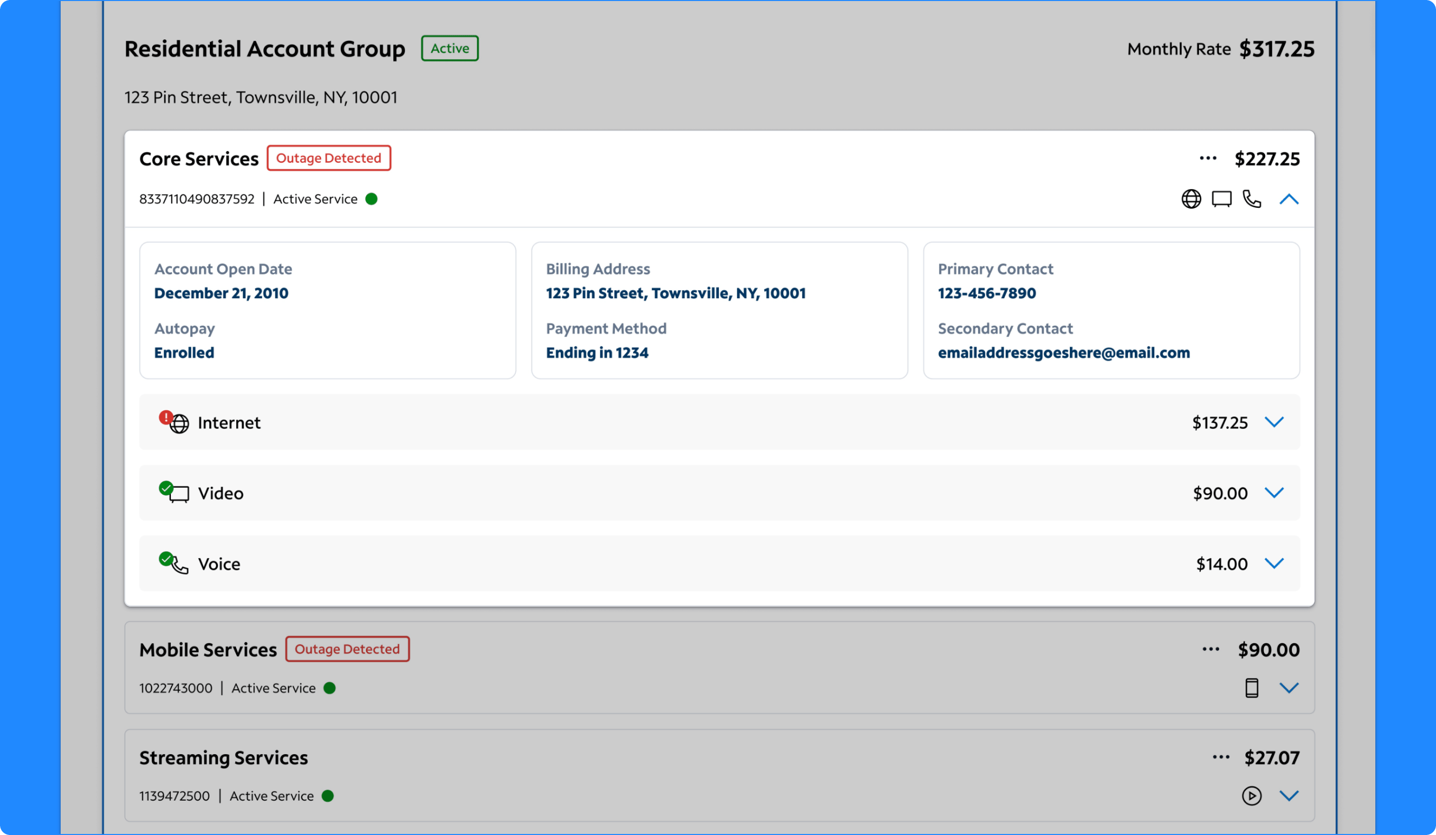
The landing page concept was designed to give agents a more complete view of the customer relationship from one screen. The experience combines a top-level customer overview with structured account groups, account status, service summaries, and direct access to related details. Rather than treating each account as a separate destination, the page organizes residential, business, disconnected, and other account relationships into a broader customer view that helps agents understand what the customer has, what is currently in focus, and what other accounts may also be relevant. The goal was to make the first screen more useful, more actionable, and more capable of supporting a wider range of conversations without forcing agents to jump elsewhere immediately.
Why it mattered:
- Created a more holistic starting point for customer support
- Reduced the need to move across multiple tabs and tools
- Helped agents understand both the active account and the broader customer relationship
- Made the page feel more like a working hub than a pass-through screen
Customer Overview Panel
Giving Agents A Faster Read On The Customer
The customer overview panel was designed to help agents quickly understand who they are speaking with and how to approach the interaction. It surfaces information such as customer tenure, call count, last communication, monthly recurring revenue, sentiment, and AI-derived customer attributes that reflect personal context or recurring themes from prior calls. Rather than limiting the overview to static account facts, the concept turns the top of the page into a more intelligent summary layer that helps agents anticipate tone, prepare for sensitive conversations, and personalize the interaction more naturally. Agents responded positively to having this information in one place and saw it as useful for both rapport-building and faster issue understanding.
Why it mattered:
- Helped agents build rapport faster
- Gave agents a more human understanding of the customer
- Made recent history and tone more visible at a glance
- Used AI to turn prior interactions into more actionable support context
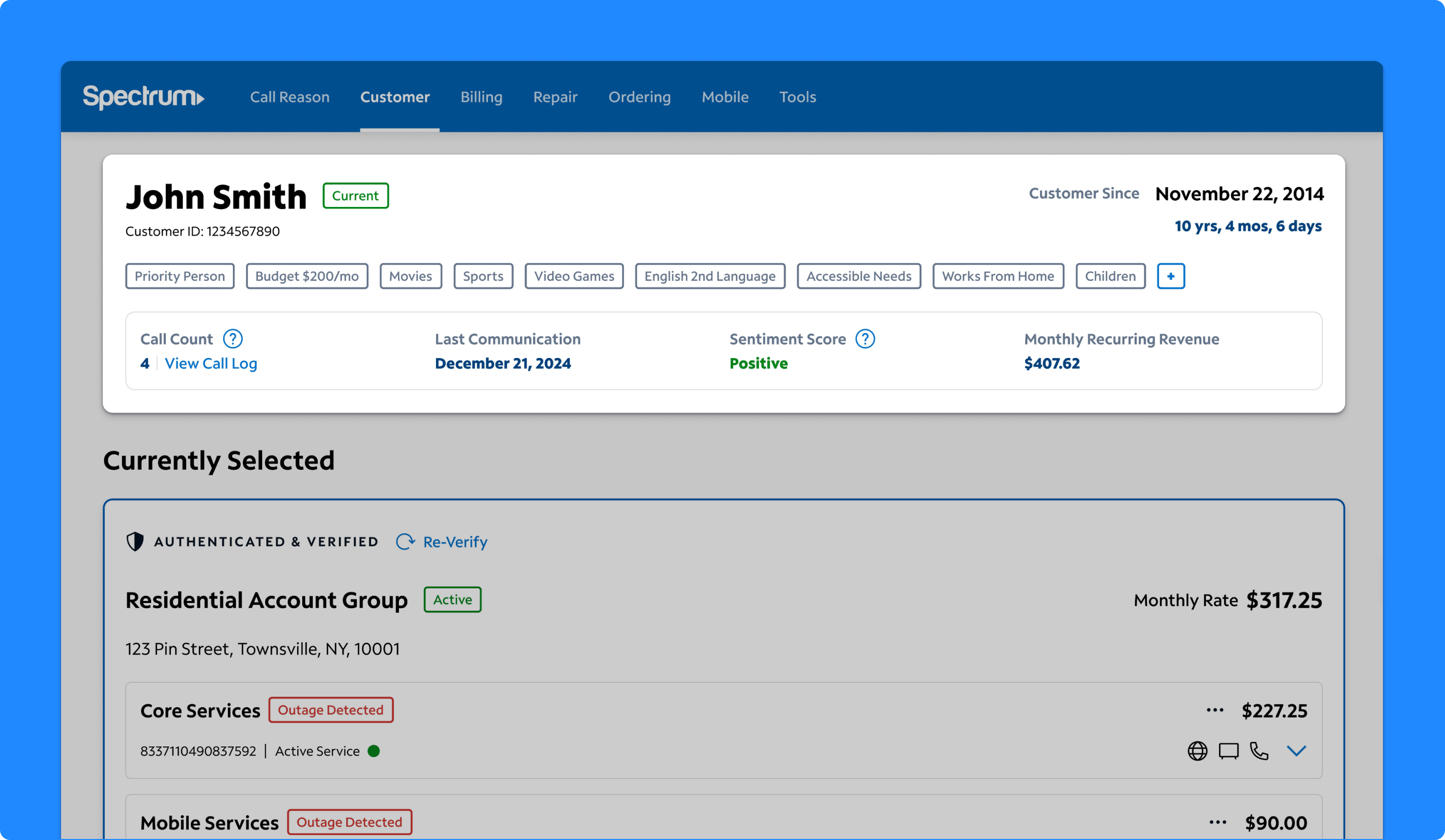
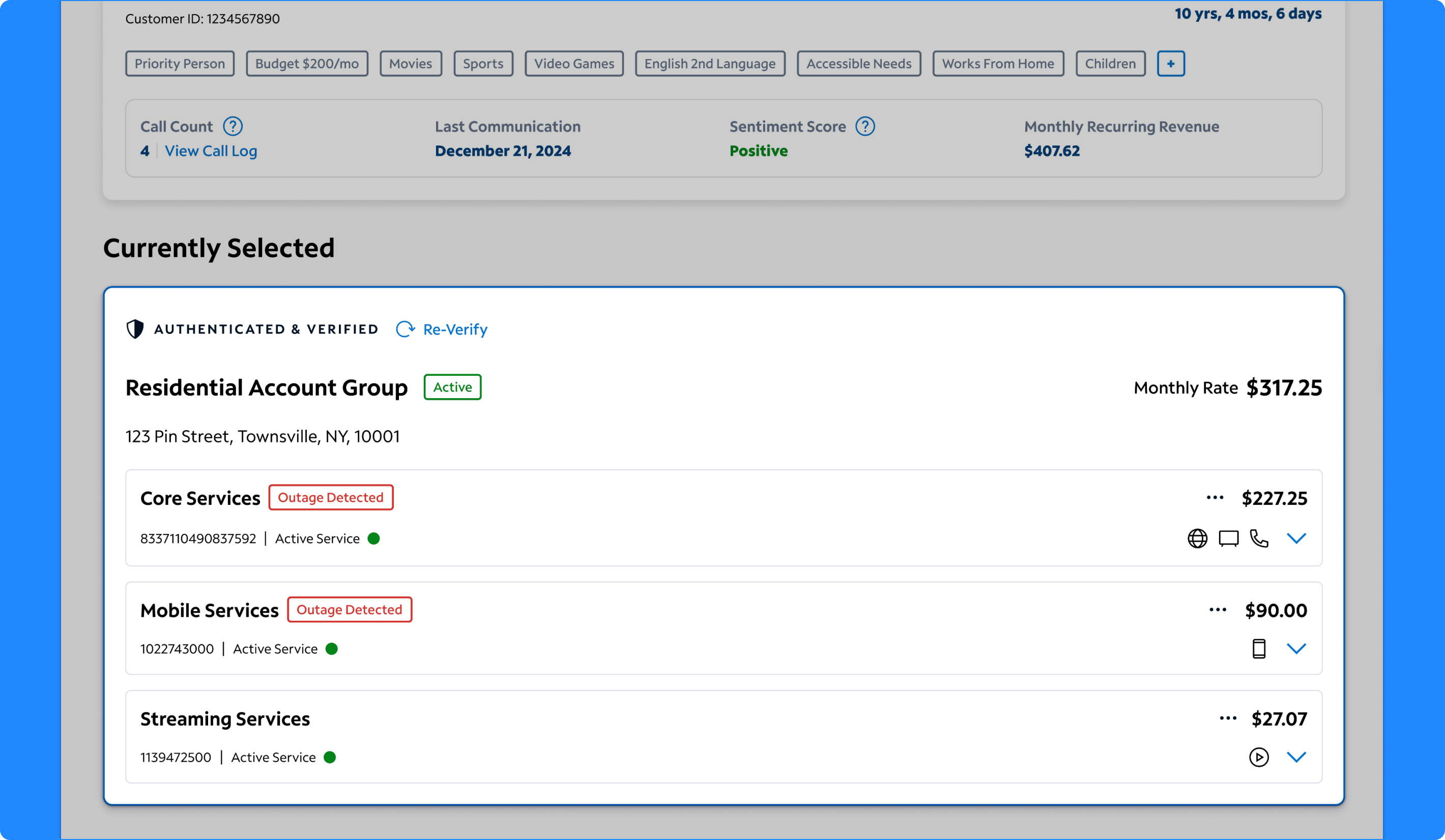
Selected Account Group
Making The Active Account Easier To Understand
The selected account group was designed to act as the agent’s primary working view for the current interaction. Research and testing showed that when multiple account groups are visible at once, agents need a strong visual and informational anchor that makes it obvious which account is currently in focus. The selected state brings together service groupings, account status, billing details, authentication state, and key service signals in one concentrated panel. This helps agents understand what account they are actively supporting while still keeping surrounding related accounts visible on the page.
Why it mattered:
- Clarified which account was actively driving the interaction
- Reduced confusion in multi-account scenarios
- Consolidated key account details into a more scannable working view
- Supported faster decisions around troubleshooting, billing, and next steps
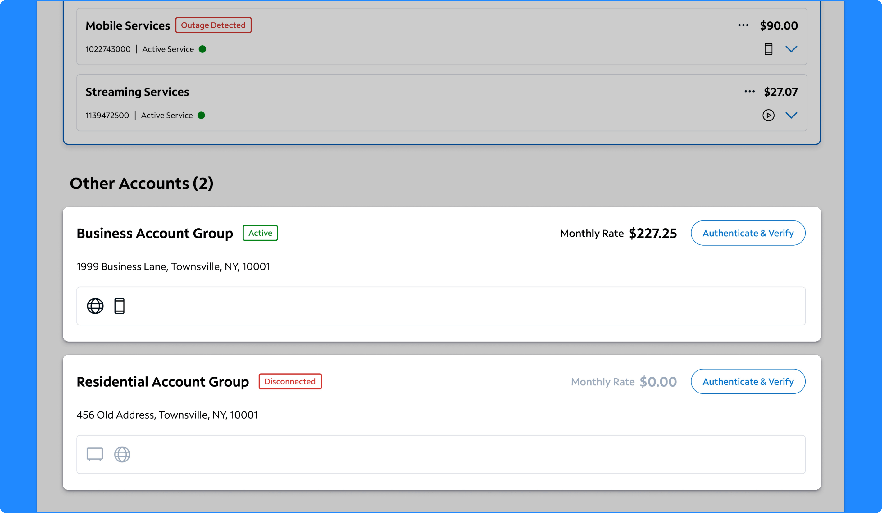
Multi-Account Hierarchy
Organizing Related Accounts Into A More Usable Customer View
One of the biggest design moves in the concept was the introduction of a structured multi-account hierarchy. Foundational research showed that customers with multiple accounts created significant friction for agents, who often had to reopen search, duplicate tabs, or authenticate accounts one at a time in disconnected ways. The new hierarchy groups related accounts together on the same page, allowing agents to see residential, business, disconnected, and other account relationships in context. The design also supports switching and authenticating additional accounts without leaving the page, helping agents stay oriented while addressing broader customer needs.
Why it mattered:
- Reduced friction when customers had multiple accounts
- Helped agents understand account relationships faster
- Supported account switching without losing context
- Created a clearer model for working across residential and business scenarios
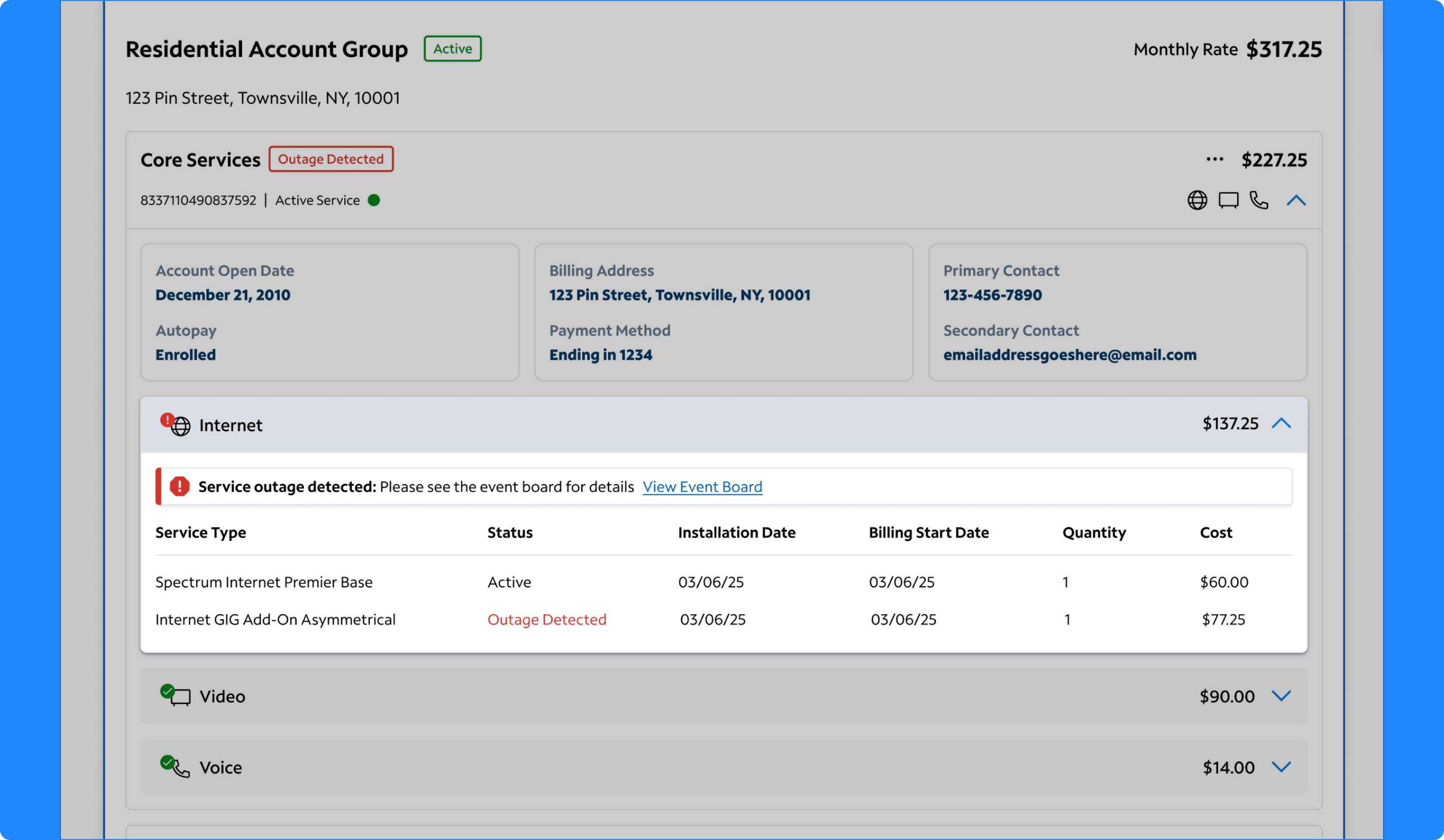
Expanded Core Services
Using Progressive Disclosure To Keep Details Close At Hand
The expanded Core Services view was designed to let agents drill into more detailed account information without leaving the landing page. Within the expanded state, agents could see account open date, autopay, billing address, payment method, contact information, service groupings, service status, and costs. This created a more structured way to move from a high-level account summary into the operational details agents often need for billing, service, and upsell conversations. Testing showed that agents found this pattern intuitive and valuable because it reduced the steps normally required to gather this information elsewhere in AgentOS.
Why it mattered:
- Reduced navigation away from the landing page
- Kept important billing and service details close to the account summary
- Made it easier to answer common support questions more quickly
- Created a scalable model for expanding deeper service information only when needed
Expanded Internet Services
Surfacing Troubleshooting Context More Directly
The expanded Internet Services section was designed to support troubleshooting and service understanding within the same overall experience. It surfaces internet package details, service status, installation date, billing start date, quantity, cost, and outage visibility directly in the expanded panel. Agents responded positively to having outage signals and plan information readily available because it helped them interpret what might be happening before navigating into separate repair tools. The concept also demonstrated how service-specific details could live naturally within the broader account context instead of being split into disconnected pages.
Why it mattered:
- Brought troubleshooting signals into the landing experience
- Helped agents explain internet plans and charges more clearly
- Reduced time spent navigating to separate repair views
- Made service-specific context easier to access at the right moment
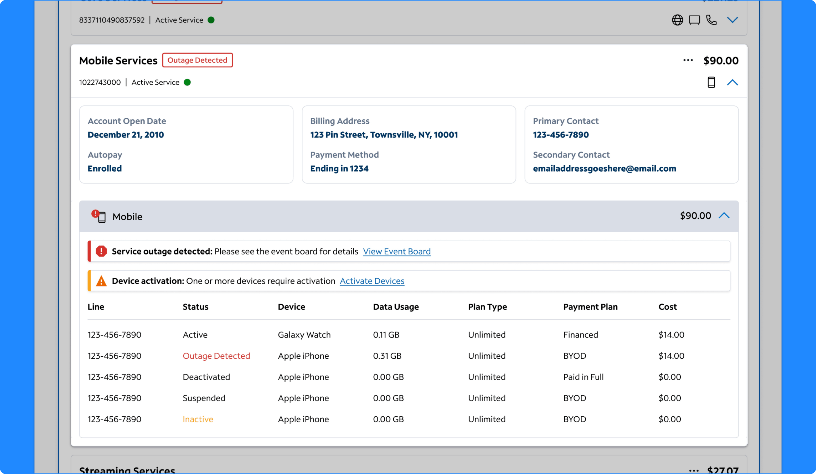
Expanded Mobile Services
Making Device And Line Details Easier To Scan
The expanded Mobile Services view was designed to help agents understand a customer’s mobile situation more fully without leaving the landing page. The section includes line status, device, data usage, plan type, payment plan, and cost across multiple lines and device states. It also surfaces activation issues and distinguishes between financed devices, BYOD, and fully paid devices. Agents found this depth of information especially helpful for understanding billing questions, activation issues, and line-specific service context. The design showed how a more consolidated service view could reduce the need to jump between mobile-specific screens just to answer common questions.
Why it mattered:
- Made mobile account details easier to understand at a glance
- Supported faster responses to activation and billing questions
- Reduced time spent searching across line-level information
- Extended the landing page concept beyond core services into a fuller customer view
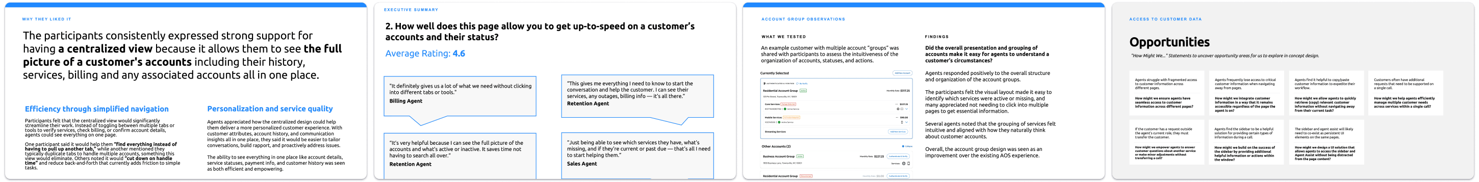
Takeaways

Testing Showed Strong Support for the Direction
The customer landing page concept tested well overall. Agents described the design as streamlined, modern, intuitive, and easier to navigate than the current experience. In the later design testing, the concept received strong average ratings for helping agents understand the customer and their relationship with Spectrum, get up to speed on account status, present customer details and related accounts helpfully, and organize accounts and associated actions intuitively. Agents repeatedly emphasized the value of having more customer, account, and service context on one page and saw the design as a more effective primary starting point inside AgentOS.