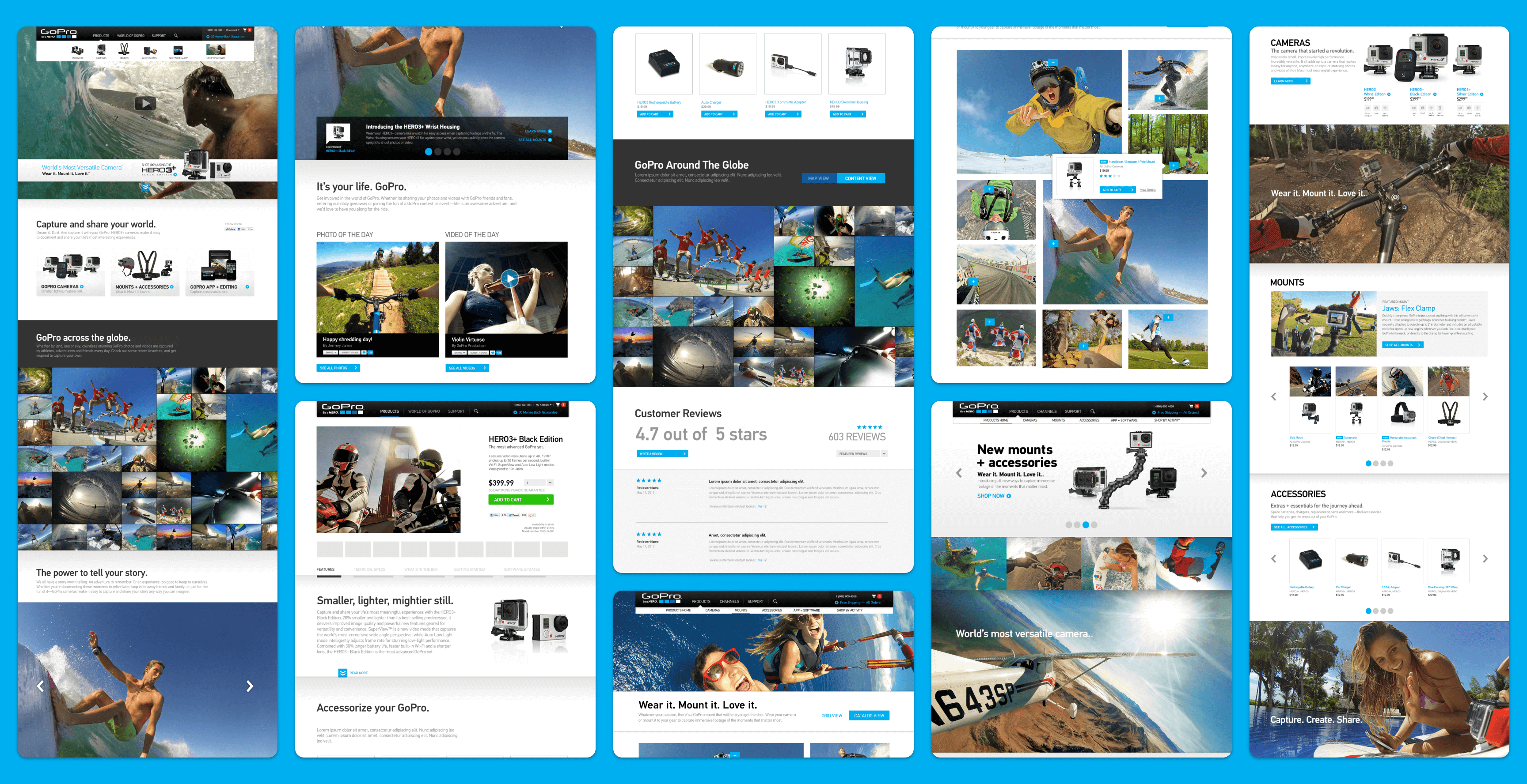
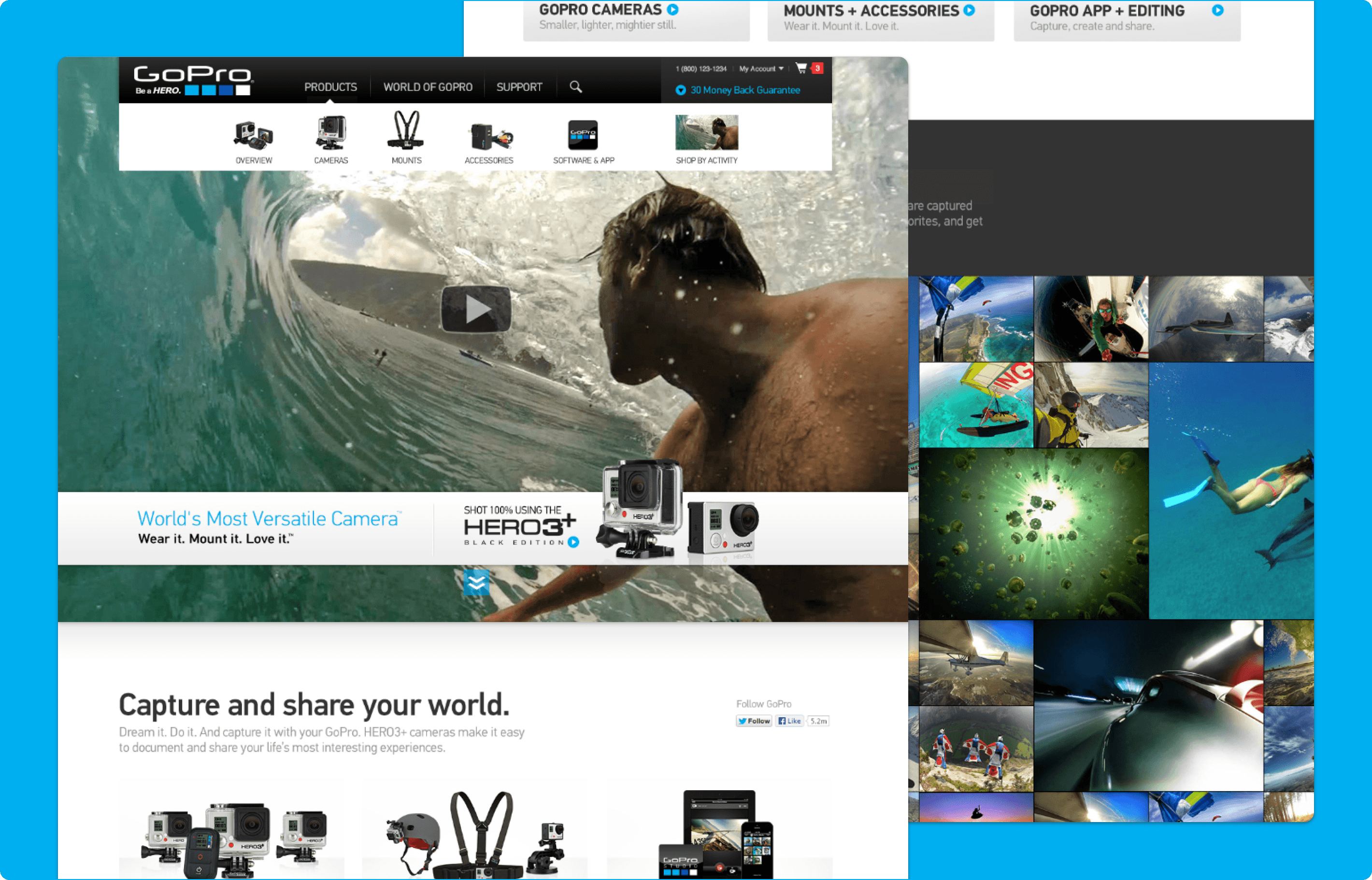
The World's Most Versatile Camera
A Webby Award-Winning storefront experience for a new product launch and re-platforming
Platforms
Salesforce Commerce Cloud
Deliverables
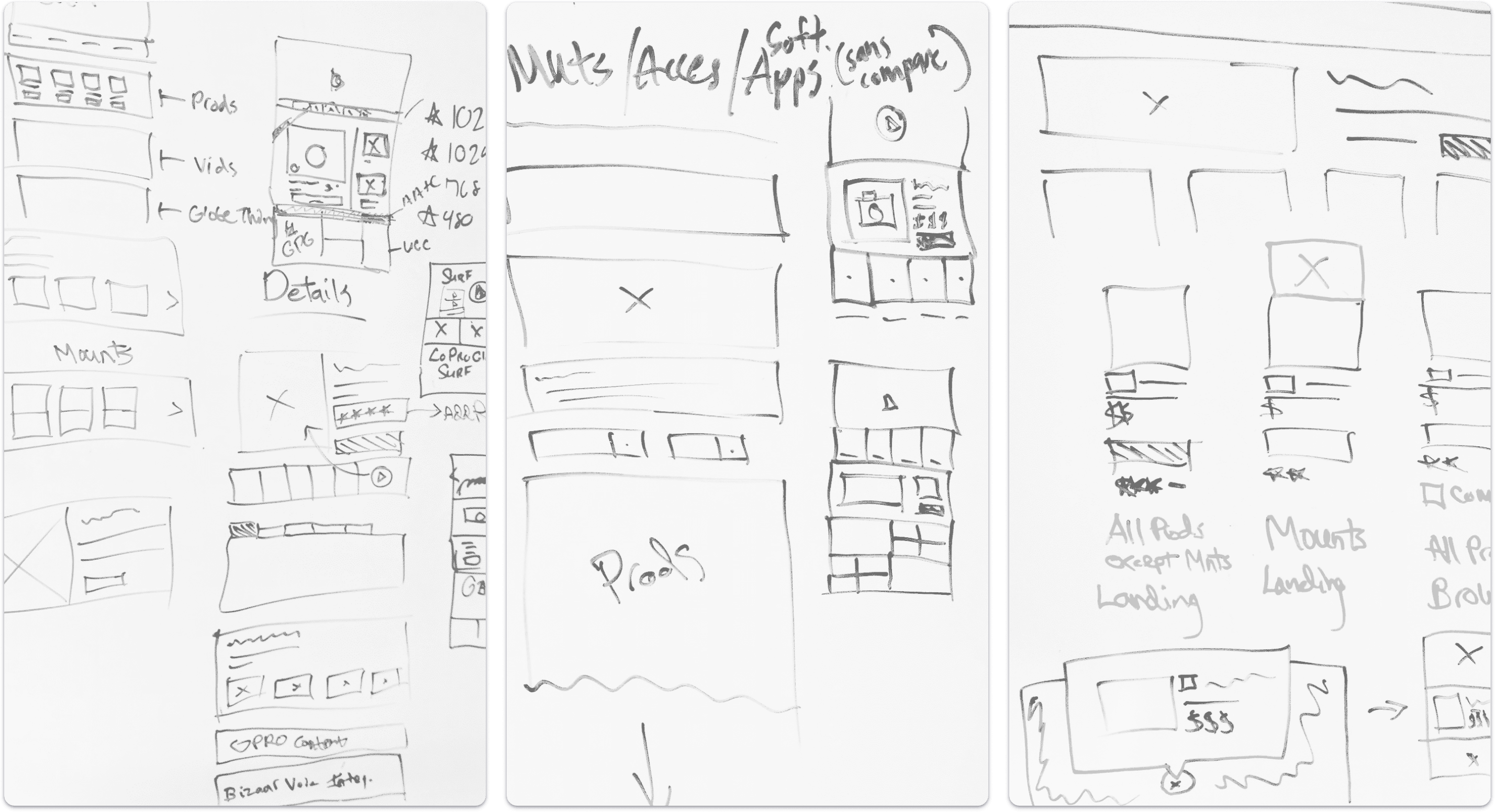
Wireframes, Prototypes
Expertise
iA, UI / UX Design
Year
2013
Project Overview

Designing for Launch and Long-Term Growth
GoPro partnered with LYONSCG to replatform the ecommerce experience in support of an upcoming product launch and future business growth. The work had to move quickly within a fast-paced agile process while also meeting a hard launch deadline. Alongside migrating existing functionality, the project introduced new browsing and merchandising interactions that helped expand what the platform could do and better reflect how GoPro customers discover and shop for products.
Research Approach

Rethinking How Customers Discover Products
One of GoPro’s biggest strengths was the way the brand helped customers imagine how products fit into real activities and lifestyles. The redesign explored how to bring that same sense of possibility more directly into the shopping experience rather than relying only on external channels like YouTube. The team worked closely with the client and development partners to find ways to integrate more contextual, action-oriented content into browse and merchandising experiences using the existing platform capabilities.

Key Research Themes
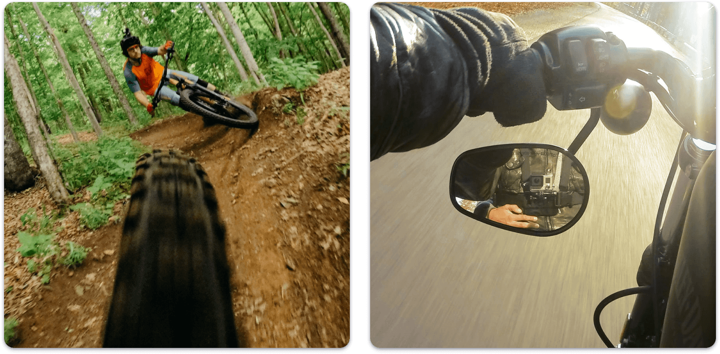
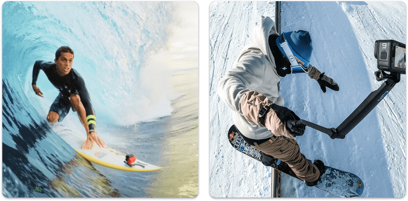
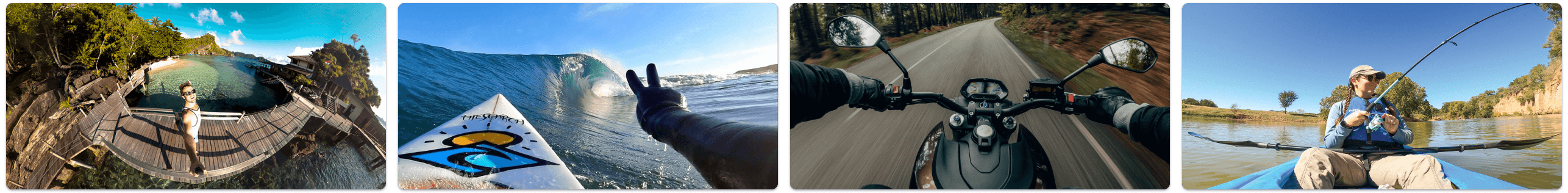
Products Need To Show Real-World Use
Traditional browse pages often focus on product tiles, pricing, and reviews, but GoPro’s audience also needed to see how products and accessories actually get used in action.
The Experience Needs To Feel More Immersive
The redesign explored ways to move beyond a standard product grid and create a more visually engaging browse experience that better matched the energy of the brand.
Better Guidance Across Activities And Gear
Because GoPro products are often purchased in the context of specific activities, the experience needed to help users connect products, accessories, and use cases more clearly.
Products Positioned as Complete Solutions
The experience introduced more bundled and activity-based shopping paths so customers could more easily find combinations of products that worked together.
Design Strategy

A More Immersive, Activity-Driven Shopping Experience
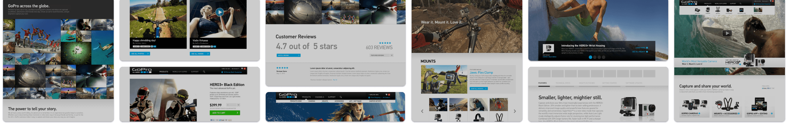
The design strategy focused on making the GoPro storefront feel more aligned with how customers actually think about using the products. Rather than limiting discovery to traditional ecommerce patterns, the experience introduced more contextual browse pages, activity-based merchandising, and bundled product paths that connected cameras and accessories to real-world use. The result was a shopping experience built around four core ideas: immersive product browsing, stronger visualization of products in action, better activity-based wayfinding, and more complete solution-oriented merchandising.
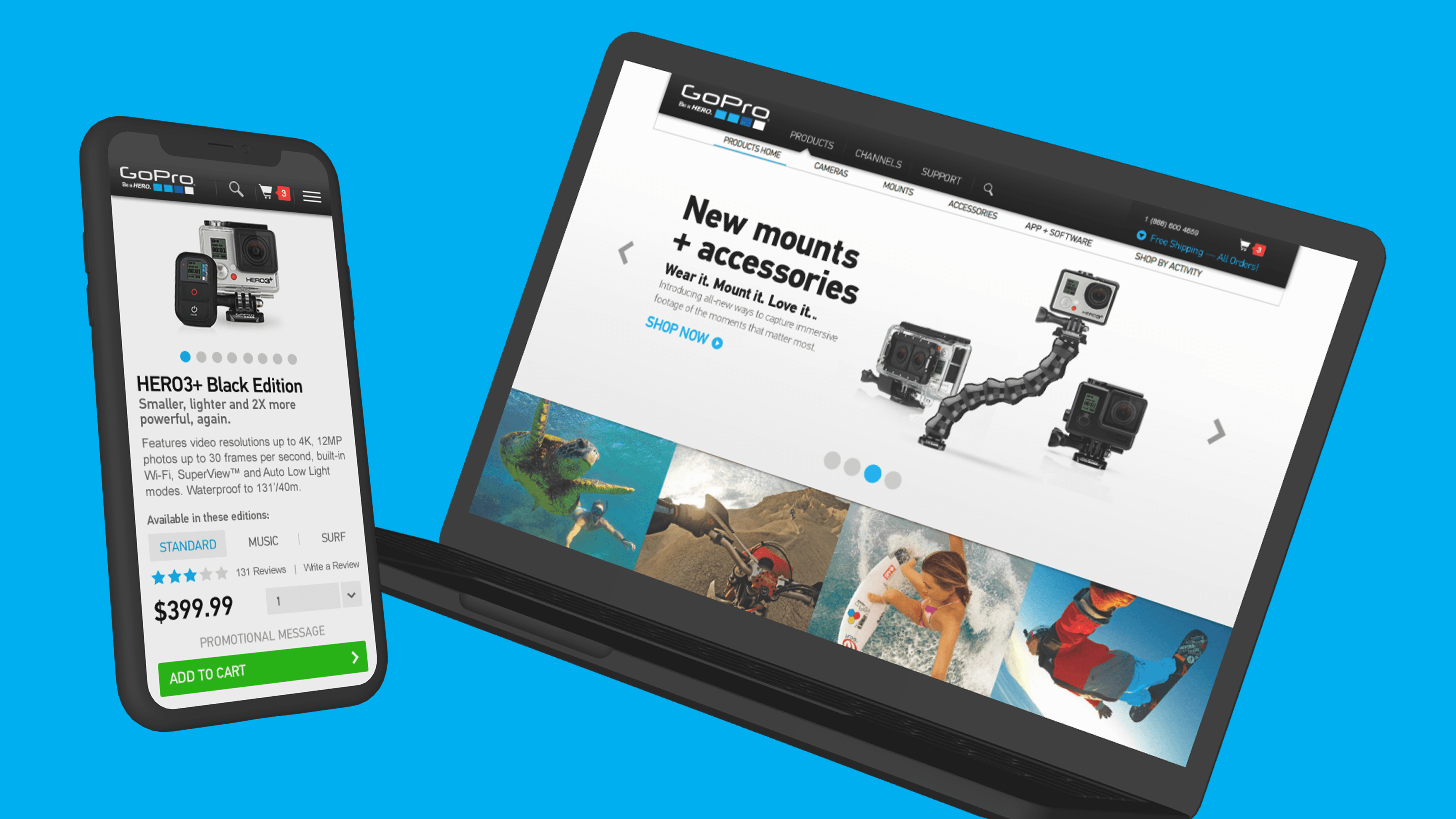
Home Page Design
Creating a More Immersive Entry Point Into the Brand
The homepage was designed as a visually driven entry point that immersed users in the energy of the GoPro brand through large-scale action imagery, featured product messaging, and clear pathways into cameras, mounts and accessories, the GoPro app, and activity-based exploration. Rather than functioning like a traditional storefront, the page balanced commerce and inspiration by combining product entry points with community content, storytelling, and features like “GoPro across the globe,” “The power to tell your story,” and daily photo and video highlights.
Why it mattered:
- Created a more immersive first impression that reflected the brand’s energy
- Balanced product discovery with storytelling and community-driven inspiration
- Gave users clear entry points into cameras, accessories, app experiences, and activities
- Helped connect commerce with the real-world content that makes GoPro compelling
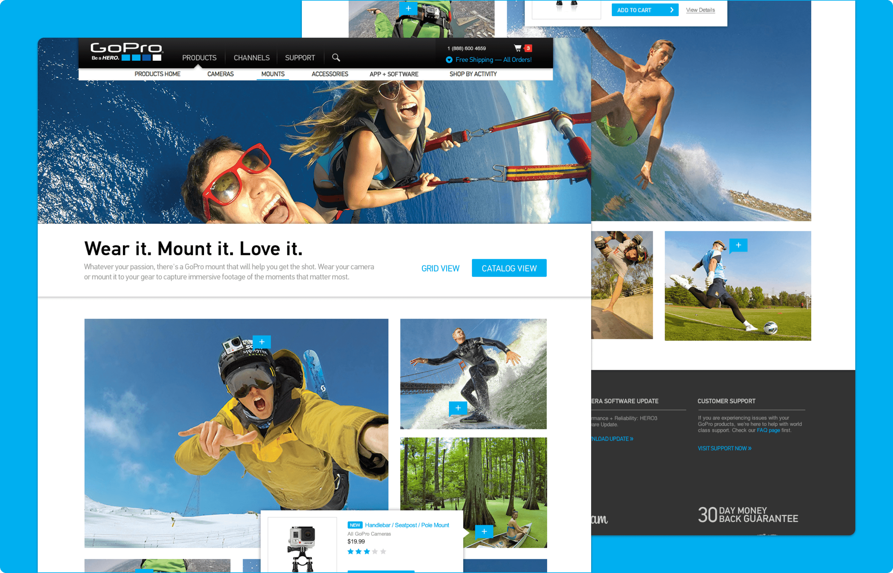
Product Browse Experience
Making Product Discovery More Visual and Contextual
A key part of the browse redesign was the introduction of a “catalog view” that let users move beyond a standard scrolling product grid. This view used action photography to showcase products in the context of the activities they support, giving customers a more immersive way to shop. By allowing users to switch between traditional browsing and a more visual discovery mode, the experience supported different shopping preferences without losing usability.
Why it mattered:
- Helped customers better visualize products in use
- Let customers explore products through activity-focused imagery
- Better reflected the aspirational nature of the GoPro brand
- Created a more engaging alternative to standard catalog browsing
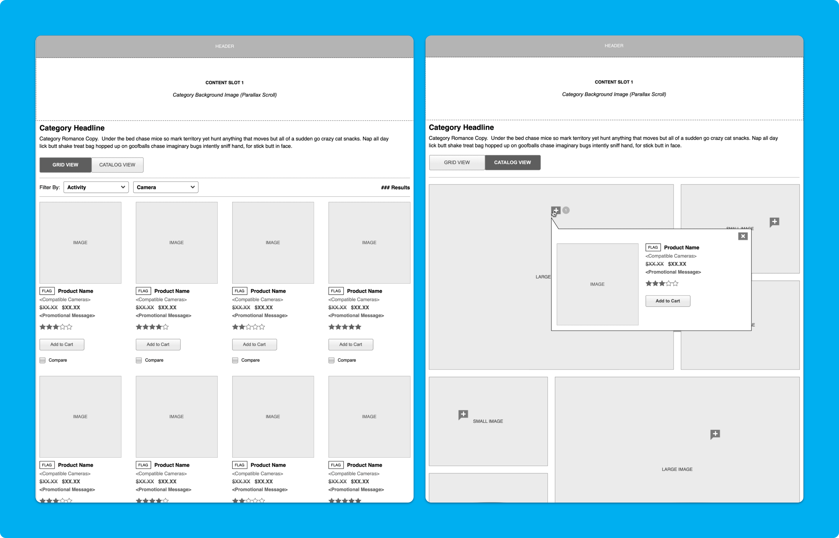
Interactive Hotspots
Connecting Action Imagery Directly to Products
The “catalog view” also introduced interactive hotspots layered onto action imagery so users could identify which products were being used in each activity. This was especially valuable on mounts and accessories pages, where customers often need help understanding which gear fits which scenario. The design required close collaboration with development to create a lightweight responsive solution that worked within platform constraints while still delivering a more dynamic experience.
Why it mattered:
- Helped users connect products to real activities more directly
- Improved understanding of how accessories fit into use cases
- Added interactivity without overwhelming the browsing flow
- Extended merchandising through a more informative visual layer
Shop by Activity
Organizing the Store Around Customer Intent
To better support how GoPro customers shop, the ecommerce experience introduced a “Shop by Activity” pathway that grouped products around the activities people care about most. Rather than asking users to piece together gear on their own, this structure gave them a clearer starting point based on intended use. It helped customers move through the storefront with more confidence and made the experience feel more relevant to their goals.
Why it mattered:
- Aligned navigation more closely to customer needs and intent
- Reduced guesswork when shopping across cameras and accessories
- Supported faster discovery for activity-based audiences
- Created a stronger connection between products and real-life scenarios
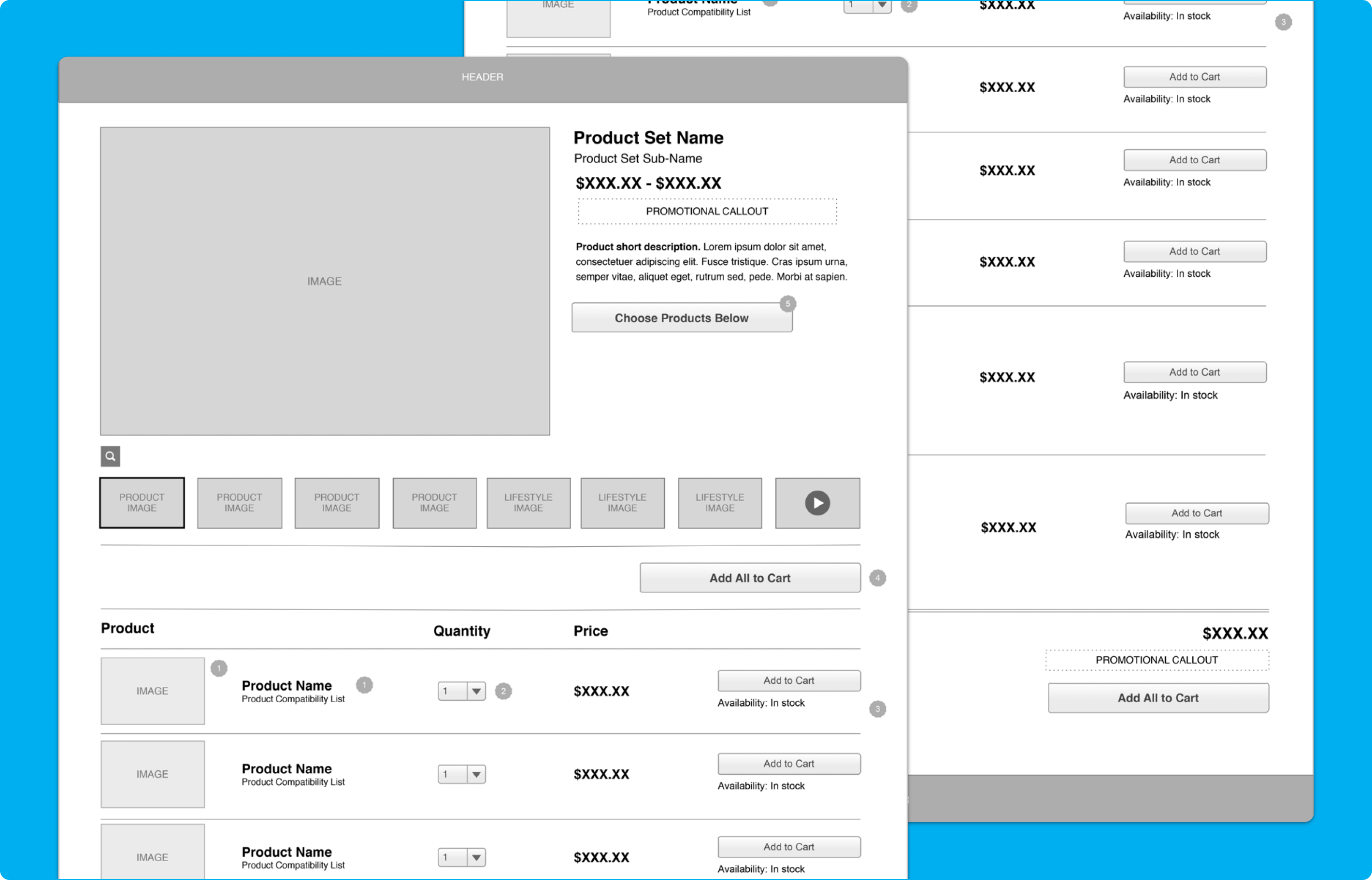
Bundled Products
Helping Customers Find More Complete Solutions
The activity-based experience also included bundled product concepts that paired primary cameras with relevant accessory options. These bundles were designed to reflect the needs of different audience segments and activity types, making it easier for customers to find combinations that worked together. This shifted the experience from simply browsing individual products to discovering more complete setups built around how customers actually use GoPro gear.
Why it mattered:
- Simplified shopping across related products
- Helped customers find more complete solutions faster
- Supported merchandising tied to specific audience needs
- Reduced friction in assembling the right gear combination
Takeaways

- Successfully launched within a tight deadline
- Worked with a diverse team through a fast paced agile process
- GoPro was named Demandware Partner of the Year 2013
- Webby Award Winner for "Best Consumer Electronics Site" and "People's Voice Award for Best Consumer Electronics Site"