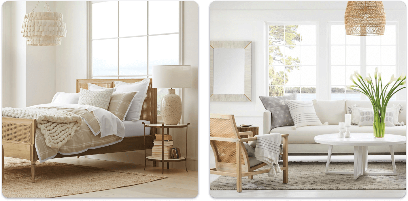
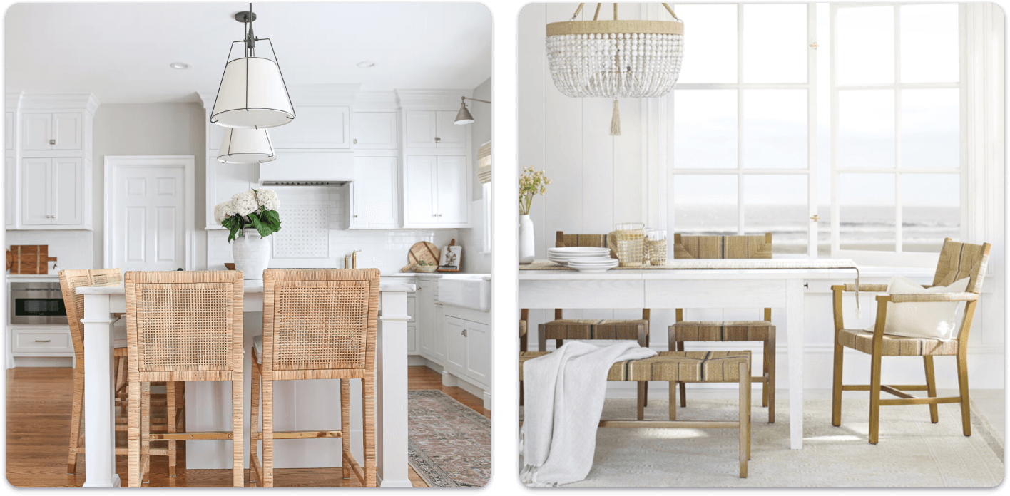
Make Home a Welcoming Oasis
Unique storefront experience for bespoke design-driven luxury home and lifestyle brand
Platforms
Salesforce Commerce Cloud
Deliverables
Wireframes, Prototypes
Expertise
iA, UI / UX Design
Year
2015
Project Overview

Elevating the Serena & Lily Shopping Experience
Serena & Lily partnered with LYONSCG to create a more distinctive digital storefront experience for its luxury home and lifestyle brand. Working with Sweden Unlimited, the focus was on designing an ecommerce experience that better reflected the brand while making it easier for customers to discover products, browse collections, and personalize their purchases. The work explored how a more thoughtful structure and more immersive interactions could support both inspiration and conversion across key parts of the site.
Design Strategy

Balancing Editorial Inspiration with Ecommerce Utility
The design direction focused on creating an experience that felt more curated, visually engaging, and supportive of Serena & Lily’s product storytelling. Rather than relying only on standard ecommerce patterns, the work introduced features and page structures that helped customers browse by room, explore coordinated collections, and interact with products in a way that felt more aligned to how people shop for home furnishings. It also connected the broader shopping journey more intentionally, from account creation and saved-item management to product customization and checkout, resulting in an experience that felt both more premium and more useful, with a stronger emphasis on inspiration, merchandising flexibility, and smoother interaction design.
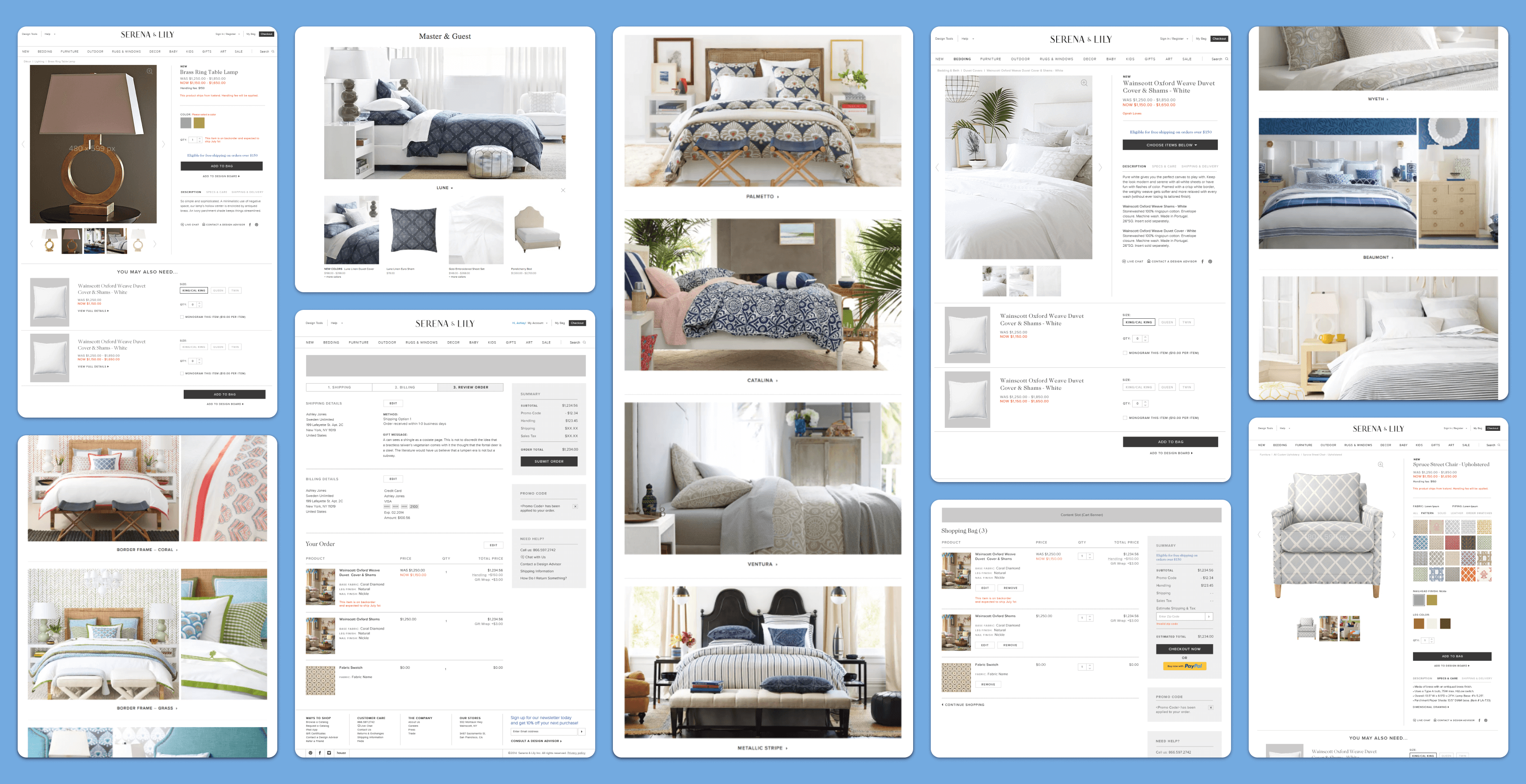
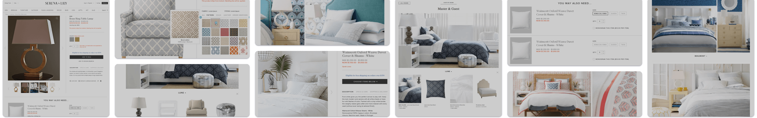
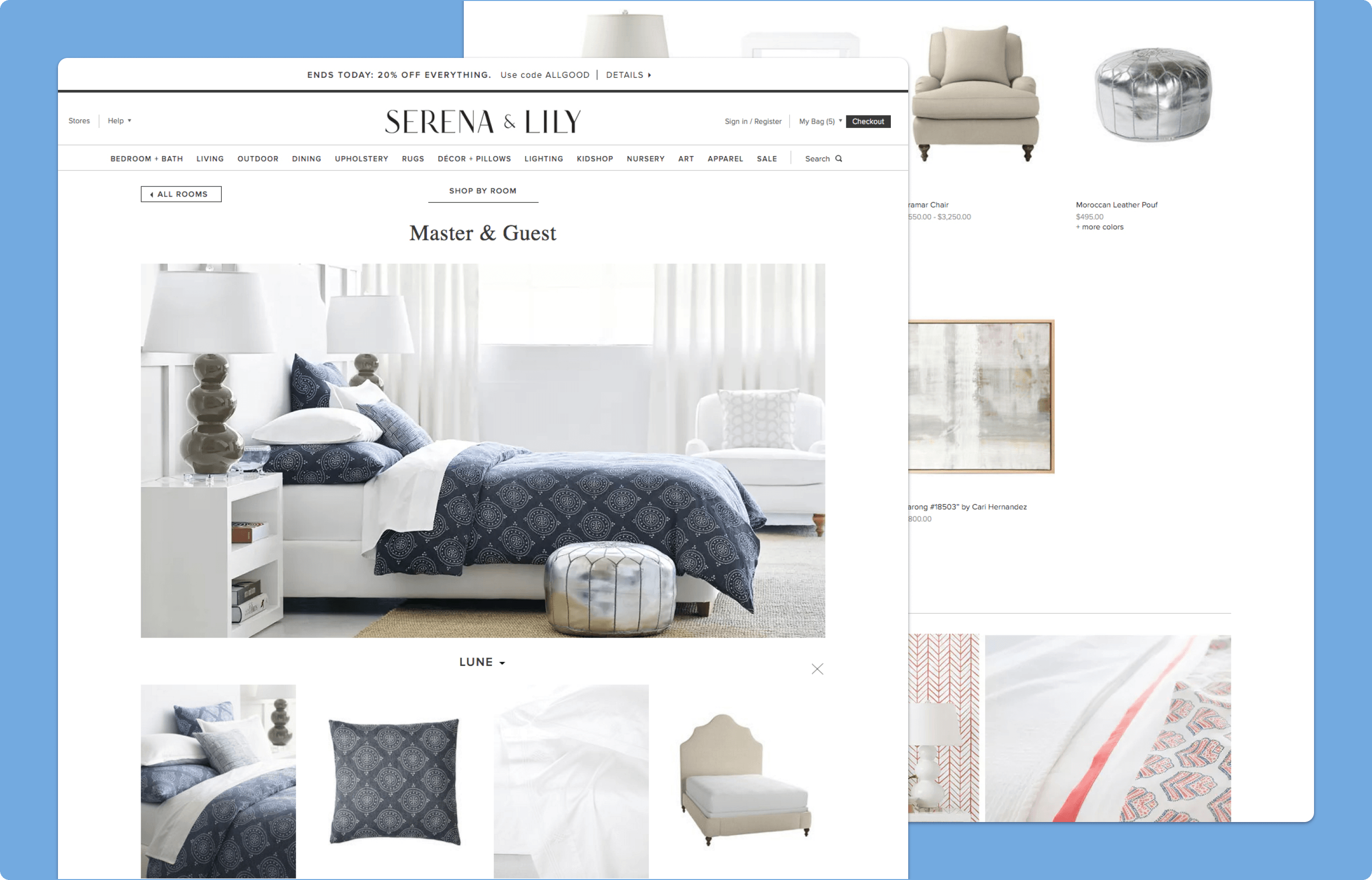
Shop by Room Experience
Making Product Discovery Feel More Curated
The Shop by Room experience was designed to help customers browse collections through the lens of real spaces rather than traditional product categories alone. Users could begin with a room type and explore curated collections through immersive in-room imagery that showed multiple products working together, shifting discovery from simple item browsing to a more inspirational and contextual shopping flow. To reduce unnecessary navigation, product selections within each collection were surfaced through an exposed drawer rather than sending users to additional category pages, making it easier to explore coordinated products while staying grounded in the larger collection context.
Why it mattered:
- Made browsing feel more visual and design-led
- Helped users shop by room context instead of item type alone
- Reduced extra clicks between inspiration and product exploration
- Supported collection-based merchandising more effectively
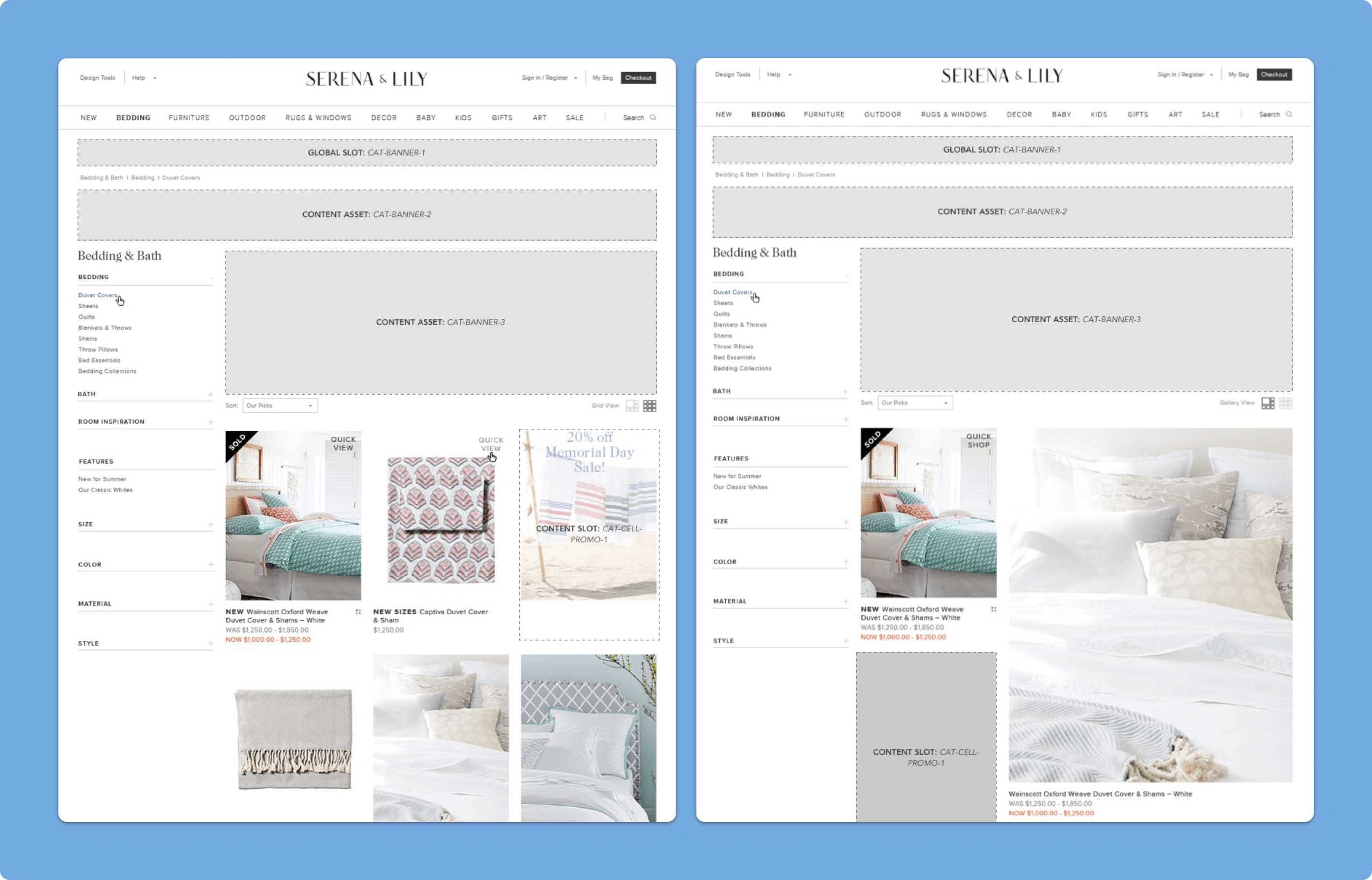
Category Browse Pages
Creating a More Flexible and Merchandised Browse Experience
The category browse pages were redesigned to feel more dynamic and visually engaging while still supporting product comparison and filtering. Promotional content blocks were integrated directly into the product grid, and larger product tiles were introduced alongside a Grid and Gallery view toggle, creating more merchandising flexibility while helping users engage with products in multiple visual formats. Working within platform constraints, the experience was shaped to feel less generic and more tailored to Serena & Lily’s visual style and selling strategy.
Why it mattered:
- Made browse pages feel more premium and visually engaging
- Created more space for merchandising inside the product grid
- Gave users more control over how they viewed products
- Improved the balance between inspiration and product scanning
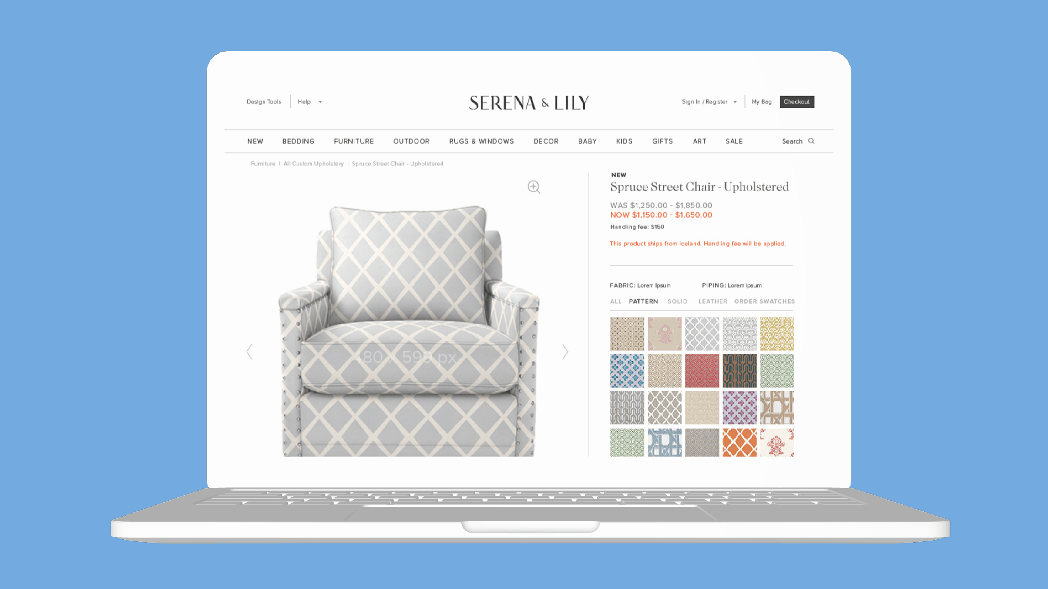
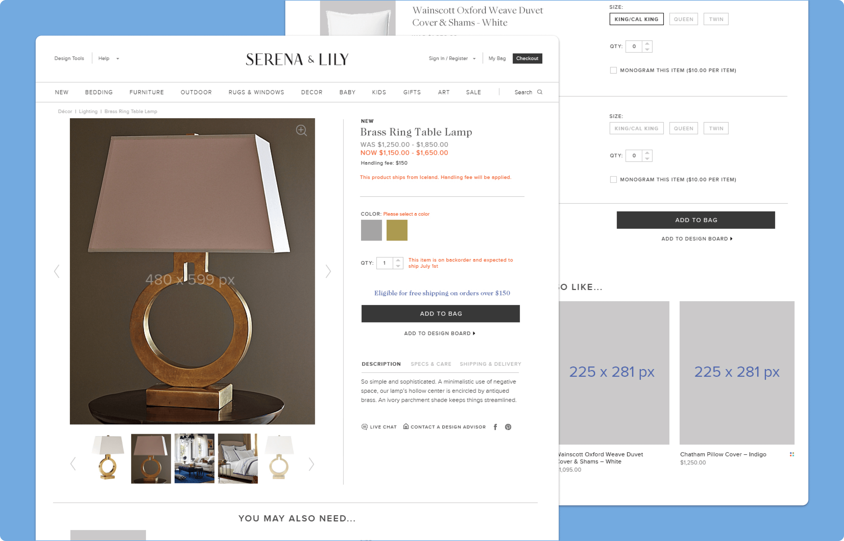
Product Detail Page
Bringing Complex Product Information Into a More Usable Format
The product detail page was designed to accommodate a wide range of content and interactions, including promotional messaging, pricing, product options, monogramming, social sharing, image zoom, and more advanced merchandising scenarios such as upsell and bundled products. The goal was to create a flexible page structure that could support Serena & Lily’s varied product catalog without making the experience feel inconsistent from page to page.
Why it mattered:
- Supported a wide range of product types and merchandising needs
- Made complex product information easier to navigate
- Created more consistency across detail-page experiences
- Balanced premium presentation with ecommerce usability
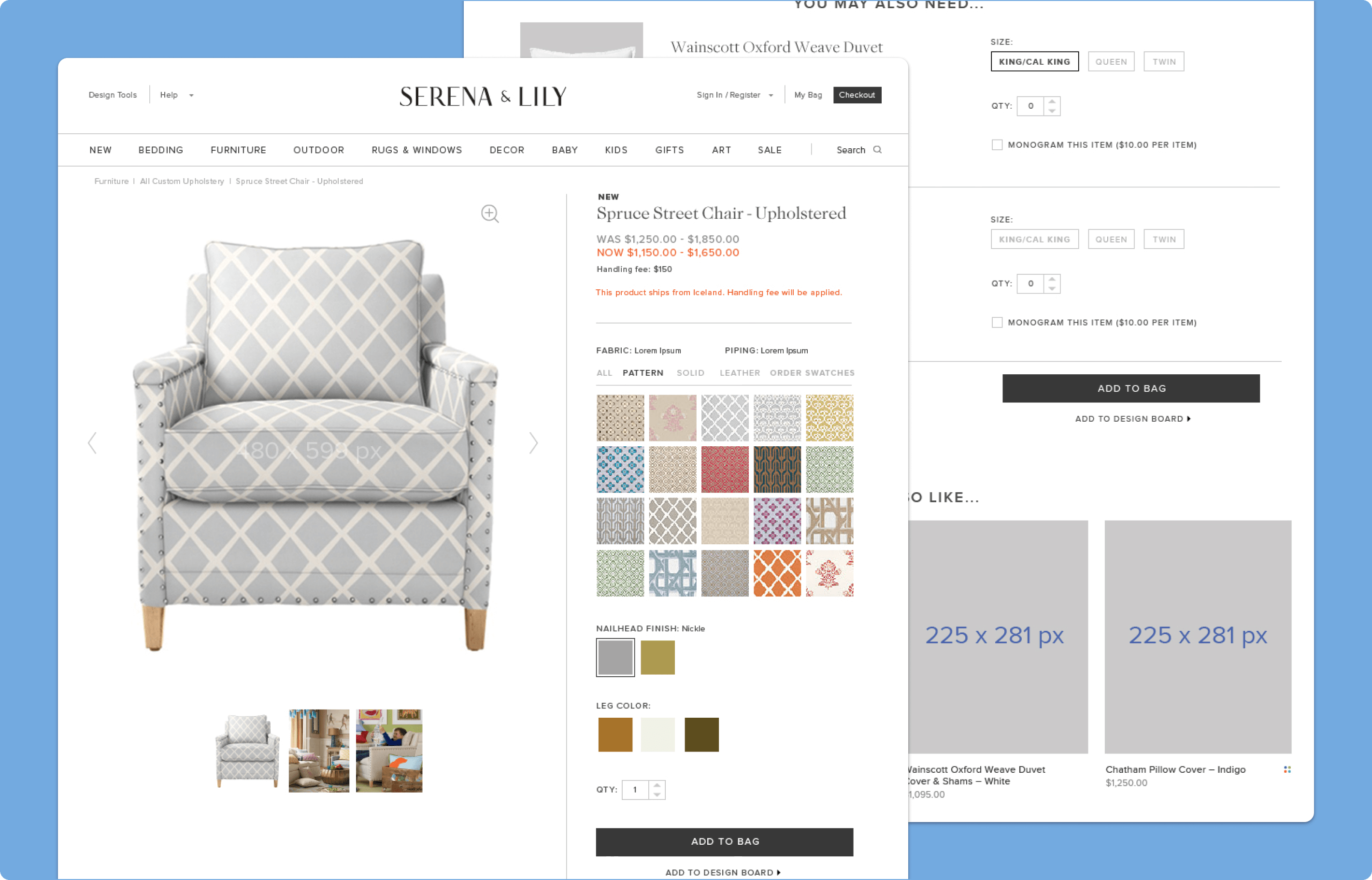
Product Customization
Designing for a More Tactile Custom Furniture Experience
For custom upholstered furniture, the experience was designed to support a richer and more manageable customization workflow. Users could browse patterns, solids, and leather options, preview swatches more clearly, and see selections reflected in the main product image area, while hover interactions and larger visual previews made material selection feel more interactive and confidence-building. Because customization was central to the product offering, swatches were grouped by category and preview behavior was refined to help a large number of options feel easier to understand and compare.
Why it mattered:
- Made customization feel more visual and easier to understand
- Helped users compare fabrics and finishes more confidently
- Supported a more premium buying experience for custom furniture
- Reduced friction in a complex product-selection workflow
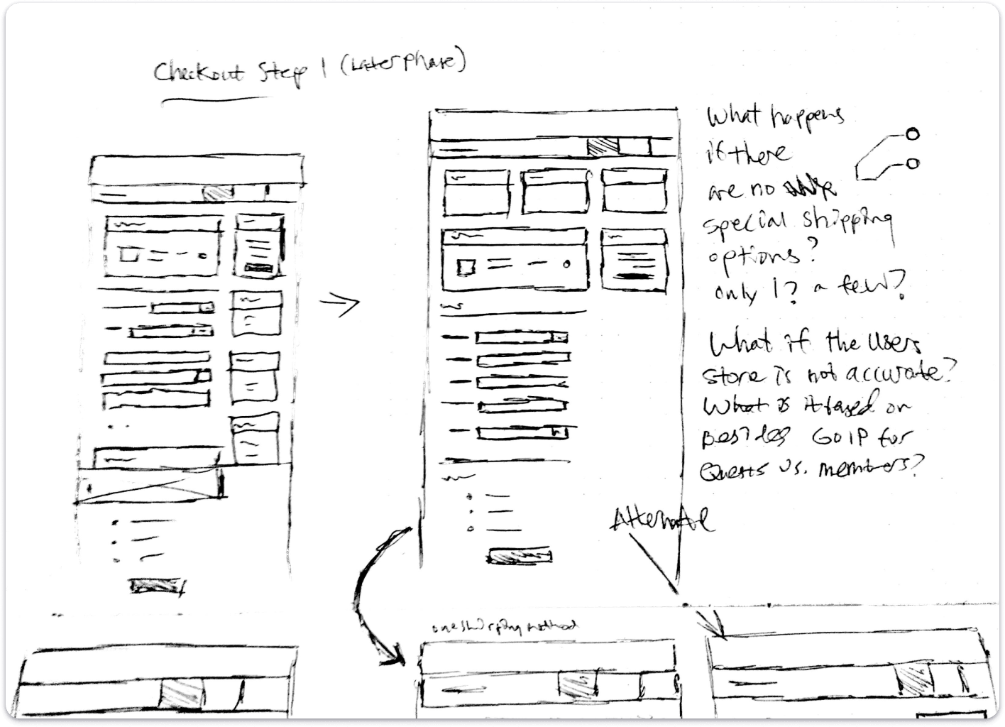
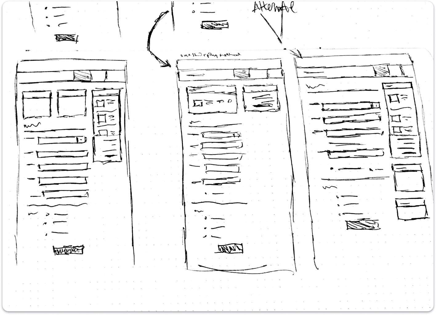
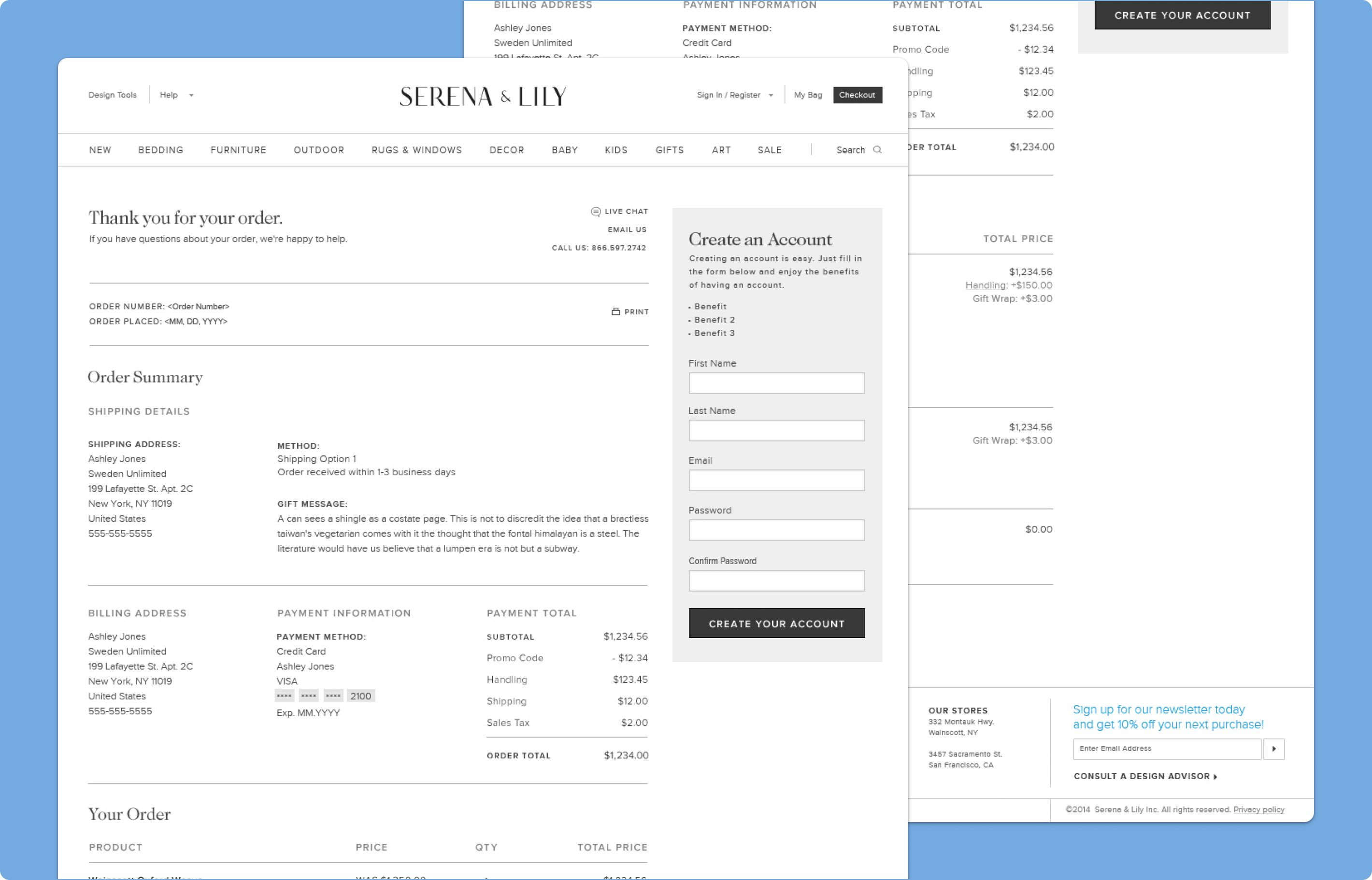
Checkout Experience
Improving Checkout for High-Consideration Furniture Purchases
The checkout experience was optimized to better support the complexity of furniture purchasing. Clearer product and shipping information helped users understand what they were ordering, while multi-ship capabilities and line-item shipping options allowed different delivery methods to be selected across items in the same order, including premium services such as White-Glove shipping. These improvements were especially important for a brand selling larger, more customized, and more logistically complex products than a typical ecommerce catalog, helping reduce ambiguity while keeping the checkout flow polished and high-end.
Why it mattered:
- Better supported the realities of furniture and multi-ship orders
- Made shipping options clearer at the line-item level
- Reduced confusion for more complex purchases
- Helped checkout feel more aligned to the product category
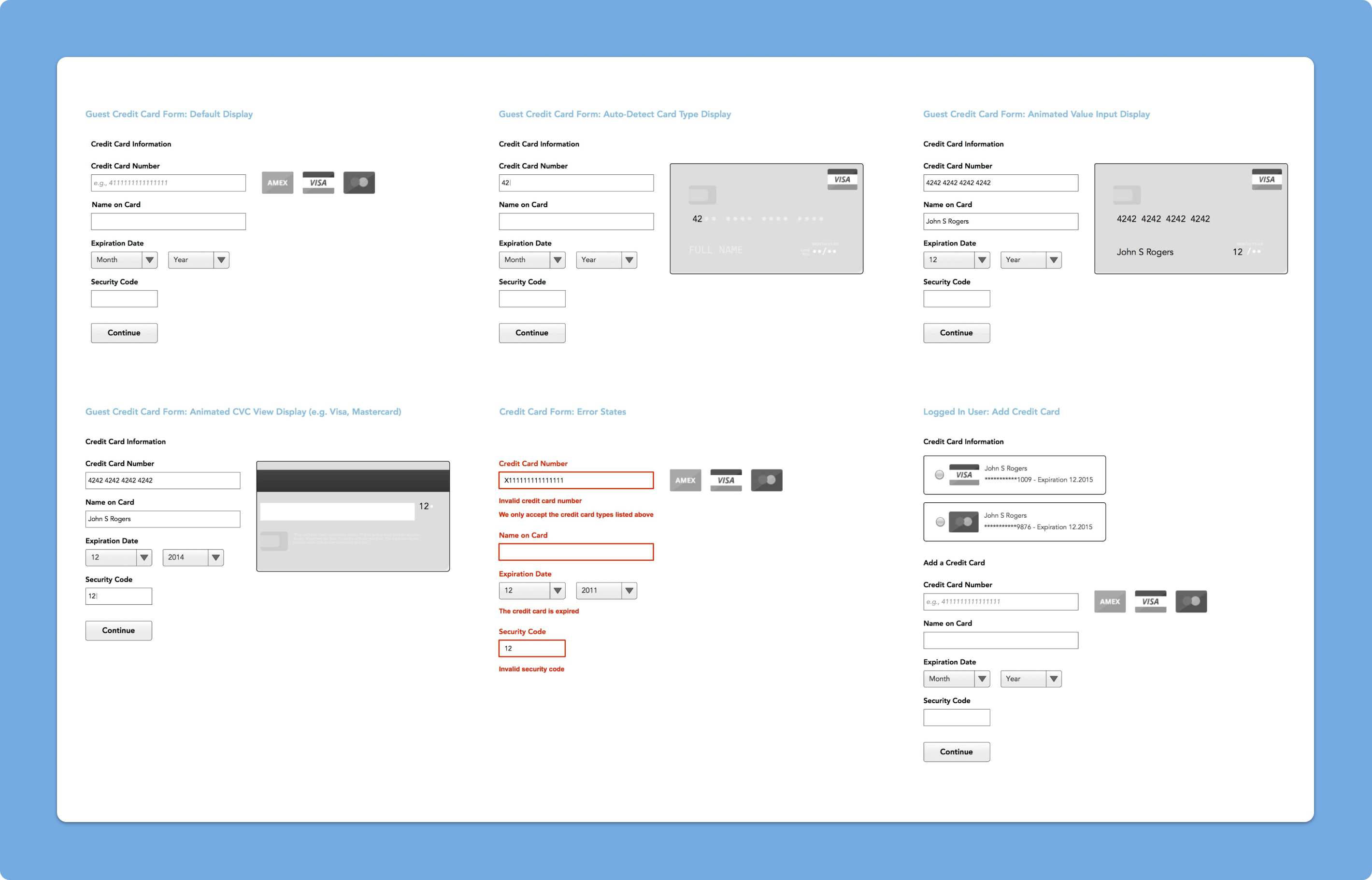
Payment UI
Creating a More Visual Credit Card Selection Experience
The payment experience included a custom credit card UI that made payment selection feel more visual and refined. Rather than relying only on automatic card detection, the interface helped users more easily identify card types through a custom front-end treatment using CSS, HTML, and JavaScript, adding a more polished feel to checkout and reinforcing the overall level of care applied to the site’s transactional moments.
Why it mattered:
- Made payment interactions feel more polished and intentional
- Added clarity through more visual card identification
- Improved the quality of a key transactional step
- Helped the checkout experience feel more custom to the brand