Reimagining Digital Health Care
A future-state healthcare experience designed to make care discovery, trust, and support more accessible
Platforms
Stanfordhealthcare.org
Deliverables
UX Strategy, Concept Design, Validation Testing
Expertise
UX Research, iA, UI / UX Design
Year
2024


Project Overview

Designing a More Supportive Digital Care Journey
Stanford Health Care needed a digital experience that better reflected the quality of its care while more effectively supporting the real needs of patients, caregivers, and healthcare professionals. The opportunity was to rethink how the website could become a more active part of the healthcare journey by helping people find care, evaluate doctors, understand treatment options, build confidence, and take the next step with less friction. The site was reimagined as a stronger digital extension of the care experience through more credible health content, more approachable care pathways, better support for referrals, and more meaningful ways to communicate Stanford’s expertise and compassion.
Research Approach

Learning What Users Need in a Modern Healthcare Experience
The project was grounded in qualitative research across consumers, caregivers, and healthcare professionals. Patients and caregivers wanted more than basic information. They were trying to understand where to go, who to trust, what care would feel like, and whether Stanford was the right fit. Healthcare professionals were more focused on referral efficiency, specialty fit, direct access to experts, and content that could support patient care or ongoing learning. That research foundation was then extended through moderated testing of low-fidelity concepts with both consumer and HCP audiences.


Experience Strategy
Translating Research Into Experience Principles
Research showed that users were evaluating whether the site felt credible, clear, compassionate, and genuinely useful during moments that often carried stress or uncertainty. In response, the experience strategy focused on a set of principles that could bridge the gap between Stanford’s strong care reputation and the current digital experience. These principles were used as design criteria for concepting.
Trustworthy
Users needed confidence that the information, doctors, and recommendations were credible and dependable.
Authentic
Participants want experiences that feel honest, grounded, and patient-centered rather than overly polished or promotional.
Empathetic
Research showed that users wanted the experience to recognize the emotional weight of healthcare decisions.
Supportive
Users wanted the website to actively help them make progress, not just present information.
Approachable
People were often overwhelmed by medical language, dense content, and complex healthcare processes.
Innovative
Patients and caregivers expected Stanford to reflect its leadership through a more modern, forward-thinking digital experience.
Concepting Process

Turning Opportunities Into Testable Experience Ideas
The concepting process followed a sprint-based approach that helped turn research insights into more focused experience directions. The goal was to put ideas in front of users early and learn which ones actually felt valuable before investing too heavily in them, so the work stayed grounded in real user response rather than internal assumptions. Each concept asked: if we solved this problem in this way, would users actually value it?
Sprint Process
- Review inspiration and strategy
- Define opportunity areas and sprint questions
- Sketch low-fidelity solutions
- Review and prioritize concepts
- Refine selected concepts
- Validate with users
- Synthesize findings into recommendations
Validation Approach
Testing Concepts Before Investing in Full Design
Rather than just reviewing ideas internally, the team put low-fidelity concepts in front of real users to understand which ones felt useful and worth developing further. Consumer concepts were tested through remote moderated sessions across different experience themes, and separate sessions with healthcare professionals focused on referrals and professional content. This feedback helped show which ideas connected, which ones needed work, and where Stanford had the strongest opportunities going forward.
Why it mattered:
- Revealed what users actually valued
- Helped prioritize the strongest concepts
- Reduced risk before full design investment
- Created research-backed alignment around future direction


Experience Themes
Resource Hub
Making Stanford a More Trusted Digital Health Resource
The Resource Hub explored how Stanford could become more valuable between direct moments of care. Instead of assuming users would only visit the site to look up a doctor or book an appointment, this concept group asked how Stanford could support ongoing health needs through relevant content, personalization, saving behaviors, and better information discovery. This direction was especially important because research showed that people often went elsewhere for health information and only returned to provider sites for transactional tasks.
Experience goals:
- Create a stronger reason to return to the site
- Position Stanford as a more credible digital health resource
- Support personalized, condition-specific engagement
- Help users find, save, and understand information with less effort
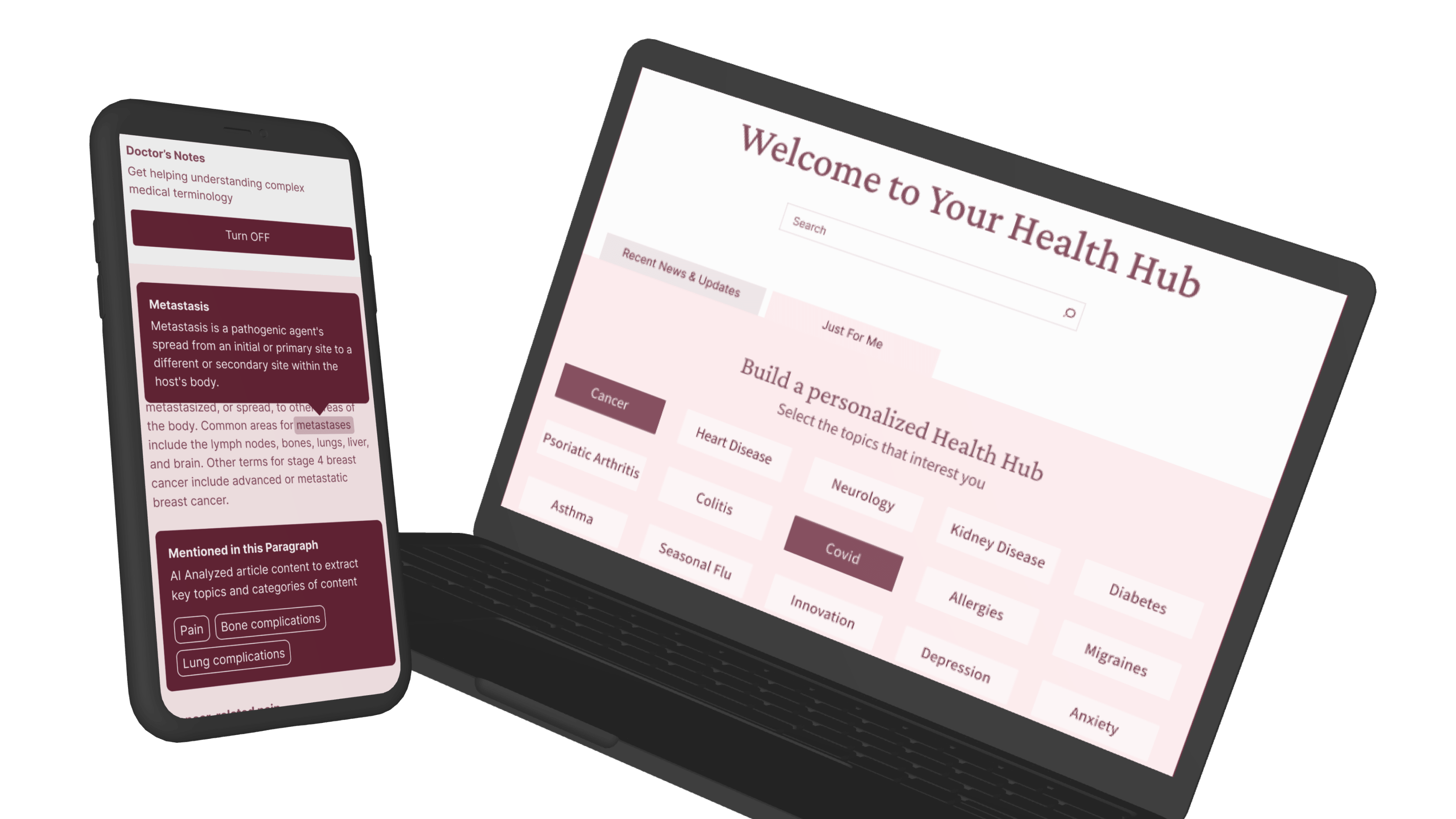
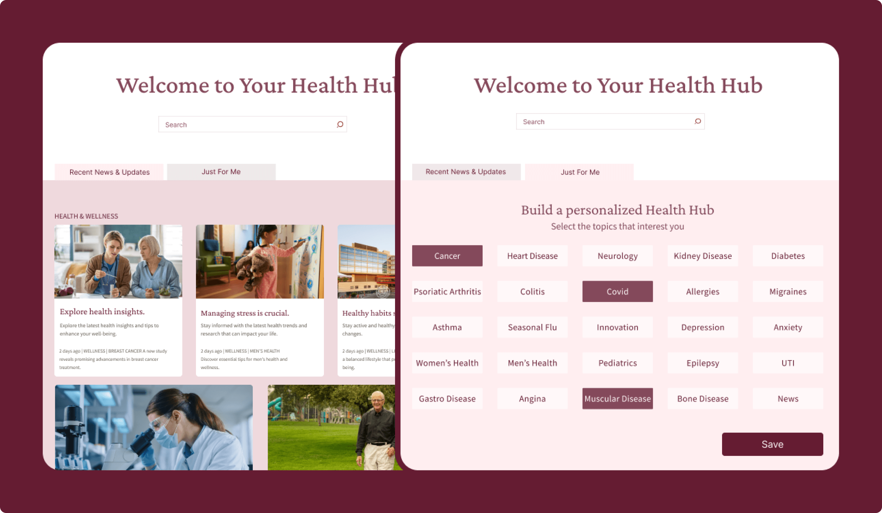
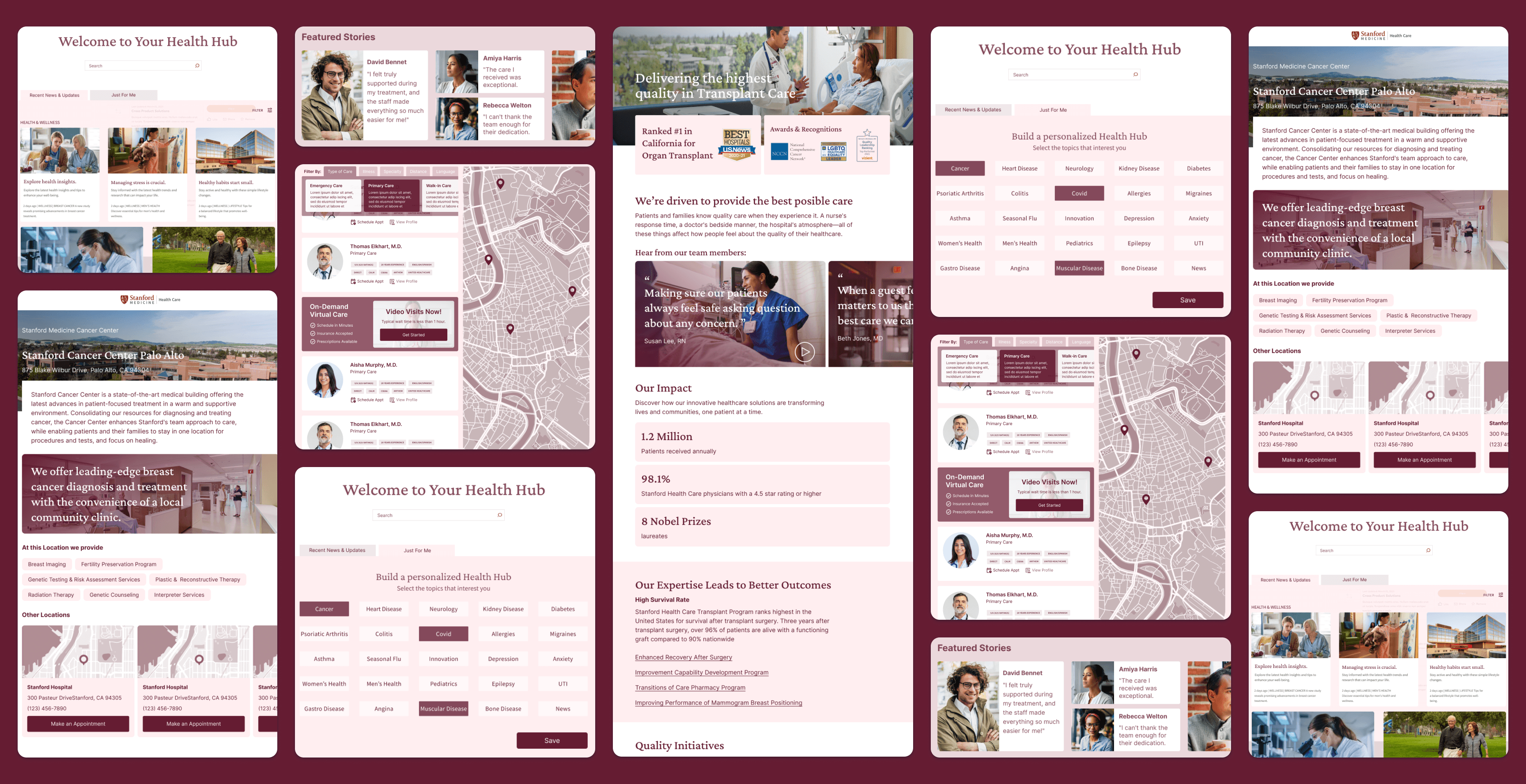
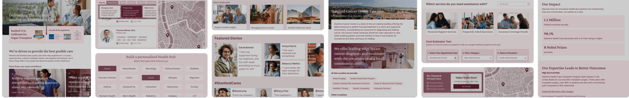
Your Health Hub
A Personalized Hub for Relevant Health Content
This concept introduced a centralized destination for wellness, condition, and community health content that users could browse, search, and personalize based on their interests. It was designed to make Stanford feel more useful by giving people a more relevant health content experience.
Why it mattered:
- Created a stronger reason to return to the site
- Positioned Stanford as a more credible health resource
- Supported personalized, condition-specific engagement
- Reinforced individualized care digitally
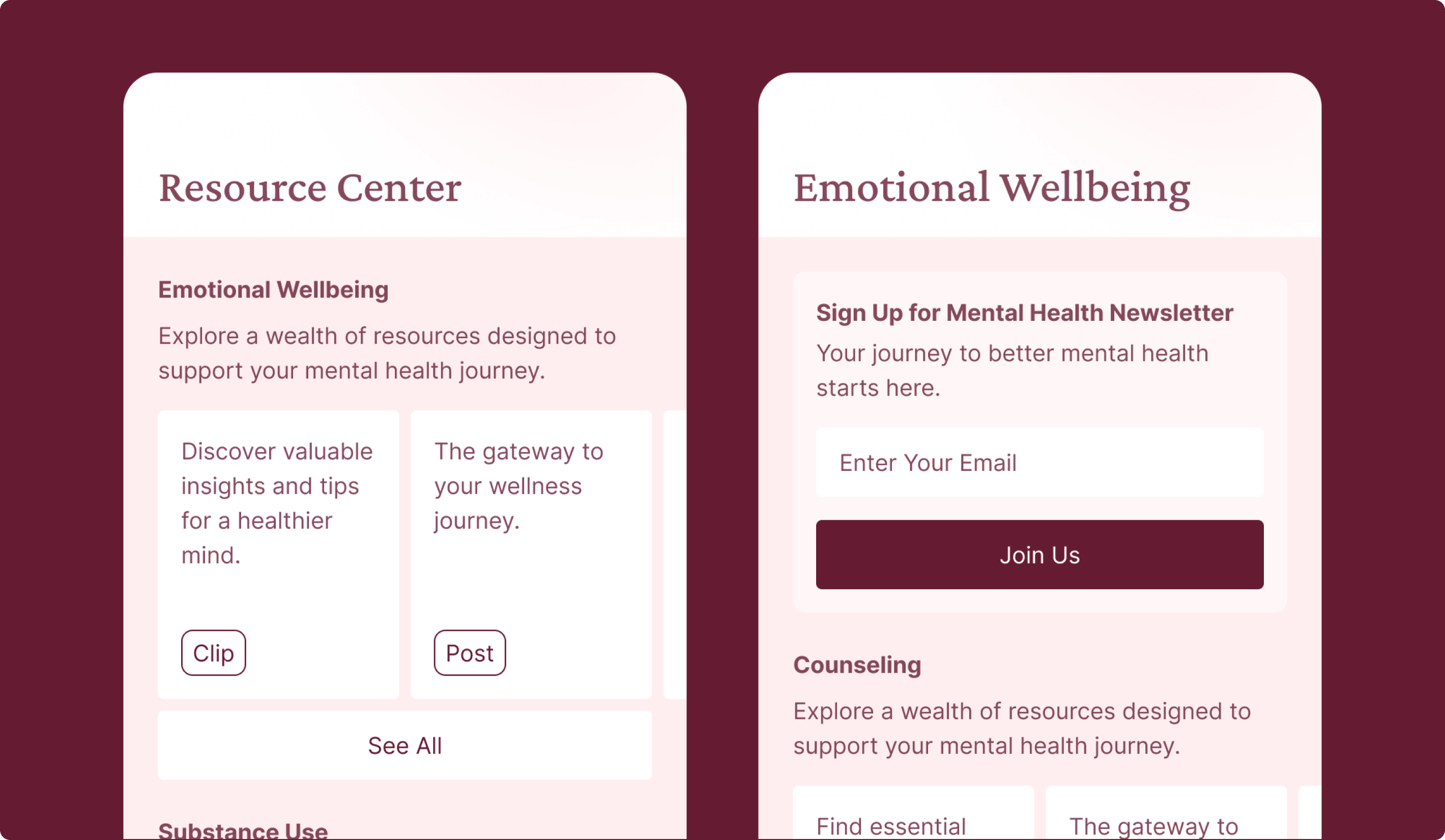
Topic Subscription
Helping Users Stay Connected to What Matters Most
This concept allowed users to subscribe to topics of interest and receive updates over time tied to conditions, treatments, research, or other health themes. It extended the relationship beyond a single visit and made Stanford feel more like an ongoing source of relevant support rather.
Why it mattered:
- Extended engagement beyond a single visit
- Helped users stay informed on relevant topics
- Created a lighter-weight ongoing relationship
- Reinforced the value of personalized content
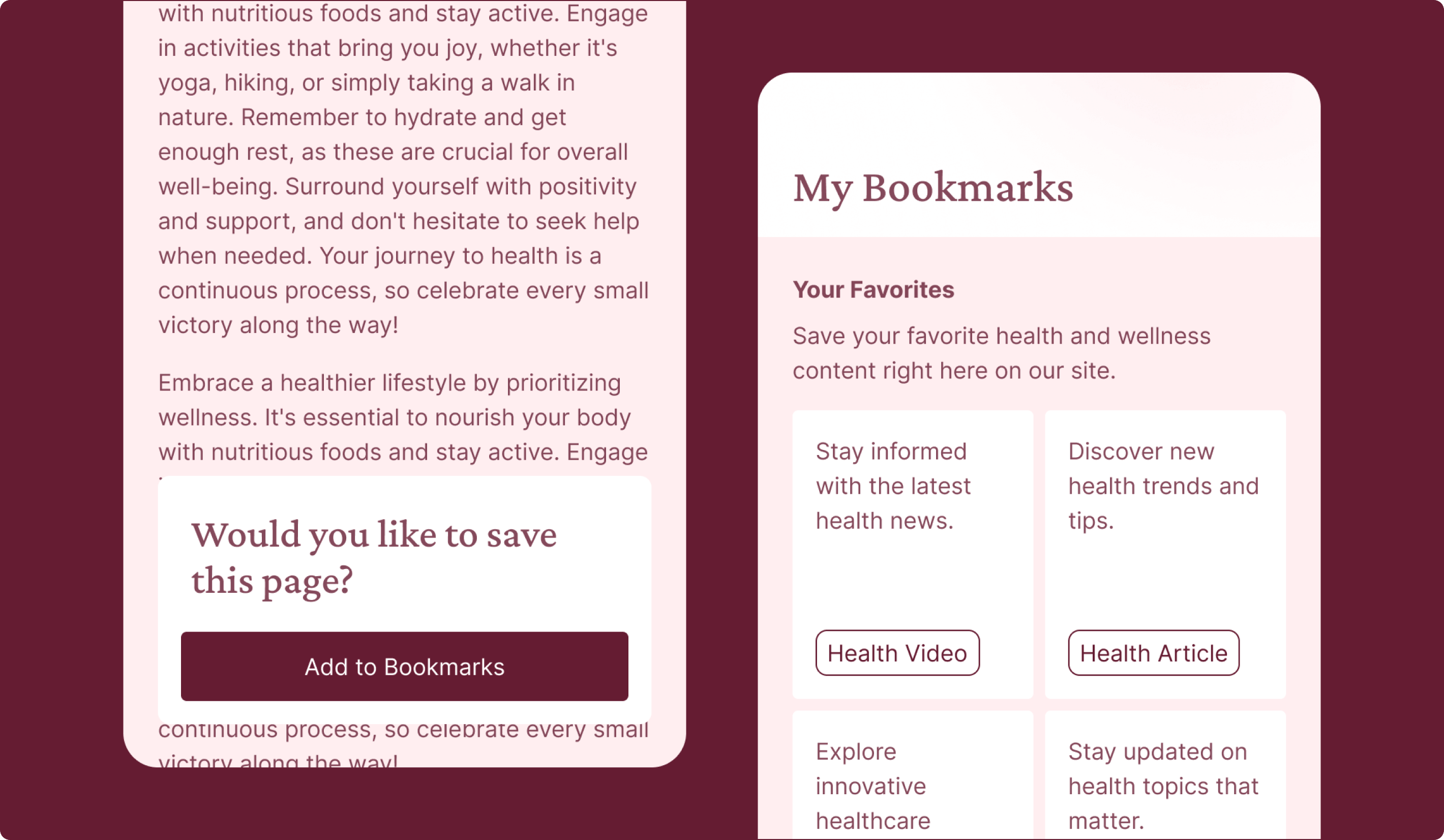
Your Bookmarks
Making It Easier to Save and Revisit Important Information
This concept gave users a simple way to save content and return to it later, recognizing that healthcare research often happens over time rather than in one session. It supported the reality that people compare options, revisit information, and often share what they find with family members or caregivers before making a decision.
Why it mattered:
- Supported longer-term healthcare research behavior
- Made important content easier to revisit and share
- Reduced effort across repeat visits
- Reflected familiar digital behaviors users already understand
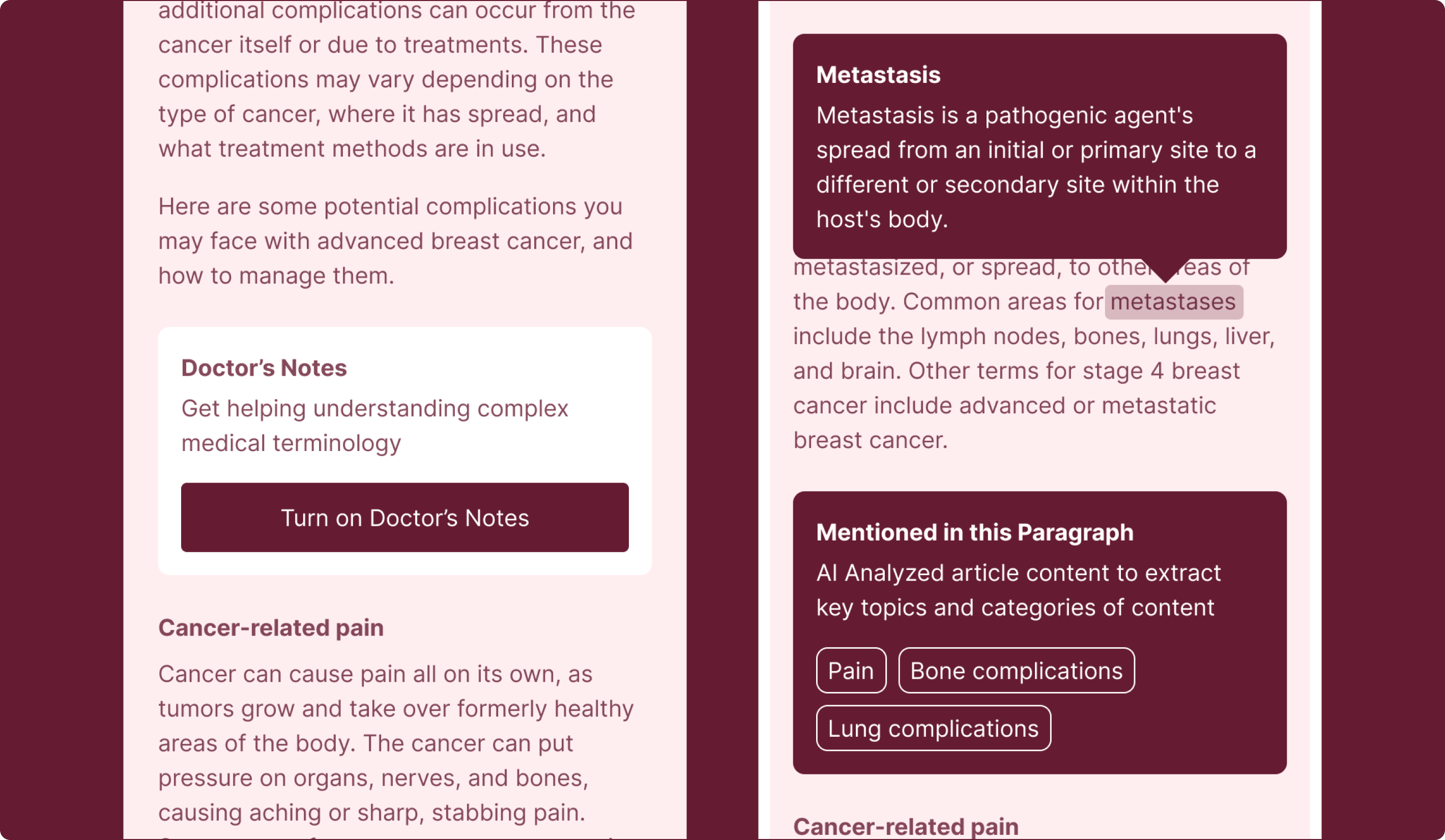
Doctor’s Notes
Making Medical Content Easier to Understand
This concept added contextual guidance to help users make sense of more complex healthcare information directly within the experience. By offering plain-language support around medical terminology and content, it aimed to make Stanford’s information feel more approachable without losing the credibility users expect from a leading healthcare organization.
Why it mattered:
- Reduced friction caused by complex medical language
- Made health content easier to understand
- Supported confidence without oversimplifying information
- Helped Stanford feel more approachable and useful
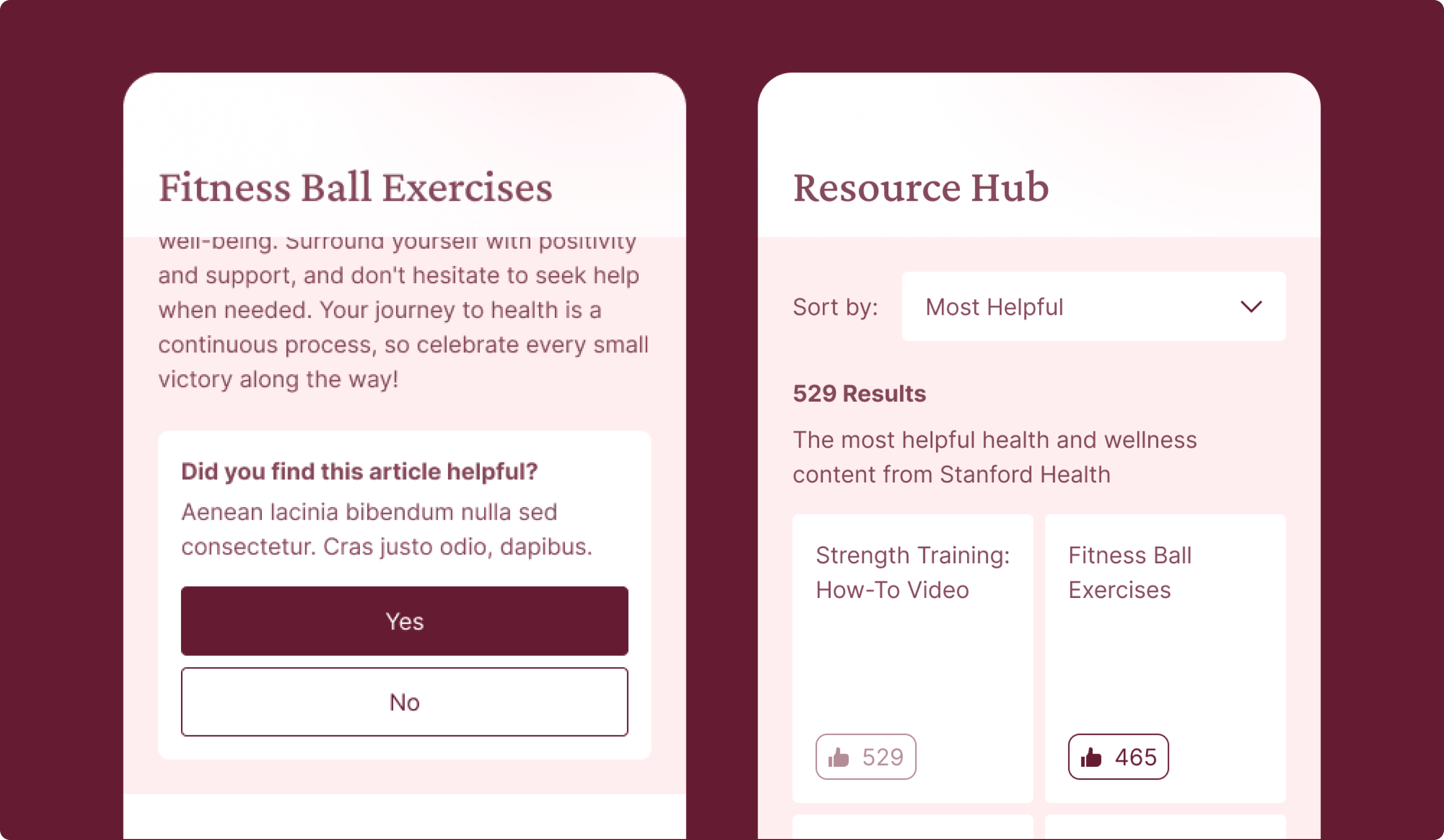
Helpful Content
Learning What Content Resonates Most
This concept explored whether users would benefit from seeing what content other people found helpful and from being able to quickly rate content themselves. It combined “most helpful” sorting with lightweight feedback prompts so users could identify content that felt more worth their time, while also giving Stanford a clearer signal about what information was actually landing well.
Why it mattered:
- Helped users identify what content might be most worth reading
- Created a lightweight way to improve content discoverability
- Gave Stanford signals about what information users found useful
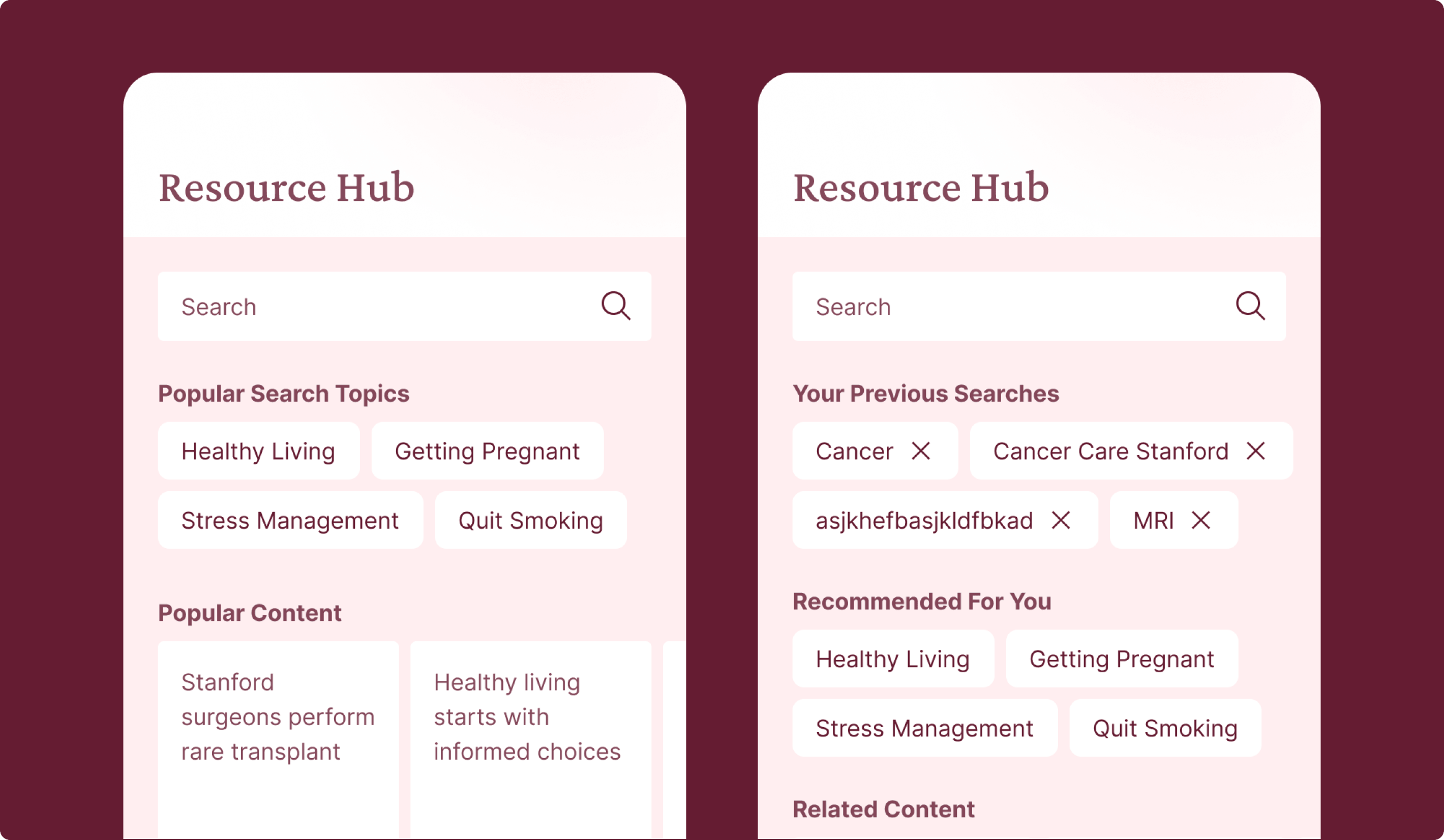
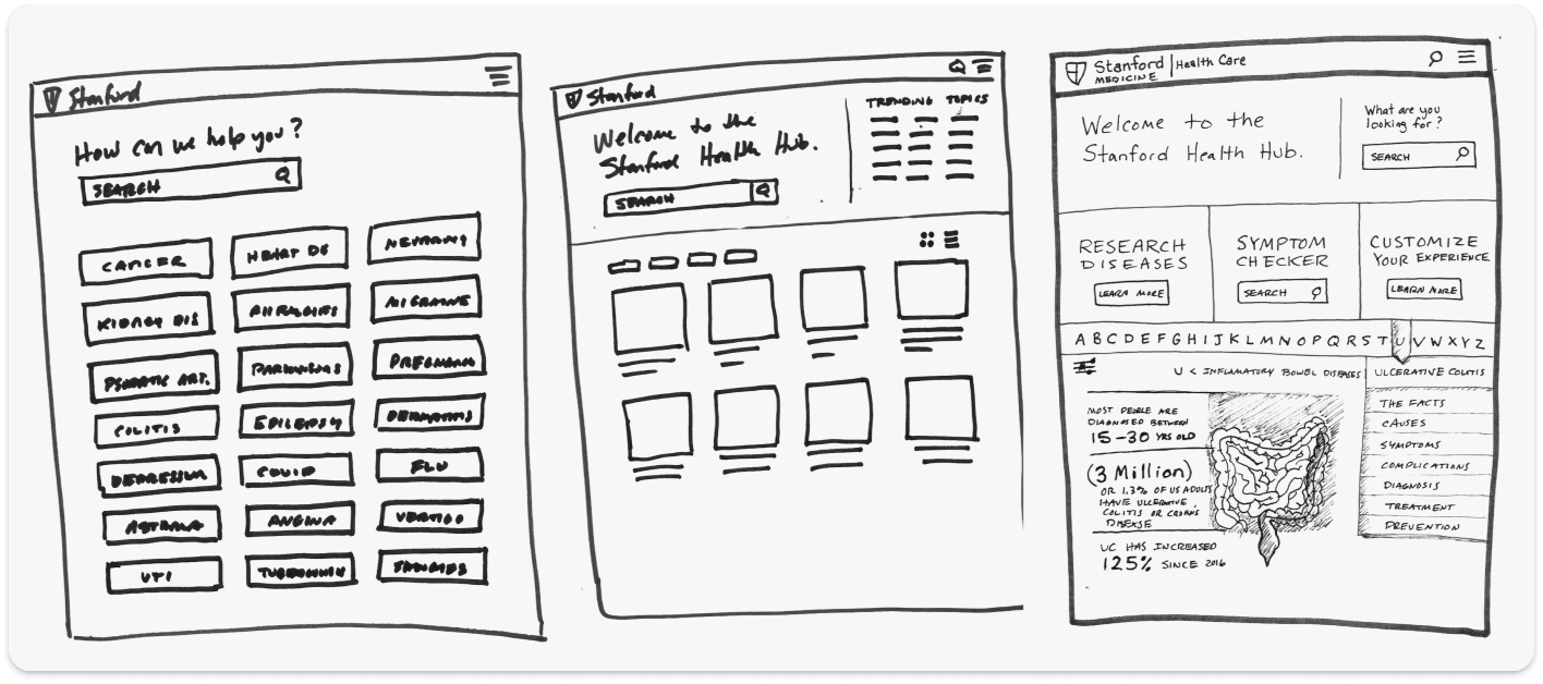
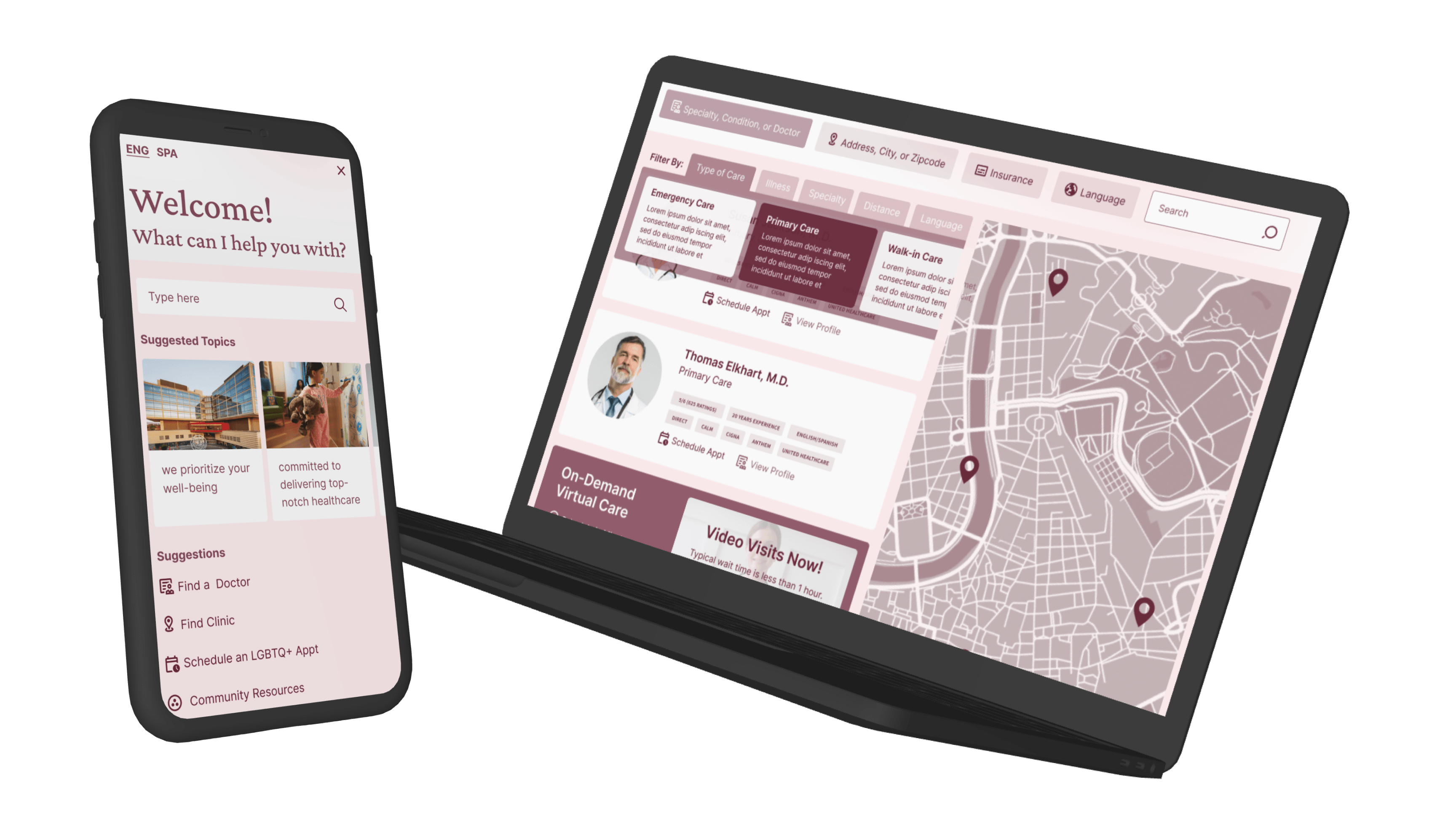
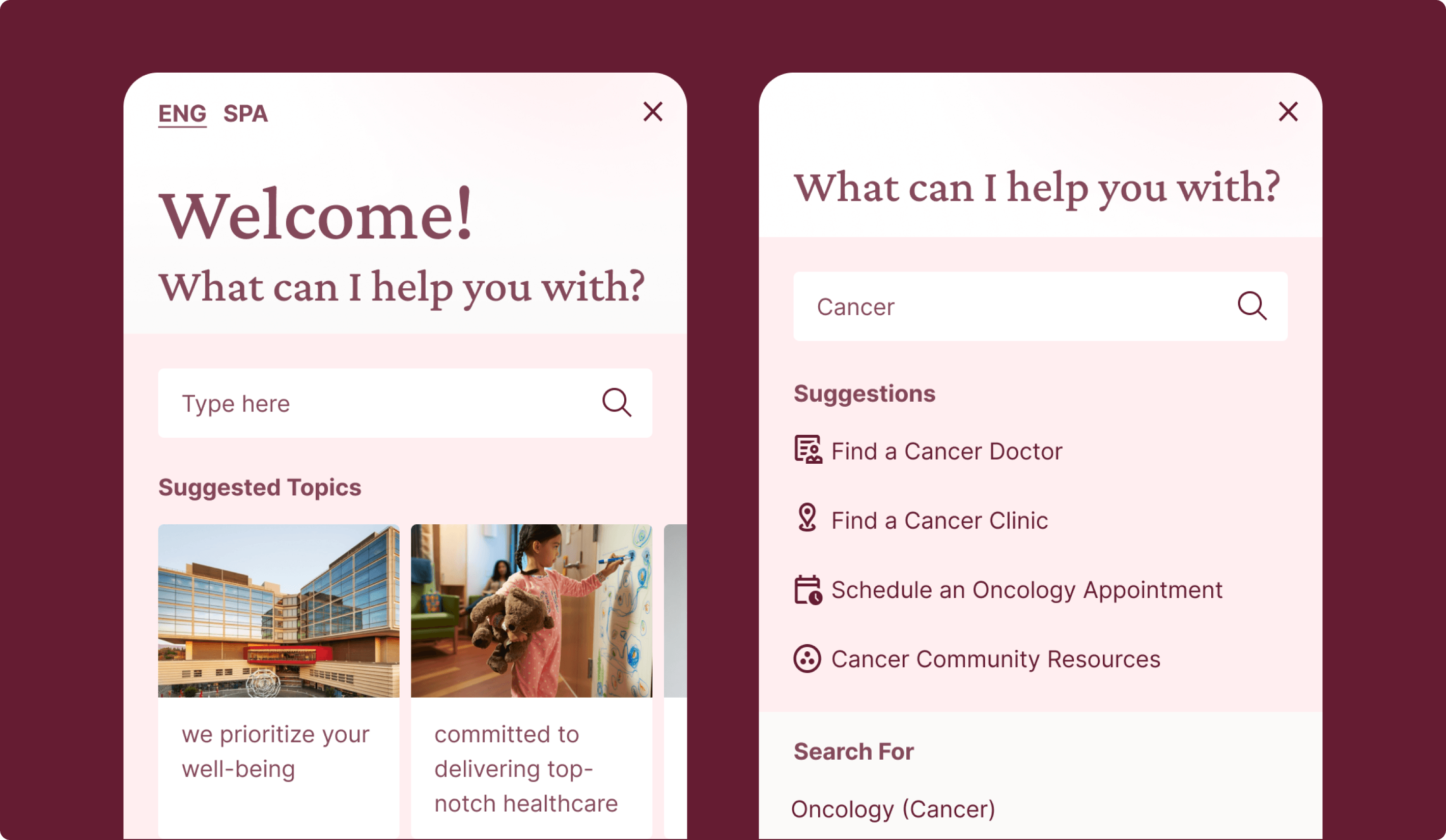
Intelligent Search
Search That Feels More Useful and More Relevant
This concept rethought search as a more dynamic and supportive experience by combining trending topics, prior search history, related content, and personalized recommendations. It was designed to help users get to relevant content faster and discover information that better matched their interests and behavior.
Why it mattered:
- Reduced effort in finding relevant content, care, or answers
- Positioned search as a decision-support tool
- Created opportunities for more personalized and useful discovery
- Helped connect users to the right information faster
Humanized Narratives
Making Stanford Feel More Personal, Approachable, and Relatable
This concept area focused on making the experience feel more personal, relatable, and confidence-building through richer doctor information, patient stories, guided doctor matching, and direct access to expertise. The strongest ideas here were the ones that helped people make better decisions, not just feel more emotionally connected to the brand. Users responded especially well when the concepts gave them clearer ways to judge provider fit, understand real care experiences, or get practical answers from trusted experts.
Experience goals:
- Made doctor discovery feel more personal and less overwhelming
- Added more human context to support decisions about care
- Helped users assess fit, trust, and confidence earlier in the journey
- Reinforced Stanford’s expertise through more approachable experiences
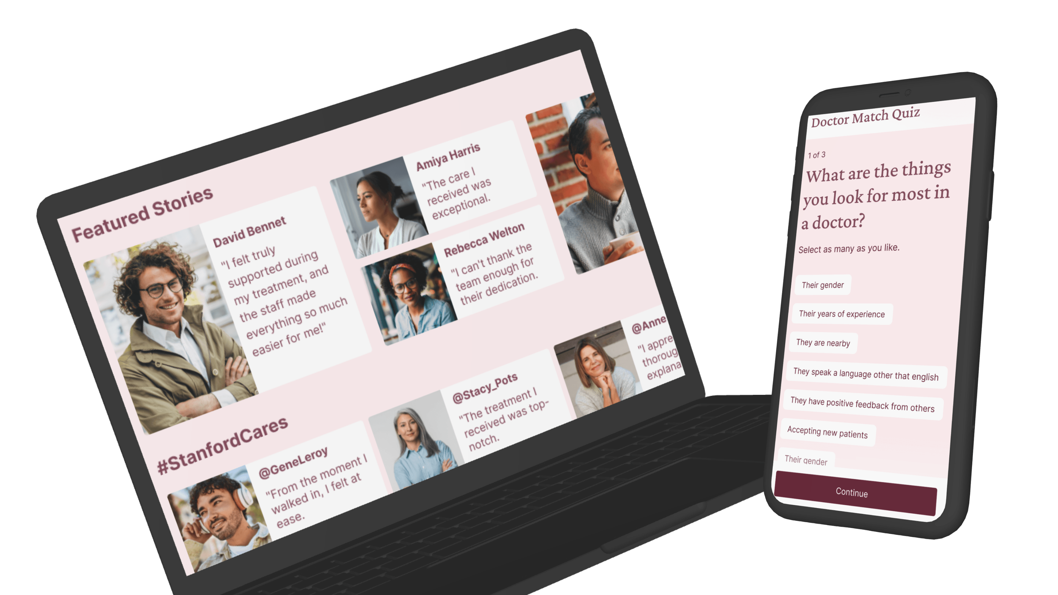
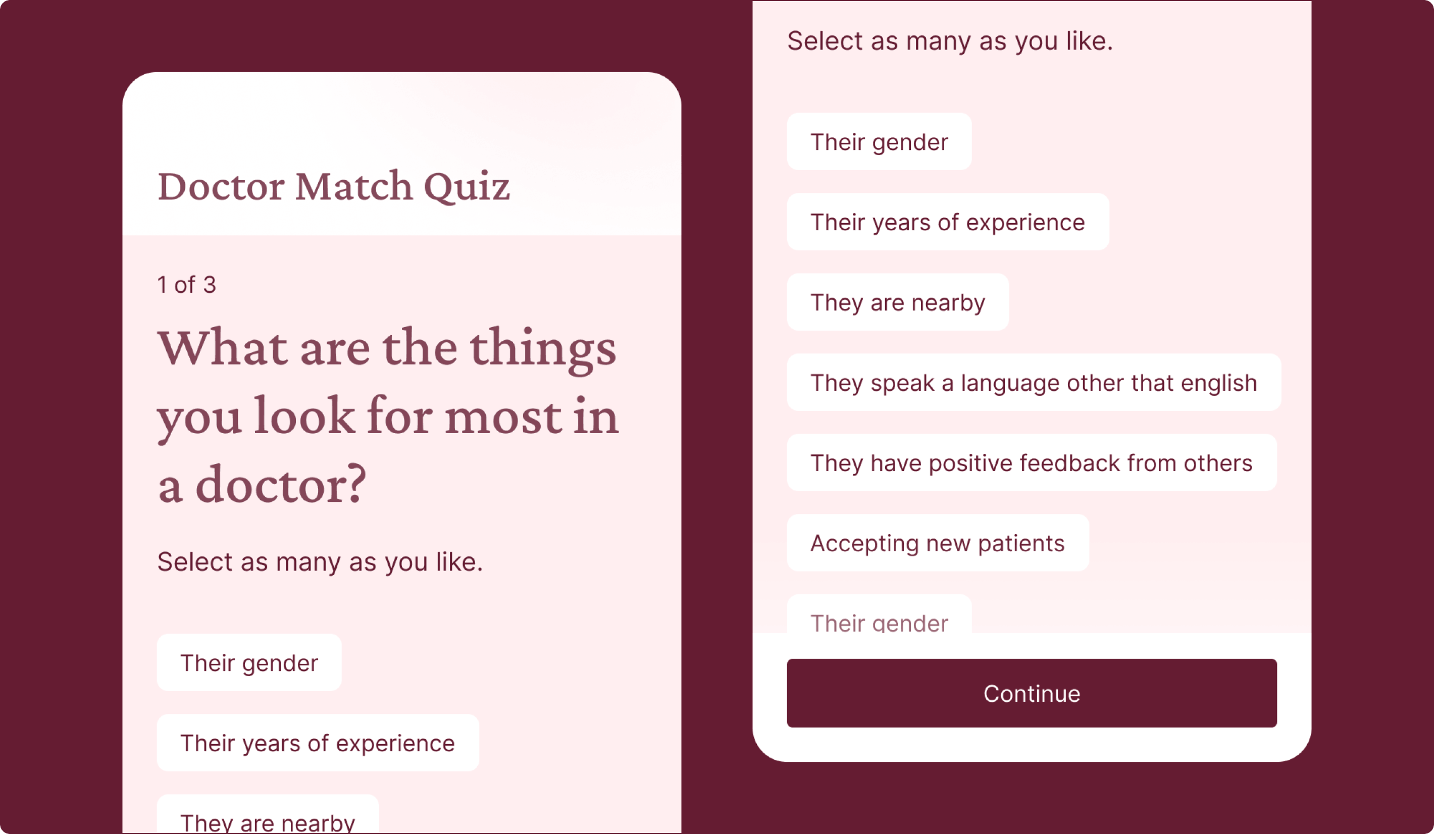
Doctor Match Quiz
A More Personal Way to Find the Right Doctor
This concept reframed doctor search around the qualities people naturally think about when choosing a provider, such as gender, language, location, availability, and type of care. It offered a more guided matching flow that helped narrow options in a way that felt more personal and easier to use.
Why it mattered:
- Made provider discovery feel more personal
- Helped users express needs in their own terms
- Supported better-fit decision-making
- Reduced friction in a high-stakes task
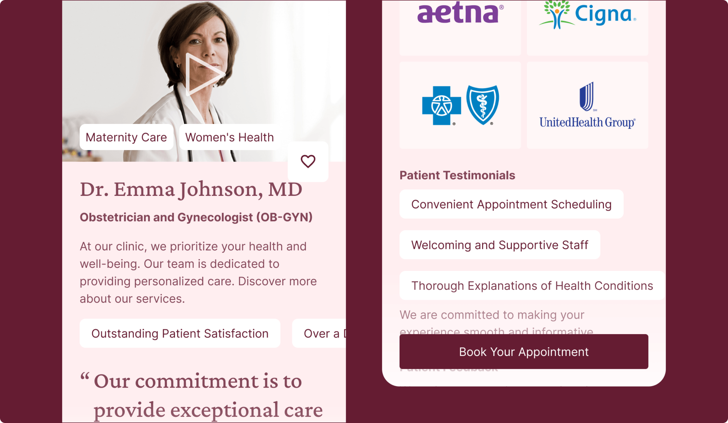
Enhanced Profiles
Turning Doctor Profiles Into Stronger Decision-Making Tools
This concept expanded doctor profiles to include richer details like ratings and reviews, accepted insurance, next available appointments, and more. It was designed to help users evaluate both practical and personal fit in one place, so they could better understand a doctor’s qualifications and what kind of experience they might expect.
Why it mattered:
- Gave users more confidence in choosing a provider
- Brought key decision criteria into one place
- Reduced the effort needed to evaluate fit
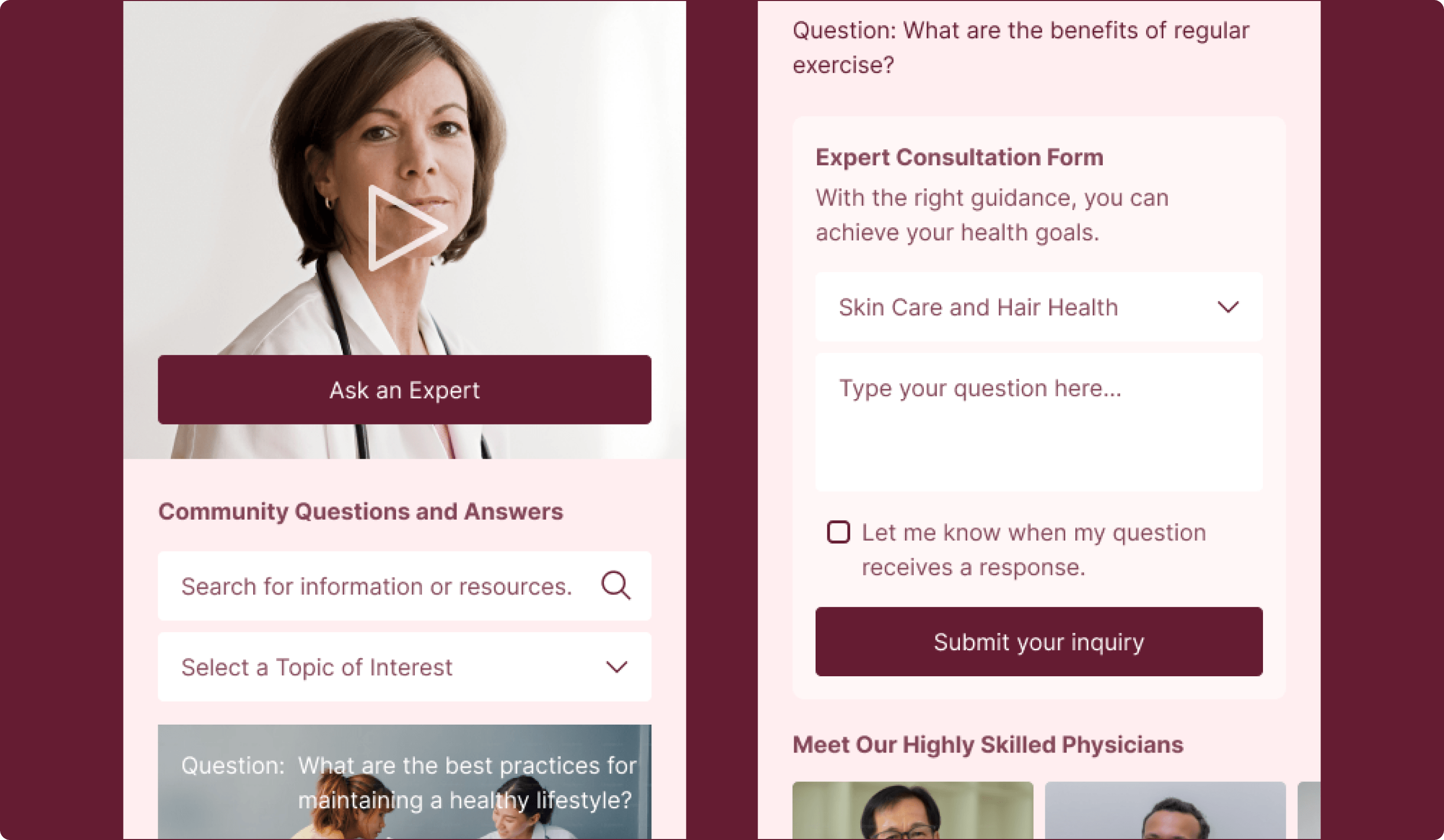
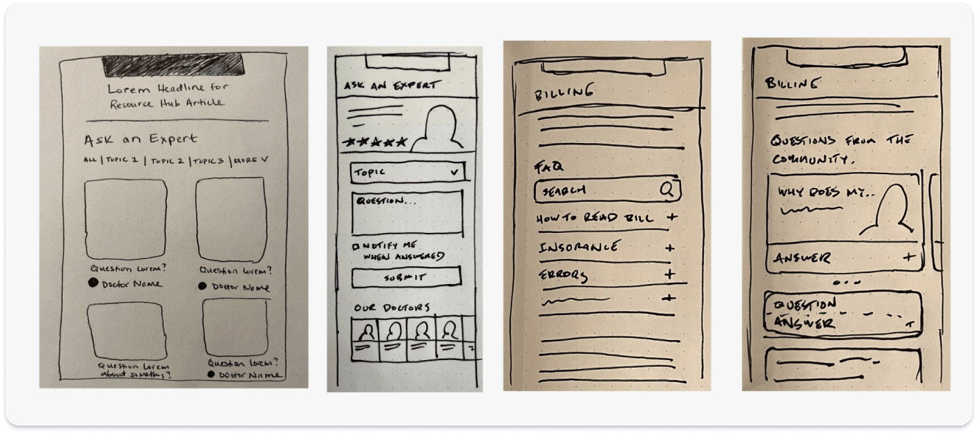
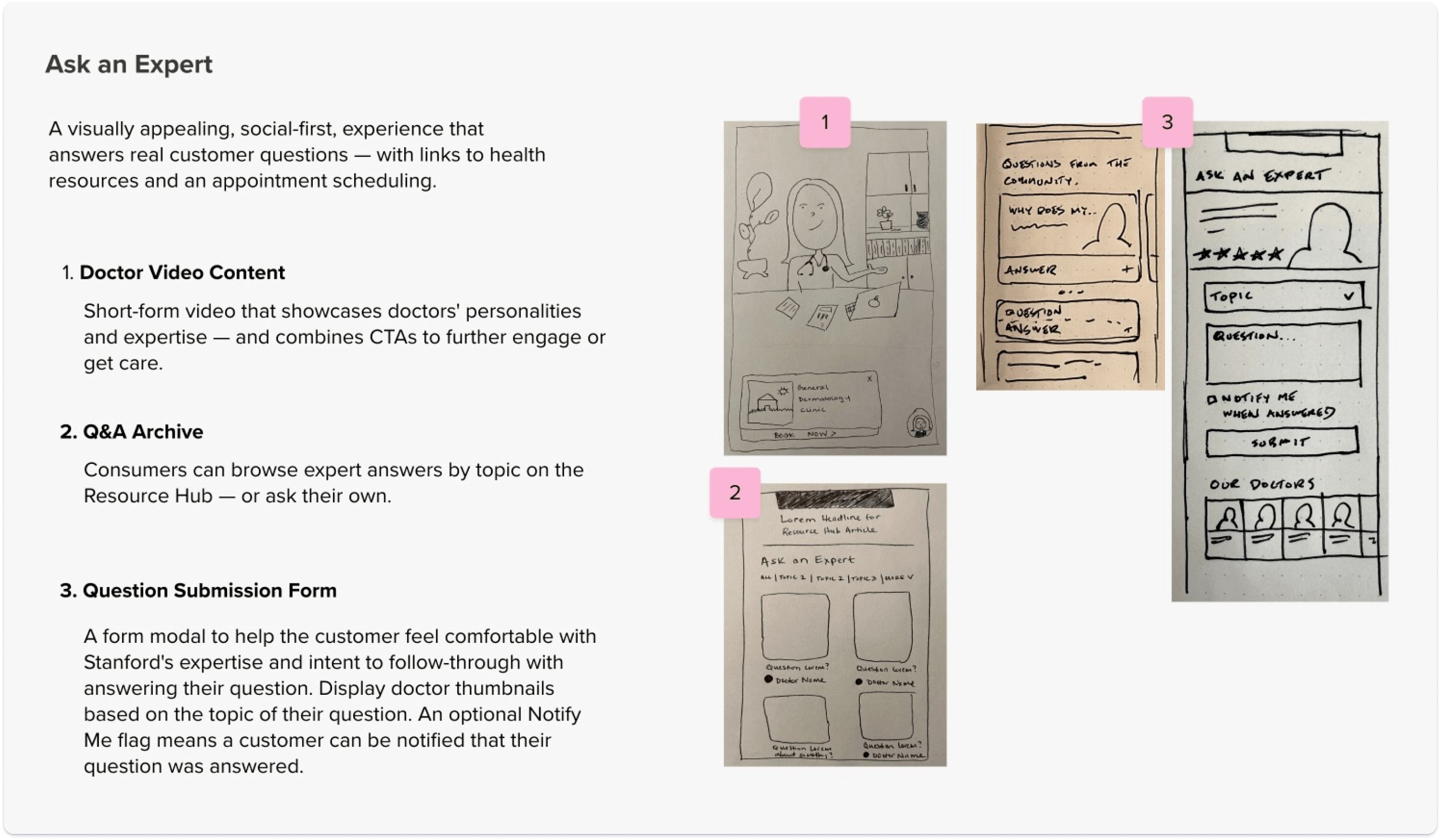
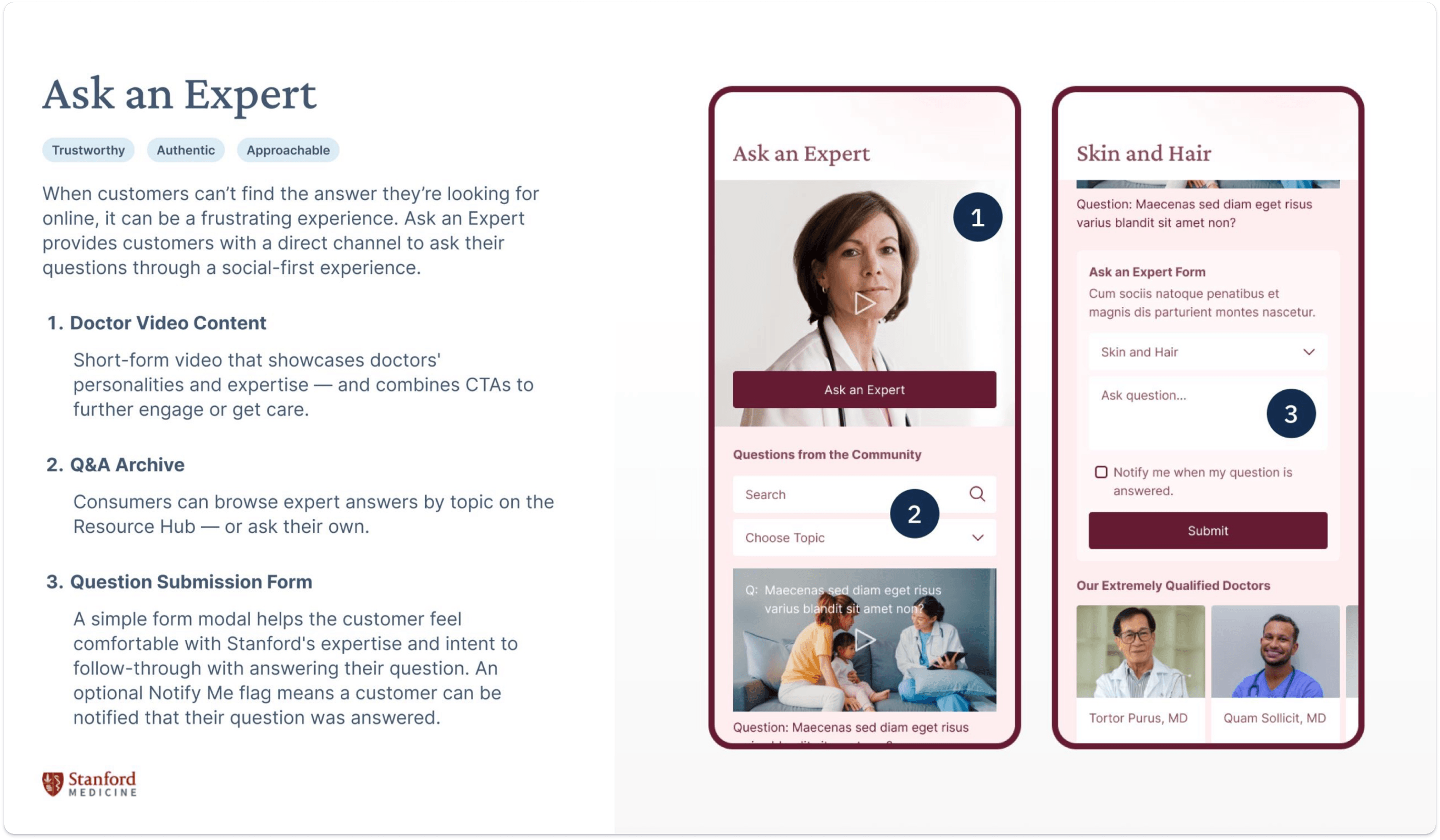
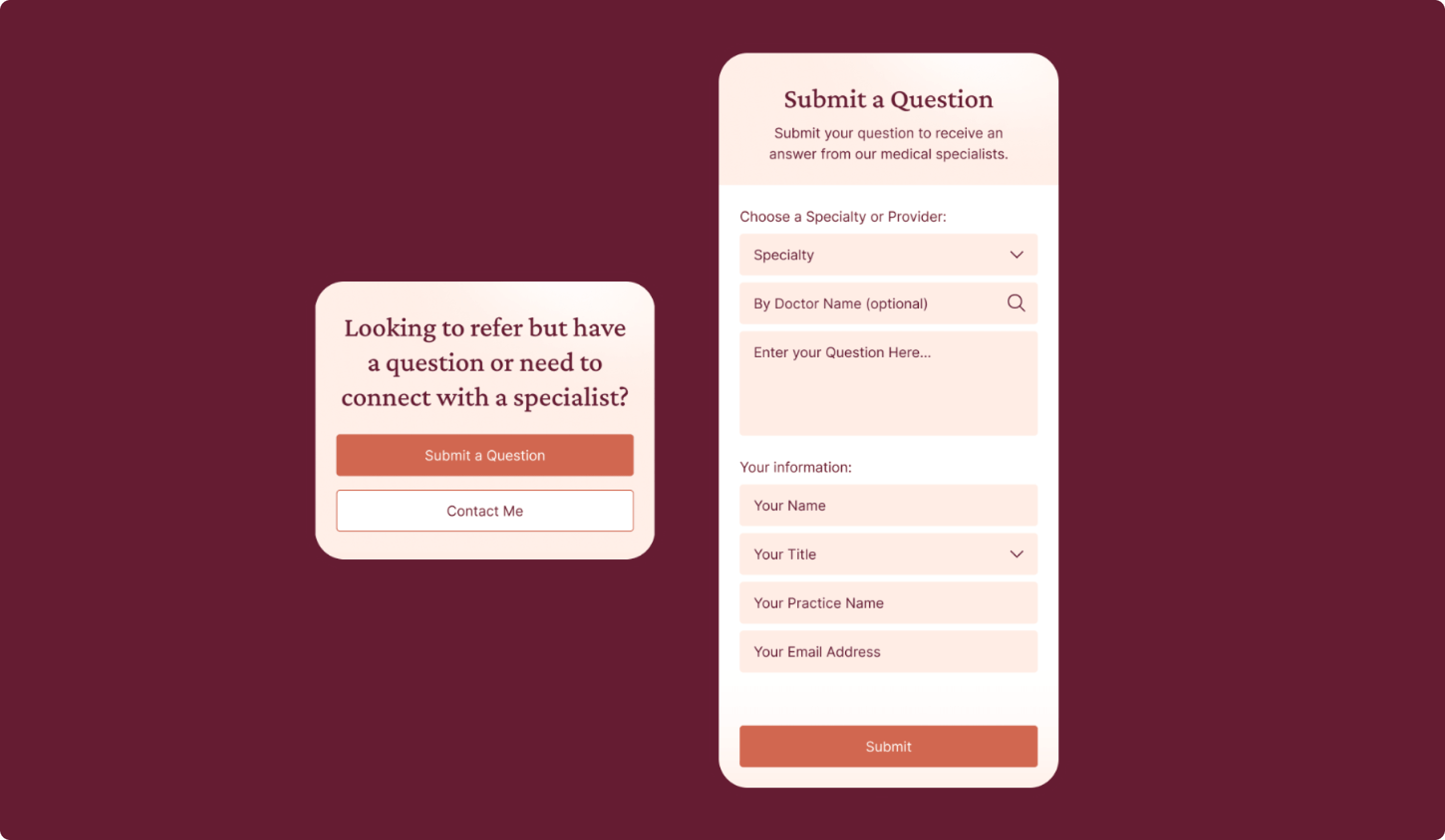
Ask an Expert
Giving People More Direct Trusted Answers
This concept introduced a way for users to submit health questions and browse answers from Stanford experts through a more social, approachable experience. It included expert video content, a Q&A archive, and a question submission flow that helped people feel like they could get credible answers without doing all the research themselves.
Why it mattered:
- Created a more direct connection to Stanford expertise
- Helped users get answers with less effort
- Reinforced trust through expert-backed content
- Made the experience feel more helpful and responsive
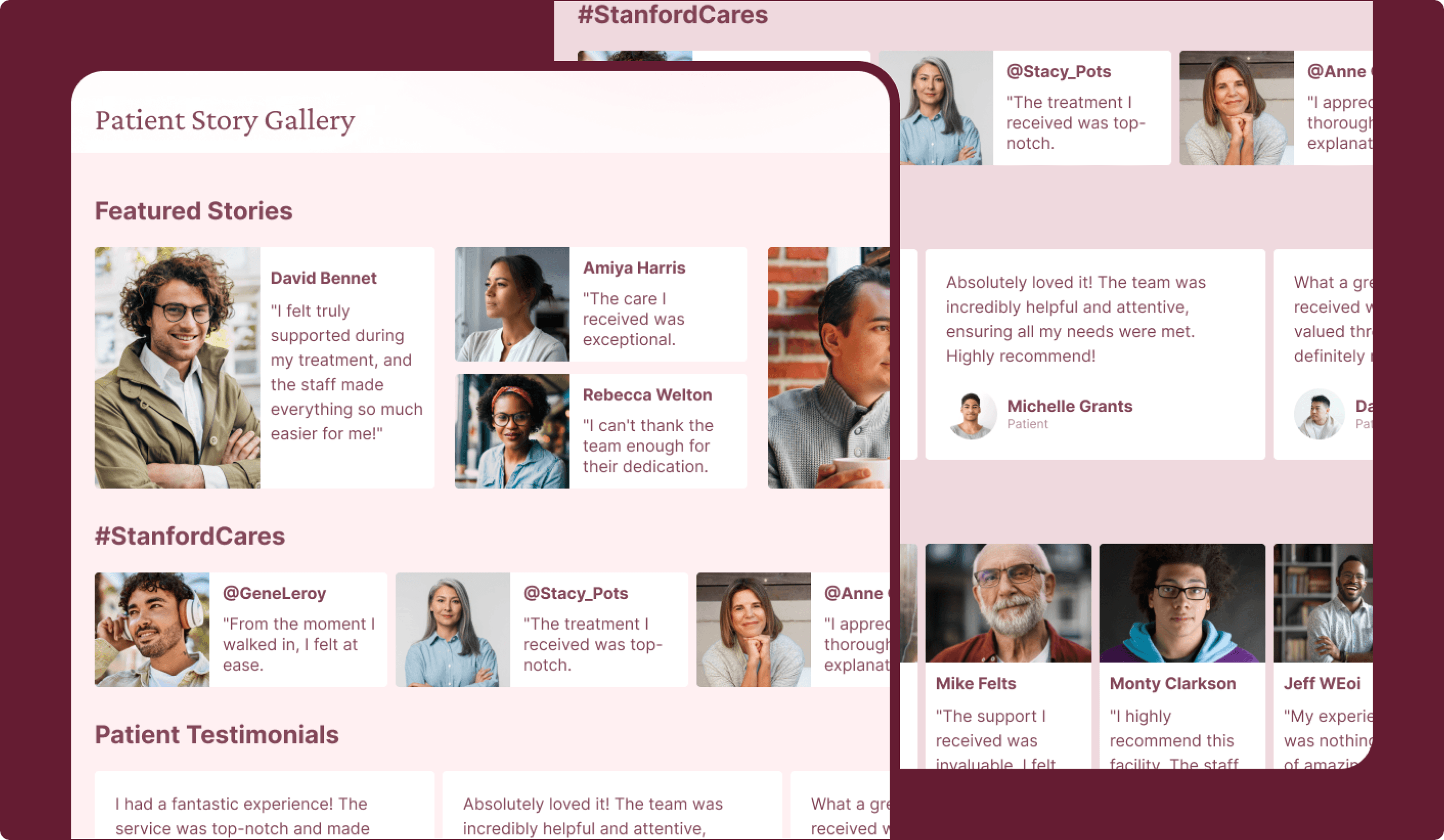
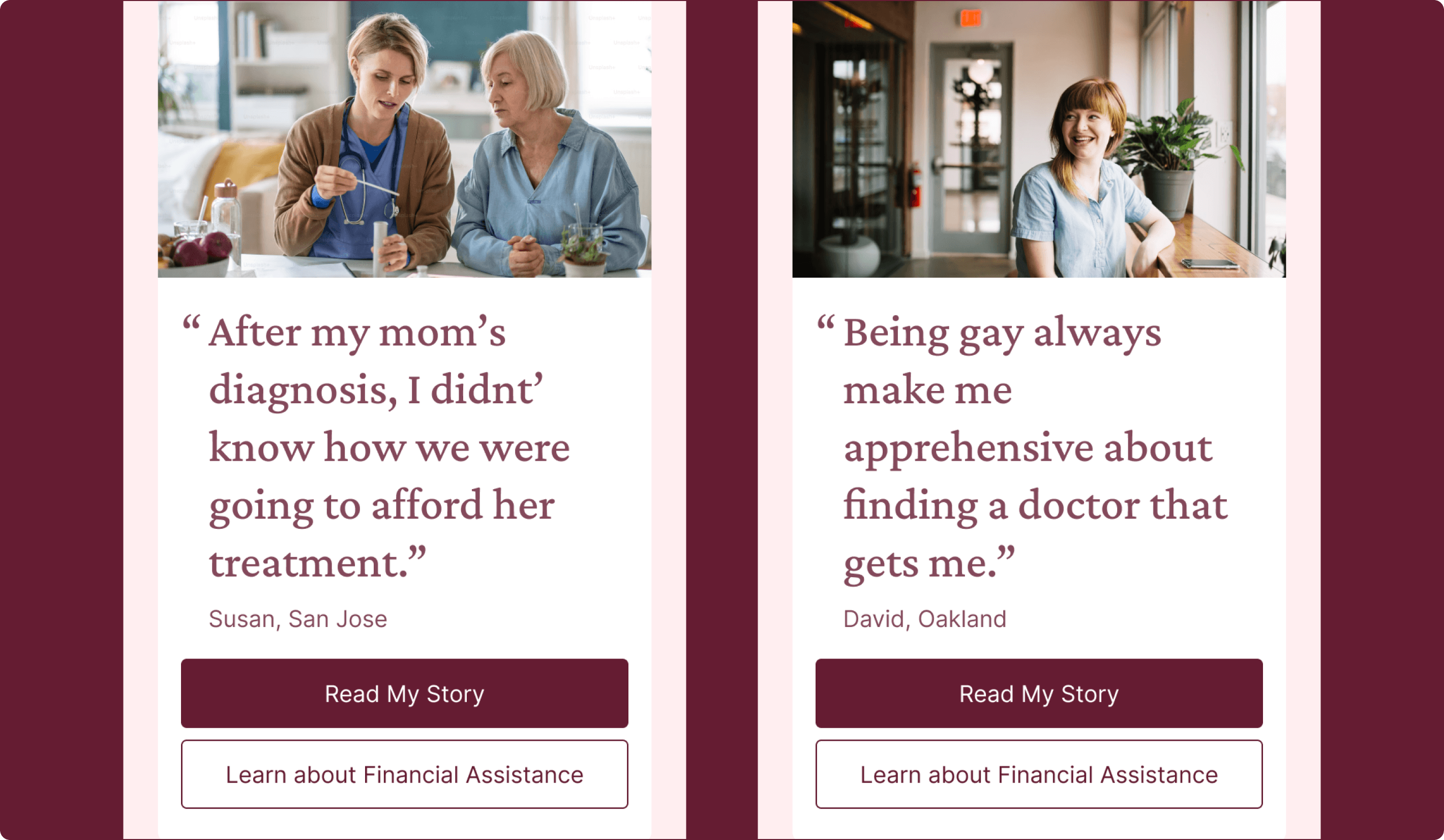
Patient Story Gallery
Using Real Patient Experiences to Build Trust and Relevance
This concept presented patient stories and treatment journeys in a more engaging, social-style format to help people understand what care at Stanford might actually feel like. Its value came from surfacing relatable stories that connected to a user’s condition, treatment needs, or life situation.
Why it mattered:
- Added relatable context to care decisions
- Helped users picture the patient experience more clearly
- Built trust through real stories rather than claims alone
- Showed the importance of relevance in story-based content
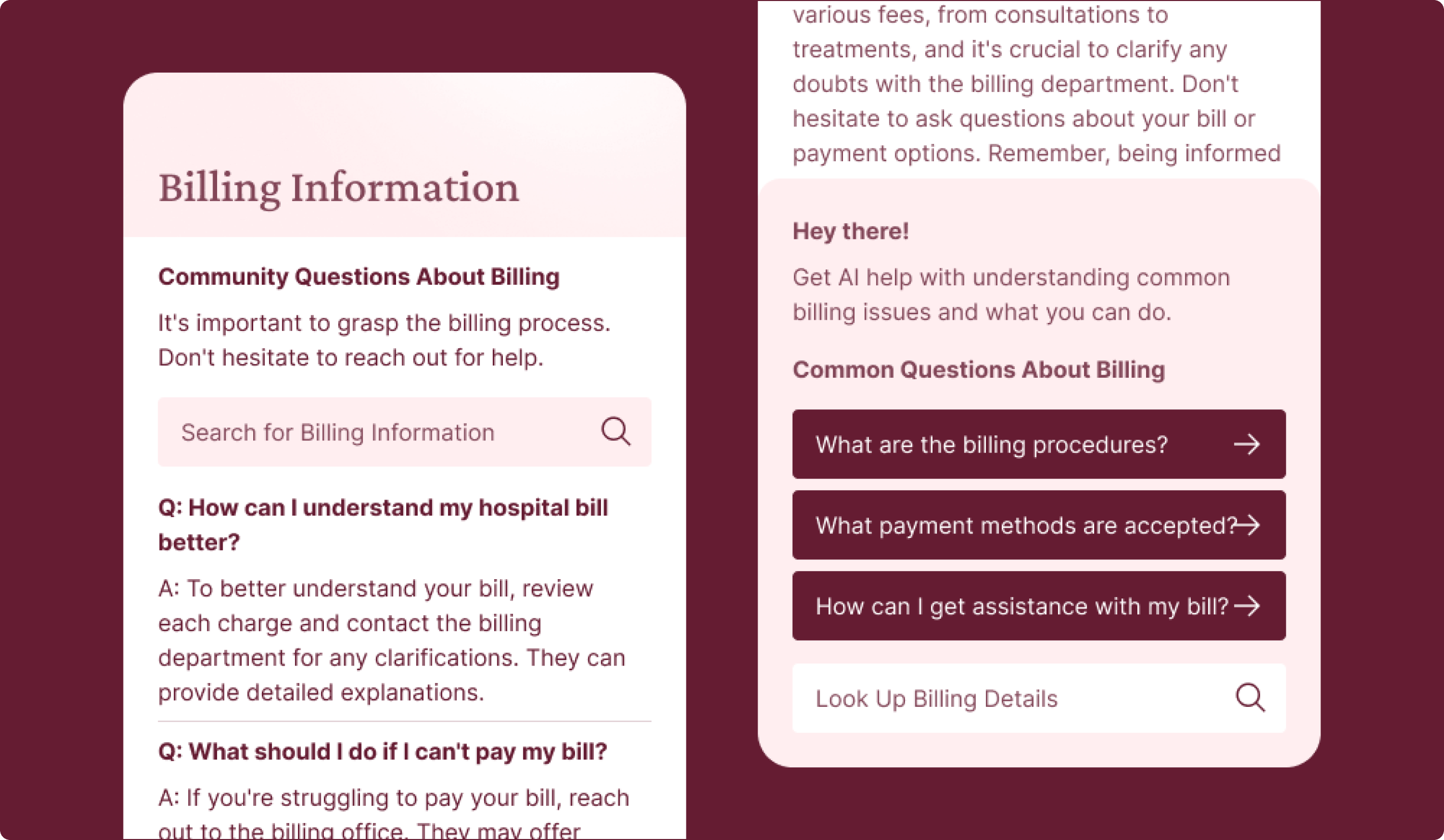
Responsive Billing
Making Financial Questions Easier to Ask and Easier to Resolve
This concept addressed the reality that billing, insurance, and cost questions often create confusion and stress. It combined FAQ content, community Q&A, and chatbot support so people could get answers in the way that felt most intuitive to them while still having a path to human help when needed.
Why it mattered:
- Created a more direct connection to Stanford expertise
- Helped users get answers with less effort
- Reinforced trust through expert-backed content
- Made the experience feel more helpful and responsive
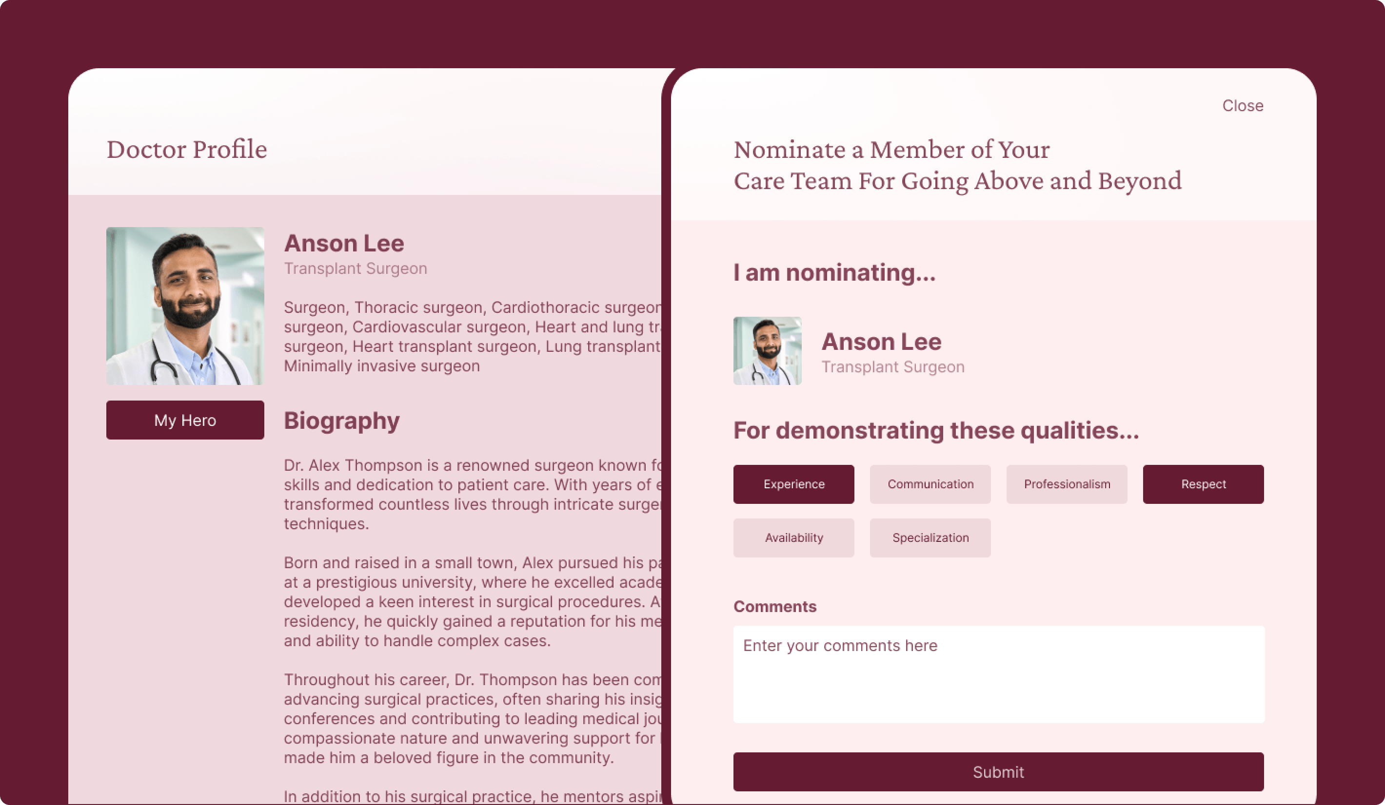
Hero Nomination
Highlighting Exceptional Care Through Recognition
This concept explored a more emotionally expressive way to showcase exceptional care by giving patients and caregivers a way to recognize staff members for compassion, support, communication, or going above and beyond during treatment. It added a human layer to the experience by turning moments of gratitude into visible proof of care quality, while also giving future patients another way to understand what kind of experience they might have at Stanford.
Why it mattered:
- Created a more visible signal of compassionate care
- Helped communicate quality through real care experiences
Access to Care
Reducing Friction Around Finding Care and Taking the Next Step
The Access to Care concepts focused on helping users move from uncertainty to action. These ideas addressed some of the clearest needs in the research, including knowing what type of care to seek, finding a doctor with the right characteristics, understanding cost and insurance, and reducing stress around getting to appointments. Testing showed strong interest in concepts that directly supported decision-making, especially when they helped users avoid unnecessary phone calls or gave them clearer next steps.
Experience goals:
- Helped users act on care needs more confidently
- Reduced uncertainty around where to go and what to do next
- Supported practical concerns like availability, insurance, and navigation
- Made the digital experience feel more helpful during stressful moments
Patient Experience Nav Bar
A More Guided Way to Navigate Care and Support
This concept introduced a digital support layer that could help users find care, access support services, translate content, and move through healthcare information more easily. It was designed to reduce confusion and make the site feel more responsive, especially for users who were unsure where to start.
Why it mattered:
- Offered guided help across complex healthcare tasks
- Reduced reliance on phone support for basic navigation
- Supported translation and broader accessibility needs
- Made Stanford feel more responsive and supportive
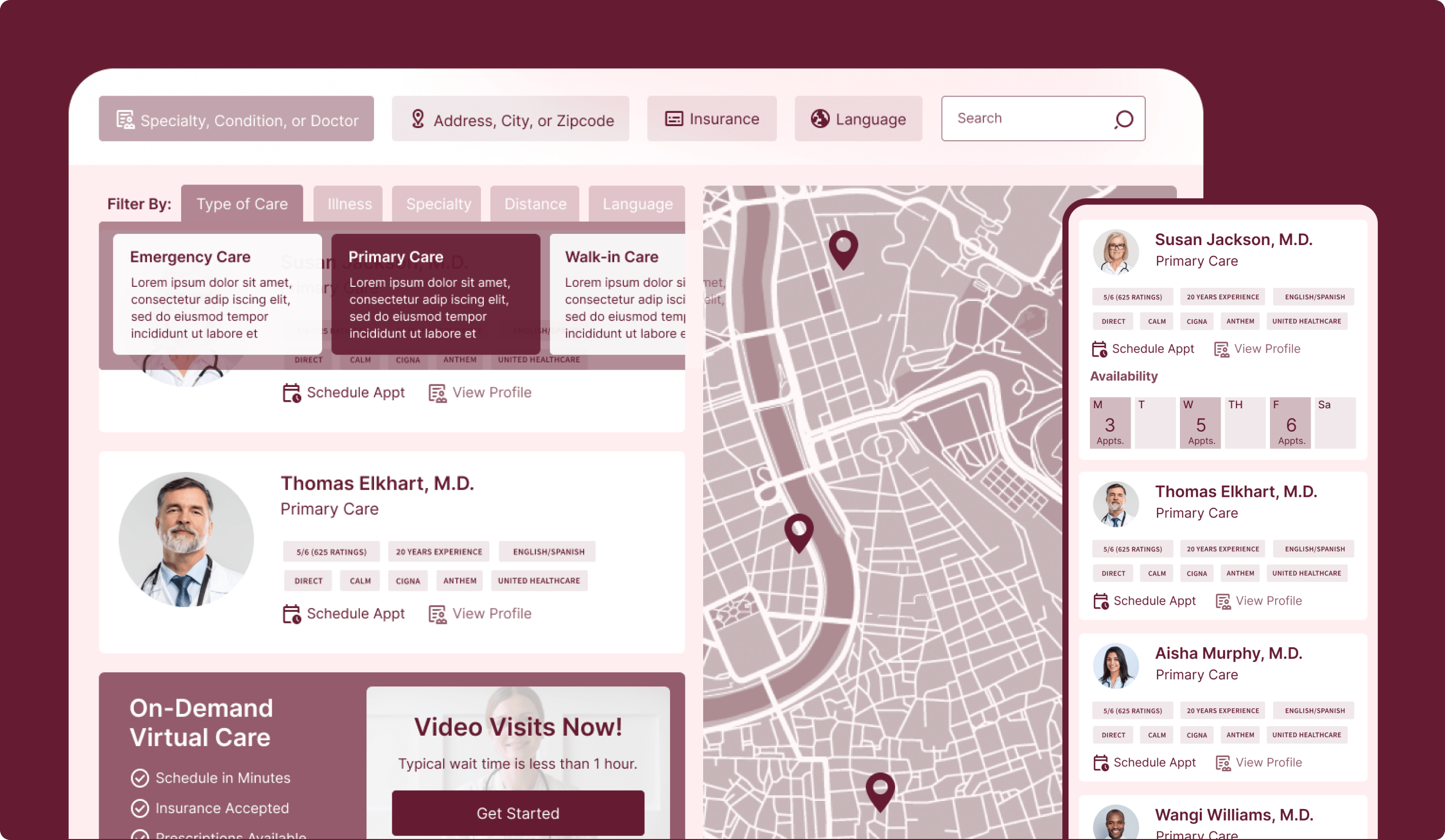
Search & Doctor Cards
Making Provider Search More Useful and Personal
This concept rethought doctor search around the factors users actually care about, including insurance, language, ratings, experience, and availability. It helped users more quickly evaluate fit and move toward action with more confidence.
Why it mattered:
- Made provider search feel more useful and personal
- Supported practical decision-making with better filters
- Surfaced availability as a critical factor
- Helped users evaluate provider fit faster
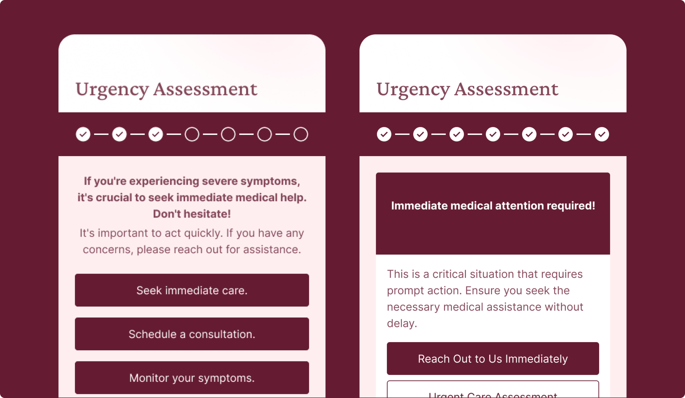
What Care Do You Need?
Helping Users Figure Out the Right Next Step
This concept was designed for people who begin their journey without knowing exactly what kind of care they need. Through a more guided flow, it helped narrow options and direct users toward the right care path, reducing hesitation and making the experience feel more supportive from the start.
Why it mattered:
- Helped users who were unsure where to start
- Reduced confusion around care pathways
- Directed people toward clearer next steps
- Made the website more actively supportive
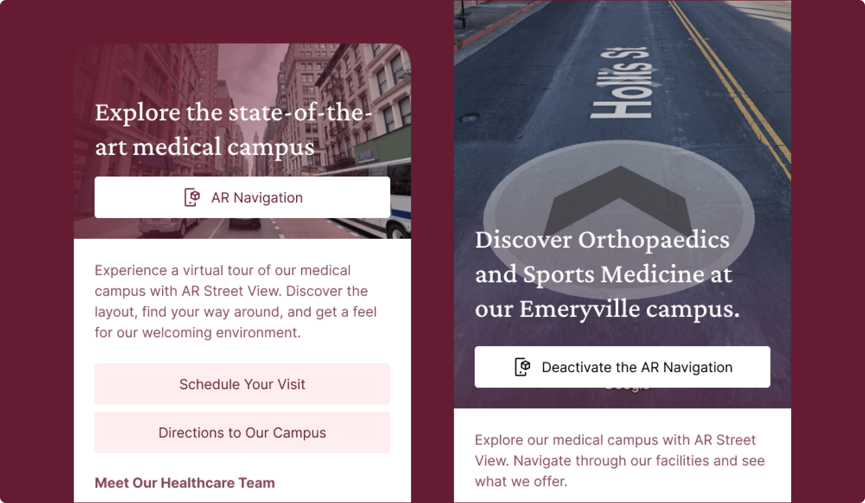
AR Navigation
Extending Digital Support Into the In-Person Journey
This concept used immersive navigation tools to help patients better understand and navigate Stanford’s physical locations before or during an appointment. It addressed a common source of anxiety and showed how the website could be useful beyond scheduling and information lookup.
Why it mattered:
- Reduced anxiety around arriving at unfamiliar locations
- Extended digital support into the in-person journey
- Helped appointments feel easier to navigate
- Added practical utility beyond scheduling alone
Care for Everyone
Using Realistic Scenarios to Make Care Feel More Accessible
This concept used customer vignettes and relatable examples to show how Stanford could support a wide range of people and health situations. It was designed to make the experience feel more inclusive and reassuring, especially for users who may not immediately see themselves reflected in a major healthcare system.
Why it mattered:
- Explored how inclusive messaging could reduce hesitation
- Helped some users see themselves in the experience
- Connected emotional reassurance to action
- Showed that relatability matters when it feels relevant
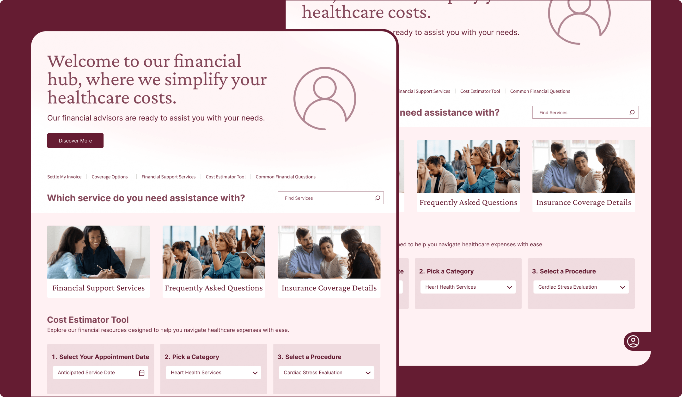
Financial Hub
Bringing Cost, Coverage, and Billing Into One Clearer Experience
This concept created a centralized place for users to access billing resources, insurance information, financial assistance, FAQs, and cost-estimation tools. It addressed one of the most practical and emotionally charged parts of healthcare by making financial information easier to find and easier to understand.
Why it mattered:
- Addressed one of the clearest practical pain points
- Centralized insurance and billing information
- Helped users estimate and validate costs
- Made the financial side of care easier to navigate
Quality of Care
Making Stanford’s Excellence Easier to Understand
The Quality of Care concepts explored how Stanford could communicate its clinical excellence in ways that felt more concrete and personally relevant. Instead of relying only on institutional reputation, these concepts showed quality through treatment information, specialty leadership, care environments, and clearer messaging around what makes Stanford different. Concepts in this area performed best when they translated high-level claims into information users could actually use in their decision-making.
Experience goals:
- Made quality feel more tangible and easier to evaluate
- Connected Stanford’s reputation to practical treatment decisions
- Reinforced confidence through specialty leadership and clearer proof points
- Helped users understand what Stanford’s care quality would mean for them personally
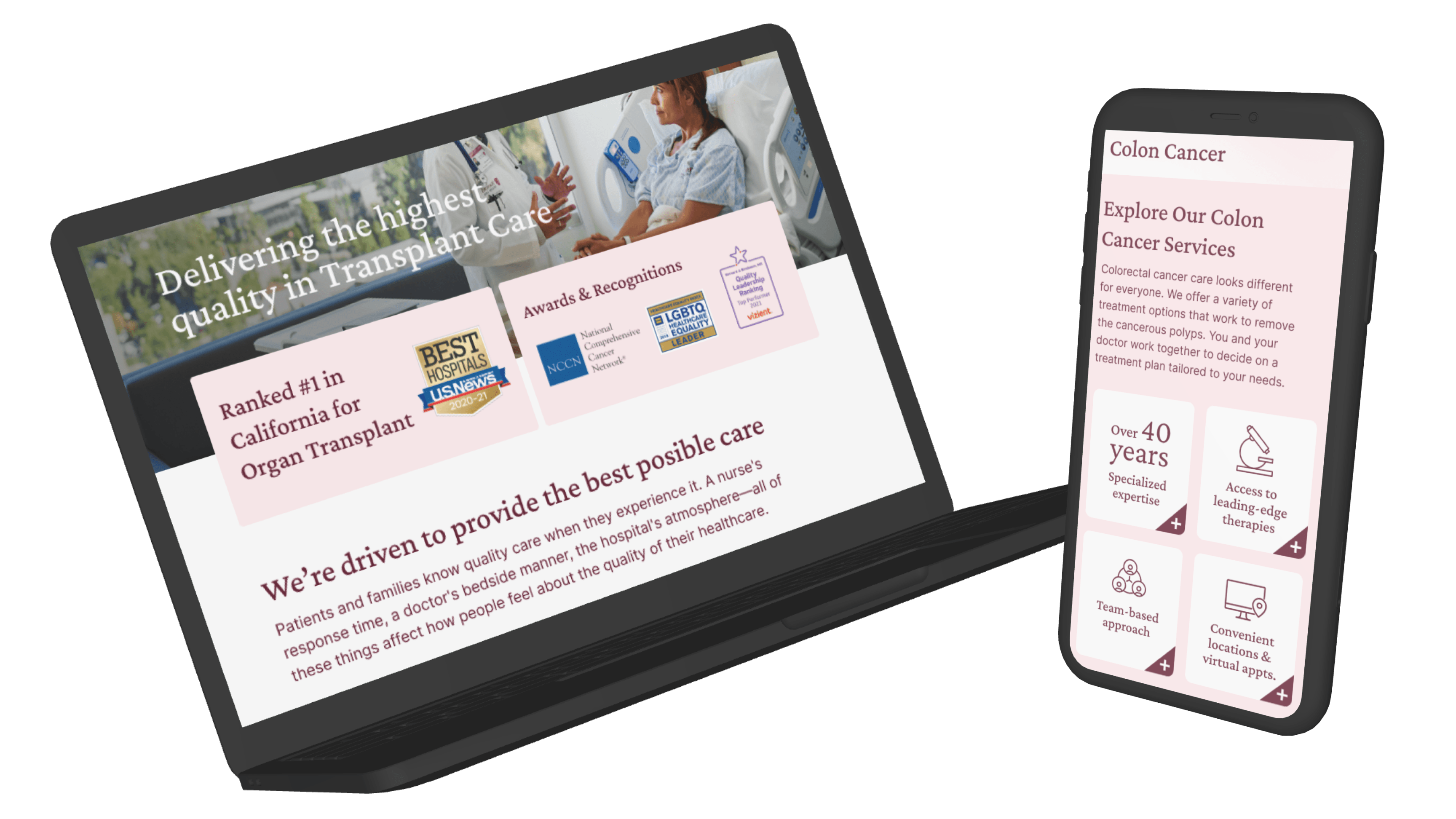
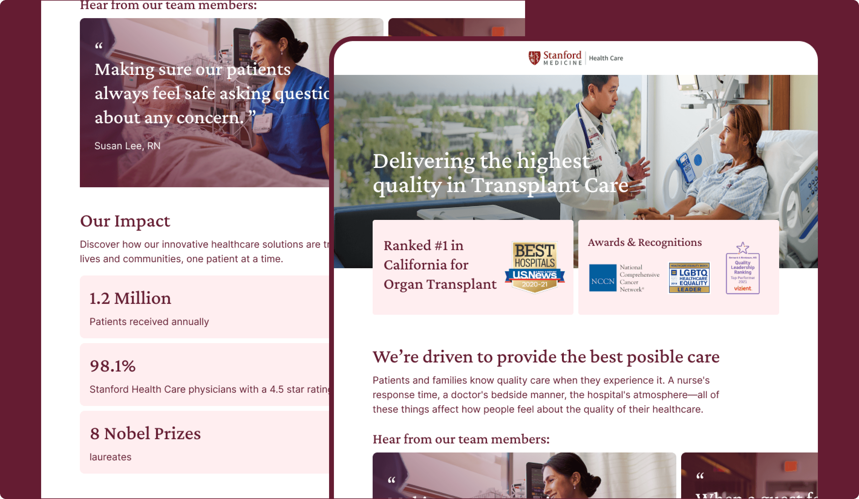
Delivering Quality Care
Making Stanford’s Excellence Feel More Tangible and Human
This concept brought together patient-centered messaging, care outcomes, clinical expertise, and more human expressions of the care experience in one clearer story. It was designed to help users understand what Stanford’s quality of care means for them as patients.
Why it mattered:
- Made care quality feel more understandable and human
- Connected institutional reputation to user-facing value
- Reinforced compassion as part of quality
- Helped users better interpret Stanford’s strengths
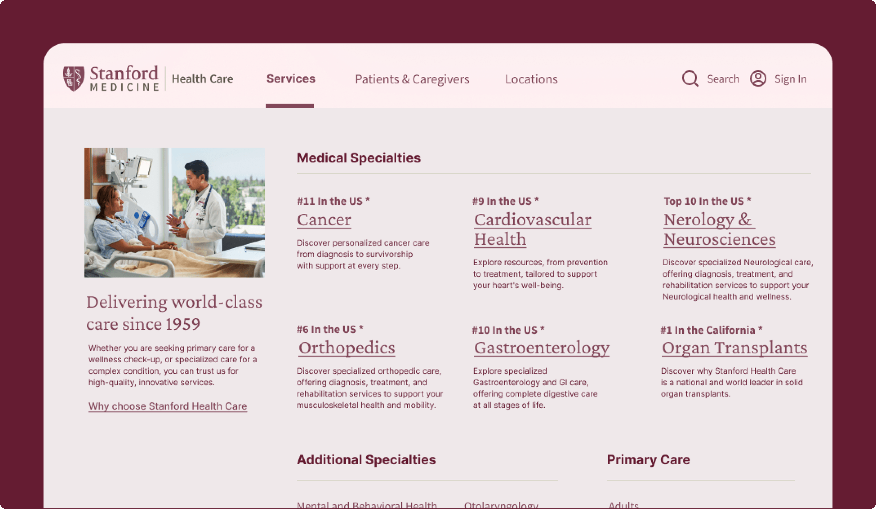
Mega Care Menu
Making Stanford’s Breadth of Expertise Easier to Explore
This concept expanded how specialties and service areas were surfaced in navigation so users could more easily browse the range of care Stanford offers. It turned navigation into a stronger discovery tool and helped communicate Stanford’s depth of expertise in a way that felt more visible and useful.
Why it mattered:
- Made Stanford’s expertise easier to explore
- Improved discoverability of service offerings
- Reinforced specialty leadership through navigation
- Helped users understand breadth and depth faster
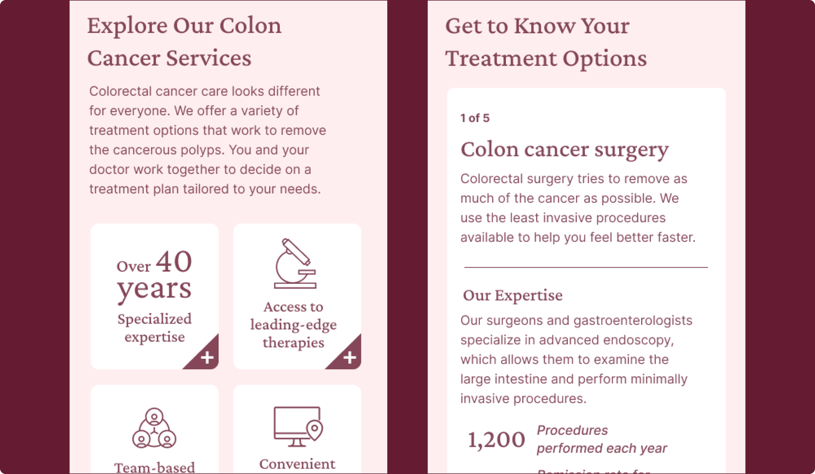
Treatment Options
Helping Users Better Understand Their Care Choices
This concept focused on presenting Stanford’s treatment offerings in a clearer and more useful way for people researching specific conditions or care needs. By surfacing different approaches, advanced options, and more detailed treatment information, it connected Stanford’s reputation to the actual decisions users were trying to make.
Why it mattered:
- Made treatment information more tangible and useful
- Supported deeper care evaluation before action
- Connected expertise to real condition-specific decisions
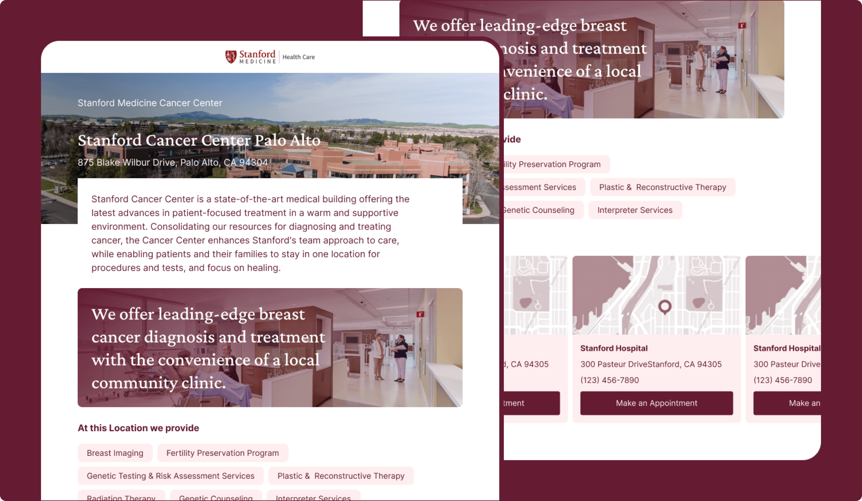
Care Destinations
Showing How the Care Environment Shapes the Experience
This concept treated location pages as more than logistical stopovers by using stronger imagery, messaging, and feature callouts to show where care happens and what that environment feels like. It recognized that physical setting influences perception and helped make care destinations feel more reassuring and informative.
Why it mattered:
- Recognized that care environment shapes perception
- Reduced uncertainty around where care happens
- Combined reassurance with practical location details
- Supported quality perception through clearer context
Healthcare Professional Experience
Supporting Referrals, Access to Expertise, and Professional Learning
For healthcare professionals, the work explored how Stanford could create a clearer digital front door for referrals while also delivering more long-term value through specialty-specific education and expert content. Referring providers wanted fast access to the right people, tools, and criteria, while professional audiences also responded to opportunities for ongoing learning and specialty-driven updates.
Experience goals:
- Reduced friction in referral-related workflows
- Made Stanford easier to work with as a referral partner
- Supported ongoing engagement through relevant professional content
- Reinforced specialty expertise through direct access to experts and research
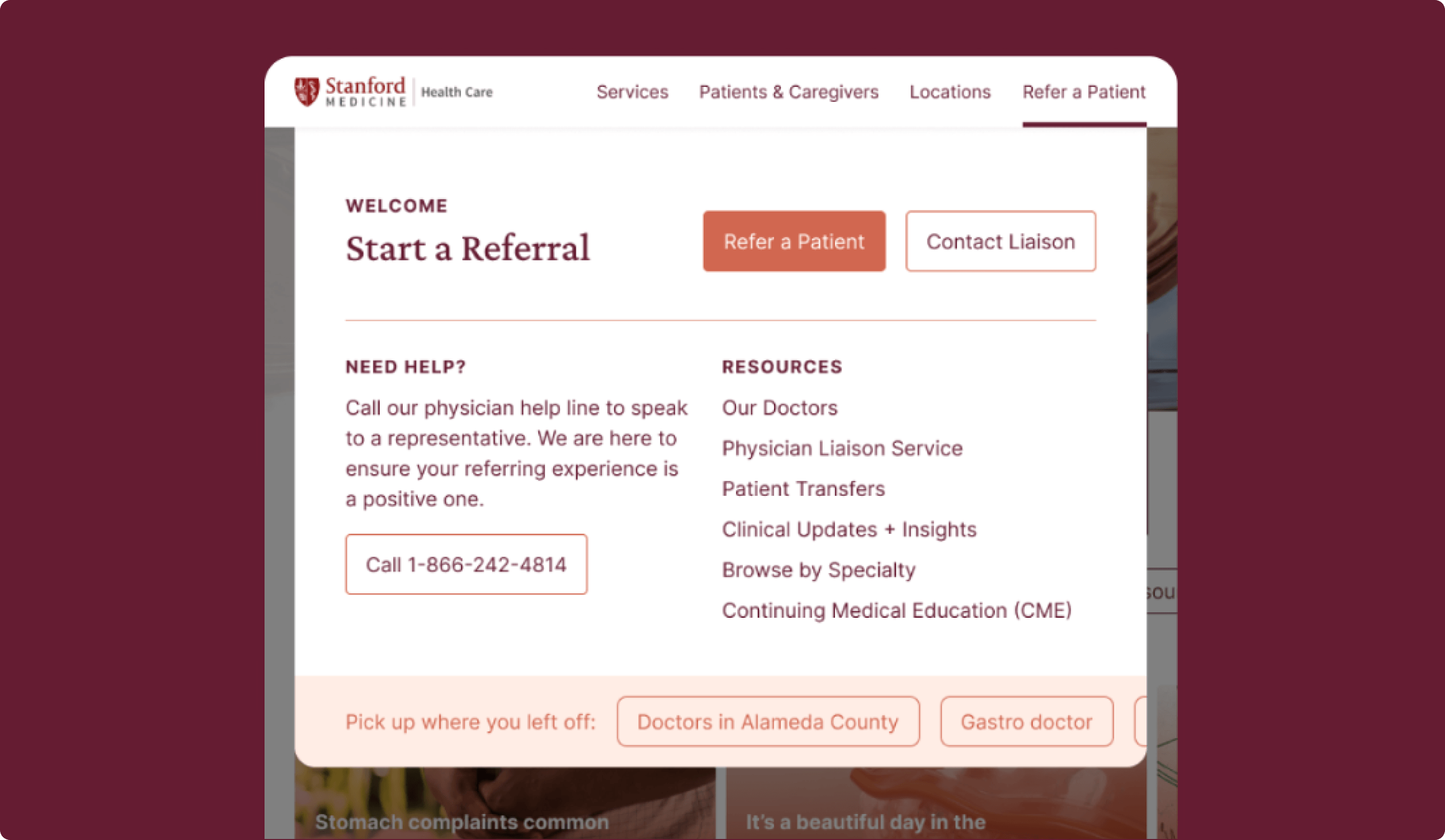
Enhanced Navigation
Creating a Clearer Digital Front Door for Providers
This concept proposed a more tailored navigation experience for healthcare professionals, giving them faster access to referrals, contact information, and the resources most relevant to their needs. It was designed to reduce friction for providers who need quick access to the right tools and information.
Why it mattered:
- Created a faster entry point for referring providers
- Reduced friction around common referral tasks
- Signaled that HCPs were a distinct audience
- Improved access to the most important resources
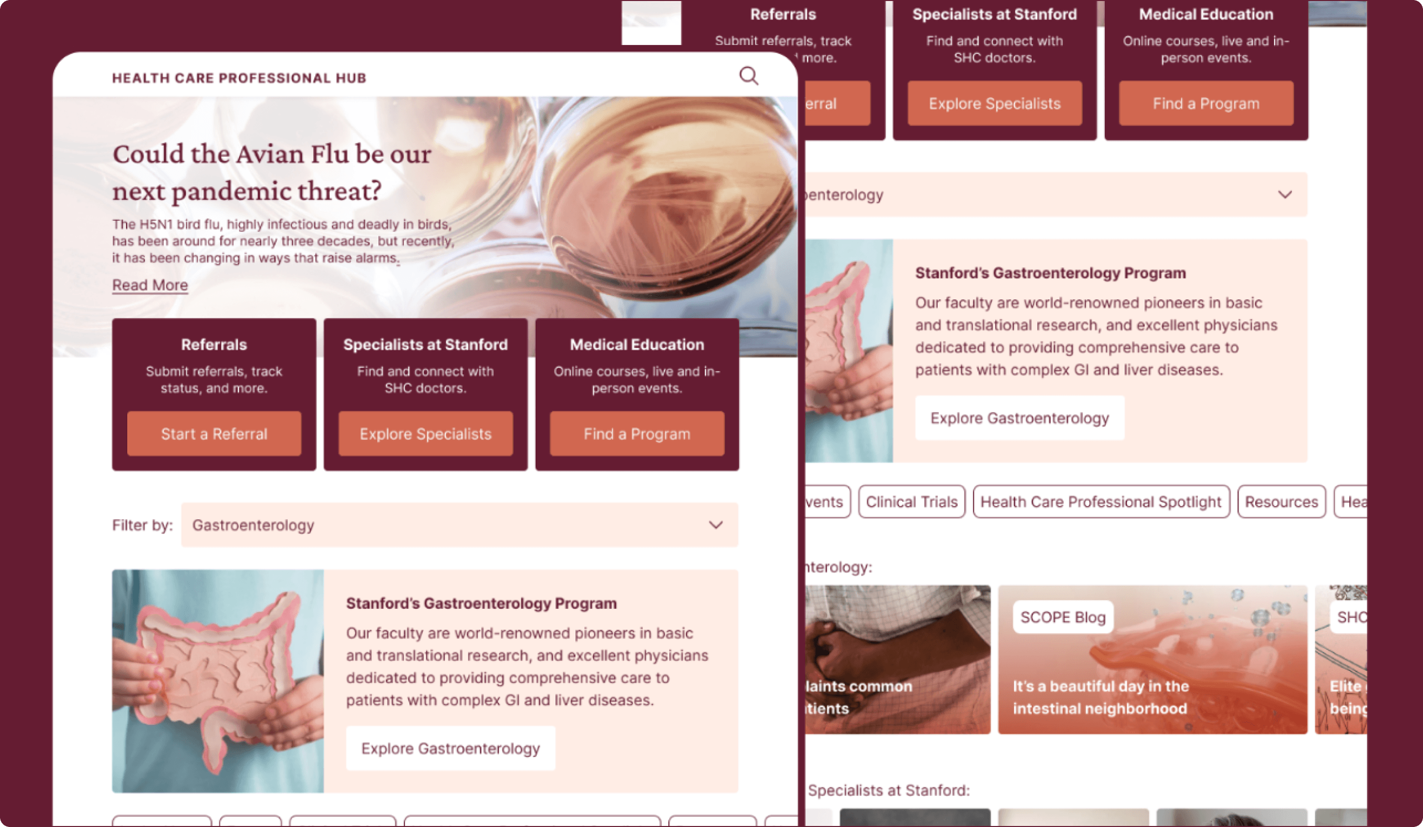
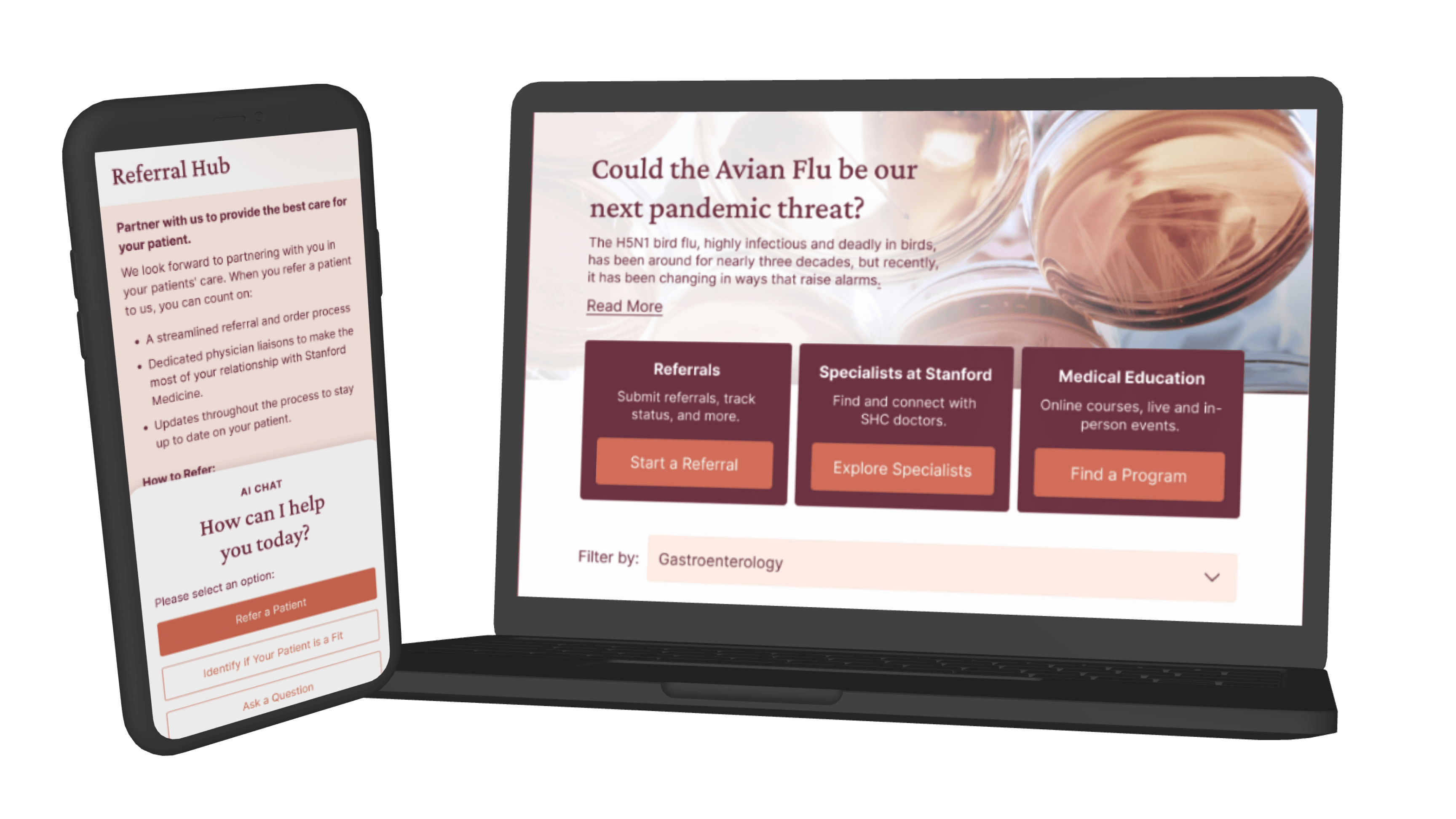
Health Care Professional Hub
A Dedicated Destination for Referral Support and Professional Value
This concept created a dedicated hub that brought together referral resources, research, educational content, specialty filtering, and other tools relevant to healthcare professionals. It supported immediate workflow needs while also giving Stanford a stronger way to stay connected with providers over time.
Why it mattered:
- Centralized referral and education resources
- Supported both short-term and long-term HCP needs
- Made Stanford feel more tailored to professionals
- Increased the value of the digital relationship
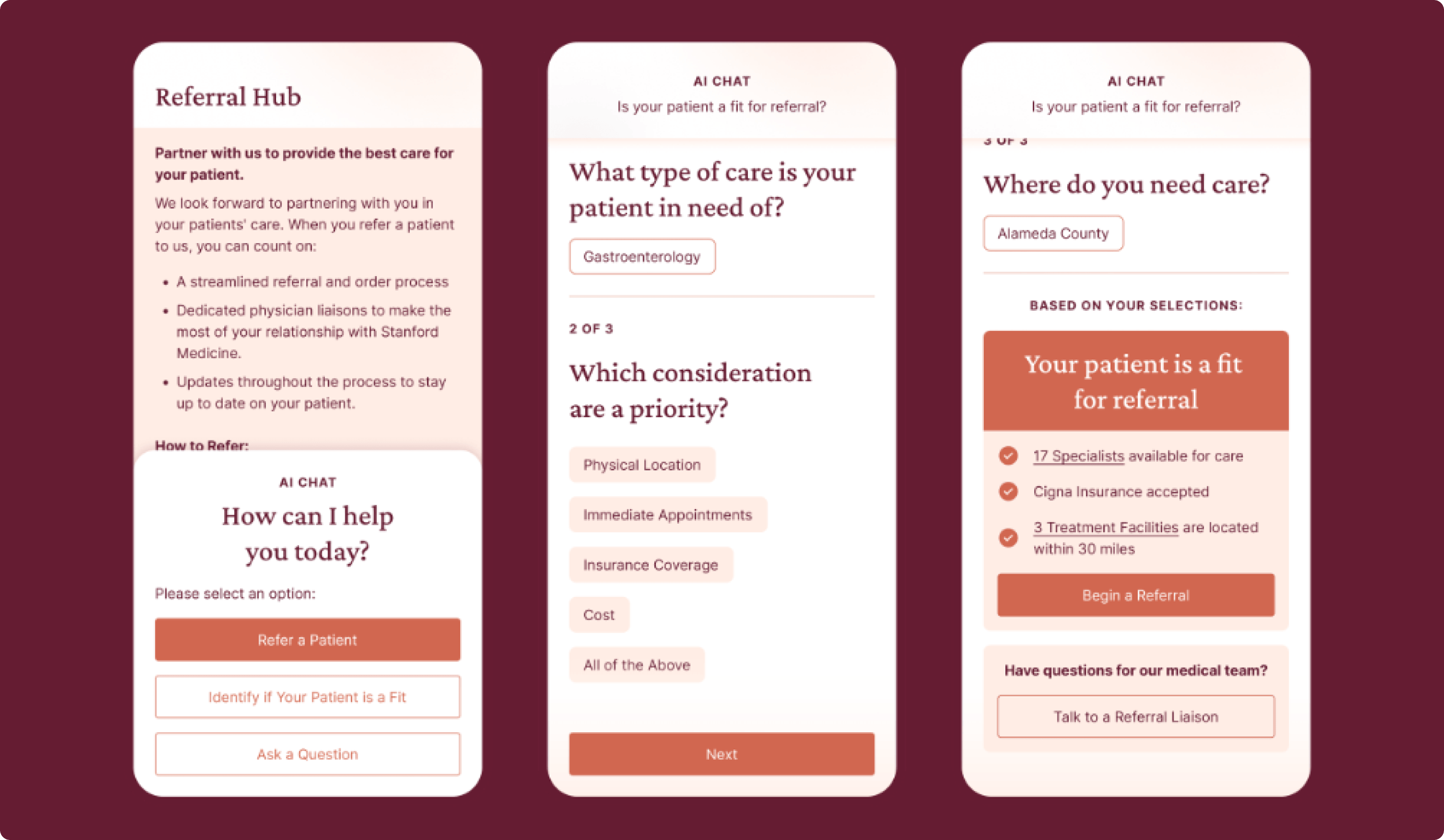
AI Liaison
Exploring How AI Could Support Referral Decisions
This concept introduced a chatbot-style assistant that could help providers understand referral requirements, assess patient fit, and identify next steps. It was positioned as a time-saving support tool that could add efficiency to professional workflows while still preserving access to human help for more complex needs.
Why it mattered:
- Explored how AI could streamline referral workflows
- Helped with triage and patient-fit questions
- Tested trust in AI-supported professional tasks
- Reinforced the need for human backup in complex cases
Expert Connect
Giving Providers Faster Access to Stanford Expertise
This concept created a more direct way for providers to ask questions, request support, or connect with the right Stanford expert before or during a referral decision. It recognized that many referral situations are nuanced and that direct access to expertise can be highly valuable.
Why it mattered:
- Supported more direct access to Stanford expertise
- Reduced uncertainty in complex referral scenarios
- Helped providers make better referral decisions
- Reinforced responsiveness as part of Stanford’s value
Takeaways

A Research-Backed Direction for the Future of Stanford
The project created a clearer, research-backed direction for how Stanford Health Care could evolve its digital experience to better support patients, caregivers, and healthcare professionals. The strongest concepts were the ones that made Stanford feel more useful, more relevant, and easier to act on, whether that meant understanding care options, finding the right doctor, navigating referrals, or engaging with meaningful content over time.
The work helped define how Stanford’s website could better express its care quality, reduce friction, and build trust in ways that felt tangible to real users. It also clarified where future investment had the strongest potential and gave Stanford a stronger foundation for shaping the next generation of its digital experience.